-
Notifications
You must be signed in to change notification settings - Fork 4
TABLE
<TABLE/> : <BOX/>
The <TABLE/> is used to display data in a tabular format. Tables, like <LIST/>, are the best way to display large amounts related data in a separated and comparable way.
| Name | Type | Default | Description | Req |
|---|---|---|---|---|
| data | Datasource | Name of the table's datasource. | ||
| pagesize | int | Rows to show per page. If not specified, all rows are displayed on a single scrollable page | ||
| menu | bool | true | Show the menu button for each header cell. Note, individual header cells may override this | |
| sortable | bool | true | All columns cells are sortable. Individual header cells may override this | |
| resizeable | bool | true | All columns are resizeable. Individual header cells may override this | |
| editable | bool | false | All columns are editable. Individual header cells may override this | |
| shadow | bool | false | Show a shadow on the table | |
| showbusy | bool | true | Show the busy indicator by default while the table is building or the asscoaited datasource is retrieving data | |
| filter | bool | false | Toggles the tables filter bar on/off | |
| textsize | int | 12 | The default text size for header and row cells. Note, this only applies for simple grid cells. Grid cells defined using custom FML widgets ignore this | |
| textcolor | color | true | The default text color for header and row cells <TD/>. Note, this only applies to simple grid cells with a defined field attribute. Row cells with custom markup ignore this value |
| Name | Values | Default | Description |
|---|---|---|---|
| selected | The data element of the selected list. This cam be used in binding using the {selected.xxx} syntax where xxx is the name of the field in the corresponding record |
| Name | Description |
|---|---|
| onchange | When a field is edited, this event fires |
| oninsert | When a new row is inserted, this event fires |
| ondelete | When a row is deleted, this event fires |
| Name | Description |
|---|---|
| export(format, filename) | Exports the table to file. Valid formats are adobe pdf (default), comma seperated csv or raw. When raw is used, the tables datasource is exported |
| insert(data, index) | Inserts a new row at the specified index. If index is not specified, the row is inserted immediately after the current row. New rows are created as a copy of the first row in the table using the supplied data. The data parameter can be either json or xml and is automatically added to the datasource. |
| delete(index) | Deletes the row at the specified index and removes the corresponding row from the datasource. If index is not specied, it deletes the current row. |
| move(indexFrom, indexTo) | Moves the row at position indexFrom to position indexTo. The associated rows in the datasource are also moved |
| autosize(fit) | Sizes the columns widths to the specified "fit", where fit can "scale", "equal" or "fit". Refere to <TH/>
|
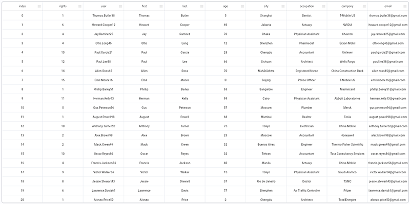
All of the following examples use the <TESTDATA/> datasource.
This is the simplest example where all data in the datasource will be displayed.
<FML>
    <TESTDATA id="ds1"/>
    <TABLE id="tbl" data="ds1"/>
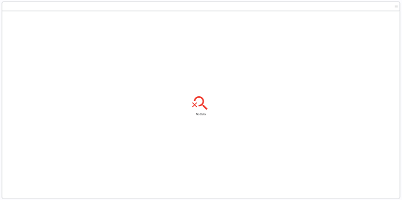
</FML>Here is that same example using the <NODATA/> widget to display a default table body when the datasource has no data. This is handy when building the table from a dynamic datasource like <GET/>. In this example, we have simply set rows="0" on the <TESTDATA/> widget in order to return an empty dataset.
<FML>
    <TESTDATA id="ds1" rows="0"/>
    <TABLE data="ds1" margin="10" >
      <NODATA center="true">
        <ICON color="red" size="96" icon="search_off_outlined"/>
	<TEXT value="No Data"/>
      </NODATA>
    </TABLE>
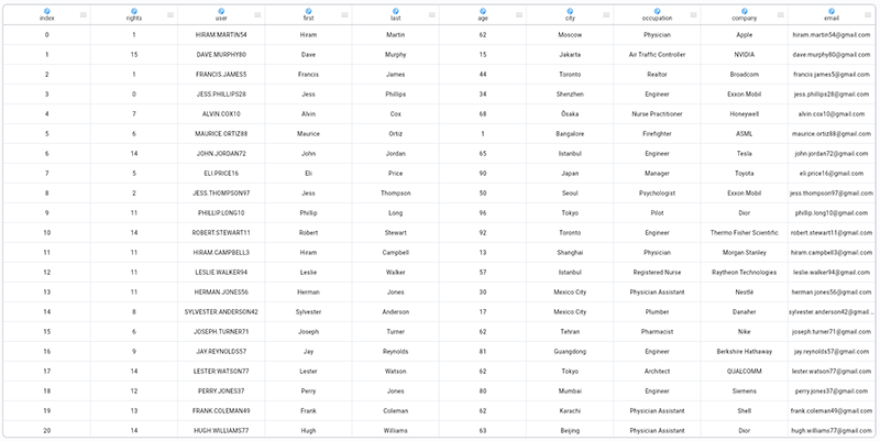
</FML>Building off of example1, we can specify the header cell contents using the a <TH/> - Table Header with a custom <TD/> - Table Header Cell. Not ice the [*] syntax. This is used for dynamically rendered values. All occurrences of [*] are automatically replaced with the data sets element value.
<FML>
    <TESTDATA id="ds1"/>
    <TABLE data="ds1" margin="10" >
      <TH center="true">
        <TD field="[*]">
            <ICON icon="supervised_user_circle_outlined" color="blue" size="16"/>
  	    <TEXT value="[*]"/>
        </TD>
      </TH>
    </TABLE>
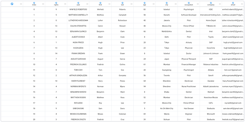
</FML>Building off of example3, we can add a mix of static and dynamic columns. Notice the first <TD/> - Table Header Cell widget. Since it does not reference a dynamic [*] value, it is considered static and creates a column in front of the other columns headers that are dynamically created from the datasource.
<FML>
    <TESTDATA id="ds1"/>
    <TABLE data="ds1" margin="10" >
      <TH center="true">
        <TD>
            <ICON icon="supervised_user_circle_outlined" color="blue" size="24"/>
        </TD>
        <TD field="[*]">
            <ICON icon="supervised_user_circle_outlined" color="blue" size="16"/>
  	    <TEXT value="[*]"/>
        </TD>
      </TH>
    </TABLE>
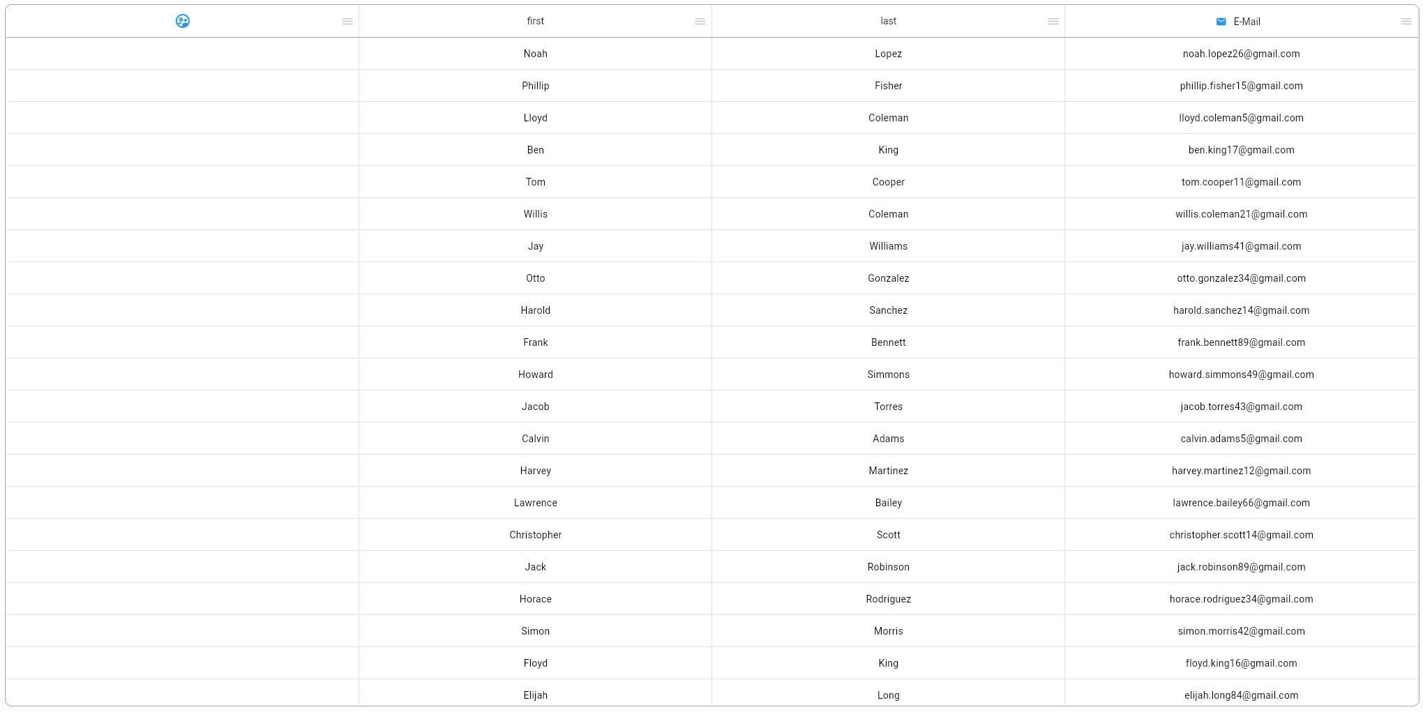
</FML>Table columns do not have to be dynamically created. They can be created either as a mix of static and dynamic <TD/> - Table Header Cell widgets or by creating a `<TD>' for each cell as shown in this example.
<FML>
    <TESTDATA id="ds1"/>
    <TABLE data="ds1" margin="10" >
      <TH center="true">
        <TD>
            <ICON icon="supervised_user_circle_outlined" color="blue" size="24"/>
        </TD>
        <TD field="first"/>
        <TD field="last"/>
        <TD field="email" layout="row">
            <ICON icon="email" color="blue" size="16"/>
  	    <TEXT value="E-Mail" margin="10"/>
        </TD>
      </TH>
    </TABLE>
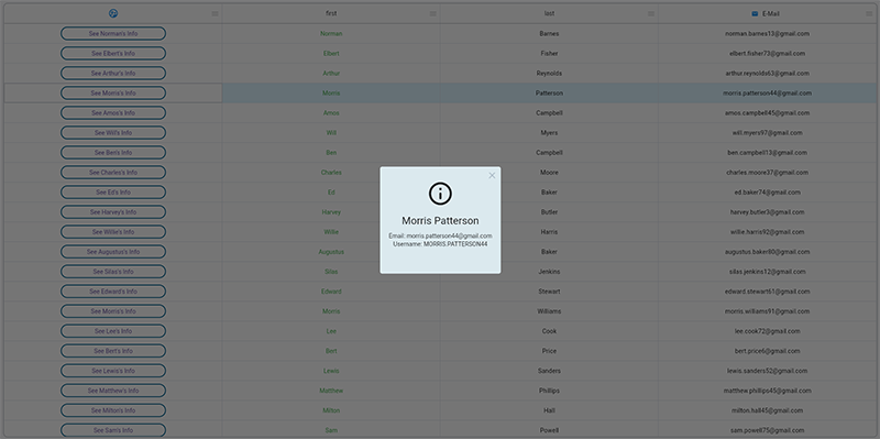
</FML>This example builds off of example5 and introduces the table <TR/> row and <TD/> cell widgets. Custom row cells are created by using custom widgets inside of the table row <TD/> cell widgets. In this example, we create 2 custom renderers for the row cells. Notice the {data.user} dotnotation. This binds data from the row to the corresponding widget values. In this example we create a custom <BUTTON/> in the first column that displays detailed user information in an alert when clicked.
<FML>
    <TESTDATA id="ds1"/>
    <TABLE data="ds1" margin="10" >

      <TH center="true">
        <TD>
            <ICON icon="supervised_user_circle_outlined" color="blue" size="24"/>
        </TD>
        <TD field="first"/>
        <TD field="last"/>
        <TD field="email" layout="row">
            <ICON icon="email" color="blue" size="16"/>
  	    <TEXT value="E-Mail" margin="10"/>
        </TD>
      </TH>

      <TR>
        <TD>
            <BUTTON type="outlined" width="250" label="See {data.first}'s Info" onclick="alert('info','{data.first} {data.last}', 'Email: {data.email}\nUsername: {data.user}\n')"/>
        </TD>
        <TD>
            <TEXT color="green" value="{data.first}"/>
        </TD>
      </TR>
    </TABLE>
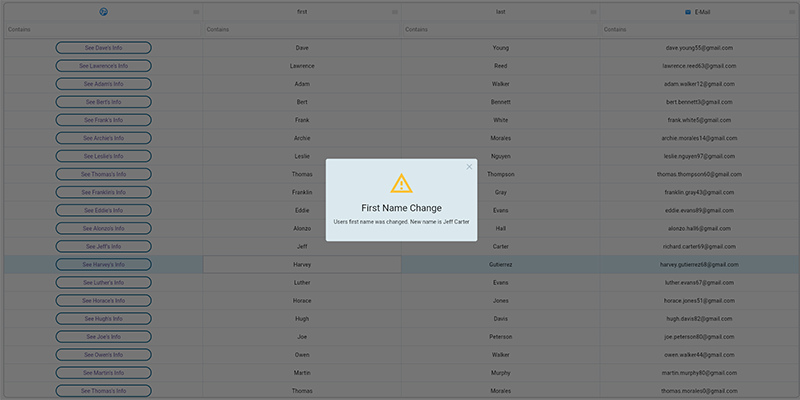
</FML>This example builds off of example6 and show simple in-place editing of a row's cell value. Individual row cells can be set to editable if using the editable="true" attribute on the corresponding <TD/> - Table Header Cell widget. One important note, the row cell must NOT define custom widgets. As data is edited, the individual cell's onchange event string is executed and the value is written back to the datasource.
The onchange event fires in the following order and aborts immediately if the event returns false.
- (1st)
<TD/>- Row Cell - (2nd)
<TR/>- Row - (3rd)
<TD/>- Header Cell - (4th)
<TH/>- Header - (5th)
<TG/>- Header Group - (6th)
<TABLE/>- Table
<FML>
    <TESTDATA id="ds1"/>
    <TABLE data="ds1" margin="10" filterbar="true">
      <TH center="true">
        <TD>
            <ICON icon="supervised_user_circle_outlined" color="blue" size="24"/>
        </TD>
        <TD field="first" editable="true"/>
        <TD field="last" editable="true"/>
        <TD field="email" layout="row">
            <ICON icon="email" color="blue" size="16"/>
  	    <TEXT value="E-Mail" margin="10"/>
        </TD>
      </TH>

      <TR>
        <TD>
            <BUTTON type="outlined" width="250" label="See {data.first}'s Info" onclick="alert('info','{data.first} {data.last}', 'Email: {data.email}\nUsername: {data.user}\n')"/>
        </TD>
	<TD onchange="alert('warning','First Name Change', 'Users first name was changed. New name is {data.first} {data.last}')"/>
	<TD onchange="alert('warning','Last Name Change', 'Users last name was changed. New name is {data.first} {data.last}')"/>
      </TR>
    </TABLE>
</FML>Framework Markup Language is an open source programming language created by AppDaddy Software Solutions Inc. FML and is licensed under a fair source license agreement and is maintained by a community of developers.
- Quick Start
- Widget Structure
- Layout Basics
- Config
- Navigation
- Authentication
- Server Configuration
- Offline Use
- Resource Guides
-
<FML/>
- <BOX/>
- <CHART/>
- <COLUMN/>
- <DRAWER/>
- <FOOTER/>
- <FORM/>
- <GRID/>
- <HEADER/>
- <LIST/>
- <MAP/>
- <WINDOW/>
- <PAGER/>
- <ROW/>
- <SCROLLER/>
- <SPLITVIEW/>
- <STACK/>
- <TABLE/>
- <TABVIEW/>
- <TREEVIEW/>
- <WEBVIEW/>

 Important Concepts