-
Notifications
You must be signed in to change notification settings - Fork 4
LIST
<LIST/> : <BOX/>
The <LIST/> widget is used to display a set of of one or more list <ITEM/>'s. <LIST/>'s are typically used to display dynamic data (data retrieved from an associated data source).
List's are best for displaying large data sets. List <ITEM/>'s lasy loaded, that is, item's are created as they scroll into view and disposed of when they scroll out of view.
When a <LIST/> is tied to a datasource, the first child <ITEM/> is used as a "prototype". For each row returned in the datasource, a corresponding <ITEM/> is created from that prototype and its data assigned from the row that created it.
| Name | Type | Default | Description | Req |
|---|---|---|---|---|
| direction | string | vertical | The orientation of the list's items, either "vertical" or "horizontal" | |
| datasource | string | The id of a valid data source. Used for dynamic <ITEM/> creation. | ||
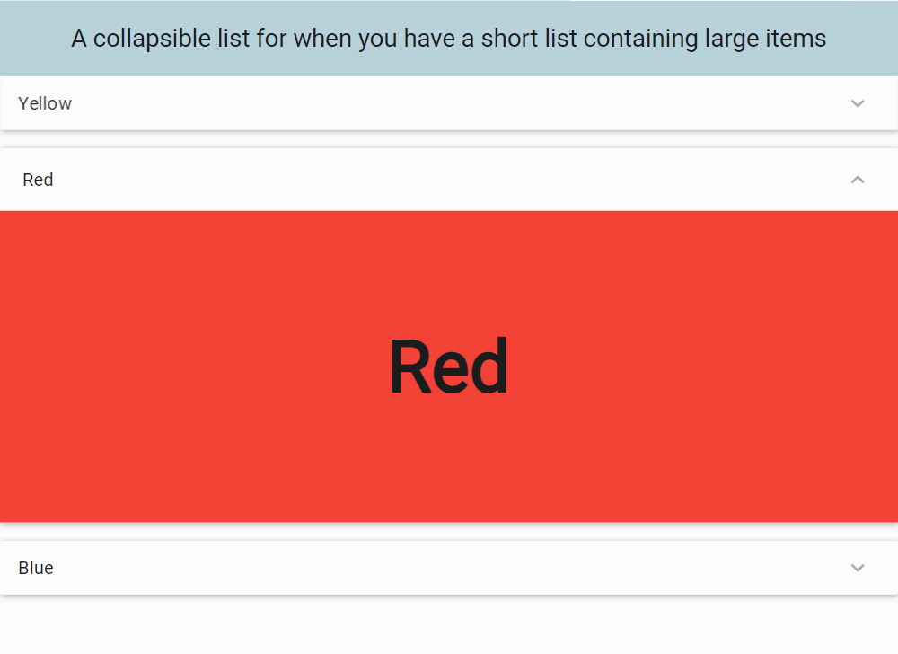
| collapsed | bool | false | If set to true creates a collapsed list | |
| selectable | bool | false | If set to true, <ITEM/>'s in the list can be "selected" and referenced using the "selected" property of the list. Note: Individual <ITEM/>'s may override this by setting their own "selectable" attribute. |
|
| reverse | bool | false | If the list scrolls and builds from bottom up |
| Name | Values | Default | Description |
|---|---|---|---|
| selected | The data element of the selected <ITEM/>. This can be used in data binding using {selected.property} where property is the name of the field in the corresponding record |
| Name | Description |
|---|---|
| select(index) | Selects the item at the specified index |
| deselect(index) | Deselects the item at the specified index |
| clear() | deselects any/all selected items |
| insert(data, index) | Inserts a new item at the specified index. If index is not specified, the item is inserted in the first position. New items are created as a copy of the first item (the prototype) using the supplied data. The data value must be a valid json or xml string. This data is automatically added to the data source. |
| delete(index) | Deletes the item at the specified index, fires the ondelete event handler of the item (if specified) and removes the corresponding item from the data source. |
| move(indexFrom, indexTo) | Moves the item at position indexFrom to position indexTo. The associated item in the data source is also moved |
| forEach(eventString) | Executes the event string defined in eventString for each item in the list. |
| scroll(pixels) | Scrolls the list +/- pixels specified in the direction of the primary axis |
| scrollTo(id, position) | Scrolls to the item with the specified id. The position parameter is optional and can be be either top, bottom, start or end. Note: This method does not function if the list contains variable size items in the direction of scrolling |
Example #1 : a simple list of 6000 <ITEM/>'s
<FML  title="LIST (example1)" linkable="true" layout="column">
    <!-- test data -->
    <TESTDATA id="ds1" rows="6000"/>

   <BOX margin="20,5,20,5"  borderlabel="Selected Item" radius="5" height="125" pad="15" bordercolor="{THEME.primary}" valign="center" >
     <TEXT value="Name: {list1.data.first} {list1.data.last} "/>
     <TEXT value="Occupation: {list1.data.occupation}"/>
  </BOX>

    <!-- simple list of 6000 items -->
    <LIST id="list1" data="ds1">
      <ITEM id="item" layout="row" halign="between" valign="center" bordercolor="={this.selected} ? 'green' : {THEME.primary}" borderwidth="={this.selected} ? 3 : 1" radius="5" margin="5,5,5,5" padding="5" selectable="true">
          <COL>
          <TEXT value="Row # {data.index}"/>
          <TEXT value="Name: {data.first} {data.last}"/>
          <TEXT value="Occupation: {data.occupation}"/>
         </COL>
          <ICON value="check" color="={item.selected} ? 'green' : 'transparent' "/>
      </ITEM>
    </LIST>

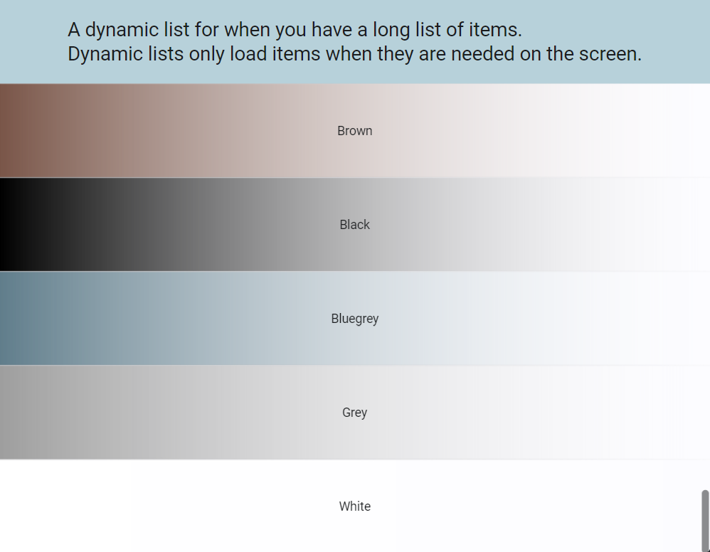
</FML><FML title="LIST (example2)" linkable="true" layout="column" color="{THEME.secondaryContainer}" >
<COLUMN pad="20" expand="false">
<TEXT style="h6" value="A dynamic list for when you have a long list of items." />
<TEXT style="h6" value="Dynamic lists only load items when they are needed on the screen." />
</COLUMN>
<LIST>
<ITEM>
<BOX color="brown,blur" start="left" end="right" width="100%" height="40%" center="true">
<TEXT value="Brown" halign="center" />
</BOX>
</ITEM>
<ITEM>
<BOX color="black,blur" start="left" end="right" width="100%" height="40%" center="true">
<TEXT value="Black" halign="center" />
</BOX>
</ITEM>
<ITEM>
<BOX color="bluegrey,blur" start="left" end="right" width="100%" height="40%" center="true">
<TEXT value="Bluegrey" halign="center" />
</BOX>
</ITEM>
<ITEM>
<BOX color="grey,blur" start="left" end="right" width="100%" height="40%" center="true">
<TEXT value="Grey" halign="center" />
</BOX>
</ITEM>
<ITEM>
<BOX color="white,blur" start="left" end="right" width="100%" height="40%" center="true">
<TEXT value="White" halign="center" />
</BOX>
</ITEM>
</LIST>
</FML><?xml version="1.0"?>
<FML title="LIST (example3)" linkable="true">
<SCROLLER>
<BOX color="{THEME.primary}" center="true" expand="false" width="100%" pad="20">
<TEXT style="h6" value="A collapsible list for when you have a short list containing large items"/>
</BOX>
<LIST collapsed="true">
<ITEM>
<BOX color="yellow" start="left" end="right" width="100%" height="50%" center="true">
<TEXT value="Yellow" bold="true" size="64"/>
</BOX>
</ITEM>
<ITEM>
<BOX color="red" width="100%" height="50%" center="true">
<TEXT value="Red" bold="true" size="64"/>
</BOX>
</ITEM>
<ITEM>
<BOX color="blue" start="left" end="right" width="100%" height="50%" center="true">
<TEXT value="Blue" bold="true" size="64"/>
</BOX>
</ITEM>
</LIST>
</SCROLLER>
</FML>Framework Markup Language is an open source programming language created by AppDaddy Software Solutions Inc. FML and is licensed under a fair source license agreement and is maintained by a community of developers.
- Quick Start
- Widget Structure
- Layout Basics
- Config
- Navigation
- Authentication
- Server Configuration
- Offline Use
- Resource Guides
-
<FML/>
- <BOX/>
- <CHART/>
- <COLUMN/>
- <DRAWER/>
- <FOOTER/>
- <FORM/>
- <GRID/>
- <HEADER/>
- <LIST/>
- <MAP/>
- <WINDOW/>
- <PAGER/>
- <ROW/>
- <SCROLLER/>
- <SPLITVIEW/>
- <STACK/>
- <TABLE/>
- <TABVIEW/>
- <TREEVIEW/>
- <WEBVIEW/>


 Important Concepts