-
Notifications
You must be signed in to change notification settings - Fork 4
DATEPICKER
<DATEPICKER/> : FormField
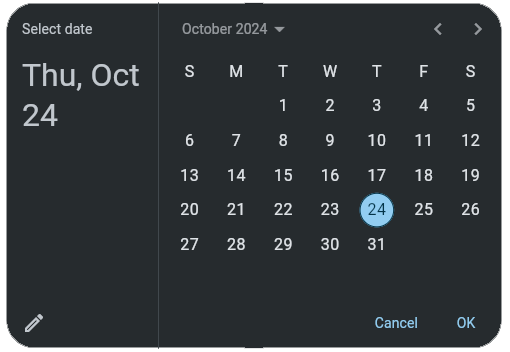
The <DATEPICKER/> widget is a specialized type of Form Field that opens a calendar style datepicker, and displays the date in an input field. <DATEPICKER/> uses the date format class notation from Flutter.
The <DATEPICKER/> default date format is 'yMd' and can be changed using the format property. The format is independent of the type, a type of datetime will still output as format if it is set. The input and output format's will always be the same. If required to be different, using evaluation functions such as todate() or other methods of data manipulation as required.
| Name | Type | Default | Description | Req |
|---|---|---|---|---|
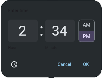
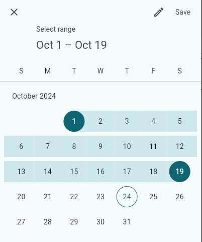
| type | string | date | The type of datepicker to be displayed. Valid entries are date, datetime, time, and range. | |
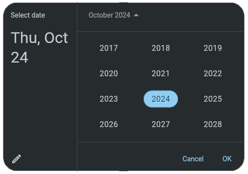
| cmode or mode | string | calendar | The mode of datepicker's calendar dialog. Valid entries are calendar, calendaronly, input, inputonly and year. | |
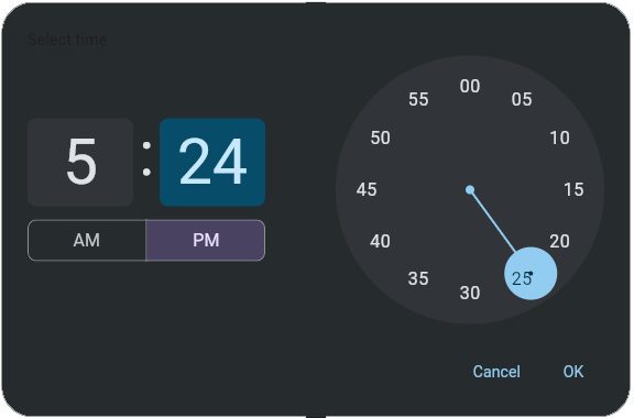
| tmode | string | input | The mode of datepicker's time dialog. Valid entries are dial, dialonly, input, and inputonly | |
| value | string | The initial or selected date or time. When type="range", the value property holds the initial or selected lower date range. | ||
| format | string | 'yMd' 'HH:mm' 'y/M/d HH:mm' | The input and output date format. Valid formats are defined here. | |
| oldest | string | The oldest allowable date. Must be as defined in the format property | ||
| newest | string | The newest allowable date. Must be as defined in the format property | ||
| clear | bool | false | If a default clear value button is displayed | |
| border | string | all | Border type. Can be all, underline or none | |
| bordercolor | The color of the dialog's border | |||
| borderwidth | int | 1 | The width of the dialog's border | |
| radius | int | 5 | The radius of the border. | |
| textcolor | The color of the display text | |||
| showicon | boolean | true | Show/Hide the prefix calendar icon |
| Name | Description |
|---|---|
| open() | Opens the date picker dialog. |
<DATEPICKER id="dt1" type="datetime" margin="0" />
<TEXT value="=toDate({dt1}, 'yyyy/MM/dd HH:mm', 'MM-dd-yyyy HH:mm')" visible="=!noe({dt1})" margin="5,0,0,0"/>
<TEXT value="=toDate({dt1}, 'yyyy/MM/dd HH:mm', 'EEEE MMMM d, yyyy - h:mm a')" visible="=!noe({dt1})" margin="5,0,0,0"/><DATEPICKER id="dt2" type="date" margin="0" />
<TEXT value="=toDate({dt2}, 'yyyy/MM/dd', 'MM-dd-yyyy')" visible="=!noe({dt2})" margin="5,0,0,0"/>
<TEXT value="=toDate({dt2}, 'yyyy/MM/dd', 'EEEE MMMM d, yyyy')" visible="=!noe({dt2})" margin="5,0,0,0"/><DATEPICKER id="dt3" type="time" margin="0" />
<TEXT value="Time: {dt3}" visible="=!noe({dt3})" margin="5,0,0,0"/><DATEPICKER id="dt4" type="range" margin="0" />
<TEXT value="Range: {dt4.value} to {dt4.value2}" visible="=!noe({dt4})" margin="5,0,0,0"/><DATEPICKER id="dt5" type="date" mode="year" margin="0"/>
<TEXT value="{dt5.value}" visible="=!noe({dt5})" margin="5,0,0,0"/><DATEPICKER id="dt5" type="time" tmode="dial" margin="0"/>
<TEXT value="{dt5.value}" visible="=!noe({dt5})" margin="5,0,0,0"/>Framework Markup Language is an open source programming language created by AppDaddy Software Solutions Inc. FML and is licensed under a fair source license agreement and is maintained by a community of developers.
- Quick Start
- Widget Structure
- Layout Basics
- Config
- Navigation
- Authentication
- Server Configuration
- Offline Use
- Resource Guides
-
<FML/>
- <BOX/>
- <CHART/>
- <COLUMN/>
- <DRAWER/>
- <FOOTER/>
- <FORM/>
- <GRID/>
- <HEADER/>
- <LIST/>
- <MAP/>
- <WINDOW/>
- <PAGER/>
- <ROW/>
- <SCROLLER/>
- <SPLITVIEW/>
- <STACK/>
- <TABLE/>
- <TABVIEW/>
- <TREEVIEW/>
- <WEBVIEW/>

 Important Concepts