-
-
Notifications
You must be signed in to change notification settings - Fork 4
Confirm Screen Updates #11
Comments
|
Latest confirm screen designs that addresses all of the problems discussed above. This design also fits within the latest size constraints (width and height) that @alextsg and I have been solidifying. |
|
This is a nice design for when the transfer is pure ether. A couple topics I'd want to consider more: The primary currency shownThese current designs massively prioritize the user's currency, even making the ether very small by comparison. I think I'm okay with this, but would like to ask: Is there a way we can represent the approximate nature of these dollar values? One way I've suggested is adding a tilde ( Pure Function CallsNot all transactions have ether implicitly attached to them. Often, the transaction really is about the For cases when there is no ether being sent, and there is data associated with the transaction, and we are able to retrieve a function name from the on-chain registry, I strongly feel we should show the function name as a primary label on the confirmation screen. It is clearly the most useful information we could show the user. Rendering Function InfoI'm sorry if providing this JSON ABI to you in the past was confusing. This data structure is probably not actually the ideal thing to show the end user. The data you see in the above screen shot includes some specific things that could be rendered nicely:
That That The Hex DataIf we're able to render the Function data, we can probably tuck the Hex Data under a expandable section. It's big, it's ugly, and it's basically meaningless to the vast majority of people who might look at the view. An Advanced Option: Full Tx ParamsIf under ConclusionIt looks very nice, so much cleaner & smaller now that we got rid of the redundant to/from, that's great. It's definitely an upgrade from what we have now, so if we just wanted to load something into the queue, I'd be happy to approve this as is, and iterate from there. |
|
Thanks for the feedback
Yes, this is what this issue is focused on addressing. I think we can extract other use-cases from your point about pure function calls or "actions". Here's an issue I created for that. #16 |
|
this is nice @cjeria! the nonce element jumps out at me – it's reminiscent of the little orange also, what's the approach to the new "review transfer" header here? would it update if the function changes? might be worth thinking about how we utilize the header text more generally across all confirmation screens since it'll be big for explaining / clarity. |
|
I would like to see ETH as the primary currency and USD (or whatever) as the secondary currency. At the moment, I cannot even choose Suggestions:
|
|
Re: Presentation of transaction call data, if your team has the resources and/or interest in championing ethereum/EIPs#719 that would be the ultimate solution (IMO) to presenting users with contract call data in a way that is actually consumable by them. Even if you convert the JSON into something more "human readable" like a table, you still have the problem that most humans (non-engineers) won't have any idea what any of the data means. |
|
thanks @MicahZoltu - I've opened an issue on the main extension to discuss what you're suggesting. @cjeria as we chatted about today, these screens should be able to cover
could you do another mock with @danfinlay's suggestions on the data screen just to make sure we're on the same page? function name, address (+link to etherscan), unit256, hex data (collapsed), full function call (collapsed) |
|
@bdresser Since the nonce is calculated in the background after user confirmation, we're only sure of the nonce when the transaction is a retry transaction, so that's where you can see it. |
|
closing this since it's been merged! |


We have a few GH issues that are addressing different problems with the confirm transaction screen.
Problems:
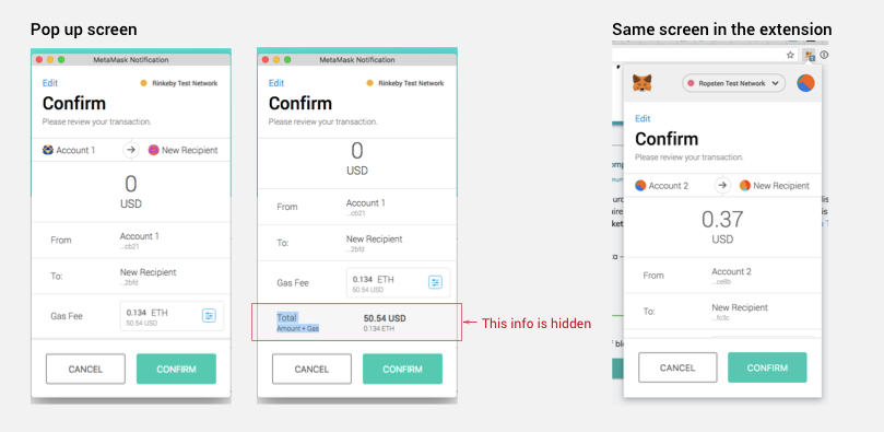
Total amount + Gas not visible
Total and Amount/Gas Fee values are hidden below main action buttons because tx body data is pushing it all the way down.
See the gihub issue here: MetaMask/metamask-extension#3885

Show method data
Need to show transaction “method data” in transaction ui somewhere. Dan suggested bubbling up this piece of data. Need to find a balance between this and amount.
See the gihub issue here: MetaMask/metamask-extension#2847
Trust Badge
Another team at ConsenSys is wanting us to design for adding a trust badge to verified smart contracts. This is a work in progress and we still don't have details regarding what this will mean, but there's a mock with a checkmark in the sketch file to reference.
Side Notes
We need to strike a balance between displaying the transaction type, method data, amounts and action buttons in such a way can be consistently displayed across confirm screens.
@celinepark94 I've added a new page in our sketch file called "Confirm TX screen" with all the screens related to the above. Let me know if you have any questions!
The text was updated successfully, but these errors were encountered: