-
-
Notifications
You must be signed in to change notification settings - Fork 3.6k
New issue
Have a question about this project? Sign up for a free GitHub account to open an issue and contact its maintainers and the community.
By clicking “Sign up for GitHub”, you agree to our terms of service and privacy statement. We’ll occasionally send you account related emails.
Already on GitHub? Sign in to your account
Wrap versions' list to look more consistent #3445
Conversation
|
Good catch! I think when there is no active/inactive version we don't want to display it as a table (or unordered list). So, I'd say that this should be something like: Similar as it is now but without the borders (probably this means more than CSS --I mean, touching the html layout maybe). What do you think? |
|
@humitos I think the same, but that it is how the rest of the sections looks like, should we change the other sections too? |
|
Oh, I haven't notice that. I'd say that it's "cleaner" to remove the dark gray when there is nothing to show. Looks nicer without that background IMHO. |
|
@stsewd can you make the changes I mentioned you? I think that's the only thing missing to wrap this PR in a mergeable state. |
|
@humitos should I change the empty state for all the lists then? I think we are moving to other style and layout as mention on #3572 (comment) Also see https://github.com/rtfd/readthedocs.org/issues/3554 |
Yes, I'd say so.
This, and the other issue you linked are going to be bigger changes. I'd prefer to wrap this PR, merge it and achieve those other changes in different PR. I'm sure those will require some discussion to finally agree. |
75e074c to
0ca31d8
Compare
There was a problem hiding this comment.
Choose a reason for hiding this comment
The reason will be displayed to describe this comment to others. Learn more.
I'm approving the PR since it's looks great.
The only thing to consider is my comment about not using list stylish when the list is empty and we are showing a simple message.
Maybe this is a matter of tastes, so another opinion could help here.
| </p> | ||
| <li class="module-item"> | ||
| <p class="quiet"> | ||
| {% trans "No active versions." %} |
There was a problem hiding this comment.
Choose a reason for hiding this comment
The reason will be displayed to describe this comment to others. Learn more.
Why are we considering this as a list of 1 element if it's empty?
I mean, we are using a li and displaying it as a row when it's not a list. In another comment I suggested to use just the simple text:
"No active versions."
as a p without too much style.
There was a problem hiding this comment.
Choose a reason for hiding this comment
The reason will be displayed to describe this comment to others. Learn more.
This is a common pattern across other lists (some times with a p and other just with a li)
There was a problem hiding this comment.
Choose a reason for hiding this comment
The reason will be displayed to describe this comment to others. Learn more.
Nice reply! Hehe!
Makes sense to leave as you did, then :)
|
👍 on using a single item list to display "No items". This is the pattern we're using on all other listings as they are reworked. |
|
The changes here are great! For some reason the "Edit" buttons are misaligned now though. The text should align to the middle of the button, it's more towards the top currently. I'd take a look at some of the places we do use this same table layout and have a button inline in the rows for a clue. |
There was a problem hiding this comment.
Choose a reason for hiding this comment
The reason will be displayed to describe this comment to others. Learn more.
Noting required change on edit button alignment.
|
@agjohnson I see the same on master :/. Probably something about the font that rtd uses on production? LocalOrg siteMaster on localThis branch on localOn the org site |
|
I have the same problem than @stsewd with the fonts. They look different from .org than from local host. Although, I think the problem is because the I think it should be |
2104e30 to
7b7ecb3
Compare
|
I just rebased this PR, for recap the only thing missing here is the problem with the font: on local development looks different from the production site, so it looks like is not centered. And as @humitos mention #3445 (comment) is not really centered on the production site either. The only difference I see from prod/local is that Typekit is loaded on dev, so, I think that takes precedence over fontawesome. |
|
I created an issue with respect to fonts in development vs production #3939. Essentially, we are using proprietary fonts (loaded through TypeKit) which are loaded in production only. |
|
This looks ready to merge. Should we hold off on this @agjohnson until we do more design tweaks, or should we get this in to make things a bit nicer for now? |
|
Tested locally & it looks good. |


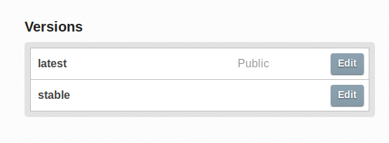
I just noted that the
Versionssection looks different to the others.Here is how it looks right now
And how it will look like after merging