-
Notifications
You must be signed in to change notification settings - Fork 4.3k
New issue
Have a question about this project? Sign up for a free GitHub account to open an issue and contact its maintainers and the community.
By clicking “Sign up for GitHub”, you agree to our terms of service and privacy statement. We’ll occasionally send you account related emails.
Already on GitHub? Sign in to your account
Try a perfect fourth heading #5631
Conversation
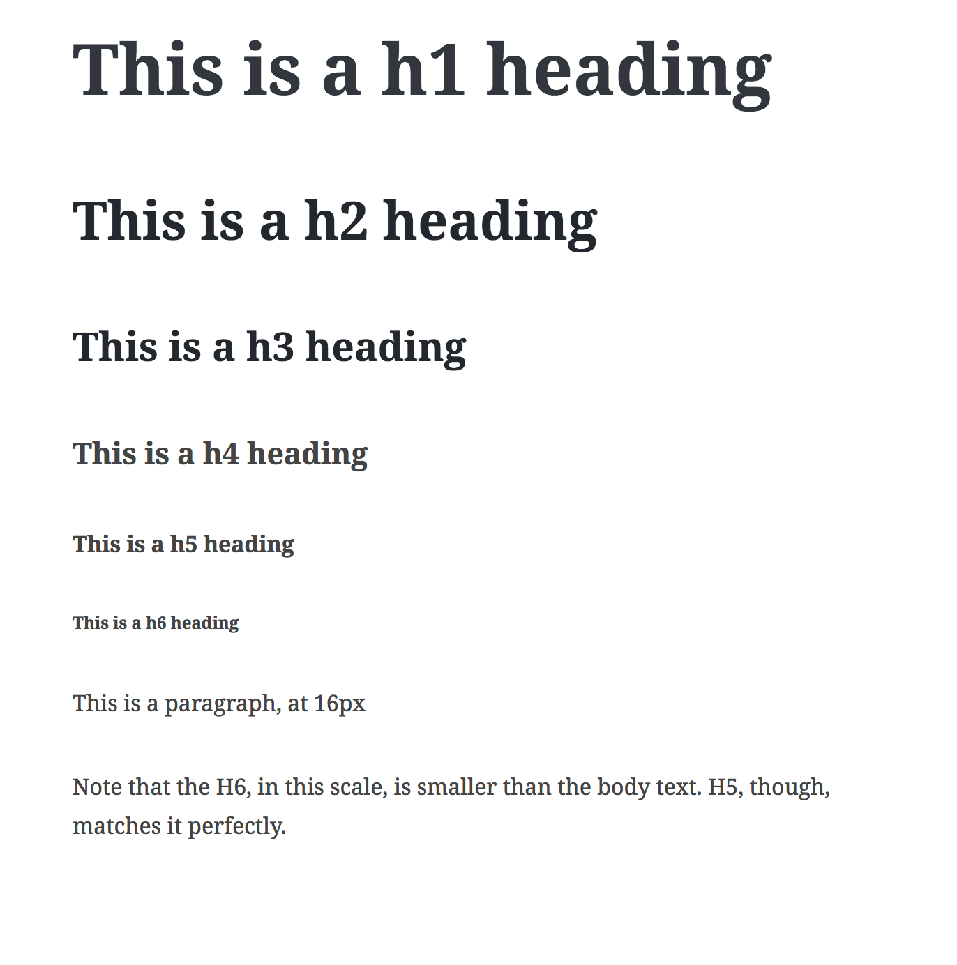
This fixes #4965. It's very much an attempt at this point, and it needs design feedback. It uses this typographic scale: http://type-scale.com/?size=16&scale=1.333&te
xt=A%20Visual%20Type%20Scale&webfont=Noto%2BSerif&font-family=%27Noto%20Serif%27%2C%20serif&font-weight=600&font-family-headers=&font-weight-headers=inherit&backgroun
d-color=white&font-color=%2324282d

We may want to try a perfect fifth instead. Unlike the preview seen at the link above, it looks quite monstrously big in Gutenberg. See screenshot.
There was a problem hiding this comment.
Choose a reason for hiding this comment
The reason will be displayed to describe this comment to others. Learn more.
I like this, it feels a lot better.
|
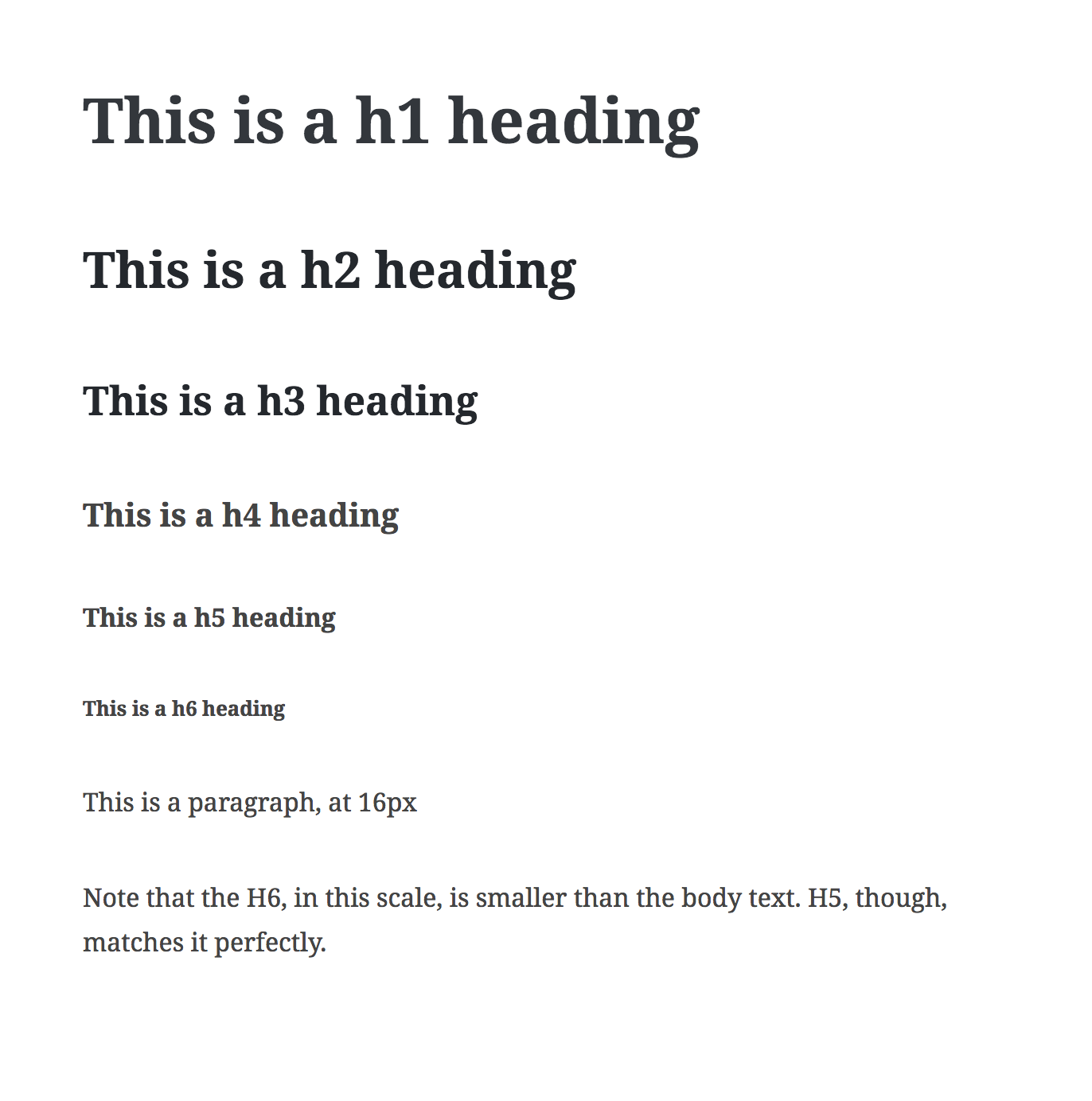
I switched to a Major Third instead, see http://type-scale.com/?size=16&scale=1.250&text=A%20Visual%20Type%20Scale&webfont=&font-family=%27Noto%20Serif%27,%20serif&font-weight=600&font-family-headers=&font-weight-headers=inherit&background-color=white&font-color= The reason being: the H1 which is used for the title, was GIANT in a perfect fourth. Too big. The contrast was nice, but the Major Third seems to be a much better fit for what is essentially the default editor stylesheet. Additionally, I rounded the em values to 2 digits after the comma, with no perceivable change to the sizes. Screenshot time. This branch, now: Sharing an empty page just to show how big the H1 is, even in the smaller "Major Third" scale which puts the H1 at a 2.44em size. In Here's the Perfect fourth, which is even bigger, with a 3.15em size. Looking just at this screenshot in isolation it doesn't look that massive, but inside the editor it's HUGE. Here's the Major Third with the same footprint: Here's Major Third, rounded to 2 digits: Here's how @karmatosed can you take another look? |
|
I do like the larger headers but I totally understand having less changes probably best on this point. I . am happy with any of the options presented so far, the important bit is getting a scale in as that's a really strong foundation. |
|
Good thoughts. Merging this now as it adds a scale. If we, over the weekend, feel this is too big we can easily move to a Minor Third scale which would make the heading size virtually the same as is in master now. |
|
I'm all for better typography and hierarchy, really appreciate this. Just wanted to suggest that any scale should be adapted to the real use case. Displays are still made of pixels. While some operating systems allow for sub-pixel rounding, ideally any font size value should compute to a value in pixels without decimals. For example, when using |


This fixes #4965. It's very much an attempt at this point, and it needs design feedback. It uses this typographic scale: http://type-scale.com/?size=16&scale=1.333&te
xt=A%20Visual%20Type%20Scale&webfont=Noto%2BSerif&font-family=%27Noto%20Serif%27%2C%20serif&font-weight=600&font-family-headers=&font-weight-headers=inherit&backgroun
d-color=white&font-color=%2324282d
We may want to try a perfect fifth instead. Unlike the preview seen at the link above, it looks quite monstrously big in Gutenberg. See screenshot:
Other downsides include the fact that heading sizes become very uneven in the em sizes, with 4 digits after the comma. Additionally, are we okay with the H6 being smaller than body text? It feels weird to me to have any heading that's smaller than the body text.
It is important to remember that what we are adjusting here is the base Gutenberg stylesheet. If themes load their own stylesheet into the editor, they will control the heading sizes themselves.
CC: @webmatros