-
Notifications
You must be signed in to change notification settings - Fork 4.2k
New issue
Have a question about this project? Sign up for a free GitHub account to open an issue and contact its maintainers and the community.
By clicking “Sign up for GitHub”, you agree to our terms of service and privacy statement. We’ll occasionally send you account related emails.
Already on GitHub? Sign in to your account
Writing Flow: Stretch "Click Redirect" to occupy full height of content #18732
Conversation
| .edit-post-visual-editor > .block-editor__typewriter, | ||
| .edit-post-visual-editor > .block-editor__typewriter > .block-editor-writing-flow, | ||
| .edit-post-visual-editor > .block-editor__typewriter > .block-editor-writing-flow > .block-editor-writing-flow__click-redirect { | ||
| height: 100%; |
There was a problem hiding this comment.
Choose a reason for hiding this comment
The reason will be displayed to describe this comment to others. Learn more.
I see that .block-editor-writing-flow__click-redirect is smaller than .block-editor-writing-flow, taking into account the rest of the content, even though it's set to 100%. How does this work?
There was a problem hiding this comment.
Choose a reason for hiding this comment
The reason will be displayed to describe this comment to others. Learn more.
I see that
.block-editor-writing-flow__click-redirectis smaller than.block-editor-writing-flow, taking into account the rest of the content, even though it's set to 100%. How does this work?
If I understand correctly:
.block-editor-writing-flow is a flex container. I recall that in the past, it was very specifically implemented that the click redirect have a base height to occupy the full space, shrinking if necessary. I think those specific shrink styles might have since been removed, but apparently it still works? I might want to do a round of cross-browser testing, and perhaps add back that attribute just to be explicit.
|
@jasmussen It was a separate regression, fixed in #18683. |
|
Hmm, this doesn't work as expected when the content scrolls, presumably because the containers are set to a fixed height of I would have thought simply changing this to I'll take a closer look. |
|
Do any of the changes in #18687 fix issues you encountered here? |
|
It does seem to help when using |
|
There are a few options I think we could consider:
Personally, while it feels kinda hacky to use Unrelated: In testing this, I noticed as well there's a small gap between notices and the content area: It seems to be caused by this margin: gutenberg/packages/editor/src/components/editor-notices/style.scss Lines 24 to 26 in 3cbb291
I expect it might make sense to change that selector to |
|
Looking more closely at the changes in #18044, I think the issue might be simpler, in that previously the VisualEditor expanded to try to occupy as much space as possible using That still exists in the VisualEditor styling:
But in #18044, the styling to treat the container as a flex container was removed: Restoring the flex container styling seems to be sufficient to fix all the issues (ae77d49). cc @youknowriad Since I understand the intention of #18044 to make these regions more unopinionated about the contents they contain, I'm curious if you see the changes of ae77d49 being problematic, or if you can think of another convention where these opinionated styles can exist (e.g. styling I do notice one remaining issue which affects very-narrow, very-tall viewports (screenshot). However, I think this is unrelated to the changes here, since the issue stems from the fact that the entire page contents ( |
Yes, my initial reaction is, that maybe these are specific to the post editor which means, we could define these styles in |
|
I tried to describe the styles in a way which could be generalized for other use-cases. I think this behavior of "stretch to full height of the content region, shrink if necessary" could be common for other usage as well. |
I created an issue for this at #18762. |
ae77d49 to
3f6b393
Compare
|
I'd like to allow this to have some time to sit in For additional testing, I used this branch to author a few blog posts last week. I also ran it through all supported browsers, with and without meta boxes and notices, and with short and long content. Aside: Have meta boxes always been pushed down below content, vs. fixed at the bottom of the screen? I notice the behavior here is identical to when the plugin is disabled (i.e. WordPress 5.3), but I thought I recall it appearing "fixed" at some point in the past. |


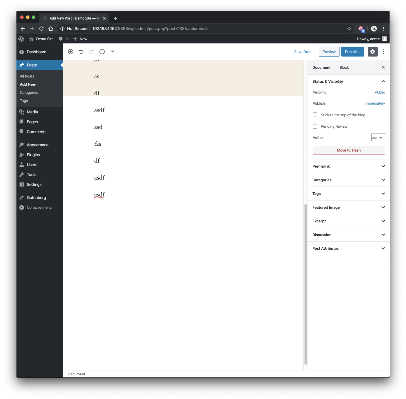
This pull request seeks to resolve an issue where the editor canvas is not stretched enough on taller viewports.
The issue manifests itself in two ways:
This has caused some trouble for us in the past, typically around the nesting of elements within the
EditPostVisualEditorcomponent (most recently with typewriter revisions in #16460). I'm open to options for better ways to "stretch" descendents of this component, but as long as there is good test coverage, I'm not overly concerned with the nested selectors forheight: 100%styling.There existed tests previously which were meant to protect against regressions here ("clicking below the default block appender"). However, with the intrinsic height of the typewriter click appender, this test was not failing as it should have been. The tests have been updated here to (a) assure there is enough viewport height to allow for this gap to exist and (b) click at the bottom of the editor content area to confirm the expected behavior.
Testing Instructions:
Verify that, with a tall viewport, both editor styles and click redirect stretch to the bottom of the content area. You can use Chrome Responsive Viewport Mode if you do not have a tall enough monitor.
Ensure end-to-end tests pass: