Skip to content
This repository has been archived by the owner on Nov 10, 2023. It is now read-only.

Scroll bar in tabs that are not necessary #773

Closed
francovenica opened this issue Apr 16, 2020 · 6 comments · Fixed by #791
Closed

Scroll bar in tabs that are not necessary #773

francovenica opened this issue Apr 16, 2020 · 6 comments · Fixed by #791
Assignees
Labels
Enhancement ✨ Minor Improvement / changes to existing functionality Major Needs to be fixed for immediate next public release.

Comments

@francovenica
Copy link
Contributor

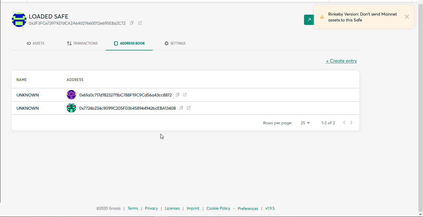
There are tabs that have plenty of room for the full length of the page to be displayed, but still has a scroll bar to see the footer of the page.
Example:
image.png

The suggestion would be to make sure the entire page fits in regular laptop screen

@nicosampler
Copy link
Contributor

I think we can reduce this space
image.png

But Agus could has a better idea

@lukasschor
Copy link
Member

lukasschor commented Apr 19, 2020

I generally agree this might not be the best use of screen area, given that this section takes up around 20% of the entire verticle screen real estate everywhere in the app.

image.png

As an example, Zerion uses roughly 50% less vertical screen real-estate, yet even has more information/functionality, yet it still does not feel crowded in my opinion.

image.png

Considering, that we also want to show the total Fiat value amount, similar to Zerion (see #408) we might want to optimize this section.

Maybe @posthnikova has also some thoughts on this.

@lukasschor
Copy link
Member

Also related to this, I see quite some web apps using sidebars for the app navigation. I am aware of all the benefits/drawbacks of this vs. our navigation solution with the tabs. While I wouldn't say that there is a particular need to change something in that regard right now, might be worth keeping it in the back of the mind in case we (1) add more tabs or (2) need more verticle screen real-estate.

Screenshot 2020-04-19 at 22.18.02.png
Screenshot 2020-04-19 at 22.12.08.png

@pablofullana
Copy link

While I wouldn't say that there is a particular need to change something in that regard right now, might be worth keeping it in the back of the mind in case we (1) add more tabs or (2) need more verticle screen real-estate.

@lukasschor shall we create a new issue for this?

@lukasschor
Copy link
Member

While I wouldn't say that there is a particular need to change something in that regard right now, might be worth keeping it in the back of the mind in case we (1) add more tabs or (2) need more verticle screen real-estate.

@lukasschor shall we create a new issue for this?

Yes, I think we can create a ticket to at least do some design exploration in that direction to collect feedback. Could you create the ticket?

@posthnikova
Copy link

I generally agree this might not be the best use of screen area, given that this section takes up around 20% of the entire verticle screen real estate everywhere in the app.

@lukasschor We can reduce this space. How about 96px padding? In the web app it's currently 135px.
Total value could show next to the Safe name. On mobile total value could go below the Safe name.

image

image

image

image

@lukasschor lukasschor added Enhancement ✨ Minor Improvement / changes to existing functionality Major Needs to be fixed for immediate next public release. labels Apr 21, 2020
alongoni added a commit that referenced this issue Apr 22, 2020
(Enhancement) #773 Scroll bar in tabs that are not necessary
Sign up for free to subscribe to this conversation on GitHub. Already have an account? Sign in.
Labels
Enhancement ✨ Minor Improvement / changes to existing functionality Major Needs to be fixed for immediate next public release.
Projects
None yet
Development

Successfully merging a pull request may close this issue.

6 participants