-
Notifications
You must be signed in to change notification settings - Fork 363
Send Improvements #133
Comments
In the background or only after the user clocked "Done" on the success screen? |
|
I would propose after clicking on done. |
|
@lukasschor @tschubotz Regarding the review text, we don't have designs for this. I assume the place would be placed were the |
I can see this point. I still feel that I personally would prefer to get redirected to the transaction list but notifications might indeed already solve for this. If everyone else is also in favor of staying on the asset / settings screens I would go with that.
Exactly, and sorry about not having screens at this point. @posthnikova is currently reducing the discrepancies between implementation, future implementation & and initial screens. But we will probably still feel the design-debt pain occasionally until Devcon. |
I agree with German that it makes sense for settings page to stay on the same screen. But for send view it may be different. Maybe it's a thing for UX research :) |
|
As we haven't yet implemented the transaction list during the first user test, we were not able to get feedback on that. But just talked to Kristina and during the tests at Dappcon, users were looking for more information about the transaction right after sending the transaction and usually gravitated towards the transaction list. In 1-oo-1 cases it might be fine if the view stays the same (asset view or settings) as the user cares more about the actual change (=assets sent out, owners change, etc.) rather than the success of the tx. But especially in x-oo-y cases it makes sense to redirect to the transaction list as an acutal change (e.g. owner change, etc.) can't be expected soon anyways. As only a minority would probably use a 1-oo-1 scheme I would actually optimize for the majority and redirect to the tx list. |
|
What about making a reference to the Safe where notifications come from? Could be confusing if the user is renaming/changing the threshold/etc. for all the Safes.
|
Yes I think that makes sense, especially when we have more insights into how people interact with multiple safes and might be part of a future "notification center" or "activity list". I put this on the backlog for now if that's fine for you: https://docs.google.com/spreadsheets/d/1RgYKZMITnFuQQSCmiTGWYNfqFePK8vOMFpfAazEtc7g/edit#gid=0 |
The improvements below are applicable to all send flows (asset transfer, custom transaction, change owners, change threshold, confirmation, cancellation)
In the review step, add text at the bottom: "You're about to create a transaction and will have to confirm it with your currently connected wallet. Make sure you have 0.0XX (fee price) ETH in this wallet to fund this confirmation."
QR Code inputs
Add QR code scanner for recipient field
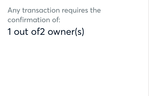
Missing whitespace

There is a whitespace missing between "of" and the number of owners.
Execute Transaction as default
It is more common that users would like to execute a transaction immediately after all signatures are collected. Therefore the "Execute Transaction" checkbox should be checked by default.
Change phrasing to: "Approving this transaction executes it right away. If you want approve but execute the transaction manually later, click on the checkbox below."
Switch to Transaction list
After clicking on "Done" in the success screen, automatically switch to the transaction list view.
Fix sending tokens with decimals other than 18:
Transfer of a token with 2 decimals fails because it is treated as 1e18 decimals #218
The text was updated successfully, but these errors were encountered: