-
Notifications
You must be signed in to change notification settings - Fork 2
New issue
Have a question about this project? Sign up for a free GitHub account to open an issue and contact its maintainers and the community.
By clicking “Sign up for GitHub”, you agree to our terms of service and privacy statement. We’ll occasionally send you account related emails.
Already on GitHub? Sign in to your account
Notification banner #2
Comments
|
One proposal: The alert component would be a top level component that is generic that does not have any understanding of the context it's used in. This component would have different variants called 'danger', 'success'. Similar to the digital marketplace implementation. We'd then move 'Error summary' component and 'Confirmation panel' component into patterns that use 'danger' variant and 'success' variant respectively. |
|
@NickColley Should we be using colour, especially red, this way? Because red can cause stress, especially when a page loads and it is not connected to what they have done, like the way error messages work. Should we be recommending this amount of red? There is something about the red button that would make me think I was doing something destructive like deleting something. I realise the red, amber, green and blue are enhancements and everything should make sense without the colour so should not affect people who are colour blind. |
|
@stevenaproctor thanks for the points. 👍 💯
One nice thing about the current error summary component is that it indicates it's usage in the name, so you wouldn't accidentally use it to display something that is not an error. If we were to do this I suspect we'd need to be careful with the guidance to help people choose the right variant for their use case. In terms of increased amount of colour, we could consider doing alerts more in line with the current error summary component, which does not change the text colour.
We could remove the buttons from the scope of this component, then consider updates to the 'Button' component separately in the future. |
|
I'd like to do some work with making these more consistent and maybe reducing them down to a simpler set of banners and notifications, but I'm not sure they would make sense as a single component;
|
|
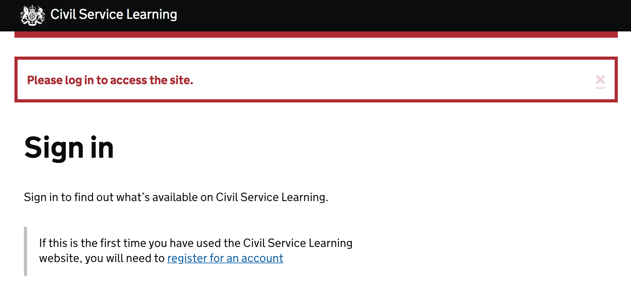
I've done some research on this pattern that might prove useful, talking to the designers involved and looking through the references in the description. ThemesAcross all the references linked to in the description, I found the following themes: Visual patternsAlerts in transactions have a complete solid border: Most of those on content pages just have a different background colour: GOV.UK has a variant called notice, like those for transactions but with a thiner border: Those on dashboards have a border on the left, like the inset text pattern, with a background colour to match the border but with a lighter hue. IconsRural payments, Pay, Notify and Registers all also use tick and cross icons to indicate success and failure. ColourColour is used fairly consistently.
Where orange is used, the intention was often unclear and in a few place it indicated the alert contained information which should just be part of the page content. Types of alertThe types of alert seem tied to the type of page.
Your action was successfulYour action was not successfulThis banner should include information (including links) on how to be successful. Digital Marketplace, Registers, Notify and Pay use this to ask users to confirm an action and so include Information you need before using this pageUse casesDigital Marketplace have forms with pre-filled fields, based on information users have already given them. They use a banner to let users know where the answers came from. Information you need before reading this pageUse casesDigital Marketplace show services that are no longer available to buy on their procurement frameworks. They use this banner to mark them as different to those still available. GOV.UK display policies from previous governments and so use this banner to mark them as different from those of the current government. Notice about the service processNotice to draw attention to a part of a dashboardTechnical implementationARIA useARIA attributes should be added to give alerts accessible names. Those that need immediate attention should have a role of alert. Other alerts should have a role of region and an aria-label attribute set to "notice". FocusAlerts that need immediate attention should have focus shifted to them when the page loads or when the action they relate to completes, if that doesn't involve a new load. Additional notes@abbott567 mentioned the DWP patterns page isn't used for all DWP projects, just the 'Prepare for Universal Credit' service. The following people helped out with this (thanks!) and all have experience of implementing this pattern: |
|
@tombye Impressively comprehensive. Red works well with validation error messages and similar use cases where the red is connected to something you have just done. But when a page, like a dashboard, loads and the red is there in a notice it could inadvertently cause people stress. It might not be obvious why the red is there. If the colour is there to draw attention, all notices could be blue to signify 'this is a notice' without any extra effects. The meaning will come from the content. If we want to use red, we could be less intrusive but still effective. We want people to do something but we do not want to cause stress. In the HMRC example mentioned in the description, the alert would be better and more accessible without all the red content. In the example under 'Your action was not successful' with the red button, you cannot say no. And it is not as accessible as it could be. The button is not linked to the question in any obvious way and the label does not make sense out of context. It could say 'Yes, delete testing' and you could have another button that says 'No, do not delete testing' but that is not how yes-no questions are usually handled. This type of action would be more accessible as a separate, standard yes-no question with radio buttons. The screen would come immediately after someone tries to delete something. |
|
@stevenaproctor we had a blue notice at the top in bereavement to inform agents that a claim needed attention, and it tanked in session after session. Agents just couldn’t see it. It was like they were banner blind or something. Literally staring at the page and not seeing it for minutes. Was really awkward. However, the red notice in the example above about the overpayments did work, they saw that straight away. But we do use it sparingly. It’s only ever shown under really niche conditions. Most people will never see it. I think that we’d have to be really careful in the guidance if we go ahead, because alerts are really open to being abused when plain content may actually be better. |
|
@abbott567 I have no doubt it draws people's attention and guidance about when to use and not to use it is super important. When we tested alerts in tax credits, people rarely saw those at the top of the screen because they do look a little banner-y. But when we moved them further down the screen so they were under the |
|
@tombye This is an awesome piece of work 👏 |
|
For anyone interested, this is the blue banner we tried that nobody saw. I can't remember the exact figures, but it was definitely more than 50% of people that didn't interact with it or even see it. It got to the point where we literally sat in research sessions saying "Do you think there might be anything else you need to do on this page?" and... nothing. haha |
Companies HouseWe're testing this pattern as part of our accounts filing service (currently in Beta) - testing well with all users so far (including those reliant on assistive technology and those with low digital skills) - the common reactions tend to be "Yes, I've seen this type of thing before" or "Yes, that's what I expected". |
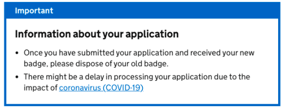
Release of notification banner using the experimental labelThe notification banner component has been published in the Design System as experimental because more research is needed to validate it. The notification banner component tells the user about something they need to know about, but that’s not directly related to the page content. Problems we looked to solve
What we decided and what has changed
How we went about building it
How you can help our ongoing user researchThis component is experimental because:
Share your research or feedback by commenting on this issue or propose a change – read more about how to propose changes in GitHub |
|
What an interesting challenge @neil-holroyd and thank you for raising it. Could you help me learn a little bit more about the service and the action in which you want the user to take? I guess you may not have implemented the notification banner component yet but it would be really helpful to get some user research to strengthen this need. If teams are facing a similar design scenario we'd be interested to hear about it too. |
|
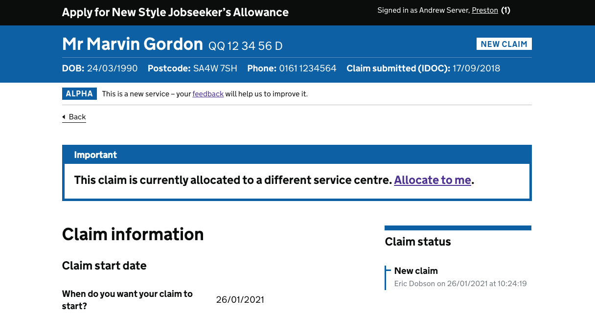
Hi @CharlotteDowns, I have been head down in a new project so apologies for the late reply. The service is a caseload management system for NSJSA. This instance occurs when a customer calls and the agent goes to their claim but it is allocated to a different service centre – then they can only do any updates on the case if they allocate it to themselves. Upon doing so the actions for this page will be in view. At the moment this is a prototype and we have done a playback to the user groups. All feedback has been positive overall. At the time of testing we didn't have a UR in place so it was more of a general playback. This summary panel is quite a commonly used mechanism across WA so this may occur across a few services. |
|
The Department For Education used the notification banner in a prototype journey for teacher training, but it was consistently missed by lots of of users, so they’re removing it: DFE-Digital/publish-teacher-training-prototype#99 |
|
Hi all, we are currently developing a feature on UC that allows agents to create and modify diary schedules and there are some instances where we believe the most suitable component to use would be a red version of the notification banner. For example, if the user tries to save a schedule a red banner would allow us to clearly indicate that there has been an error related to the save action. Importantly, this can not be achieved using the error validation summary component as that contains a link to fix the error on the page, which is not appropriate in this case. For this case we are A. Informing the user that the save action has failed and why, and B. Presenting three possible ways to fix the problem (clicking on the link to review the conflicting schedule, changing the dates, or setting the ad hoc checkbox to override the existing schedule). Please see the attached design for context. |
|
Has anyone looked into a floating notification banner? So for context below the banner is several blocks of content that can grow depending on the user. Sometimes this means the notification banner scrolls off the screen. In our case, the notification banner has a link and in UR we have seen users failing to see the link as it is now off-screen. |
|
Is the link in the green notification box (under 'reacting to something the user has done') meant to be green (#00703c)? This seems to contradict the design system guidance that links should be blue by default and I can't find any discussion about these links needing to be green anywhere. |
|
Hi @andrewhick, thanks for getting in touch. It is intentional. Like with the error summary, we style the links to be in a consistent colour with the border. This is to make the components more cohesive visually – we found that using blue links with a different border colour made them look a bit broken. We're confident that the context, colouring and underlines used still make it clear enough that it's a link, and haven't observed any issues specifically with links in usability testing to date. |
|
We have removed the 'Experimental' tag from components, patterns, and guidance in the Design System 😌. The tag was being used on the notification banner component to raise awareness that more research is needed to validate it. However, we recently published new guidance on how to share findings from users which we hope will make it easier to collect more information about how our Design System is being used across services. If your team has used this component please let us know 💪🏻. |
|
I'm using the notification success banner as part of a workflow, and I've been testing on various screen readers - all fine except for Talkback on Android, We've been unable to shift the focus state to the message inside the banner to read. Has anyone else had experience with this? May be worth mentioning we are using role="alert" so the focus shifts on page load |
|
Is role=alert necessary for the error summary context if that pattern includes moving focus to the notification banner? |
|
I'm Graham from NHS BSA. I'm a designer working on an overseas service application. My users are trained internal users. We are improving the accessibility and experience of their tool. May I ask the folks here if they are currently researching or exploring the use of a 'close' function in this notification component? The Gov UK guidance states further research required to find out "whether it’s sometimes helpful to allow users to dismiss notifications, and how to do this" Anyone? Thanks |
|
Hi, We have just had an accessibility audit carried out and an issue has been raised surrounding the hierarchical structure when the notification banner is used and subsequently failing WCAG 1.3.1. Has there been any more research done surrounding the issue this proposes when a H2 is used before the H1 and the issues for screen reader users? Thanks, |
|
@RyanHobbsCO the audit is wrong, there is no requirement to start with H1 - wcag even has an example (see example 2 here) |
|
Hi Joe, I did see this example but under the heading hierarchy within the WCAG guidelines it does state you should be starting with a H1 and I could see this raise as a potential issue at the bottom of the design guide for the notification banner so wondered if there was an more thought around if this is the best solution for the component. |
|
Where does it say that in the wcag guidance sorry? |
|
Hi Jon, I was going off a different W3C page that you've linked. However, I've re-read our Audit and looks like the issue isn't with the initial heading so I don't need to worry about my original comment. Thanks for commenting back. |


Also known as: alert
What
An on-screen alert to notify users that something important has happened.
For example:
Why
Anything else
The text was updated successfully, but these errors were encountered: