-
Notifications
You must be signed in to change notification settings - Fork 3.3k
New issue
Have a question about this project? Sign up for a free GitHub account to open an issue and contact its maintainers and the community.
By clicking “Sign up for GitHub”, you agree to our terms of service and privacy statement. We’ll occasionally send you account related emails.
Already on GitHub? Sign in to your account
[#12290] Instructor view session results (course-wide): Improve display of no-response card header #12396
[#12290] Instructor view session results (course-wide): Improve display of no-response card header #12396
Conversation
|
Hi @rhyses-pieces, the approach generally looks fine, but do fix the failing tests (snapshot, accessibility, E2E) before we do a complete review.
Can you help to check if the panel chevron is usually on the right or left in other pages? I think it would be good to standardise the chevron's location across the entire website. @zhaojj2209 do weigh in if you have any other opinions |
|
@weiquu The positions are currently not standardised; the submit feedback and instructor session edit panels have the chevron on the left, the rest have it on the right. We can discuss whether to standardise the position in a separate issue; for this particular PR, let's keep it consistent with the previous design and have the chevron on the right. |
|
Hello! Thanks for the feedback. I've updated the chevron's position in the no-response card header, but I wasn't sure how to resolve indicating that the card header is expandable without using Also, I'm running into problems with testing on my local system. My system keeps crashing even after following guidelines to set up E2E testing for the Edge browser. (For reference, I'm using Windows and WSL for my local dev environment.) Not sure how else to do testing on my end. |
In this case I think it's fine to have nested buttons. Let's go with an approach similar to the other card headers (e.g. instructor edit session card header).
Unfortunately E2E testing for TEAMMATES is known to be wonky on Edge, we recommend using other browsers such as Chrome or Firefox. If E2E tests still do not work on your local machine, you can use the E2E tests workflow on GitHub to debug as well, but we would not recommend doing it directly on this PR as repeated commits would spam maintainers with notifications. You can try using the following steps instead:
|
|
@rhyses-pieces My bad, forgot that nested buttons will cause accessibility tests to fail. Let's revert the change, have checked and verified that the other card headers in the codebase still use divs. |
|
@zhaojj2209 Hello! Thanks for the feedback. I've fixed the nested buttons issue as suggested, and E2E testing is now passing. |
There was a problem hiding this comment.
Choose a reason for hiding this comment
The reason will be displayed to describe this comment to others. Learn more.
LGTM, thanks for the changes!
There was a problem hiding this comment.
Choose a reason for hiding this comment
The reason will be displayed to describe this comment to others. Learn more.
LGTM! Thanks for contributing
Fixes #12290
Outline of Solution
I reformatted the
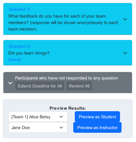
instructor-session-no-response-panel-componentto have the.cardclass, and nested old code accordingly. The changes added include:card-headerfrom a<div>into a<button><tm-panel-chevron>to be the first element under thecard-headerbuttoncard-header-btn-toolbarunder a flex containercard-header-btn-toolbarso that it behaves smoothly in mobile view.Screenshot of the no-response card header in mobile view:

Comments
After reformatting the no-response card header to be consistent with the edit question card headers, I noticed that the no-response card header is inconsistent with the other card headers on the session results page:

Should the other card headers also be consistent with the edit question card headers and no-response card header too?
Please let me know if there's any questions or concerns. This is my first time contributing code to an open source project, so I'm open to feedback!