-
Notifications
You must be signed in to change notification settings - Fork 0
New issue
Have a question about this project? Sign up for a free GitHub account to open an issue and contact its maintainers and the community.
By clicking “Sign up for GitHub”, you agree to our terms of service and privacy statement. We’ll occasionally send you account related emails.
Already on GitHub? Sign in to your account
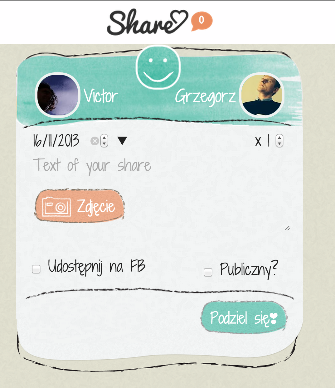
rethink layout on create Share❣ dialog #65
Comments
|
Strzałka - zrezygnować układ przycisków share + cancel/return |
|
@rimbambala attachment missing - in github you have to wait until photo finishes uploading before closing the page. (I got caught by this a few times too). |
|
Positioning of info is good. I think for the top thing re-make it so it clearly shows that it is the two things being exchanged For the facebook selection - |
|
This will also match the landing page images. |
|
|
|
I still think the post-on facebook button is too prominent. The most important thing on this page is "add photo" and "Share!" button but instead what appears biggest is "post on facebook" slider... I think a check box was better. |
|
can you put PSD into google docs or here so I can experiment with this myself? |
|
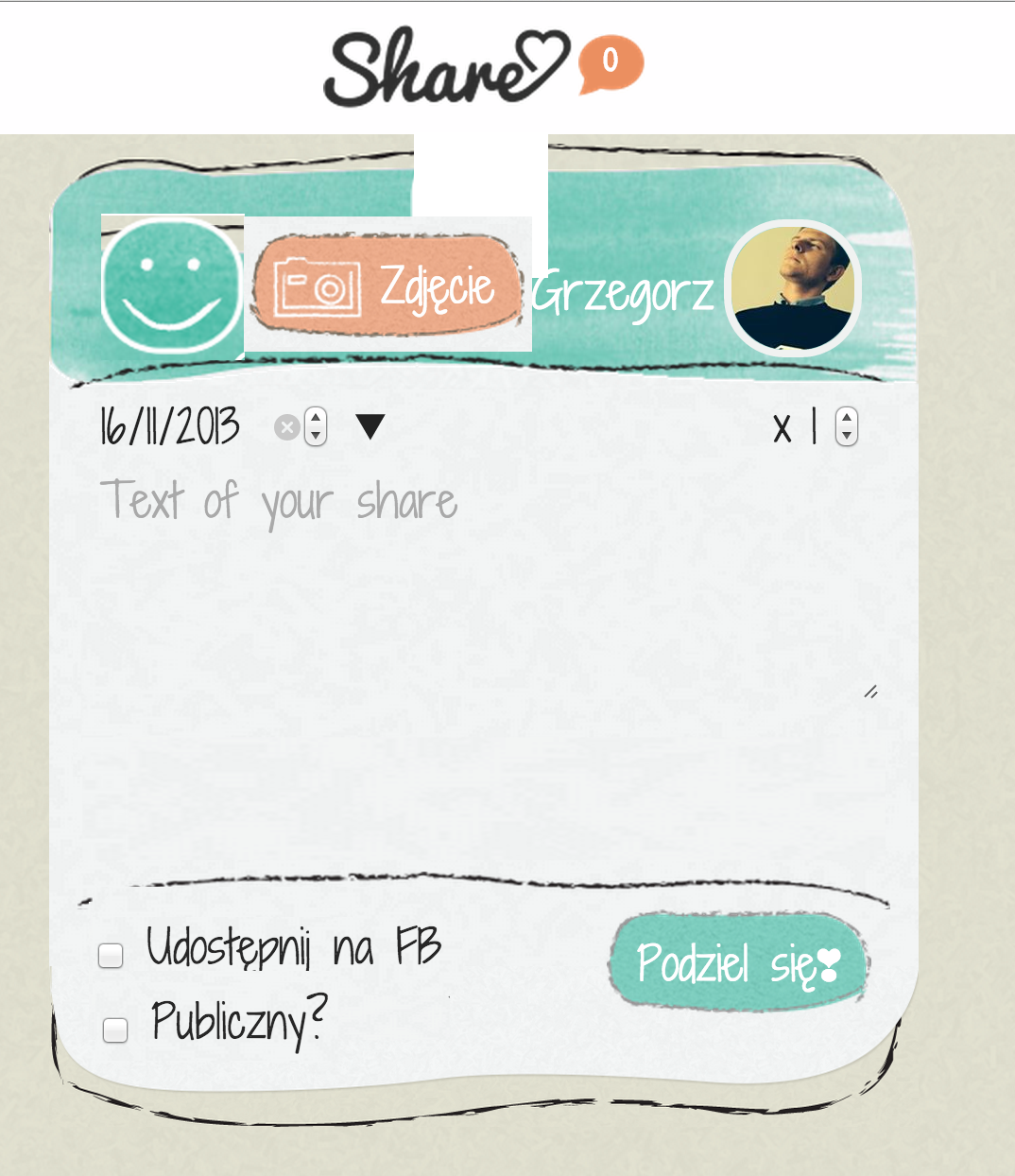
Getting better but I think we can do clearer yet... The photoshop file is full of layers named things like "layer 30 copy" that makes it very hard to work with so could only do very rough sketches... (how the heck do you select groups of things in this document?!) . but here are two rough sketches of possible ideas for what could be done: option #1 change direction icon between namesoption #2 go to a traditional e-mail (or google maps directions) layout. Perhaps in the end this will be the most sensible in the end? |
|
As far as checkboxes are concerned I can do that. I can also work on the other issues here to make them look as nice as possible, but in my opinion we are going in a bad direction in case of the design and UX. Every page starts to look completely different and we are loosing coherence. The second part here is that if we change the length of image container there will have to be downloaded another texture to cover the place. Third thing: what if we upload the image and then we want to change the share direction? Depending on the photo we may have the arrows become illegible. Putting a semitransparent filed underneath would somehow do the job but it would look just awful. |
|
@rimbambala I agree, so how do we make this screen be easy to use? Maybe we should put the from&to above the photo on this screen? Btw. this is the google maps from-to & switching arrows: |
|
@rimbambala "I wouldn't use the logo there, it will be misleading." Let's try and see how it looks. " Call to action shouldn't be confused with logo." Actually in this case I do want them to become one and the same. "In case of the exclamation heart mark - I frankly find it very ugly :):" Until we have the money and the time to do proper branding it's our branding. I think it's quite cute actually - but that could be too many years spent in Japan. |
|
works for me. let's implement and get user feedback... |
|
Yes, the first step we are not making any changes on I think. |
|
Ok, we re-thought this with Zak, if we set the direction of share on #30 then we don't need to complicate this screen, let's go with the simple: |
|
@ZakGhouze implemented, still missing the notice on no-data-input but that's a separate ticket, please test, file bugs for whatever you find... |


Current screens:
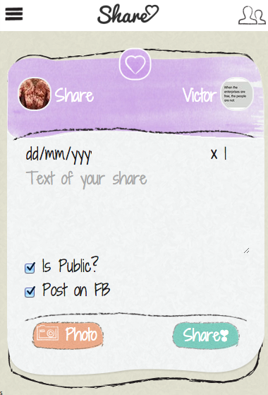
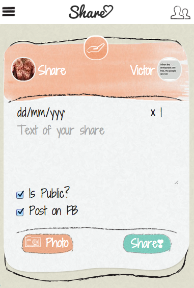
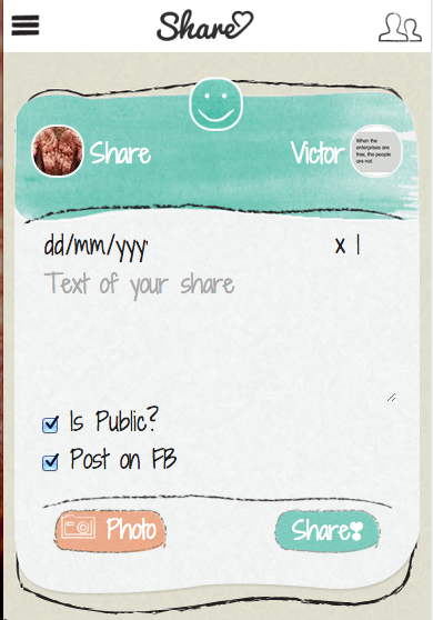
Some rough ideas:
The text was updated successfully, but these errors were encountered: