Skip to content
New issue

Have a question about this project? Sign up for a free GitHub account to open an issue and contact its maintainers and the community.

By clicking “Sign up for GitHub”, you agree to our terms of service and privacy statement. We’ll occasionally send you account related emails.

Already on GitHub? Sign in to your account

Update UI to Match Figma Specs: Labels, Buttons, Gaps #6415

Merged
merged 3 commits into from
Jul 28, 2024

Conversation

ehconitin
Copy link
Contributor

@Bonapara
Done with issue #5910

Screenshot from 2024-07-25 22-37-03

Copy link
Contributor

@greptile-apps greptile-apps bot left a comment

Choose a reason for hiding this comment

The reason will be displayed to describe this comment to others. Learn more.

PR Summary

Updated UI components to align with Figma design specifications, focusing on labels, buttons, and gaps.

  • CommandGroup.tsx: Removed text-transform: uppercase; from StyledGroup to match Figma specs.
  • CommandMenu.tsx: Replaced 'Esc to cancel' text with ModalCloseButton, adjusted search input padding, and added top padding to StyledInnerList.

Ensure these changes do not affect other components relying on CommandGroup and verify ModalCloseButton functionality across devices.

2 file(s) reviewed, no comment(s)
Edit PR Review Bot Settings

@charlesBochet
Copy link
Member

Hi @ehconitin, thanks for the contribution

Here it's how it look on your PR:
image

Here is the figma:
https://www.figma.com/design/xt8O9mFeLl46C5InWwoMrN/Twenty?node-id=33424-184388&m=dev

image

Let's make sure they perfectly match, a few thing I've noticed:

  • the "X" button should be a LightIconButton variant tertiary
  • the search bar seems to have a slightly darker background than the list below

Tackling this PR requires an attention to details :)

@ehconitin
Copy link
Contributor Author

Thank you @charlesBochet for your detailed review and feedback. I appreciate your attention to detail.
I actually noticed these differences as well while working on the PR.
Regarding the specific points:

The "X" button: I'm currently using the ModalCloseButton component from the spreadsheet-import which has some different properties.
I see two potential solutions:
a) Create a new ModalCloseButton specifically for CommandMenu.
b) Modify the existing ModalCloseButton to accept properties that allow for the LightIconButton variant tertiary.
Search bar background: I'll adjust the background color to match the design in Figma.

Which approach would you prefer for the "X" button? I'm happy to implement either solution or discuss alternatives if you have other ideas.
I'll make sure to carefully review all details against the Figma design to ensure perfect alignment. Let me know if you have any other concerns or suggestions.

@charlesBochet
Copy link
Member

@ehconitin I think we don't need to use the ModalCloseButton (especially since the menu is not a modal). Let's directly use a LightIconButton component within the CommandMenu

@ehconitin
Copy link
Contributor Author

Thank you for the clarification, @charlesBochet.
You're absolutely right - the CommandMenu isn't a modal, so using a ModalCloseButton isn't the best approach. I'll implement the change using a LightIconButton component directly within the CommandMenu as you've suggested.
I'll make this adjustment along with addressing the search bar background color to match the Figma design.

@ehconitin
Copy link
Contributor Author

Hi @charlesBochet,
I've implemented the changes as requested. The CommandMenu now uses a LightIconButton component directly, and I've addressed the other points you mentioned. Could you please review the updated PR when you have a moment?
I also have a question regarding the code structure:
I noticed that all the styled components in CommandMenu are being exported. Given that these styles are specific to the CommandMenu and don't seem to be used elsewhere, is there a particular reason for exporting them? I'm wondering if we could remove these exports to reduce potential naming conflicts and improve code organization.

Copy link
Member

@charlesBochet charlesBochet left a comment

Choose a reason for hiding this comment

The reason will be displayed to describe this comment to others. Learn more.

@ehconitin Thank you! you are perfectly right, these styles should not be exported for the exact reason you mentioned.

I have also fixed another padding, I have noticed.

Thanks a lot, LGTM!

@charlesBochet charlesBochet merged commit 75e0e14 into twentyhq:main Jul 28, 2024
11 checks passed
Copy link

Thanks @ehconitin for your contribution!
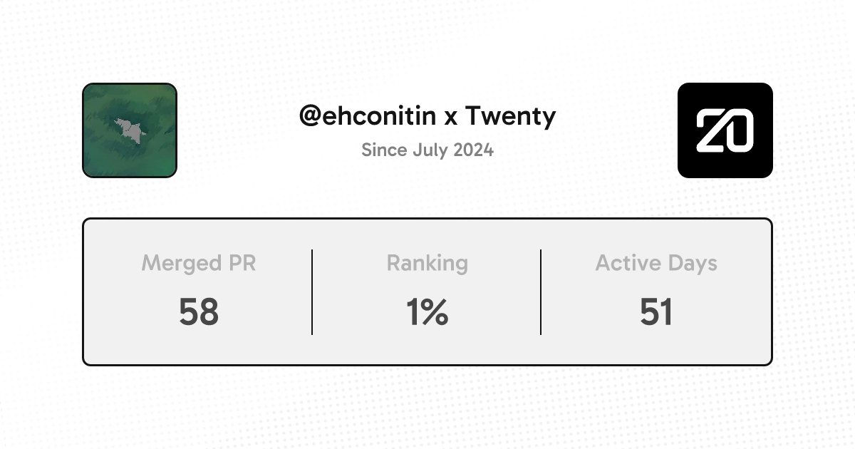
This marks your 0th PR on the repo. You're top 0% of all our contributors 🎉
See contributor page - Share on LinkedIn - Share on Twitter

Contributions

@ehconitin ehconitin deleted the fixed-issue-5910 branch August 6, 2024 06:14
Sign up for free to join this conversation on GitHub. Already have an account? Sign in to comment
Projects
None yet
Development

Successfully merging this pull request may close these issues.

2 participants