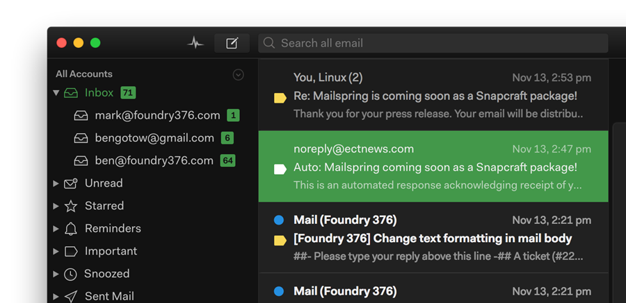
The Mailspring Theme Starter is a basic starting point for creating a theme for the Mailspring email client.
Creating a new theme in Mailspring is easy! Here's how you can do it.
-
Fork this repo or download the code. Add a name, display name, title, and description for your theme to
package.json, and change the directory name to match. -
Open Mailspring and install the theme by going to
Mailspring > Install New Theme...and selecting the directory. -
Choose
Developer > Run With Debug Flagsfor easier debugging. -
Now, you can start playing with the theme! It's installed in
~/Library/Application Support/Mailspring/packages/THEME_NAME(on macOS), so open it from there. Most of Mailspring's React components are derived from the core variables defined inui-variables.less, and any changes you make there will override the defaults for Mailspring. You can also add more LESS files instyles(ideally, separated into logical components likethread-list.less) to make your own specific changes. To reload the theme, just open the console (Developer > Toggle Developer Tools) and typeAppEnv.themes.setActiveTheme('ui-light'); AppEnv.themes.setActiveTheme('your-theme-name'); -
Once you're happy with your theme, check how it looks in the theme picker (
Mailspring > Change Theme...). We use your UI variables to pull the colors, but if you want to add your own selections to the color palette, create atheme-colors.lessfile that includes any of the variables that you want to change, and they'll only affect the theme preview. Here are the variables, on the left, with the part of the theme preview that they match:@background-secondary: BACKGROUND_COLOR @text-color: TEXT_COLOR, FIRST_SWATCH_COLOR @component-active-color: MIDDLE_SWATCH_COLOR @toolbar-background-color: LAST_SWATCH_COLOR @panel-background-color: STRIP_COLOR
.
├── styles                 # All stylesheets
|   ├── index.less             # Main LESS file to import your stylesheets
│   ├── ui-variables.less  # UI variables that override N1's defaults
│   ├── theme-colors.less  # Theme colors for theme preview (optional)
├── package.json           # Metadata about the theme
├── LICENSE.md             # License with usage rights
└── README.md              # Info about your theme and how to use it
