- Overview
- Requirements
- Installation
- Usage
- UIKit Customization
- SwiftUI Customization
- References
- Contributed
- License
- Author
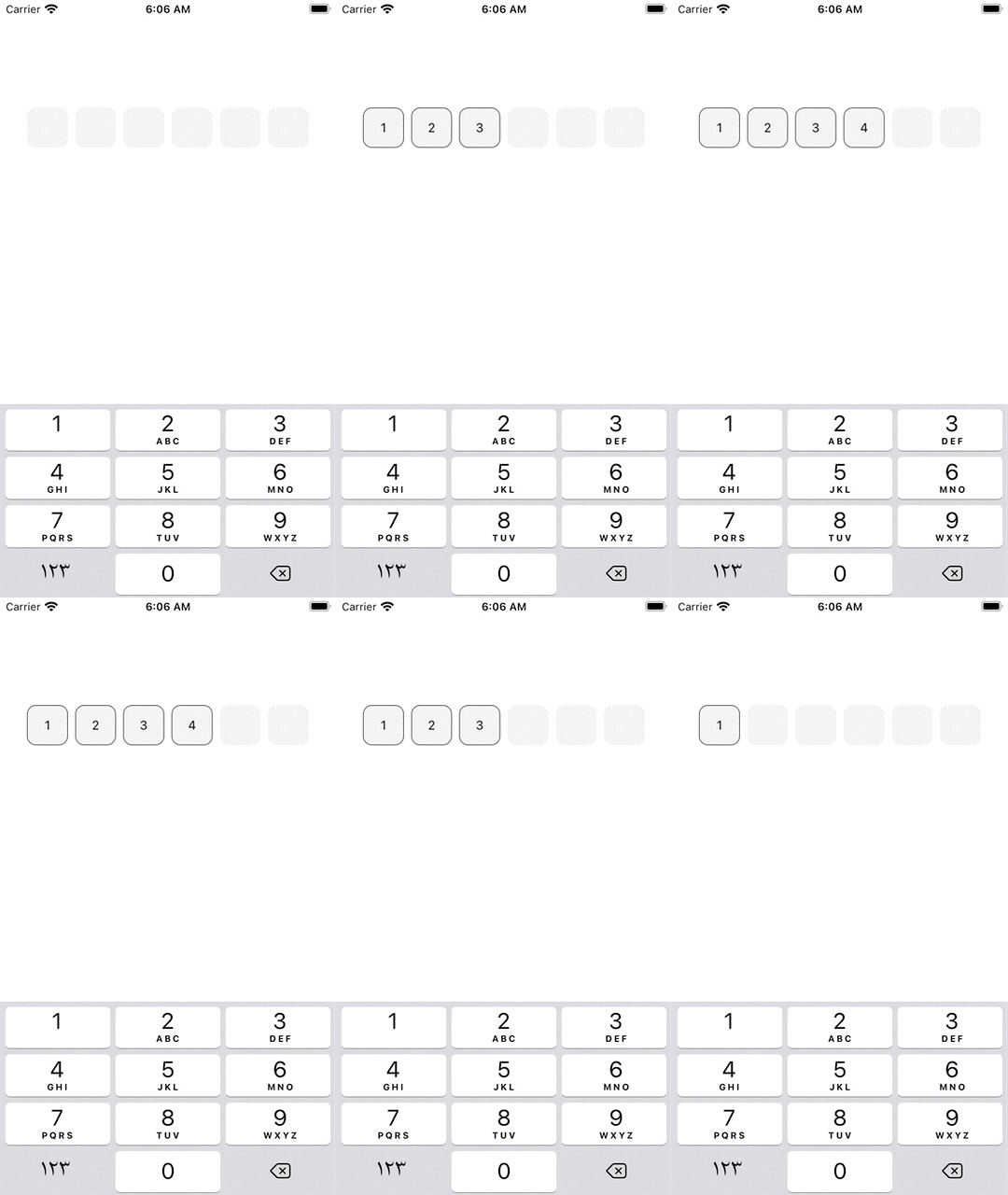
AEOTPTextField is a simple and easy text field control written in Swift.
- It can be implemented in storyboard without a single line of code.
- Highly customizable without needing to write tons of custom code.
- Supports both portrait and landscape views.
- Supports SwiftUI implementation.
Check out the example project to see it in action!
| Default |
|---|
 |
| With Border | Without Border | Clear Background |
|---|---|---|
 |
 |
 |
 |
 |
 |
- Xcode 11.
- Swift 5.
- iOS 10 or higher.
CocoaPods is a dependency manager for Cocoa projects. You can install it with the following command:
$ gem install cocoapodsTo integrate AEOTPTextField into your Xcode project using CocoaPods, specify it in your Podfile:
source 'https://github.com/CocoaPods/Specs.git'
platform :ios, '10.0'
use_frameworks!

pod 'AEOTPTextField'
Then, run the following command:
$ pod installThe integration of AEOTPTextField using Carthage will be available soon.
The integration of AEOTPTextField using Swift Package Manager will be available soon.
-
Add UITextField to your ViewController. Set the
Custom Classof the UITextField to beAEOTPTextFieldin the Identity Inspector. Set theModuletoAEOTPTextField(ignore this step if you've manually added AEOTPTextField to your project).
-
Take an oultlet from the
UITextFieldto yourViewController.
First:
import AEOTPTextFieldSetup the otpDelegate and configure the AEOTPTextField below viewDidLoad(), do something like this:
    override func viewDidLoad() {
        super.viewDidLoad()
        otpTextField.otpDelegate = self
        otpTextField.configure()
    }
To configure the AEOTPTextField with a custom slots count, do something like this:
    override func viewDidLoad() {
        super.viewDidLoad()
        otpTextField.otpDelegate = self
        otpTextField.configure(with: 4)
    }
Then, Setup the AEOTPTextFieldDelegate method. Add this extension to your ViewController, do something like this:
extension ViewController: AEOTPTextFieldDelegate {
    func didUserFinishEnter(the code: String) {
        print(code)
    }
}
You have done.
First:
import AEOTPTextFieldThen, use tha AEOTPView in your SwiftUI View, do something like this:
struct SwiftUIView: View {
    @State private var otp: String = ""

    var body: some View {
        AEOTPView(text: $otp)
    }
}
You have done.
AEOTPTextField
AEOTPTextField supports the following:
    /// The default character placed in the text field slots
    public var otpDefaultCharacter = ""
    /// The default background color of the text field slots before entering a character
    public var otpBackgroundColor: UIColor = UIColor(red: 0.949, green: 0.949, blue: 0.949, alpha: 1)
    /// The default background color of the text field slots after entering a character
    public var otpFilledBackgroundColor: UIColor = UIColor(red: 0.949, green: 0.949, blue: 0.949, alpha: 1)
    /// The default corner raduis of the text field slots
    public var otpCornerRaduis: CGFloat = 10
    /// The default border color of the text field slots before entering a character
    public var otpDefaultBorderColor: UIColor = .clear
    /// The border color of the text field slots after entering a character
    public var otpFilledBorderColor: UIColor = .darkGray
    /// The default border width of the text field slots before entering a character
    public var otpDefaultBorderWidth: CGFloat = 0
    /// The border width of the text field slots after entering a character
    public var otpFilledBorderWidth: CGFloat = 1
    /// The default text color of the text
    public var otpTextColor: UIColor = .black
    /// The default font size of the text
    public var otpFontSize: CGFloat = 14
    /// The default font of the text
    public var otpFont: UIFont = UIFont.systemFont(ofSize: 14)
Aslo you can use isSecureTextEntry property:
otpTextField.isSecureTextEntry = trueExample of Customization
    override func viewDidLoad() {
        super.viewDidLoad()
        otpTextField.otpDelegate = self
        otpTextField.otpFontSize = 16
        otpTextField.otpTextColor = .systemRed
        otpTextField.otpCornerRaduis = 5
        otpTextField.otpFilledBorderColor = .blue
        otpTextField.configure(with: 4)
    }
}AEOTPTextField
AEOTPTextField supports the following:
    // MARK: - INIT
    //
    /// The Initializer of the `AEOTPTextView`
    /// - Parameters:
    ///   - text: The OTP text that entered into AEOTPView
    ///   - slotsCount: The number of OTP slots in the AEOTPView
    ///   - width: The default width of the AEOTPView
    ///   - height: The default height of the AEOTPView
    ///   - otpDefaultCharacter: The default character placed in the text field slots
    ///   - otpBackgroundColor: The default background color of the text field slots before entering a character
    ///   - otpFilledBackgroundColor: The default background color of the text field slots after entering a character
    ///   - otpCornerRaduis: The default corner raduis of the text field slots
    ///   - otpDefaultBorderColor: The default border color of the text field slots before entering a character
    ///   - otpFilledBorderColor: The border color of the text field slots after entering a character
    ///   - otpDefaultBorderWidth: The default border width of the text field slots before entering a character
    ///   - otpFilledBorderWidth: The border width of the text field slots after entering a character
    ///   - otpTextColor: The default text color of the text
    ///   - otpFontSize: The default font size of the text
    ///   - otpFont: The default font of the text
    ///   - isSecureTextEntry: A Boolean value that indicates whether the text object disables text copying and, in some cases, hides the text that the user enters.
    ///   - enableClearOTP: A Boolean value that used to allow the `AEOTPView` clear the OTP and set the `AEOTPView` to the default state when you set the OTP Text with Empty Value
    ///   - onCommit: A Closure that fires when the OTP returned
    public init(
        text: Binding<String>,
        slotsCount: Int = 6,
        width: CGFloat = UIScreen.main.bounds.width * 0.8,
        height: CGFloat = 40,
        otpDefaultCharacter: String = "",
        otpBackgroundColor: UIColor = UIColor(red: 0.949, green: 0.949, blue: 0.949, alpha: 1),
        otpFilledBackgroundColor: UIColor = UIColor(red: 0.949, green: 0.949, blue: 0.949, alpha: 1),
        otpCornerRaduis: CGFloat = 10,
        otpDefaultBorderColor: UIColor = .clear,
        otpFilledBorderColor: UIColor = .darkGray,
        otpDefaultBorderWidth: CGFloat = 0,
        otpFilledBorderWidth: CGFloat = 1,
        otpTextColor: UIColor = .black,
        otpFontSize: CGFloat = 14,
        otpFont: UIFont = UIFont.systemFont(ofSize: 14),
        isSecureTextEntry: Bool = false,
        enableClearOTP: Bool = false,
        onCommit: (() -> Void)? = nil
    ) {
Example of Customization
    AEOTPView(
                text: $otp,
                slotsCount: 4,
                width: .infinity,
                height: 50,
                otpFilledBackgroundColor: .green,
                isSecureTextEntry: true,
                onCommit: {
                    // do something
                }
            )
.padding()This is an open source project, so feel free to contribute.
AEOTPTextField is available under the MIT license.
Abdelrhman Eliwa, made this with ❤️.