Skip to content
forked from prayag17/JellyFlix

Jellyfin but Looks, Feels and Smells like Netflix

Notifications You must be signed in to change notification settings

miovo/Jellyflix


Folders and files

NameName
Last commit message
Last commit date

Latest commit


Repository files navigation

Jellyflix

Looks, Feels and Smells like Netflix

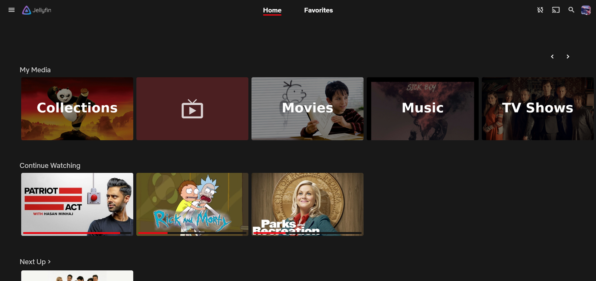
Netflix Theme for Jellyfin


Usage:

To use it, got to Setting ==> Dashboard ==> General and scroll down to custom css and paste the following line

Base Version:

Auto Update:

@import url("https://cdn.jsdelivr.net/gh/miovo/Jellyflix@latest/default.css");

With Logos(recommended):

Auto Update:

@import url("https://cdn.jsdelivr.net/gh/miovo/Jellyflix@latest/default.css");
@import url("https://cdn.jsdelivr.net/gh/miovo/Jellyflix@latest/addons/Logo.css");

You can also use Jellyfin colors instead of Netflix red

Jellyfin-Blue:
@import url("https://cdn.jsdelivr.net/gh/miovo/Jellyflix@latest/addons/jf-blue.css");

Jellyfin-Purple:

@import url("https://cdn.jsdelivr.net/gh/miovo/Jellyflix@latest/addons/jf-purple.css");
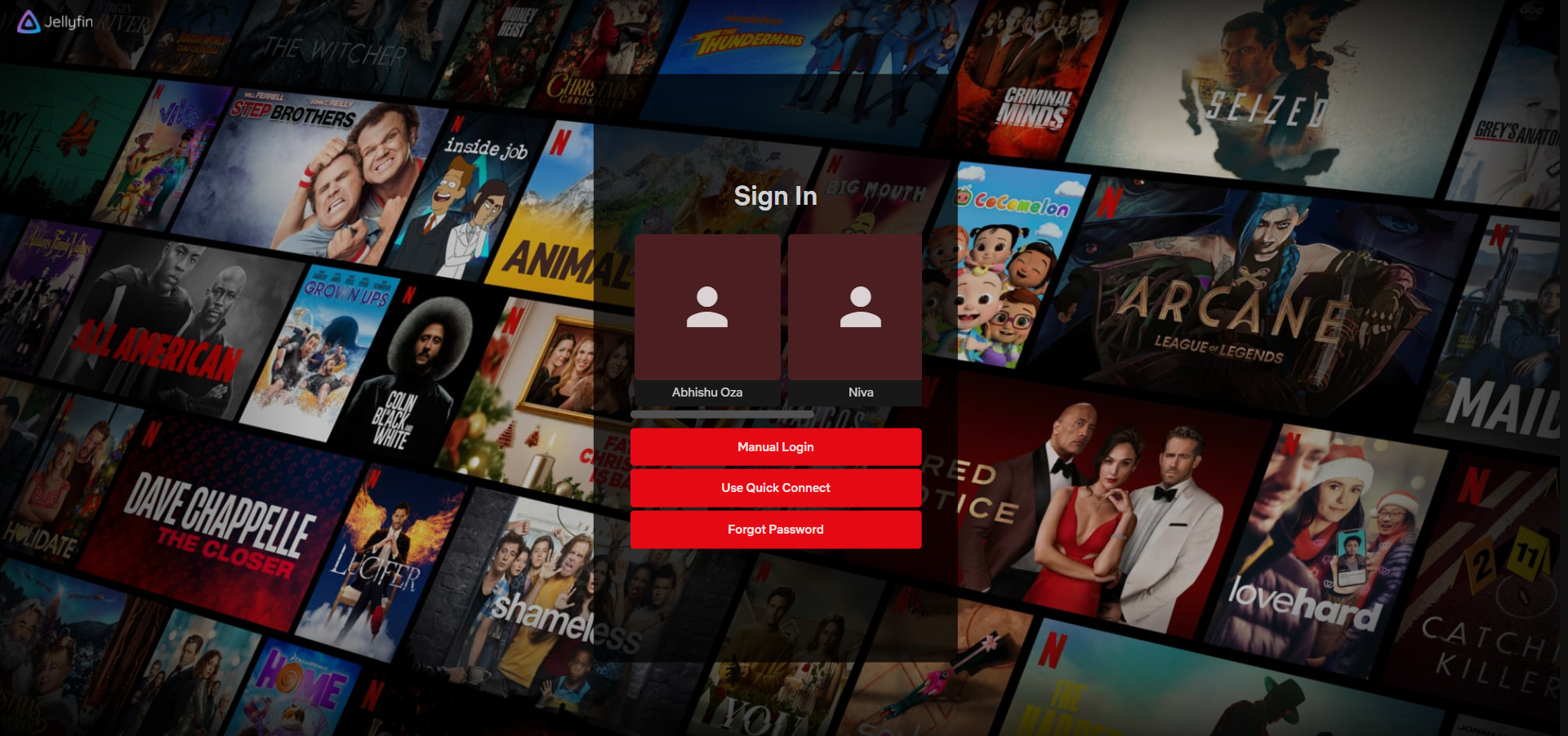
Login

Home Page

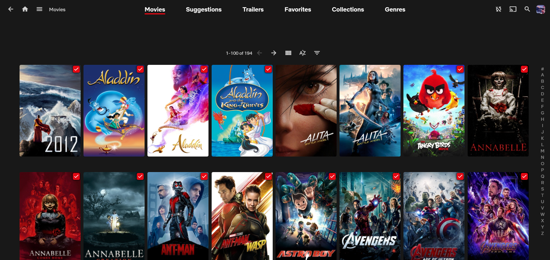
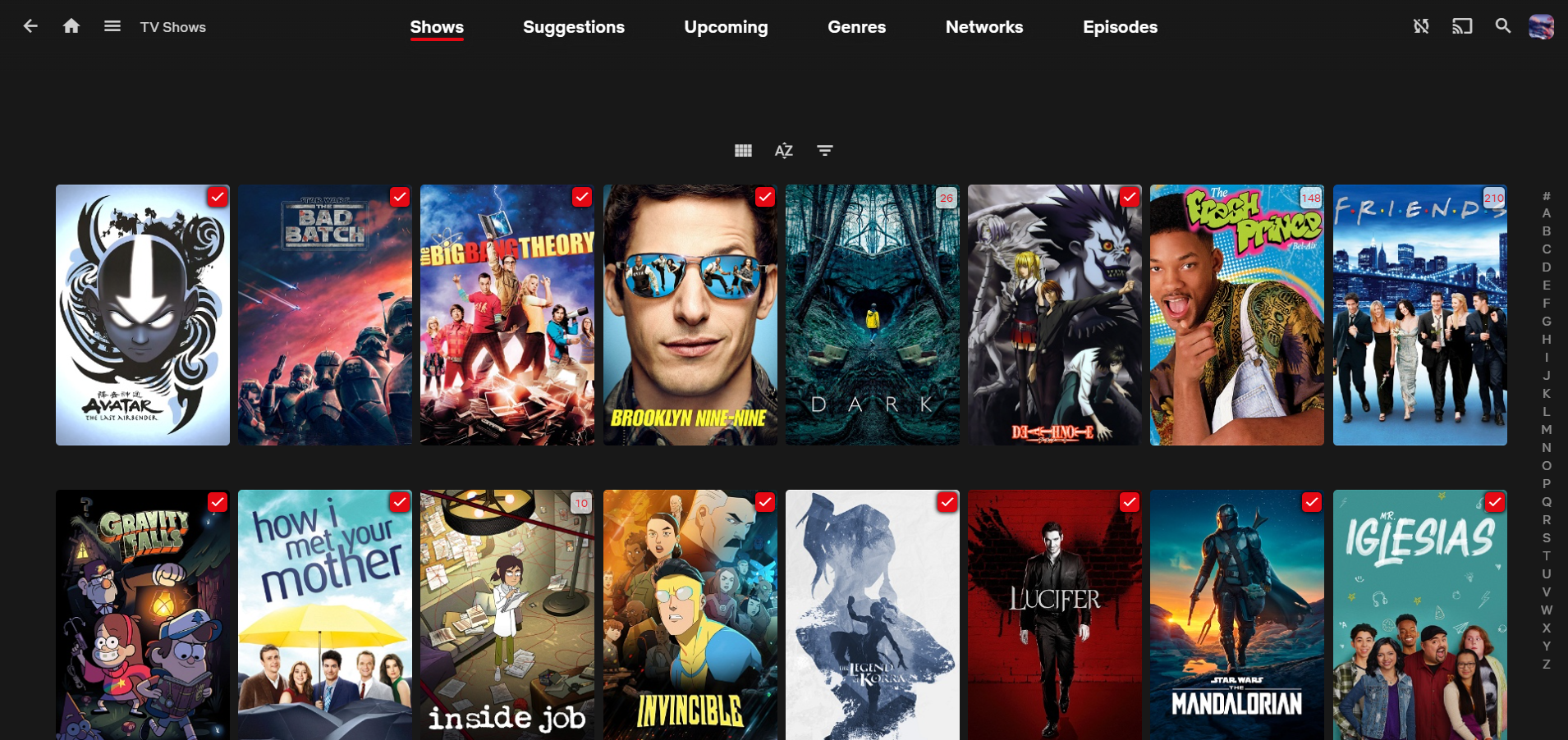
Library

Movie Title Page

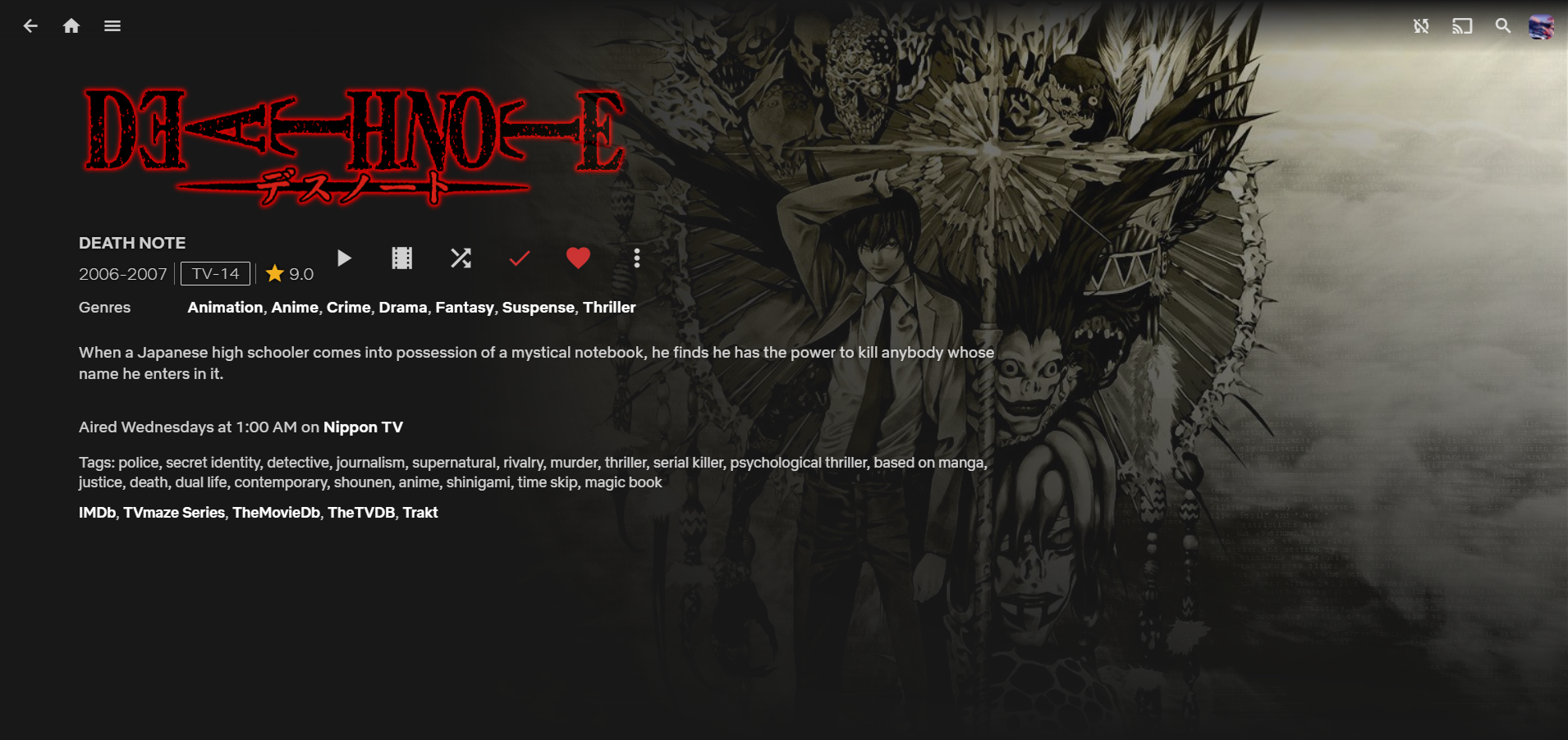
TV Show Title page


The UI feels cluttered? try:

Use 67% zoom for better experience on PC

About

Jellyfin but Looks, Feels and Smells like Netflix

Resources

Stars

Watchers

Forks

Packages

No packages published

Languages

  • CSS 100.0%