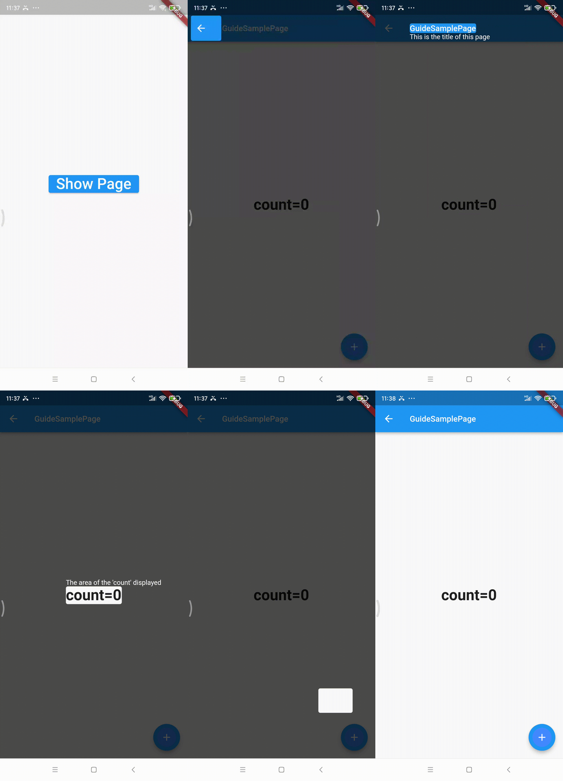
- Supports locking the tip position with
Widget#keyorRect - Supports setting the background mask opacity
- Supports setting the duration of animation transitions
- Supports custom style settings for the tip text
- Supports preset options for the position of the tip text
- Supports setting the padding of the guidance area
- Supports setting the border radius of the guidance area
- Supports setting the interval between description and guidance area
WidgetsBinding.instance.addPostFrameCallback((timeStamp) {
  guideManager ??= GuideManager(context, opacity: 0.7);
  guideManager!.prepare([
    GuideItem(
      description: "Click here to go back",
      toGuideKey: keyAppBarBack,
      padding: EdgeInsets.zero,
    ),
  ]);
  guideManager!.show();
});| Parameter | Description |
|---|---|
| context | BuildContext |
| opacity | Mask opacity, default value is 0.4 |
| duration | Tip block animation transition time, default value is 200ms, if set to zero then no animation |
| Parameter | Description |
|---|---|
| description | Tip text |
| toGuideKey | Pass a GlobalKey for guidance area location |
| toGuideRect | Pass a Rect for guidance area location |
| position | Text display position in guidance area enum, presets include screenCenter, areaTopCenter, areaTopFit, areaBottomCenter, areaBottomFit, auto |
| descriptionStyle | TextStyle for the tip text |
| padding | Internal padding for the guidance area |
| borderRadius | Border radius for the guidance area |
| textInterval | Interval between description and guidance area |
screenCenter- In the center of the screenareaTopCenter- Top center of the guidance areaareaTopFit- Top of the guidance area, adapts (AlignRight to the guidance area as priority, if the end exceeds screen width, then AlignLeft)areaBottomCenter- Bottom center of the guidance areaareaBottomFit- Bottom of the guidance area, adapts (AlignRight to the guidance area as priority, if the end exceeds screen width, then AlignLeft)auto- If the guidance area is in the upper half of the screen, it will display below the area, otherwise above; applies Fit attributes as described above
