Band-aid solution to make edit buttons focusable #19922
Conversation
These will need more work to get done properly.
However, this will require more communication, which might mean
that a fix may or may not make it into the next release.

To improve the situation at least a little bit, allow for
keyboard usage.

Signed-off-by: André Jaenisch <[email protected]>
As @silverwind once told me:
So it is most likely unintended that they are not buttons.
(Both quotes have been copied from #19330) |
 GiteaBot
added
the
lgtm/need 2
GiteaBot
added
the
lgtm/need 2
Probably just an oversight. Suggesting to add this CSS to restore/improve focus/hover styles. .ui.basic.secondary.buttons .button:hover,
.ui.basic.secondary.button:hover,
.ui.basic.secondary.buttons .button:active,
.ui.basic.secondary.button:active {
color: var(--color-secondary-dark-8) !important;
border-color: var(--color-secondary-dark-4) !important;
}
.ui.basic.secondary.button:focus,
.ui.basic.secondary.buttons .button:focus {
color: var(--color-secondary-dark-8) !important;
border-color: var(--color-secondary-dark-6) !important;
}
Yes, |
|
Thank you for the quick response. |
|
According to https://fomantic-ui.com/elements/button.html Could these code be used instead of <button class="ui primary basic button">Primary</button>
<button class="ui secondary basic button">Secondary</button>
<button class="ui positive basic button">Positive</button>
<button class="ui negative basic button">Negative</button> |
Yes that will work. |
|
BTW I think if you make it a |
The only downside I observed is that cancel button accepts only
space keys. Using return will execute the logic twice for whatever
reason and thus yields in no visible change.

Signed-off-by: André Jaenisch <[email protected]>
|
Took me a while longer (managing three kids during holidays is stressful, let me tell you …).
That is another opportunity to onboard contributors :-)
Thanks, picked them up and included them. I also removed the
They could and they should. |
|
While testing 5f999d8 manually I observed, that the cancel button seem not to react to return presses. It did that before. Debugging it yielded that the registered event handler gets executed twice (spacebar only once). I was not able to fix that. |
| @@ -14,8 +14,8 @@ | |||
| </h1> | |||
| {{if and (or .HasIssuesOrPullsWritePermission .IsIssuePoster) (not .Repository.IsArchived)}} | |||
| <div class="edit-buttons"> | |||
| <div id="cancel-edit-title" class="ui basic secondary in-edit button" style="display: none">{{.i18n.Tr "repo.issues.cancel"}}</div> | |||
| <div id="save-edit-title" class="ui primary in-edit button" style="display: none" data-update-url="{{$.RepoLink}}/issues/{{.Issue.Index}}/title" {{if .Issue.IsPull}}data-target-update-url="{{$.RepoLink}}/pull/{{.Issue.Index}}/target_branch"{{end}}>{{.i18n.Tr "repo.issues.save"}}</div> | |||
| <button id="cancel-edit-title" class="ui basic secondary in-edit button" style="display: none" type="button">{{.i18n.Tr "repo.issues.cancel"}}</button> | |||
There was a problem hiding this comment.
Maybe it could be shorten to:
| <button id="cancel-edit-title" class="ui basic secondary in-edit button" style="display: none" type="button">{{.i18n.Tr "repo.issues.cancel"}}</button> | |
| <button id="cancel-edit-title" class="ui basic secondary in-edit button" hidden>{{.i18n.Tr "repo.issues.cancel"}}</button> |
And there is a similar <div class=button> on line 5
There was a problem hiding this comment.
How strong do you think about this?
There was a problem hiding this comment.
Personally I would choose the better / more ideal solutions as much as possible.
Since these code is being refactored and these buttons (including the line 5) work together, so they could be improved together.
Maybe related to the legacy code (which is not ideal ....) gitea/web_src/js/features/common-global.js Lines 70 to 76 in edf1420 |
I would expect the same behaviour before then as well. But it was executed only once with the |
Yes, because the |
…ts (#22807) Replace #19922 , which is stale since my last review: #19922 (review) and #19922 (comment) Close #19769 Changes: 1. Use `<button>` instead of `<div>` for buttons 2. Prevent default event handler in `initGlobalButtonClickOnEnter` 3. Fix the incorrect call to `pullrequest_targetbranch_change` 4. Add a slight margin-left to the input element to make UI look better The logic in repo-issue.js is not ideal, but this PR isn't going to touch the logic. This is also an example for future developers to understand how to make buttons work properly. ### Before  ### After * Add a slight margin-left. * The `Cancel` button is focused. 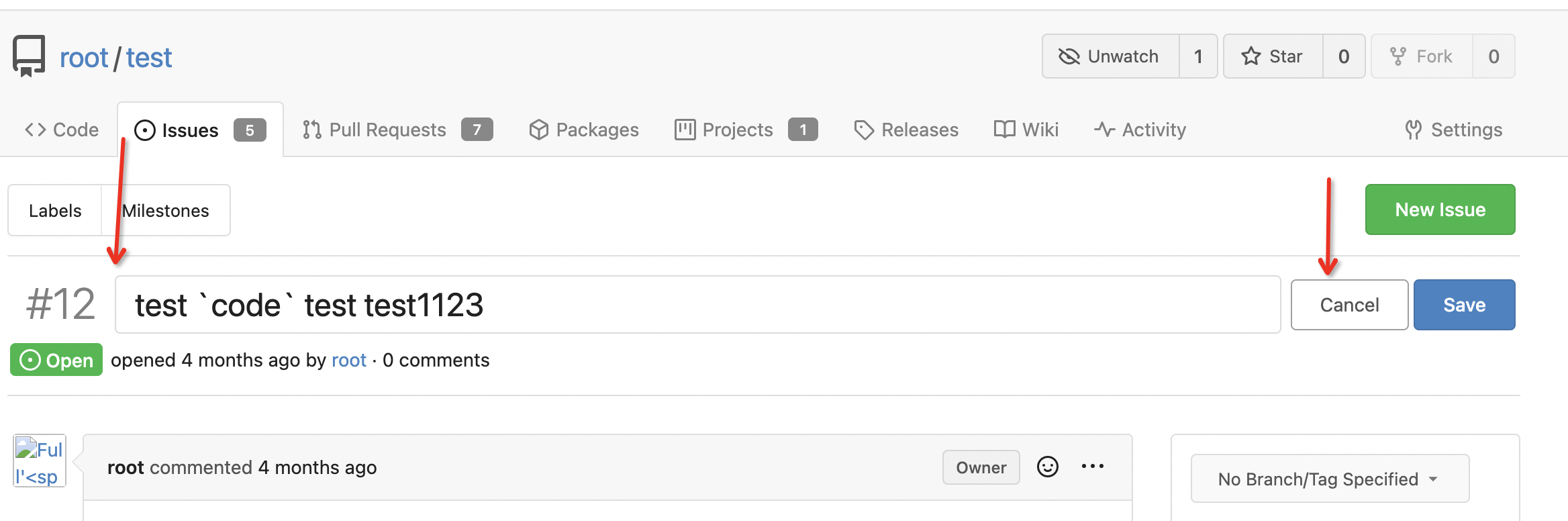 Co-authored-by: techknowlogick <[email protected]>
|
Replaced by #22807 |
Partially addressing #19769
These will need more work to get done properly.
However, this will require more communication, which might mean
that a fix may or may not make it into the next release.
To improve the situation at least a little bit, allow for
keyboard usage.
I noticed that the
:focusstyling is lost on the cancel button here.Inspecting the root cause led to a regression caused by #19763
I'd like to have @silverwind look into this if possible, as I lack the
context that led to the mentioned PR. (namely: why
!importants?)Regarding the usage of
<div>s: That was never changed here.I would assume, there is no specific reason. Should I change the
markup to a proper
<button type="button">instead? Or are thereside effects I should be aware of?
Signed-off-by: André Jaenisch [email protected]