Series of elements for handling tags with Polymer and custom elements:
- paper-tags.html
- paper-tags-input.html
- paper-tags-dropDown.html
An element for setting displaying a single tag
<paper-tags label-accessor="label" items='[{"id":1, "l" :"me", "label":"hello"},{"id":2, "label":"new"}]'></paper-tags>
The following custom properties and mixins are available for styling:
| Custom property | Description | Default |
|---|---|---|
--paper-tags |
Mixin applied to the host | {} |
--paper-tags-item |
Mixin applied to the .paper-tag-item | {} |
--paper-tag-margin |
margin between tags | 3px |
--paper-tag-focus-color |
the tag border color | --default-primary-color |
--paper-tag-text-color |
the tag text color | --secondary-text-color |
An element for settings tags tags, based on paper-input
<paper-tags-input label="input label" show-counter="tags" items='["hello", "new"]' maxLength="10"></paper-tags-input>
The following custom properties and mixins are available for styling:
| Custom property | Description | Default |
|---|---|---|
--paper-tag-margin |
bottom margin for tags | 3px |
<paper-tags-input label="input label" show-counter="tags" items='["hello", "new"]' maxLength="10"></paper-tags-input>
The following custom properties and mixins are available for styling:
| Custom property | Description | Default |
|---|---|---|
--paper-tag-margin |
bottom margin for tags | 3px |
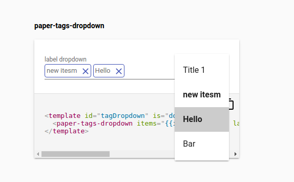
paper-tag-dropdown is based on paper-menu-dropdown, with selected item menu displayed as tags.
<paper-tags-dropdown items="{{items}}" items='[{"id": 1, "label": "first" }, {"id":"5", "label": "last" }]' noink label="label dropdown" value-object='{"5": "true"}' ></paper-tags-dropdown>
Styling from paper-dropdown-menu are available
| Custom property | Description | Default |
|---|---|---|
--paper-dropdown-menu |
A mixin that is applied to the element host | {} |
--paper-dropdown-menu-disabled |
A mixin that is applied to the element host when disabled | {} |
--paper-dropdown-menu-ripple |
A mixin that is applied to the internal ripple | {} |
--paper-dropdown-menu-button |
A mixin that is applied to the internal menu button | {} |
--paper-dropdown-menu-input |
A mixin that is applied to the internal paper input | {} |
--paper-dropdown-menu-icon |
A mixin that is applied to the internal icon | {} |
- input tags as behavior
- tags renamed items ?
- listen to iron-select and deselect
- fire unselect when close a tag
- do not toggle menu when click on close
- filter menu when change input
~~- include menu within the component ! ~~
- prevent close menu when tap on input
- open menu when input
- keep focus on input when click on input
~~- label up when tags ~~
- indicate the menu is filtered
- array and object-value
- value as a concatenation of arrayValue
- handle validator correctly (minTags and maxTags)
- documentation
- publish to bower
- implement validator for minItems and maxItems