Skip to content
New issue

Have a question about this project? Sign up for a free GitHub account to open an issue and contact its maintainers and the community.

By clicking “Sign up for GitHub”, you agree to our terms of service and privacy statement. We’ll occasionally send you account related emails.

Already on GitHub? Sign in to your account

Improve usability of details panel indicators #4557

Closed
1 task done
Tracked by #140
JonellaCulmer opened this issue Apr 19, 2021 · 7 comments
Closed
1 task done
Tracked by #140

Improve usability of details panel indicators #4557

JonellaCulmer opened this issue Apr 19, 2021 · 7 comments

Comments

@JonellaCulmer
Copy link
Contributor

JonellaCulmer commented Apr 19, 2021

What we're after:
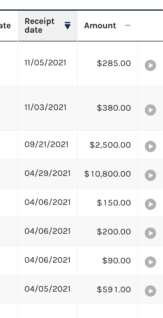
Improve the appearance of the details panel buttons/indicators. At present, users can click anywhere on the row to get to additional information nested in the details panel. But there's also the indictor at the far right side of the row that suggests there's additional content. In gray, it's not entirely clear that there's additional information and not everyone is savvy enough to pat attention to the changing cursor when looking at the rows of content.

Completion criteria:

  • Improve appearance of data table side panel indicators to improve navigation to additional report/transaction details

Current state:
Screen Shot 2021-04-19 at 10.52.55 AM.png

@JonellaCulmer
Copy link
Contributor Author

JonellaCulmer commented Oct 6, 2021

@patphongs @rfultz @johnnyporkchops Would like your input on the below mockup for the datatable details panels.

Pros:

  • Improves usability on mobile. Doesn’t require the user to navigate away and potentially lose their place when viewing the table. Shows the details in line with all other rows
  • Changes the color of the icons to federal-blue instead of gray to make them more noticeable and no longer suggests that the buttons or not functioning or inactive
  • Changes the icon from the right-arrow to the plus and minus signs. The arrow button suggests that the user might be taken to another page instead of open the panel. The plus and minus signs suggest to users that there is more information to see and because the icons are used in our accordions, can also suggest that information may opened below as opposed to the right

Cons:

  • Less horizontal space instead of potentially infinite vertical space for details
  • Need to confirm that our tables/grid will support this. I believe it can, but would like your input

New details panel 1

@JonellaCulmer
Copy link
Contributor Author

Child rows on datatables: https://datatables.net/examples/api/row_details.html

@patphongs
Copy link
Member

Thanks @JonellaCulmer, I do like the new panel indicators. I have a couple of questions about functionality/display below:

  1. Clicking on each plus sign would push table rows down. How many can be opened at once? It may be disorienting to allow them to open more than one at a time?
  2. In the current implementation, the entire row is clickable to trigger the opening of the panel. Will the + and - function in the same way? If the entire row is clicked, will it open and if the row is clicked again, will it close?
  3. It'll be interesting to see how the new horizontal panel will stack in full width view. Especially when there are 3 or more blocks/sections to display for one item.

@JonellaCulmer
Copy link
Contributor Author

@patphongs

Clicking on each plus sign would push table rows down. How many can be opened at once? It may be disorienting to allow them to open more than one at a time?

I agree. We should maintain the functionality now that allows only one panel to be open at a time.

In the current implementation, the entire row is clickable to trigger the opening of the panel. Will the + and - function in the same way? If the entire row is clicked, will it open and if the row is clicked again, will it close?

I'd like that to be the case, yes. That clicking anywhere on the row can either open or close it. It would be new functionality to click anywhere on the row to close. Currently, we use the X to close.

It'll be interesting to see how the new horizontal panel will stack in full width view. Especially when there are 3 or more blocks/sections to display for one item.

What I imagine in my mind does not always translate 1:1 on the front-end so I need to think through this a bit more. Perhaps this part of the implementation can be a pairing opportunity in addition to some more thought on my end.

@JonellaCulmer
Copy link
Contributor Author

Thinking a bit more through the amount of content needing to appear on the details panels. At this point, the best bet is just to allow the different sections to wrap top to bottom.

Would love to pair with someone on front-end during its development.

Please let me know if you have any more comments or concerns @patphongs @rfultz @johnnyporkchops

@rfultz
Copy link
Contributor

rfultz commented Oct 27, 2021

When can we get started?

@JonellaCulmer
Copy link
Contributor Author

Closing in favor of implementation ticket: #4942

Sign up for free to join this conversation on GitHub. Already have an account? Sign in to comment
Projects
None yet
Development

No branches or pull requests

4 participants