-
Notifications
You must be signed in to change notification settings - Fork 8.2k
New issue
Have a question about this project? Sign up for a free GitHub account to open an issue and contact its maintainers and the community.
By clicking “Sign up for GitHub”, you agree to our terms of service and privacy statement. We’ll occasionally send you account related emails.
Already on GitHub? Sign in to your account
[Dashboard Usability] Use hover actions for dashboard panels #151233
Labels
Feature:Dashboard
Dashboard related features
impact:medium
Addressing this issue will have a medium level of impact on the quality/strength of our product.
loe:large
Large Level of Effort
Project:Dashboard Usability
Related to the Dashboard Usability initiative
Team:Presentation
Presentation Team for Dashboard, Input Controls, and Canvas
Comments
18 tasks
|
Pinging @elastic/kibana-presentation (Team:Presentation) |
6 tasks
Heenawter
added a commit
that referenced
this issue
Mar 6, 2023
…2155) Closes #135458 Unblocks #151233 ## Summary This PR adds the floating actions back into the regular HTML tree by removing the `EuiPortal` that surrounded them, thus making them keyboard accessible via some added CSS.  In order to do this, however, there were a few changes that had to be made to the overall Dashboard HTML structure. Previously, as part of [relocating the Dashboard scrollbar](#145628), the scrollable section of the app was moved to the Dashboard viewport, like so: https://user-images.githubusercontent.com/8698078/222511861-8707917c-9edc-4292-a182-58924bb00c8a.mov <br> While this had a lot of visual appeal, because of the structure of the HTML tree, the floating actions had to be moved to an `EuiPortal` as part of this change so that they would continue to float above the top navigation bar rather than clipping behind it alongside the other contents of the viewport - this made it impossible to add native keyboard accessibility since they were removed from the natural HTML structure. Unfortunately, by removing the `EuiPortal` in order to allow for keyboard accessibility, this meant that the scrollable section could **no longer** be constrained to the viewport - this is because the `z-index` of child of a given scrollable `div` is **always relative** to its parent, which means that the floating actions would clip behind the top nav bar regardless of how high you set their `z-index`: <p align="center"><img src="https://user-images.githubusercontent.com/8698078/222518354-80f1df75-69e5-4433-a256-d0b7dc57cd97.gif"/></p> Therefore, in order to avoid this clipping, the scrollable section had to remain at the top of the app, like so: https://user-images.githubusercontent.com/8698078/222512203-60a88fc5-dd68-47ba-aeab-2425afc60a67.mov <br> In order to keep the benefit of the top query bar remaining in place, the top nav bar was added to a **fixed position** `div` that floats above the contents of the viewport as the user scrolls - this ensures that the floating actions, which are now also positioned via a `fixed` container, can still float above the nav bar while remaining part of the natural order of the HTML tree. As a follow up, we should also address #152609. ### Checklist - [x] [Unit or functional tests](https://www.elastic.co/guide/en/kibana/master/development-tests.html) were updated or added to match the most common scenarios - [x] Any UI touched in this PR is usable by keyboard only (learn more about [keyboard accessibility](https://webaim.org/techniques/keyboard/)) - [x] Any UI touched in this PR does not create any new axe failures (run axe in browser: [FF](https://addons.mozilla.org/en-US/firefox/addon/axe-devtools/), [Chrome](https://chrome.google.com/webstore/detail/axe-web-accessibility-tes/lhdoppojpmngadmnindnejefpokejbdd?hl=en-US)) - [x] This renders correctly on smaller devices using a responsive layout. (You can test this [in your browser](https://www.browserstack.com/guide/responsive-testing-on-local-server)) - [x] This was checked for [cross-browser compatibility](https://www.elastic.co/support/matrix#matrix_browsers) ### For maintainers - [ ] This was checked for breaking API changes and was [labeled appropriately](https://www.elastic.co/guide/en/kibana/master/contributing.html#kibana-release-notes-process)
bmorelli25
pushed a commit
to bmorelli25/kibana
that referenced
this issue
Mar 10, 2023
…stic#152155) Closes elastic#135458 Unblocks elastic#151233 ## Summary This PR adds the floating actions back into the regular HTML tree by removing the `EuiPortal` that surrounded them, thus making them keyboard accessible via some added CSS.  In order to do this, however, there were a few changes that had to be made to the overall Dashboard HTML structure. Previously, as part of [relocating the Dashboard scrollbar](elastic#145628), the scrollable section of the app was moved to the Dashboard viewport, like so: https://user-images.githubusercontent.com/8698078/222511861-8707917c-9edc-4292-a182-58924bb00c8a.mov <br> While this had a lot of visual appeal, because of the structure of the HTML tree, the floating actions had to be moved to an `EuiPortal` as part of this change so that they would continue to float above the top navigation bar rather than clipping behind it alongside the other contents of the viewport - this made it impossible to add native keyboard accessibility since they were removed from the natural HTML structure. Unfortunately, by removing the `EuiPortal` in order to allow for keyboard accessibility, this meant that the scrollable section could **no longer** be constrained to the viewport - this is because the `z-index` of child of a given scrollable `div` is **always relative** to its parent, which means that the floating actions would clip behind the top nav bar regardless of how high you set their `z-index`: <p align="center"><img src="https://user-images.githubusercontent.com/8698078/222518354-80f1df75-69e5-4433-a256-d0b7dc57cd97.gif"/></p> Therefore, in order to avoid this clipping, the scrollable section had to remain at the top of the app, like so: https://user-images.githubusercontent.com/8698078/222512203-60a88fc5-dd68-47ba-aeab-2425afc60a67.mov <br> In order to keep the benefit of the top query bar remaining in place, the top nav bar was added to a **fixed position** `div` that floats above the contents of the viewport as the user scrolls - this ensures that the floating actions, which are now also positioned via a `fixed` container, can still float above the nav bar while remaining part of the natural order of the HTML tree. As a follow up, we should also address elastic#152609. ### Checklist - [x] [Unit or functional tests](https://www.elastic.co/guide/en/kibana/master/development-tests.html) were updated or added to match the most common scenarios - [x] Any UI touched in this PR is usable by keyboard only (learn more about [keyboard accessibility](https://webaim.org/techniques/keyboard/)) - [x] Any UI touched in this PR does not create any new axe failures (run axe in browser: [FF](https://addons.mozilla.org/en-US/firefox/addon/axe-devtools/), [Chrome](https://chrome.google.com/webstore/detail/axe-web-accessibility-tes/lhdoppojpmngadmnindnejefpokejbdd?hl=en-US)) - [x] This renders correctly on smaller devices using a responsive layout. (You can test this [in your browser](https://www.browserstack.com/guide/responsive-testing-on-local-server)) - [x] This was checked for [cross-browser compatibility](https://www.elastic.co/support/matrix#matrix_browsers) ### For maintainers - [ ] This was checked for breaking API changes and was [labeled appropriately](https://www.elastic.co/guide/en/kibana/master/contributing.html#kibana-release-notes-process)
6 tasks
Heenawter
added a commit
that referenced
this issue
Mar 21, 2023
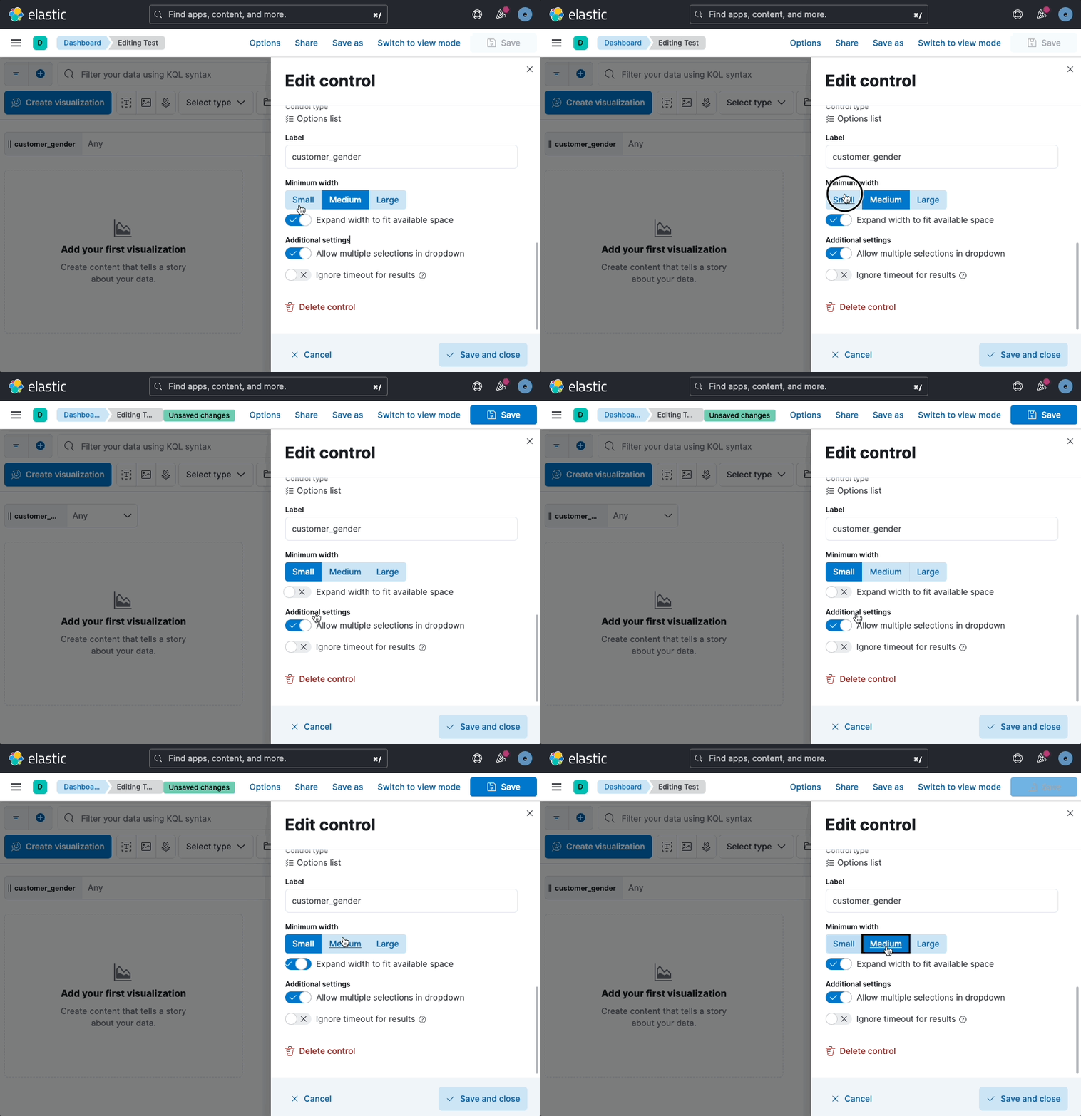
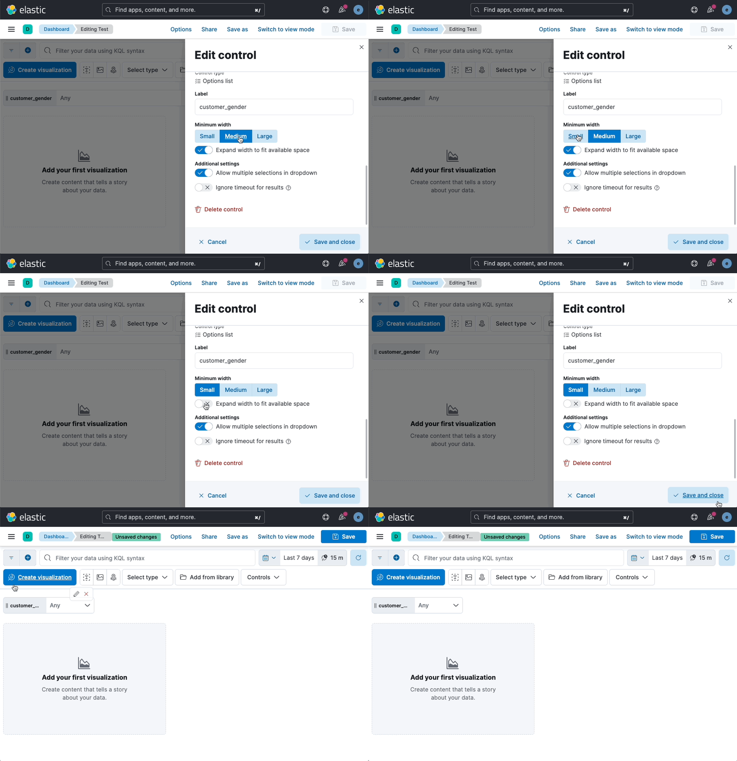
…3065) Closes #143585 Closes #151767 Closes #152609 ## Summary This PR accomplishes three things, the first of which is moving the edit/delete control hover actions to use the `uiActions` service - this is the first step in moving existing panel actions (such as replacing the panel, opening the panel settings flyout, etc.) to this hover framework, which is outlined in [this](#151233) issue. While this was the primary goal of this PR, this also made the following fixes possible: 1. Since I was refactoring the control editor flyout code as part of this PR, I made it so that changes to the control's width/grow properties are **only applied** when the changes are **saved** rather than being automatically applied. | Before | After | | ------------- | ------------- | |  |  | 2. Since the edit control button is no longer a custom component, the tooltip now responds to focus as expected. | Before | After | | ------------- | ------------- | |  |  | ### Checklist - [x] Any text added follows [EUI's writing guidelines](https://elastic.github.io/eui/#/guidelines/writing), uses sentence case text and includes [i18n support](https://github.com/elastic/kibana/blob/main/packages/kbn-i18n/README.md) - [x] [Unit or functional tests](https://www.elastic.co/guide/en/kibana/master/development-tests.html) were updated or added to match the most common scenarios - [x] Any UI touched in this PR is usable by keyboard only (learn more about [keyboard accessibility](https://webaim.org/techniques/keyboard/)) - [x] Any UI touched in this PR does not create any new axe failures (run axe in browser: [FF](https://addons.mozilla.org/en-US/firefox/addon/axe-devtools/), [Chrome](https://chrome.google.com/webstore/detail/axe-web-accessibility-tes/lhdoppojpmngadmnindnejefpokejbdd?hl=en-US)) - [x] This was checked for [cross-browser compatibility](https://www.elastic.co/support/matrix#matrix_browsers) ### For maintainers - [ ] This was checked for breaking API changes and was [labeled appropriately](https://www.elastic.co/guide/en/kibana/master/contributing.html#kibana-release-notes-process) --------- Co-authored-by: kibanamachine <[email protected]>
This was referenced Apr 5, 2023
|
We could technically do this as a general change even before the hover actions are implemented. Honestly, we could remove the |
4 tasks
10 tasks
11 tasks
Sign up for free
to join this conversation on GitHub.
Already have an account?
Sign in to comment
Labels
Feature:Dashboard
Dashboard related features
impact:medium
Addressing this issue will have a medium level of impact on the quality/strength of our product.
loe:large
Large Level of Effort
Project:Dashboard Usability
Related to the Dashboard Usability initiative
Team:Presentation
Presentation Team for Dashboard, Input Controls, and Canvas

Overview
We should move the current actions menu out of the title bar of a panel and use hover actions similar to the one on controls. This will allow us to:
Design (WIP)
Open Questions
The text was updated successfully, but these errors were encountered: