-
Notifications
You must be signed in to change notification settings - Fork 839
New issue
Have a question about this project? Sign up for a free GitHub account to open an issue and contact its maintainers and the community.
By clicking “Sign up for GitHub”, you agree to our terms of service and privacy statement. We’ll occasionally send you account related emails.
Already on GitHub? Sign in to your account
EuiDescribedFormGroup component #707
Conversation
|
If this were added to a form layout with non-descriptive elements the flow would be interrupted because of the descriptive row's different width and positioning of the input element. It might make sense to allow the two columns to be flipped in these cases so the input elements still align - thoughts @cchaos? |
|
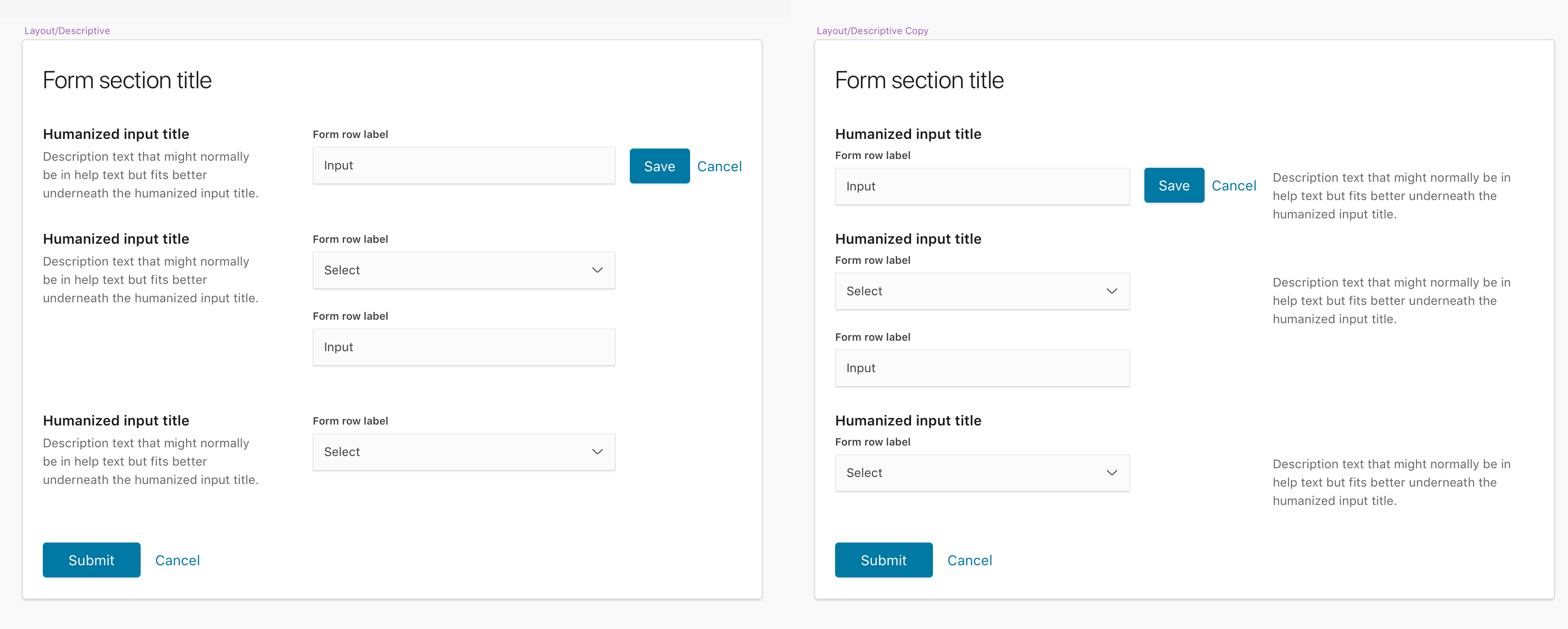
@chandlerprall I agree that combining descriptive rows with regular form rows disrupts the flow of the form. However, I think the solution is that they should not be combined. I foresee this as one pattern for the entire form. So each title an description must correspond with a form row but each descriptive form row could have multiple form rows that would just stack on the right side. Ex: Therefore, we should change the docs to add the @jen-huang Would you like me to update the docs stuff? |
|
@cchaos Go for it! |
|
@cchaos Two more questions for stacked inputs:
|
There was a problem hiding this comment.
Choose a reason for hiding this comment
The reason will be displayed to describe this comment to others. Learn more.
Woot! Thank you for building this out. It works really well and the CSS is spot on (@chandlerprall will need to peak at the JS) but I just had a few comments on making it both a little bit more restrictive and flexible.
| */ | ||
| blurHandler: PropTypes.func, | ||
| /** | ||
| * IDs of additional elements that should be part of children's `aria-describedby` |
There was a problem hiding this comment.
Choose a reason for hiding this comment
The reason will be displayed to describe this comment to others. Learn more.
👍 Thanks for the descriptions!
| padding-top: ($euiFontSize*1.5) - $euiFontSizeXS + 2px; | ||
|
|
||
| &--hasEmptyLabelSpace { | ||
| padding-top: ($euiFontSize*1.5) + $euiSizeS + 2px; |
There was a problem hiding this comment.
Choose a reason for hiding this comment
The reason will be displayed to describe this comment to others. Learn more.
🥇 Yay maths!
| </EuiFormHelpText> | ||
| </EuiFlexItem> | ||
| <EuiFlexItem> | ||
| <EuiFormRow |
There was a problem hiding this comment.
Choose a reason for hiding this comment
The reason will be displayed to describe this comment to others. Learn more.
Can we allow any number of EuiFormRow's? I know this makes it a little more complicated in terms of focusing elements, but I think if you click the Title, it would just auto-select the first one.
| } | ||
|
|
||
| EuiDescriptiveFormRow.propTypes = { | ||
| children: PropTypes.node.isRequired, |
There was a problem hiding this comment.
Choose a reason for hiding this comment
The reason will be displayed to describe this comment to others. Learn more.
children is being required, but I don't see it used anywhere.
There was a problem hiding this comment.
Choose a reason for hiding this comment
The reason will be displayed to describe this comment to others. Learn more.
children is passed to EuiFormRow as part of ...rest (so basically the input to show)
| isInvalid: PropTypes.bool, | ||
| error: PropTypes.oneOfType([PropTypes.node, PropTypes.arrayOf(PropTypes.node)]), | ||
| helpTitle: PropTypes.node, | ||
| helpText: PropTypes.node, |
There was a problem hiding this comment.
Choose a reason for hiding this comment
The reason will be displayed to describe this comment to others. Learn more.
So I'm thinking that each euiDescriptiveFormRow should require a helpTitle, helpText and any number of EuiFormRows. Is that pattern possible? It will help keep everything lined up.
|
|
👍Thanks for the feedback @chandlerprall and @cchaos - I'll make the changes needed to have |
|
Sweet thanks. I'll wait to update the docs. |
|
I've update with the following changes:
|
|
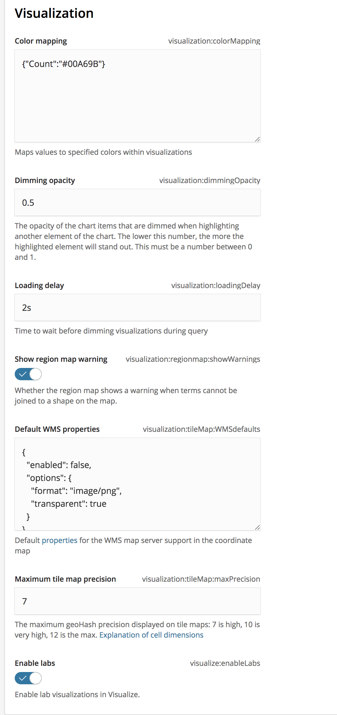
I love that we're adding this @jen-huang! I can use this to build a layout I had to hack together in Cloud: I have a few concerns though.
...I think it might make more sense to simplify this component, and make it focus solely on appending more help text to the form row. If it placed this text to the right then I think this would make this component play more nicely with regular form rows and would make more sense in terms of IA since users should hopefully be able to just use the form, and only refer to the text if they're hopelessly confused or new to the form. If we were to do this, then my heading hierarchy concern would be addressed because consumers would just use regular What do y'all think?? |
|
@cjcenizal Some thought on your thoughts:
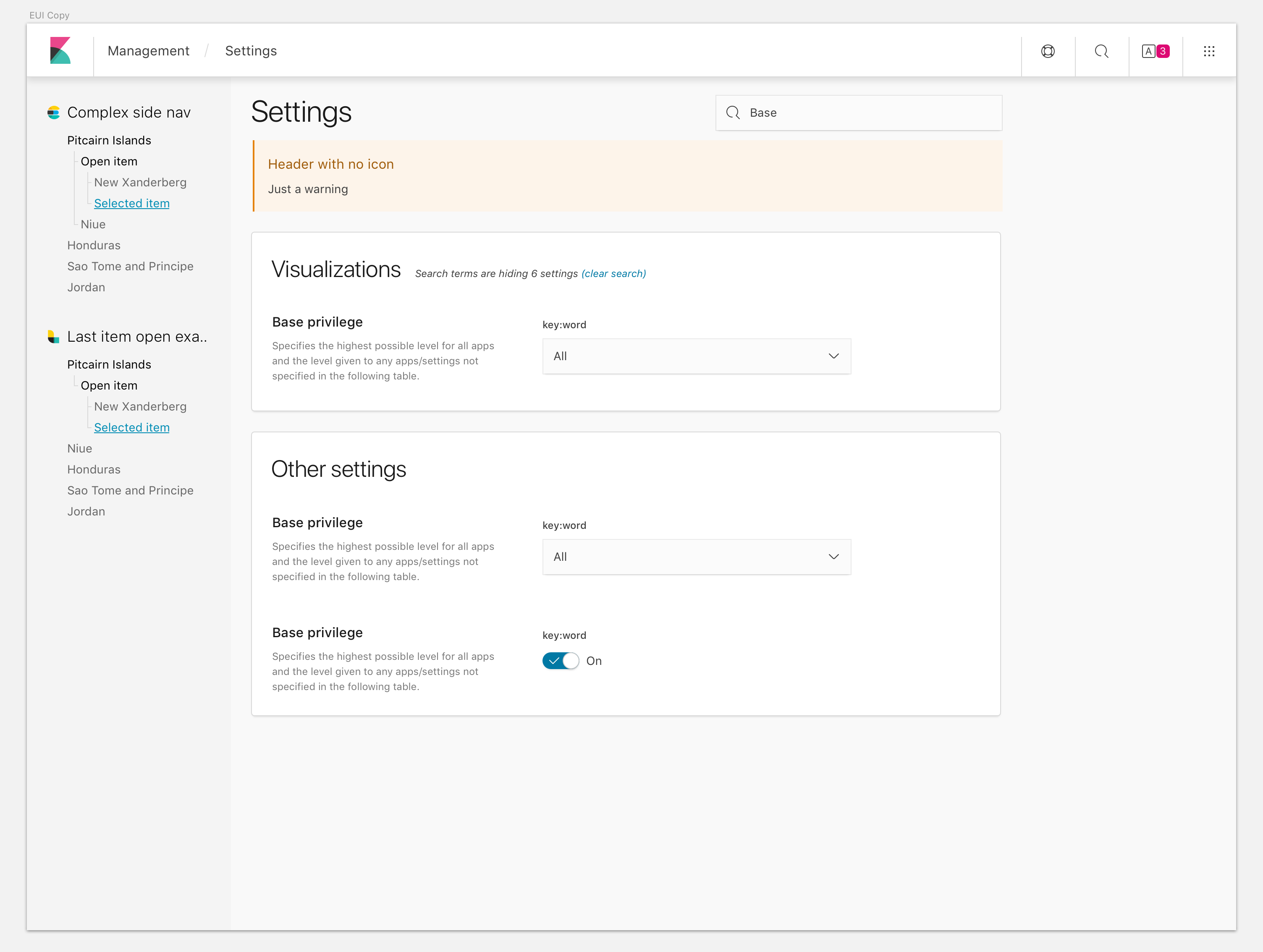
For reference, the use case for this component originally came up from elastic/kibana#17465. Here's the design suggested by @cchaos as a way to show both human readable name of the setting as well as its code-like key: |
If we adjust our approach to be that this component really is just a form row with help text appended to it (instead of thinking of this as a component involving multiple rows) then we can bring this functionality back, which I think would be a nice accessibility win. We can uncouple the appearance of the title from the heading element it uses, similarly to how So basically, to build that layout we could do something like this: <EuiTitle><h2>Other settings</h2></EuiTitle>
{/* We use the existing typographic components to add the title */}
<EuiTitle><h3>Basic privilege</h3></EuiTitle>
{/* The descriptive form row component is only responsible for creating a layout which
can accommodate a description. It can have all the same props as the regular form row,
plus a "description" prop. */}
<EuiDescriptiveFormRow
label="key.word"
description="Specifies the highest possible level, etc."
>
{/* Input goes here */
</EuiDescriptiveFormRow> |
|
That is basically the first iteration of this component, except not having title prop. (Which I'm fine with removing, and we can provide the user with a padding size prop to help with aligning to field.) We changed the component to behave like fieldset to satisfy this design pattern, which is super similar to Cloud's use case. The only difference is the description and input columns being flipped around. @cchaos If we change EuiDescriptiveFormRow to have input on the left and description on the right, then we can avoid having to wrap multiple EuiFormRows for the inputs to be aligned. I guess even if we didn't want to flip them, the user can use EuiDescriptiveFormRow with an empty description to get them aligned... what do you think? |
|
That's exactly what I was thinking too, Jen. I think the only difference between our cases is that my use case doesn't have descriptive text for a fieldset. If it were to have descriptive text for the fieldset, I think something like this would work: This kind of pattern will accommodate form layouts with fieldset descriptive text, field descriptive text, or neither. As a side note, I've found the help text which we use with fields to generally be more useful for displaying validation rules, e.g. "Only letters and numbers allowed." I think of the descriptive text as the kind of stuff you would normally hide behind an EuiIconTip next to the label, but because the layout is so airy you can surface it directly in the layout. Maybe as a later step we could make bake in accessibility by automatically hiding it inside of EuiIconTips on narrower screens? |
|
Alright, let's rein this back in: PurposeThe purpose of this component is to create a simple form layout component for a specific use-case. This not a one-size-fits-all layout and hence the name @cjcenizal I agree that help text is not always substantial enough to really explain what the input is for. Prime example is the settings page that just about every single input has help text as well as a title and label. This component is more or less specific to this use case. LayoutI am strongly against changing the layout to have the description to the right of the input. As said earlier, these rows shouldn't be mixed with regular form rows and the current layout is setup for scan-ability of long forms. A person can scan down the left column searching for the input they want to change and only needing to glance to the right when they have found the one they are looking for. Otherwise, the user would have to constantly be shifting their glance from title -> right column for description -> back to left column and down to the next one. Also, keeping the input in the right column will allow spacing to add hidden save/cancel buttons as @jen-huang has in her settings page. The placement of these don't quite work in the left column input situation: HeadingsI agree that we should allow the user to pass whatever heading level they need to the title prop and we will use However, we should not be de-coupling the heading from the description. Conclusion / ImplementationThe component should really just take 3 props:
Really this is more of a re-usable pattern than a component. @cjcenizal |
|
Agree with @cchaos on this one . Think we'll need to add some guidelines for forms fairly soon as well to solidify the best practices she's proposing. |
|
jenkins test this |
|
Latest update has the following changes:
I've attempted to illustrate the relationship between
@cchaos Welcoming any additional feedback or doc changes! |
There was a problem hiding this comment.
Choose a reason for hiding this comment
The reason will be displayed to describe this comment to others. Learn more.
Thank you @jen-huang! Sorry there's been so much back and forth on this. I think keeping this as a component but making it very flexible in terms of what form elements/rows (children) can be passed makes it more powerful and re-usable.
I have just 2 changes, but after those are done, go ahead and merge and I'll update the docs in another PR so you can (hopefully) start using this.
| > | ||
| <EuiFlexGroup gutterSize={gutterSize}> | ||
| <EuiFlexItem id={`${id}-legend`} grow={false}> | ||
| <EuiText size="xs" id={`${id}-title`} className="euiDescriptiveFormRow__title"> |
There was a problem hiding this comment.
Choose a reason for hiding this comment
The reason will be displayed to describe this comment to others. Learn more.
This should be EuiTitle instead of EuiText that way we completely control the look of whatever heading element they pass in.
There was a problem hiding this comment.
Choose a reason for hiding this comment
The reason will be displayed to describe this comment to others. Learn more.
I don't know how I misread the original comment as EuiText for this 😅
There was a problem hiding this comment.
Choose a reason for hiding this comment
The reason will be displayed to describe this comment to others. Learn more.
Updated, size will use prop titleSize but default to xs per Dave's suggestion
| @@ -60,6 +59,7 @@ export class EuiFormRow extends Component { | |||
| hasEmptyLabelSpace, | |||
| fullWidth, | |||
| className, | |||
| describedByIds, | |||
There was a problem hiding this comment.
Choose a reason for hiding this comment
The reason will be displayed to describe this comment to others. Learn more.
I think you can remove all these describedByIds references now, right?
There was a problem hiding this comment.
Choose a reason for hiding this comment
The reason will be displayed to describe this comment to others. Learn more.
TBH I think this is a pretty nice improvement because it allows people to associate form row fields with whatever other help text they want. I think it's OK to leave it in, but I would definitely add another bullet to the CHANGELOG mentioning the addition of this prop, and document it with an example in the docs site.
There was a problem hiding this comment.
Choose a reason for hiding this comment
The reason will be displayed to describe this comment to others. Learn more.
That's fine. We can keep it in but we should have @aphelionz check it to make sure it doesn't duplicate the reading of the title and description.
There was a problem hiding this comment.
Choose a reason for hiding this comment
The reason will be displayed to describe this comment to others. Learn more.
Good call, I'd love to hear @aphelionz's thoughts on this. I tested it in VoiceOver on OS X and this does repeat the title and description, but I think that's just what happens when you associate elements with other elements using aria-labelledby and aria-desrcribedby. They'll be read once as a regular part of the page text and then again as information associated with a specific element.
There was a problem hiding this comment.
Choose a reason for hiding this comment
The reason will be displayed to describe this comment to others. Learn more.
Can you add aria-hidden or some such thing to one of the pairs? It's not the worst thing in the world to read something twice (better than not reading it at all) but not ideal.
There was a problem hiding this comment.
Choose a reason for hiding this comment
The reason will be displayed to describe this comment to others. Learn more.
Sorry, to clarify the <p> in my second example is the result of the user specifying title={<p>This describes the input</p>}. I was referring to heading in the HTML sense, not in the sense of the title prop.
There was a problem hiding this comment.
Choose a reason for hiding this comment
The reason will be displayed to describe this comment to others. Learn more.
I've been staring at the WCAG docs trying to figure out which criterion this would fall under.... is the text required to be understood succinctly by a user before requiring input? Then it's a level A... however if it's not it falls to level AA.
Level A: https://www.w3.org/WAI/WCAG20/quickref/#minimize-error-cues
vs
Level AA: https://www.w3.org/WAI/WCAG20/quickref/#qr-navigation-mechanisms-descriptive
There was a problem hiding this comment.
Choose a reason for hiding this comment
The reason will be displayed to describe this comment to others. Learn more.
Maybe we should ensure that users use heading tags for the title by doing:
  title: PropTypes.node.isRequired,
  headingLevel: PropTypes.oneOf(HEADING_LEVELS).isRequired,
There was a problem hiding this comment.
Choose a reason for hiding this comment
The reason will be displayed to describe this comment to others. Learn more.
I think @jen-huang's latest changes are sound and result in a good-enough UX. Maybe we can come back and reassess accessibility later on?
There was a problem hiding this comment.
Choose a reason for hiding this comment
The reason will be displayed to describe this comment to others. Learn more.
I adjusted the aria and IDing a bit with the last update, but I think more consideration is needed for handling accessibility. I created #762 for more work 🙂
There was a problem hiding this comment.
Choose a reason for hiding this comment
The reason will be displayed to describe this comment to others. Learn more.
Nice work on this. 👍
| > | ||
| <EuiFlexGroup gutterSize={gutterSize}> | ||
| <EuiFlexItem id={`${id}-legend`} grow={false}> | ||
| <EuiText size="xs" id={`${id}-title`} className="euiDescriptiveFormRow__title"> |
There was a problem hiding this comment.
Choose a reason for hiding this comment
The reason will be displayed to describe this comment to others. Learn more.
Agreed. I'd change this to EuiTitle and allow a titleSize prop to pass in the size similar to the below. It's a little more consistent than EuiText, which is more of a catchall application. I'd likely default titleSize to xs.
<EuiTitle size={titleSize}>
  {title}
</EuiTitle>There was a problem hiding this comment.
Choose a reason for hiding this comment
The reason will be displayed to describe this comment to others. Learn more.
Added!
There was a problem hiding this comment.
Choose a reason for hiding this comment
The reason will be displayed to describe this comment to others. Learn more.
I love the thought you've put into accessibility in this! I have a few suggestions and comments. I really think we should change the name so that we don't imply a coupling or relationship with EuiFormRow.
| text: ( | ||
| <p> | ||
| Use <EuiCode>DescriptiveFormRows</EuiCode> component to associate multiple <EuiCode>EuiFormRows</EuiCode>. | ||
| It can also simply be used with one <EuiCode>EuiFormRows</EuiCode> as a way to display help text (or additional |
There was a problem hiding this comment.
Choose a reason for hiding this comment
The reason will be displayed to describe this comment to others. Learn more.
Small typo: EuiFormRows -> EuiFormRow
There was a problem hiding this comment.
Choose a reason for hiding this comment
The reason will be displayed to describe this comment to others. Learn more.
fixed
| EuiFieldText, | ||
| EuiForm, | ||
| EuiFormRow, | ||
| EuiDescriptiveFormRow, |
There was a problem hiding this comment.
Choose a reason for hiding this comment
The reason will be displayed to describe this comment to others. Learn more.
Is the name of this component EuiDescriptiveFormRow or EuiDescriptiveFormRows? Could I suggest we change the name to EuiDescribedFormGroup? Since this component isn't coupled to form rows any more and implying otherwise could make things confusing.
There was a problem hiding this comment.
Choose a reason for hiding this comment
The reason will be displayed to describe this comment to others. Learn more.
renamed to EuiDescribedFormGroup 😁
| @@ -60,6 +59,7 @@ export class EuiFormRow extends Component { | |||
| hasEmptyLabelSpace, | |||
| fullWidth, | |||
| className, | |||
| describedByIds, | |||
There was a problem hiding this comment.
Choose a reason for hiding this comment
The reason will be displayed to describe this comment to others. Learn more.
TBH I think this is a pretty nice improvement because it allows people to associate form row fields with whatever other help text they want. I think it's OK to leave it in, but I would definitely add another bullet to the CHANGELOG mentioning the addition of this prop, and document it with an example in the docs site.
| > | ||
| <EuiFlexGroup gutterSize={gutterSize}> | ||
| <EuiFlexItem id={`${id}-legend`} grow={false}> | ||
| <EuiText size="xs" id={`${id}-title`} className="euiDescriptiveFormRow__title"> |
There was a problem hiding this comment.
Choose a reason for hiding this comment
The reason will be displayed to describe this comment to others. Learn more.
Doesn't look like the id here is ever referenced? Can we remove it?
There was a problem hiding this comment.
Choose a reason for hiding this comment
The reason will be displayed to describe this comment to others. Learn more.
I changed the ID'ing a little, but now the title and description IDs are both referenced by the parent group in aria props.
| > | ||
| <EuiFormRow | ||
| label="Text field" | ||
| describedByIds={['single-example-description']} |
There was a problem hiding this comment.
Choose a reason for hiding this comment
The reason will be displayed to describe this comment to others. Learn more.
As a consumer, I'd have to know about the implementation details of EuiDescriptiveFormRow to know that single-example-description is an available ID, and that it's associated with the element containing the description. As a maintainer of the component, I may not be aware that consumers have created dependencies upon this ID and I might change it unwittingly and break screen-reader accessibility for a bunch of UIs (which we probably wouldn't discover for awhile).
I think the solution is to apply the ID directly to the EuiFlexItem component which encompasses the title and the description. This way the consumer can just reference the same ID they're passing in already. I tested this and it seems to work well.
If we make this change, we'd have to update the documentation too.
There was a problem hiding this comment.
Choose a reason for hiding this comment
The reason will be displayed to describe this comment to others. Learn more.
I changed it so that the user will pass in idAria (React didn't like "ariaId") prop, which gets put on the EuiText description. They can pass the same ID to describedByIds so there won't be a case where they have to know how the description ID is generated.
If they pass id it'll just unfold to the top level div container for EuiDescribedFormRow 🙂
| .toMatchSnapshot(); | ||
|
|
||
| // Descriptive form row has group role and is labelled by its title and text. | ||
| expect(tree.find(`EuiFlexItem`).at(0).prop(`id`)).toEqual(`test-id-legend`); |
There was a problem hiding this comment.
Choose a reason for hiding this comment
The reason will be displayed to describe this comment to others. Learn more.
I think we can remove lines 56-73 since they're all covered by the snapshot. If someone makes a change to the component in the future which affects any of the things we're asserting on these lines, then the snapshot comparison will also fail.
There was a problem hiding this comment.
Choose a reason for hiding this comment
The reason will be displayed to describe this comment to others. Learn more.
removed
There was a problem hiding this comment.
Choose a reason for hiding this comment
The reason will be displayed to describe this comment to others. Learn more.
💯 Thanks for being so patient!
|
jenkins test this |
1 similar comment
|
jenkins test this |


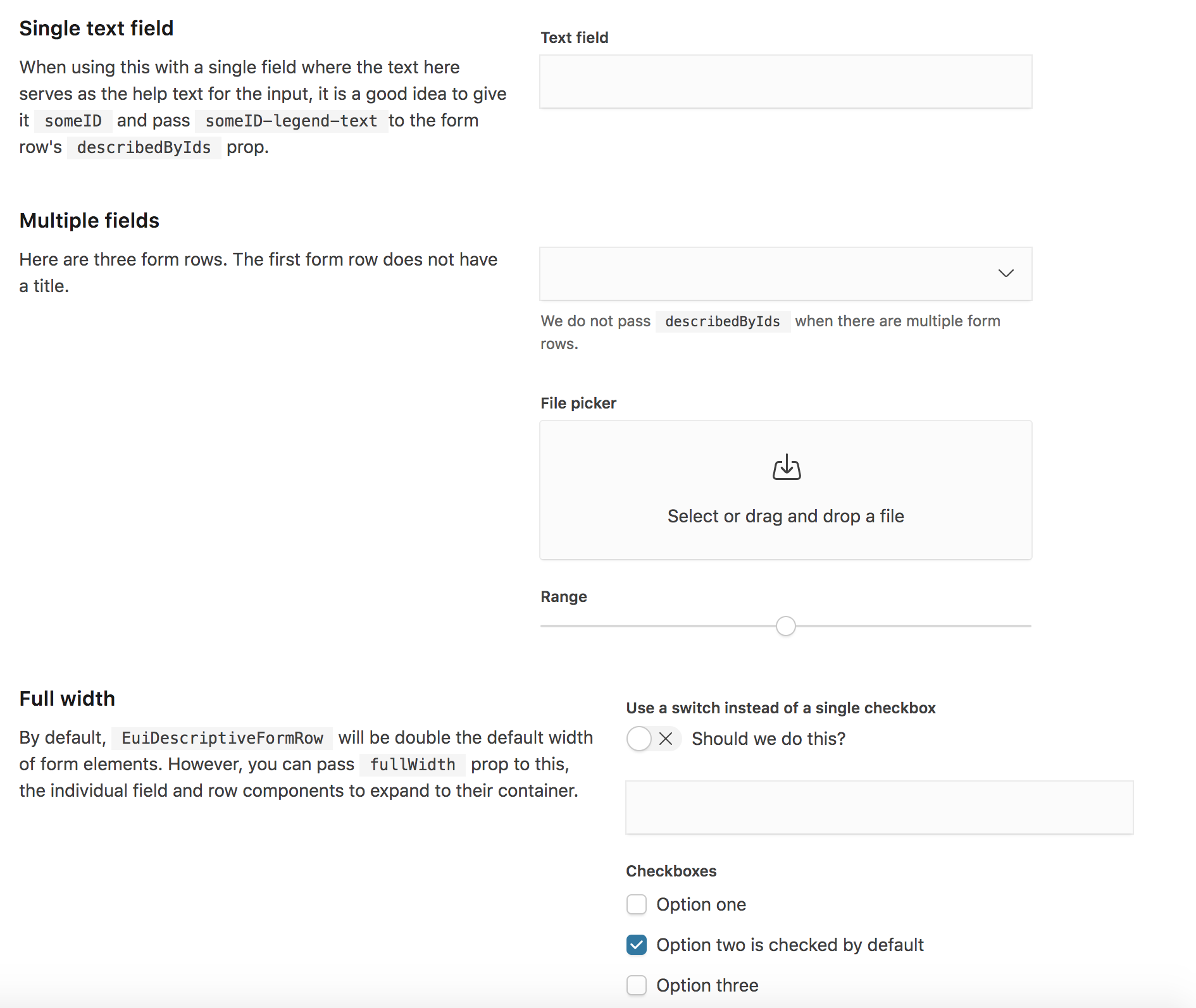
EuiDescribedFormGroupis a wrapper aroundEuiFormRowthat usesEuiFlexGroupto display help text horizontally next to the field instead of below (falls back to stacking on mobile). Includes support for validation errors and full width. If full width is not enabled, it maxes out at 800px ($euiFormMaxWidth*2).Most of its props are passed to
EuiFormRowwith the following exceptions:gutterSizepassed toEuiFlexGroup, defaults tolhelpTitleused by itself, title that displays above the help text - it is treated as a second label for the field (or only label iflabelis ommited)helpTextused by itself, not passed to form rowDesktop view with focusing fields:
Mobile view: