A React Application to create accessible color palettes that confirm to the WCAG Guidelines
ℹ️ ➡️ Try there application here 📱 💻 🖥️
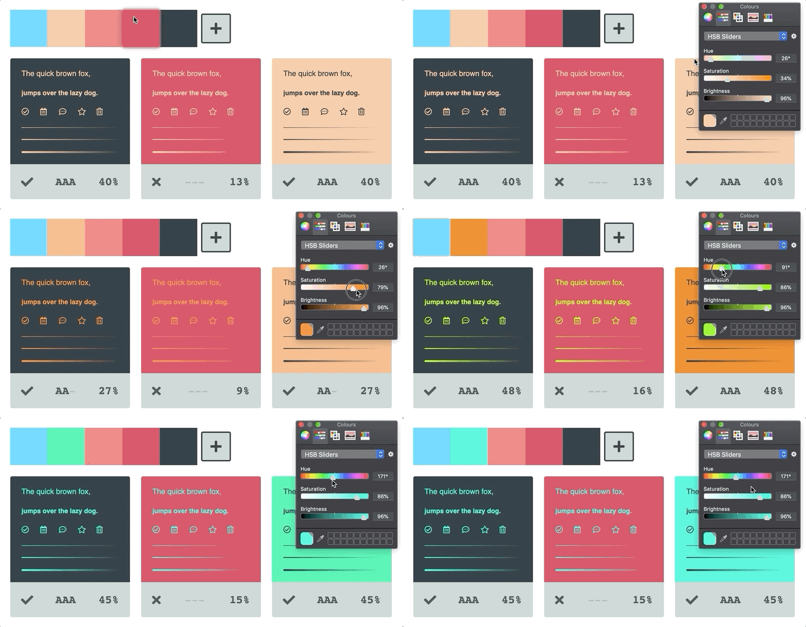
As you create color palettes we automatically generate a corresponding URL that you can share with others.
You can drag individual color swatches to re-order their sequence.
Color swatches are presented flush with one another to better portray any incremental color differences.
You can update a swatch reference and have all of its inherited references reflect the color change. This feature allows for great flexibility to try new color combinations with little effort.
Color combinations show the accessibility of their combined contrast via the following three identifiers.
-
❌
---= Poor contrast ratio -
✅
AA-= Acceptable contrast ratio -
✅
AAA= Excellent contest ratio
Hovering over a color combination reveals its corresponding color swatches.
Toggling on delete mode allows you to remove color swatches and combinations from your palette.
We make sure to not allow users to delete color swatches that are currently associated with a color combination to avoid accidental removals 👏
You can duplicate the last color swatch in your list by clicking the (add swatch) ➕ button.
Alternatively, you can duplicate any existing color swatch by dropping it onto the (add swatch) ➕ button.
You can duplicate the last color combination in your list by clicking the (add combination) ➕ button.
Alternatively, you can drop a color swatch onto the (add combination) ➕ button to create a new combination. The top slot represents the foreground color with the bottom assigned to the background.
When dropping a color swatch onto a new combination slot we automatically choose the best contrasting color from your list of color swatches as a starting point 👍
You can drop existing color swatches onto any existing color combination slot to update its palette reference.
UI states like :focus and :hover get unique color blends based on their base color.
If a color is very light, a border will appear around the swatch to differentiate it from the background.
Light and Dark colors also inherit inverted interaction states to create better contrast for our users.


