-
Notifications
You must be signed in to change notification settings - Fork 358
New issue
Have a question about this project? Sign up for a free GitHub account to open an issue and contact its maintainers and the community.
By clicking “Sign up for GitHub”, you agree to our terms of service and privacy statement. We’ll occasionally send you account related emails.
Already on GitHub? Sign in to your account
Plot APIs improvement in Series #665
Labels
enhancement
New feature or request
Comments
HyukjinKwon
added a commit
that referenced
this issue
Aug 21, 2019
This PR adds documentation and test for `Series.plot(...)` usage. See https://pandas.pydata.org/pandas-docs/stable/reference/series.html#plotting

```python
import databricks.koalas as ks
import pandas as pd

pdf_1 = pd.DataFrame({
            'a': [1, 2, 3, 4, 5, 6, 7, 8, 9, 15, 50],
        }, index=[0, 1, 3, 5, 6, 8, 9, 9, 9, 10, 10])

kdf_1 = ks.DataFrame(pdf_1)
pdf_1['a'].plot("bar", colormap='Paired').figure.savefig("output3.png")
kdf_1['a'].plot("bar", colormap='Paired').figure.savefig("output4.png")
```

Partially addresses #665
This was referenced Aug 21, 2019
Merged
Merged
Merged
Merged
HyukjinKwon
added a commit
that referenced
this issue
Aug 22, 2019
This PR add series.plot.pie in Series.
Can be tested as below:
```python
import databricks.koalas as ks
ks.range(10).to_pandas().id.plot.pie().figure.savefig("image.png")
ks.range(10).id.plot.pie().figure.savefig("image.png")
```

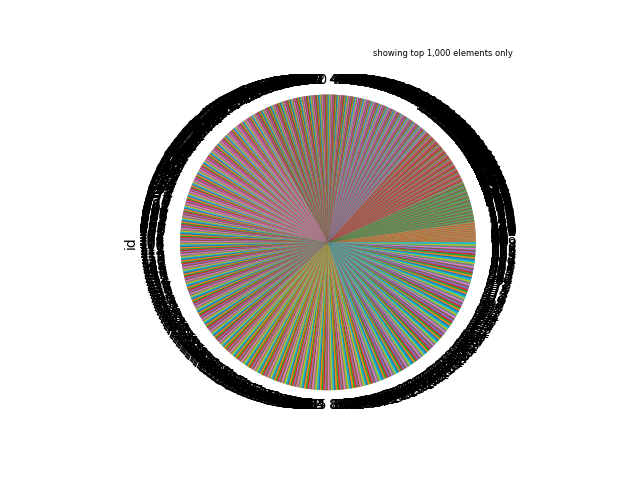
If there are more than 1000 rows, it shows as below:
```
ks.range(1001).id.plot.pie().figure.savefig("image.png")
```

Most of people will use, for instance `df.x.value_counts().plot.pie()`. This case is similar as bar plot.
Partially addresses #665
HyukjinKwon
added a commit
that referenced
this issue
Aug 22, 2019
This PR add series.plot.pie in Series.
Can be tested as below:
```python
import databricks.koalas as ks
import pandas as pd
pdf = pd.DataFrame({
'a': [1, 2, 3, 4, 5, 6, 7, 8, 9, 15, 50],
}, index=[0, 1, 3, 5, 6, 8, 9, 9, 9, 10, 10])
kdf = ks.DataFrame(pdf)
pdf['a'].plot.area(colormap='Paired').figure.savefig("image1.png")
kdf['a'].plot.area(colormap='Paired').figure.savefig("image2.png")
```

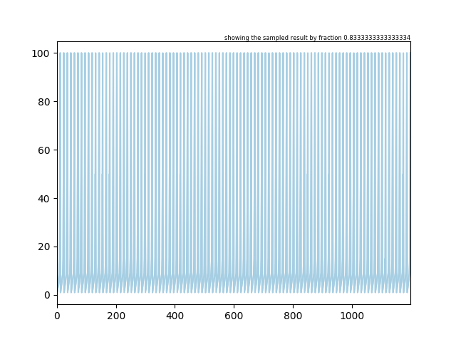
In case of this plot, we sample and match the row numbers around 1000.
```python
import databricks.koalas as ks
import pandas as pd
pdf = pd.DataFrame({'a': [1, 2, 3, 4, 5, 6, 7, 8, 9, 15, 50, 100] * 100})
kdf = ks.DataFrame(pdf)
kdf['a'].plot.area(colormap='Paired').figure.savefig("image4.png")
```

Partially addresses #665
HyukjinKwon
added a commit
that referenced
this issue
Aug 22, 2019
This PR add series.plot.pie in Series.
Can be tested as below:
```python
import databricks.koalas as ks
import pandas as pd
pdf = pd.DataFrame({
'a': [1, 2, 3, 4, 5, 6, 7, 8, 9, 15, 50],
}, index=[0, 1, 3, 5, 6, 8, 9, 9, 9, 10, 10])
kdf = ks.DataFrame(pdf)
pdf['a'].plot.line(colormap='Paired').figure.savefig("image1.png")
kdf['a'].plot.line(colormap='Paired').figure.savefig("image2.png")
```

In case of this plot, we sample and match the row numbers around 1000.
```python
import databricks.koalas as ks
import pandas as pd
pdf = pd.DataFrame({'a': [1, 2, 3, 4, 5, 6, 7, 8, 9, 15, 50, 100] * 100})
kdf = ks.DataFrame(pdf)
kdf['a'].plot.line(colormap='Paired').figure.savefig("image4.png")
```

Partially addresses #665
HyukjinKwon
added a commit
that referenced
this issue
Aug 22, 2019
This PR add series.plot.barh in Series.
Can be tested as below:
```python
import databricks.koalas as ks
kdf = ks.range(10)
kdf.to_pandas()['id'].plot.barh(colormap='Paired').figure.savefig("image1.png")
kdf['id'].plot.barh(colormap='Paired').figure.savefig("image2.png")
```

In case of this plot, we sample and match the row numbers around 1000.
```python
import databricks.koalas as ks
ks.range(1001)['id'].plot.barh(colormap='Paired').figure.savefig("image3.png")
```

Partially addresses #665
|
We will track it in #293 |
Sign up for free
to join this conversation on GitHub.
Already have an account?
Sign in to comment
Koalas: https://koalas.readthedocs.io/en/latest/reference/series.html#plotting
pandas: https://pandas.pydata.org/pandas-docs/stable/reference/series.html#plotting
We should improve Koalas' plot more.
The text was updated successfully, but these errors were encountered: