A Vue.js plugin to control an HTML5 canvas using EaselJS
Thanks go to:
- gskinner - creator of EaselJS
- Joshua Bemenderfer - writer of this helpful tutorial
- JPhilipp - creator of these sprites used for testing and demos, and
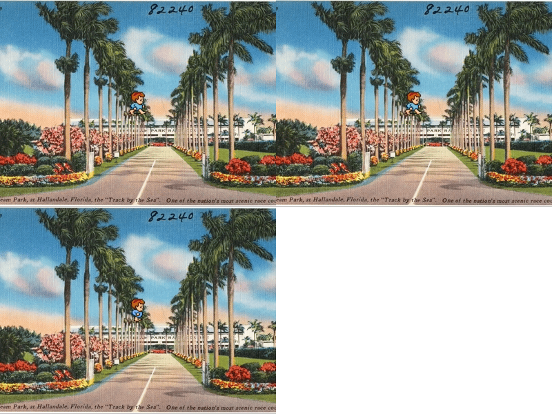
- jez s - who photographed this old postcard used for testing and demos
On the command line:
npm install vue-easeljs --save
In app.js:
Vue.use(require('vue-easeljs'));
Vue-easeljs provides Vue.js with tools to draw on an HTML5 canvas.
Using an HTML5 canvas you can apply JavaScript to draw shapes, create generative art, import images and animations from files, and print text.
Everything you need for drawing to a canvas is available in the browser, but to really get creative, use a library built for the job.
Vue-easeljs is a wrapper to a great library called EaselJS, so you can use it in your Vue.js projects. This allows you to use data-driven programming to achieve art effects.
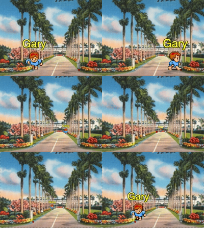
First, meet Gary (they/them).
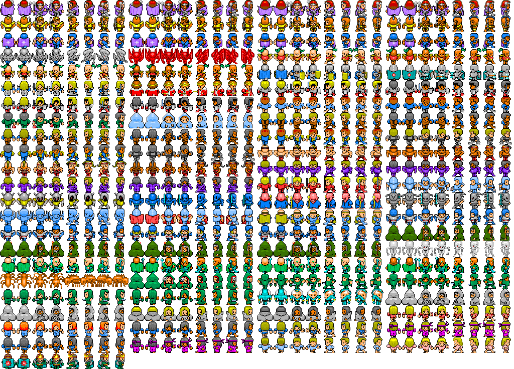
Gary is a sprite. They live in an image called a sprite sheet with all their friends. But we're just going to use Gary today.
First we'll need a canvas:
// Gary.vue
<template>
    <easel-canvas
        style="background-color: grey"
        :width="400"
        :height="300"
    >
    </easel-canvas>
</template>
All of our other elements will go inside the canvas, which controls the boundaries of where we can work.
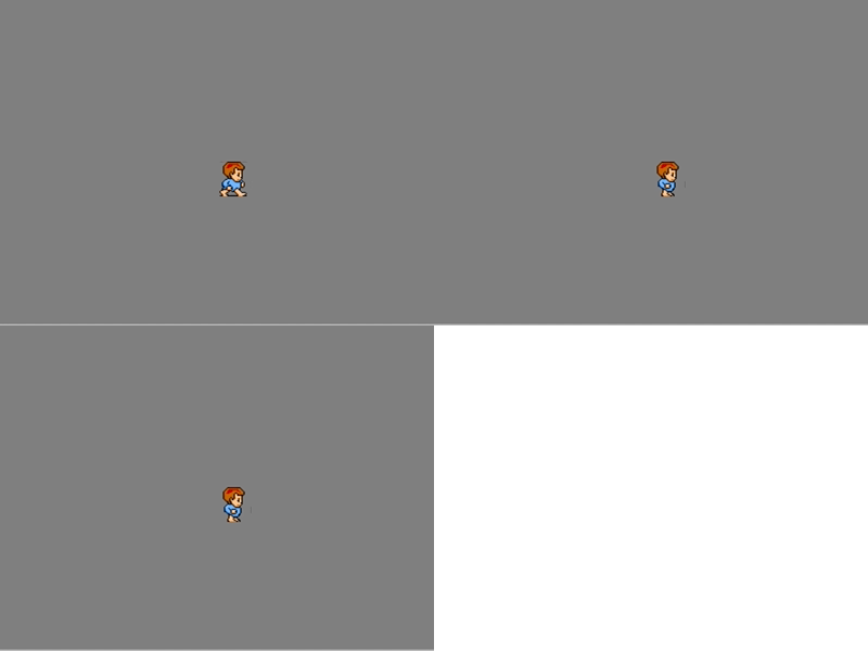
This canvas is 400px wide and 300px tall. We gave it a grey background so that it will stand out from the rest of the page.
Wait, don't leave, it gets better. Let's drop Gary into our grey void.
To do that, we're going to need to bring in Gary's sprite sheet:
// Gary.vue
<template>
    <easel-canvas
        style="background-color: grey"
        :width="400"
        :height="300"
    >
        <easel-sprite-sheet
            :images="['images/lastguardian-all.png']"
            :frames="{width:32, height:32}"
        >
        </easel-sprite-sheet>
    </easel-canvas>
</template>
There's no change yet, that's ok.
This step was to add an easel-sprite-sheet which holds information about
the image we'll use for our sprites. We're using an image called
lastguardian-all.png.
It's full of all the characters and positions we might want to use. We used the
frames attribute to let the easel-sprite-sheet know that each
position, or frame, is 32px wide and 32px tall.
We've got a sprite sheet, but we need a sprite element to use it with:
// Gary.vue
<template>
    <easel-canvas
        style="background-color: grey"
        :width="400"
        :height="300"
    >
        <easel-sprite-sheet
            :images="['images/lastguardian-all.png']"
            :frames="{width:32, height:32}"
            :animations="{walk: [214, 215]}"
        >
            <easel-sprite
                animation="walk"
                :x="200"
                :y="150"
            >
            </easel-sprite>
        </easel-sprite-sheet>
    </easel-canvas>
</template>
There's Gary. Look at them run!
Let's see how Gary works. First, notice that we added animations to the
easel-sprite-sheet. The animation walk uses frames 214 and 215.
If you count 214 frames from the top left corner of lastguardian-all.png,
you'll see Gary in mid-stride facing right. At frame 215, they're in a standing
position.
Next we added easel-sprite and the first attribute we gave it was
animation="walk" to match the easel-sprite-sheet.
We also included x and y coordinates. Setting them to 200 and 150 put Gary
in the middle of our 400 x 300 canvas.
Well, almost the middle...
Gary is slightly off center, because their coordinates identify the position of their top-left corner by default.
Let's get Gary centered. Oh and we need to slow them down:
// Gary.vue
<template>
    <easel-canvas
        style="background-color: grey"
        :width="400"
        :height="300"
    >
        <easel-sprite-sheet
            :images="['images/lastguardian-all.png']"
            :frames="{width:32, height:32}"
            :animations="{walk: [214, 215]}"
            :framerate="30"
        >
            <easel-sprite
                animation="walk"
                :x="200"
                :y="150"
                align="center-center"
            >
            </easel-sprite>
        </easel-sprite-sheet>
    </easel-canvas>
</template>
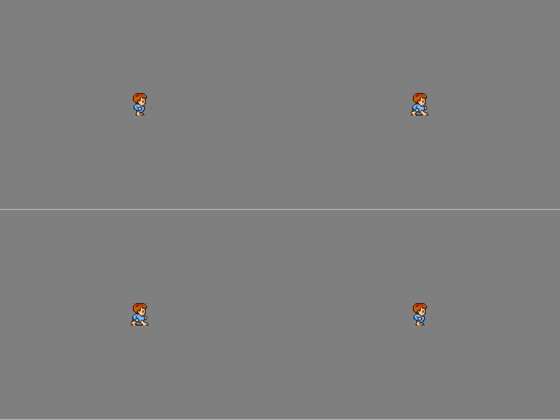
Bingo. By adding align="center-center" we ensured that Gary's center is
now at the x-y coordinates.
When we added :framerate="30" to the easel-sprite-sheet Gary got a little
more mellow.
But even mellow humans were not meant to live in a vacuum. Gary needs a place to visit.
// Gary.vue
<template>
    <easel-canvas
        style="background-color: grey"
        :width="400"
        :height="300"
    >
        <easel-bitmap
            image="images/gulfstream_park.jpg"
            x="200"
            y="150"
            align="center-center"
        >
        </easel-bitmap>

        <easel-sprite-sheet
            :images="['images/lastguardian-all.png']"
            :frames="{width:32, height:32}"
            :animations="{walk: [214, 215]}"
            :framerate="30"
        >
            <easel-sprite
                animation="walk"
                :x="200"
                :y="150"
                align="center-center"
            >
            </easel-sprite>
        </easel-sprite-sheet>
    </easel-canvas>
</template>
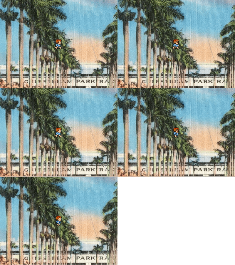
Great! Well... not great.
We've added an easel-bitmap with an image called
gulfstream_park.jpg.
We added it above Gary's code in the file so that it would show up behind
Gary.
It's centered just like Gary is. But it's much too large.
The file is 946px tall, and our canvas is only 300px tall. Let's just use some inline math to scale it down.
// Gary.vue
<template>
    <easel-canvas
        style="background-color: grey"
        :width="400"
        :height="300"
    >
        <easel-bitmap
            image="images/gulfstream_park.jpg"
            x="200"
            y="150"
            align="center-center"
            :scale="300 / 946"
        >
        </easel-bitmap>

        <easel-sprite-sheet
            :images="['images/lastguardian-all.png']"
            :frames="{width:32, height:32}"
            :animations="{walk: [214, 215]}"
            :framerate="30"
        >
            <easel-sprite
                animation="walk"
                :x="200"
                :y="150"
                align="center-center"
            >
            </easel-sprite>
        </easel-sprite-sheet>
    </easel-canvas>
</template>
That looks better. We added :scale="300 / 946" to multiply the image's
height. Down in this case, from 946 to 300.
But Gary is still struggling to get down from that tree.
// Gary.vue
<template>
    <easel-canvas
        style="background-color: grey"
        :width="400"
        :height="300"
    >
        <easel-bitmap
            image="images/gulfstream_park.jpg"
            x="200"
            y="150"
            align="center-center"
            :scale="300 / 946"
        >
        </easel-bitmap>

        <easel-sprite-sheet
            :images="['images/lastguardian-all.png']"
            :frames="{width:32, height:32}"
            :animations="{walk: [214, 215]}"
            :framerate="30"
        >
            <easel-sprite
                animation="walk"
                :x="200"
                :y="275"
                align="bottom-center"
            >
            </easel-sprite>
        </easel-sprite-sheet>
    </easel-canvas>
</template>
Yes! We've changed Gary's y to 275 (trial and error works fine here).
We've also changed their align to "bottom-center". This way we can think of
Gary's position in terms of "where their feet touch the ground". This helps a
lot when we want to resize Gary using scale while keeping their feet in
place.
Check out this Live Demo
using Gary to see more of what you can do with vue-easeljs. In it we change
Gary's scale and position dynamically, add some text that follows Gary around
using an easel-container, use attributes like flip, draw red and
white circles on screen, listen for click events, use transparency, use
anti-aliasing to retain the 8-bit look, and make Gary run around
using Vue properties and a time out.
Show a static image.
Attributes:
| Attribute | Values | Description | Required/Default |
|---|---|---|---|
| align | see alignment | controls what point of the image the x and y refer to. | Default: 'top-left' |
| alpha | 0 to 1 | controls the opacity of the image. | Default: 1, completely opaque |
| cache | boolean | instead of drawing from source constantly, use a cached version of the source | Default: false |
| cursor | string | set the CSS mouse cursor to use when hovering over this bitmap | Default: null |
| filters | see filters | apply filters. | Default: null |
| flip | 'horizontal' | 'vertical' | 'both' | '' | flips the image. | Default: '' |
| image | string | relative or absolute URL to an image file. | Required |
| rotation | degrees | rotates the image. | Default: 0 |
| scale | number | resizes the image. | Default: 1 |
| shadow | see shadow | cast an image-shaped shadow. | Default: null |
| visible | boolean | draw or do not draw the bitmap on canvas | Default: true |
| x | number | horizontal position based on the origin of the parent component. | Default: 0 |
| y | number | vertical position based on the origin of the parent component. | Default: 0 |
Example:
<easel-bitmap
    image="/images/awesome-background.jpg"
    :x="0"
    :y="0"
    :align="['left','top']"
>
</easel-bitmap>Give the vue-easeljs components a place to live. The canvas has no visible pixels of its own.
Attributes:
| Attribute | Values | Description | Required/Default |
|---|---|---|---|
| anti-alias | boolean | whether or not edges should be smoothed on scaled images. | Default: true |
| height | number | the pixel height of the canvas on the page. | Default: 300 |
| width | number | the pixel width of the canvas on the page. | Default: 150 |
| viewport-height | number | the pixel height of the canvas internally. | Default: equal to height |
| viewport-width | number | the pixel width of the canvas internally. | Default: equal to width |
The width and height props control the size of the canvas element on the
page.
The separate viewport-width and viewport-height props control the size of
the canvas internally. For example, a canvas with width and height of 100 can
fully show an element of width and height 50. But the same canvas with
viewport-width and viewport-height set to 40 cannot fully show the same
element.
The viewport-width and viewport-height props are a convenience feature,
allowing a developer to specify subcomponents' pixel sizes at a set size
regardless of the actual size of the canvas. Setting small viewport sizes
will make elements inside appear larger and pixelated, but if those elements
are then scaled down they will not be pixelated. They will regain their
original size and pixelation.
Example:
<easel-canvas width="500" height="100">
    <easel-shape
        form="rect"
        :dimensions="[500,100]"
        :x="0"
        :y="0"
        fill="#CCCCFF"
    >
    </easel-shape>
    <easel-text
        text="This is so easy!"
        :x="250"
        :y="75"
        font="70px Calibri"
        color="white"
        :shadow="['#000088',3,2,3]"
        :align="['center', 'alphabetical']"
    >
    </easel-text>
</easel-canvas>
Group other vue-easel components together and manipulate them as one. The container has no visible pixels of its own.
Attributes:
| Attribute | Values | Description | Required/Default |
|---|---|---|---|
| alpha | 0 to 1 | controls the opacity of the container's contents. | Default: 1, completely opaque |
| cache | boolean | instead of drawing contained element from source constantly, use a cached version of all elements together | Default: false |
| cursor | string | set the CSS mouse cursor to use when hovering over the elements in this container | Default: null |
| filters | see filters | apply filters. | Default: null |
| flip | 'horizontal' | 'vertical' | 'both' | '' | flips the container. | Default: '' |
| rotation | degrees | rotates the container. | Default: 0 |
| scale | number | resizes the container. | Default: 1 |
| shadow | see shadow | cast a shadow of all contained components. | Default: null |
| visible | boolean | draw or do not draw the container's elements on canvas | Default: true |
| x | number | horizontal position based on the origin of the parent component. | Default: 0 |
| y | number | vertical position based on the origin of the parent component. | Default: 0 |
Example:
<easel-container
    flip="horizontal"
    scale=".5"
    :x="250"
    :y="50"
>
    <easel-bitmap
        image="/images/wooden-sign-texture.png"
    >
    </easel-bitmap>
    <easel-text
        text="Dan's Left Shoe Emporium"
        font="50px 'Times New Roman'"
        :y="25"
    >
    </easel-text>
</easel-container>Show a shape.
Attributes:
| Attribute | Values | Description | Required/Default |
|---|---|---|---|
| align | see alignment | controls what point of the shape the x and y refer to. | Default: 'top-left' |
| alpha | 0 to 1 | controls the opacity of the shape. | Default: 1, completely opaque |
| cache | boolean | instead of drawing the shape constantly, use a cached version of the shape | Default: false |
| cursor | string | set the CSS mouse cursor to use when hovering over this shape | Default: null |
| dimensions | Depends on the form. | See below. | Required |
| fill | HTML color | the inside of the shape | Optional. |
| filters | see filters | apply filters. | Default: null |
| flip | 'horizontal' | 'vertical' | 'both' | '' | flips the shape. | Default: '' |
| form | 'circle' | 'ellipse' | 'rect' | 'star' | Required | |
| rotation | degrees | rotates the shape. | Default: 0 |
| scale | number | resizes the shape. | Default: 1 |
| shadow | see shadow | cast a same-shape shadow. | Default: null |
| stroke | HTML color | the outline of the shape. | Optional. |
| visible | boolean | draw or do not draw the shape on canvas | Default: true |
| x | number | horizontal position based on the origin of the parent component. | Default: 0 |
| y | number | vertical position based on the origin of the parent component. | Default: 0 |
Dimensions for:
| Shape | Dimension Type | Format | Value explanation |
|---|---|---|---|
| circle | number | the radius of the circle. | |
| ellipse | array | [w, h] | the width and height of the ellipse. |
| rect | array | [w, h], or [w, h, r], or [w, h, topLeft, topRight, bottomRight, bottomLeft] | the width and height of the rectangle. Optionally include the radius of rounded corners as one value or four. |
| star | array | [r, s, p] | the radius, sides count, and point size of a "star". Use point size 0 to draw a simple polygon. Max point size is 1. |
Example:
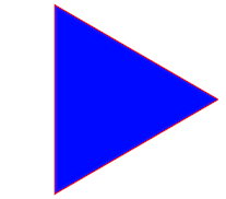
<easel-shape
    form="star"
    :dimensions="[100, 3, 0]"
    fill="blue"
    stroke="red"
    :x="100"
    :y="100"
>Show a moving image. An easel-sprite must reside in an easel-sprite-sheet node. The easel-sprite-sheet defines the animations that can be used by the easel-sprite.
Attributes:
| Attribute | Values | Description | Required/Default |
|---|---|---|---|
| align | see alignment | controls what point of the image the x and y refer to. | Default: 'top-left' |
| alpha | 0 to 1 | controls the opacity of the image. | Default: 1, completely opaque |
| animation | string | name of the animation to run from the easel-sprite-sheet. |
Required |
| cache | boolean | instead of drawing from source constantly, use a cached version of the source | Default: false |
| cursor | string | set the CSS mouse cursor to use when hovering over this sprite | Default: null |
| filters | see filters | apply filters. | Default: null |
| flip | 'horizontal' | 'vertical' | 'both' | '' | flips the image. | Default: '' |
| rotation | degrees | rotates the image. | Default: 0 |
| scale | number | resizes the image. | Default: 1 |
| shadow | see shadow | cast an image-shaped shadow. | Default: null |
| visible | boolean | draw or do not draw the sprite on canvas | Default: true |
| x | number | horizontal position based on the origin of the parent component. | Default: 0 |
| y | number | vertical position based on the origin of the parent component. | Default: 0 |
Example:
See the easel-sprite-sheet example below.
Define image animations for use in a sprite.
Attributes:
| Attribute | Values | Description | Required/Default |
|---|---|---|---|
| animations | object | defines names for animations. Each animation is a series of frames. | Required |
| framerate | number | the speed the animation should play at. | Required |
| frames | mixed | usually an object with format: {width: width, height: height}. | Required |
| images | array | relative or absolute URL's to image files. | Required |
EaselJS provides a lot of options for defining sprite sheets, to allow you to format the images in whatever way suits you.
A sprite sheet is a single image with a set of images on it that will be used in rotation to show an animation.
The friendliest approach is to layout the images in a grid. For example, if a character requires 32x32 pixels to show, you might create a sprite sheet with 10 frames of the character in a 320x32 pixel image. Or a 32x320 image. Or a 160x64 image. Whatever the image size, EaselJS will figure it out based on the width and height you give it.
In that case the following definition will do nicely:
<easel-sprite-sheet
    :images="['/images/character.png']"
    :frames="{width: 32, height: 32}"
    ...
>
But sometimes frames have space between them or margins around them. In these cases, you'll need to specify more information.
In this example, there is space and margin between the frames.
<easel-sprite-sheet
    :images="['/images/lots-of-characters.png']"
    :frames="{width: 32, height: 32, spacing: 5, margin: 10}"
    ...
>
Other times, the frames are different sizes or are on different images.
In that case, this format will be required:
<easel-sprite-sheet
    :images="['/images/thomasChugging.png','/images/thomasBraking.png']"
    :frames="[
        // x, y, width, height, imageIndex
        [0, 0, 64, 32, 0],
        [0, 32, 64, 32, 0],
        ...
    ]"
    ...
>
Animations give names to a series of frames. The name is used in the
easel-sprite component to determine what to show.
The value of an animation is a number, array, or object.
If the animation is just one frame, a number is appropriate.
If the animation is multiple frames laid out in order in the sprite sheet, then the array short form can be used. The first two values are the start and end of the animation. The third value is an optional next animation to begin when this one is done. The fourth is speed.
If the animation uses frames that are not in order, use an object with the
field frames and the optional next and speed.
animations: {
    stand: 0,
    run: [1, 4, "stand"],
    fall: {
        frames: [5, 1, 0, 2],
    },
}
Example:
<easel-sprite-sheet
    :images="['images/lastguardian-all.png']"
    :frames="{width:32,height:32}"
    :animations="{
        stand: 7,
        walk: [6, 7],
        walkAndStand: [6, 7, 'stand'],
        confusion: {
            frames: [5, 1, 0, 2],
        },
    }"
    :framerate="4"
>
    <easel-sprite
        :x="32"
        :y="32"
        animation="walkAndStand"
    >
    </easel-sprite>
>
</easel-sprite-sheet>Show some text.
Attributes:
| Attribute | Values | Description | Required/Default |
|---|---|---|---|
| align | see alignment | controls what point of the text the x and y refer to. | Default: 'top-left' |
| alpha | 0 to 1 | controls the opacity of the text. | Default: 1, completely opaque |
| cache | boolean | instead of drawing constantly, use a cached version of the text | Default: false |
| color | HTML color | the color to use for the text. | Default: 'black' |
| cursor | string | set the CSS mouse cursor to use when hovering over this text | Default: null |
| filters | see filters | apply filters. | Default: null |
| flip | 'horizontal' | 'vertical' | 'both' | '' | flips the text. | Default: '' |
| font | see font | size and family of the font. Format: "Npx family". | Default: ? |
| rotation | degrees | rotates the text. | Default: 0 |
| scale | number | resizes the text. | Default: 1 |
| shadow | see shadow | cast a text-shaped shadow. | Default: null |
| text | string | the text to display. | Required |
| visible | boolean | draw or do not draw the text on canvas | Default: true |
| x | number | horizontal position based on the origin of the parent component. | Default: 0 |
| y | number | vertical position based on the origin of the parent component. | Default: 0 |
Example:
<easel-text
    text="The Ran In Span Falls Manly On The Plan"
    :x="250"
    :y="32"
    font="20px Arial"
    color="red"
>
</easel-text>All visible components can accept an align attribute. The align attribute
defaults to 'top-left'.
The values refer to where the x, y coordinates should lie in reference to the rest of the object.
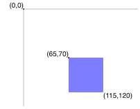
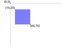
For example, if a 50x50 square shape is aligned at 'top-left', and its x and y are at 65, 70, then the square's top left point will be at 65, 70 and its bottom right point will be at 115, 120.
If the same square was aligned at 'bottom-right', then it's bottom right point would be at 65, 70 and its top left point would be at 15, 20.
The field can be either a string or an array.
As a string it is formatted as 'vertical-horizontal'.
As an array it is formatted as [vertical, horizontal].
Most components have these alignment options:
- vertical: top, center, bottom
- horizontal: left, center, right
The easel-text component has extra alignment options:
- vertical: top, hanging, middle, alphabetic, ideographic, bottom
- horizontal: start, end, left, right, center
These are described in the whatwg spec for HTML5 canvases. In cases of text with multiple lines, the horizontal alignment value applies to every line.
Note: For backwards compatibility, the horizontal and vertical parts of the string or array can be reversed. Future major versions will obsolete this option.
The cache attribute is a boolean.
When caching is active, a rasterized version of the element is created in memory and used instead of the source material that the element uses. The element essentially becomes an EaselBitmap.
Many of an element's props will cause a cache refresh when they are changed.
The props alpha, flip, rotation, shadow, x, and y are applied to
an element after caching and will not cause a cache refresh. However, if an
element is part of a cached EaselContainer, changing those props on the child
element will refresh the container's cache.
An animated sprite will refresh the rasterized image on each frame change.
And so a cached element should behave no differently from a non-cached element in most respects.
The difference is that caching has an impact on performance. In many cases it increases an element's speed, but if the cache needs to refresh often it can decrease speed.
Filters process a visual element's pixels, applying adjustments after the element is rasterized and before it is rendered on canvas.
The filters attribute is an array of arrays. Each filter array consists of
the name of a filter followed by parameters.
Several filters can be applied to the same element.
Supplying filters forces cache to be true.
This library comes pre-built with several filters.
Blur an element. Applies to shadows as well.
['BlurFilter', x, y, quality]
| Parameter | Range | Default | |
|---|---|---|---|
| x | horizontal bluriness | 0 - Infinity | 0 |
| y | vertical bluriness | 0 - Infinity | 0 |
| quality | the number of blur iterations | 0 - Infinity | 1 |
Systematically change the coloring of an element. Applies before shadowing is done. Use inside a container to include shadow.
['ColorFilter', rX, gX, bX, aX, rO, gO, bO]
| Parameter | Range | Default | |
|---|---|---|---|
| rX | red multiplier | 0 to 1 | 1 |
| gX | green multiplier | 0 to 1 | 1 |
| bX | blue multiplier | 0 to 1 | 1 |
| aX | alpha multiplier | 0 to 1 | 1 |
| rO | red offset | -255 to 255 | 0 |
| gO | green offset | -255 to 255 | 0 |
| bO | blue offset | -255 to 255 | 0 |
Adjust the brightness, contrast, saturation, and hue of an element.
['ColorMatrixFilter', brightness, contrast, saturation, hue]
| Parameter | Range | Default | |
|---|---|---|---|
| brightness | add to the brightness | -255 - 255 | undefined - no change |
| contrast | add to the contrast | -100 - 100 | undefined - no change |
| saturation | add to the saturation | -100 - 100 | undefined - no change |
| hue | add to the hue | -180 - 180 | undefined - no change |
Add a pixelated stroke around the element.
['PixelStrokeFilter', [r, g, b, a]]
| Parameter | Range | Default | |
|---|---|---|---|
| color | color of stroke as array of red, green, blue, alpha | array, values 0 - 255 | [0, 0, 0, 255] |
The underlying library EaselJS has two more filters -- AlphaMapFilter and
AlphaMaskFilter -- that are not
yet available, because their use requires complicated access to canvases. The
idiom of this library is that you should never have to access a canvas. In the
future this library should provide an <easel-mask> element to do masking,
making those filters unnecessary.
Create new filters by registering a class with the VueEaseljs library at
runtime using VueEaseljs.registerFilter.
See further documentation on Custom filters.
Example:
const VueEaseljs = require('vue-easeljs');

class MyFilter {

    constructor(value1, value2) {
        ...
    }

    adjustContext(ctx, x, y, width, height, targetCtx, targetX, targetY) {
        ...
    }
}

VueEaseljs.registerFilter('MyFilter', MyFilter);The font attribute is a string that controls the family, size, and weight of
text in an easel-text component.
The string is mostly compatible with the CSS font property with some changes.
In most cases it must include the font size and font family.
Example: "16px Garamond"
It can optionally include any of font style, font variant, font weight, and font stretch, in that order, before the font size.
Example: "italic small-caps bold 16px cursive"
All visible components can drop a shadow with an optional shadow attribute.
The field is formatted as [color, xOffset, yOffset, bluriness].
Shadow options:
- color: HTML color
- xOffset: number
- yOffset: number
- bluriness: number
All visible components and the canvas itself emit Vue.js events with an event object.
| Event | Fired when... |
|---|---|
| added | Fired when the component is added to its parent. |
| animationend | Fired when an animation completes. (easel-sprite only) |
| change | Fired when an animation changes. (easel-sprite only) |
| click | Fired when the component is clicked or tapped. |
| dblclick | Fired when the component is double-clicked or tapped. |
| mousedown | Fired when the component is clicked down. |
| mouseout | Fired when the mouse leaves a component's hit area. |
| mouseover | Fired when the mouse enters a component's hit area. |
| pressmove | Fired when the component is dragged. |
| pressup | Fired when the component is unclicked. |
| removed | Fired when the component is removed from its parent. |
| rollout | Fired when the mouse leaves a component's hit area. |
| rollover | Fired when the mouse enters a comopnent's hit area. |
| tick | Fired many times a second to keep the components in sync. Using this event can impact performance. |
Modifiers such as .stop usually work with the events.
For performance reasons, the events are only emitted if a handler exists. They will not show up in the Vue.js devtools if no handler exists.
Chrome/Chromium Users:
- When developing locally, Chrome limits canvas access to local image files. They can be viewed but click events will error out unless Chrome is opened with the
--allow-file-access-from-filesflag. But be careful, since this flag opens your system up to some danger if the scripts you run on your page are untrustworthy. This is a limitation of canvas that applies to all canvas libraries.
All users:
- When accessing image files from other hosts, CORS must be setup on the foreign host or else click events will error out. This is a limitation of canvas that applies to all canvas libraries.
The EaselJS documents can be helpful. They are essential if you intend to fork this repo and make pull requests.
These will be implemented in future releases:
- Percentages
- Pre-load images
- Masks
- Mouse cursors
- Hit areas
There are no plans to implement these features that EaselJS provides, but pull requests are accepted:
- BitmapText
- Buttons
- Complex Vector Paths
- MovieClip
If you find a bug or want to contribute to the code or documentation, you can help by submitting an issue or a pull request.

