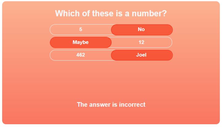
Button styled component to display a question, an interactive series of toggled answers and a result statement.
The component is intended as a recreation demo of existing component at Seneca Learning.
To use this component, fork/download the repo, install dependencies and run the webpack development server as below.
npm install --save-dev
npm run dev- Dynamically adapts to new questions and answers
- Adapts to varying number of answers
- Animated toggles
- Component dynamically changes colour depending on answer
Component shown with correct answer
Component shown with incorrect answer
For this demo, the component is passed props with a question and an array of answer objects. The answer objects are given a value and boolean to indicate the correct answer. The answers should be in pairs with one true and one false per toggle.
To change the question/answers displayed, pass 'question' and 'answers' props to the component in this format:
question = "Your question here"

answers =
  [
    {
        "value": "Answer 1",
        "correct": true/false
    },
    {
        "value": "Answer 2",
        "correct": true/false
    }
  ]
Visit http://seneca.io for more information on Seneca Learning
[License detail to go here]

