📉 Hand drawing style charts library for Python.
chart.xkcd is an interesting visualization library written in Javascript, the chart style of chart.xkcd is so cute that I love it at first sight.
There is no doubt that Javascript has more advantages in interaction as well as visual effect. Besides that, as we all know, Python is an expressive language and is loved by data science community. Hence I want to combine the strength of both technologies, as the result of this idea, cutecharts.py is born.
Unfortunately, chart.xkcd only supports a few chart types as a visualization libraray, thus if you have more needs in various kind of chart, pyecharts is better.
What's worth pointing out is that cutecharts is more about a library used to learn how to combine Javascript world with Python/notebook. The project structure of cutecharts is the same as pyecharts and it supports all core features with pyecharts while being more lightweight also more concise overall.
The aim of this project is showing others that it's not difficult to write a pyecharts-like project. In fact, pyecharts does have no magic in its source code. As a member of Python cummunity, I sincerely hope more and more developers can use their creativity to make lots of related projects for our favorite Python world.
pip install
$ pip(3) install cutechartsinstall from source
$ git clone https://github.com/cutecharts/cutecharts.py.git
$ cd cutecharts.py
$ pip install -r requirements.txt
$ python setup.py install- charts: docs/charts.md
- components: docs/components.md
- changelog: docs/changelog.md
from cutecharts.charts import Line


chart = Line("某商场销售情况")
chart.set_options(
    labels=["衬衫", "毛衣", "领带", "裤子", "风衣", "高跟鞋", "袜子"],
    x_label="I'm xlabel",
    y_label="I'm ylabel",
)
chart.add_series("series-A", [57, 134, 137, 129, 145, 60, 49])
chart.add_series("series-B", [114, 55, 27, 101, 125, 27, 105])
chart.render()
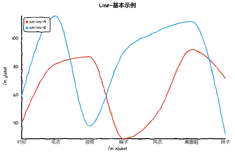
And the render.html is rendered as below. Isn't that cool!
There are some jupyterlab details that you should pay attention to.
# 1. imoport this on the top.
from cutecharts.globals import use_jupyter_lab; use_jupyter_lab()

# 2. call the `load_javascript` function when you renders chart first time.
chart.load_javascript()All demo codes are under examples directory.
$ pip install -r tests/requirements.txt
$ testTravis CI and AppVeyor is place for continuous integration.
flake8, Codecov and pylint are used.
MIT ©chenjiandongx


