-
Notifications
You must be signed in to change notification settings - Fork 6.7k
New issue
Have a question about this project? Sign up for a free GitHub account to open an issue and contact its maintainers and the community.
By clicking “Sign up for GitHub”, you agree to our terms of service and privacy statement. We’ll occasionally send you account related emails.
Already on GitHub? Sign in to your account
Outer md-button-toggle within md-button-toggle-group do not have round corners when selected or disabled #6689
Comments
|
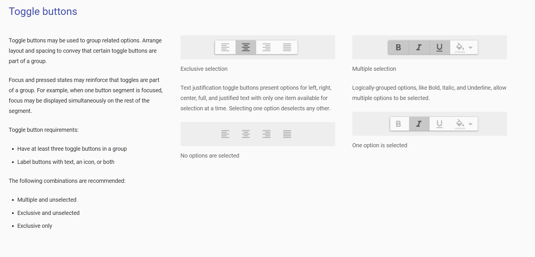
I made this screenshot from the docs example page https://material.angular.io/components/button-toggle/examples . I just set a dark background color to highlight the issue. But what is different in my expected behavior to MD specs? Found a better fix for that issue: |
|
@MA-Maddin Nothing, you're right. Your initial screenshot just looked like a screenshot from the specs to me. |
As per Material Design specifications, the button-toggle group should always have a border radius.

This behavior has been implemented in the `md-button-toggle-group` component, but does not work properly if an option is selected or disabled. This happens because selected and disabled button-toggles receives a background color, which overflows the clipped button-toggle-group.

Fixes angular#6689
As per Material Design specifications, the button-toggle group should always have a border radius.

This behavior has been implemented in the `md-button-toggle-group` component, but does not work properly if an option is selected or disabled. This happens because selected and disabled button-toggles receives a background color, which overflows the clipped button-toggle-group.

Fixes #6689
As per Material Design specifications, the button-toggle group should always have a border radius.

This behavior has been implemented in the `md-button-toggle-group` component, but does not work properly if an option is selected or disabled. This happens because selected and disabled button-toggles receives a background color, which overflows the clipped button-toggle-group.

Fixes #6689
|
This issue has been automatically locked due to inactivity. Read more about our automatic conversation locking policy. This action has been performed automatically by a bot. |

Bug, feature request, or proposal:
Bug
What is the expected behavior?
Proper styling (round corners) of
md-button-togglewithinmd-button-toggle-groupWhat is the current behavior?
Outer buttons do not have round corners when selected or disabled
What are the steps to reproduce?
https://material.angular.io/components/button-toggle/examples
What is the use-case or motivation for changing an existing behavior?
Comply with Material Design specs
Which versions of Angular, Material, OS, TypeScript, browsers are affected?
Material 2.0.0-beta.8
Google Chrome Version 60.0.3112.113 (Offizieller Build) (64-Bit)
Firefox 55.0.3 (64-Bit)
Is there anything else we should know?
This fixes the styling:
The text was updated successfully, but these errors were encountered: