-
Notifications
You must be signed in to change notification settings - Fork 383
New issue
Have a question about this project? Sign up for a free GitHub account to open an issue and contact its maintainers and the community.
By clicking “Sign up for GitHub”, you agree to our terms of service and privacy statement. We’ll occasionally send you account related emails.
Already on GitHub? Sign in to your account
Improve styling of Compatibility Tool pages #1462
Conversation
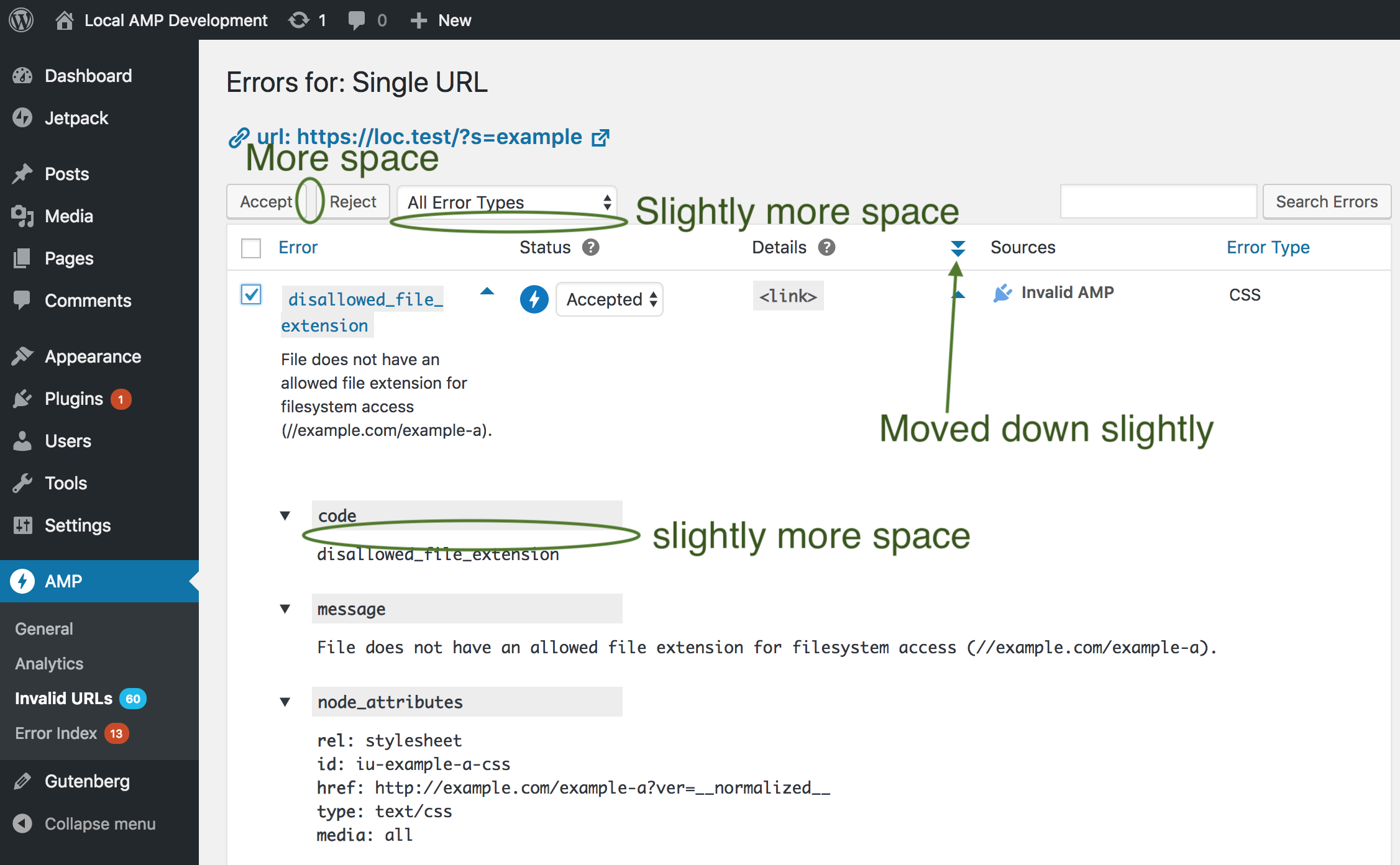
* Add more space between the list table and the fiter and search box
* Vertically center the 'double-caret' in the 'Details' column
* Add space between 'Accept' and 'Reject' buttons.
In expandable 'Details' section,
add space between <summary> and div.detailed
As Jill mentioned, this looks narrow,
especially when expanding the details column.
This 30% width might have to change, though.
|
7df5837 widens the 'Error' column: |
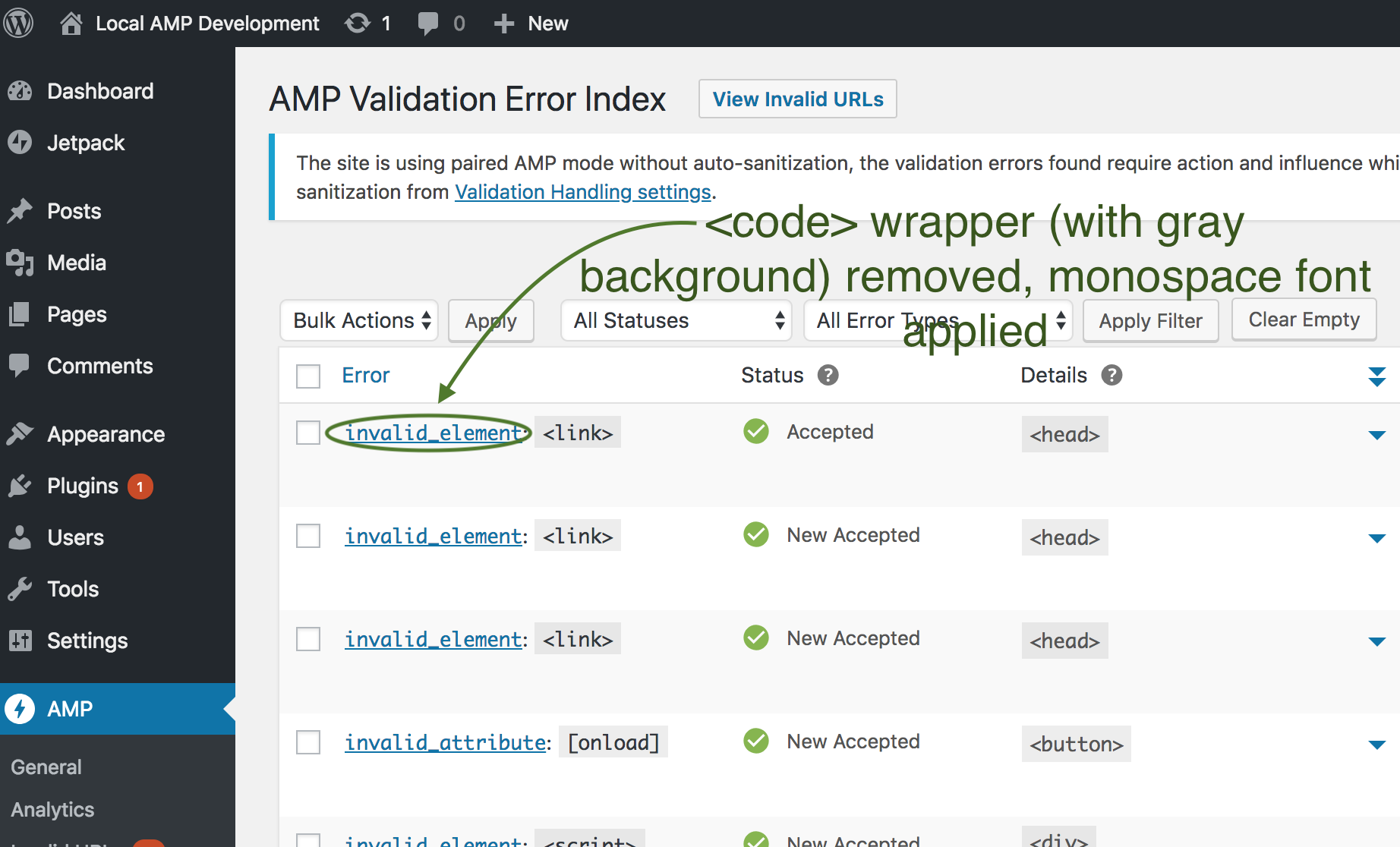
Also, apply the monospace font that
this had when it was wrapped in <code>.
This will make it clearer that one can
click to expand this,
just like clicking in the 'Error' column.
|
9fdd697 removes the |
|
e69d2f1 adds |
Per the designs, this applies the 'divider.'
There are about 20px on either side of it,
per a design decision to make this space similar
to that on /wp-admin/edit.php?post_type=page,
between 'Apply' and 'All dates.'
Before, this was the AMP icon.
This was requested to change,
to be like the green checkmark on the
AMP Validation Error Index page.
|
22c654d changes the 'Accepted' icon on the single error URL page to be the green checkmark, like on the AMP Validation Error Index page: |
* In single error URL 'Status' box
* On 'Invalid URLs' page in 'Status' column
|
b204f46 reduces the space between these items in the 'Status' box: |
As a result of design discussion,
change this to a darker shade of red.
…ottom

This will give more vertical space between each item,
as a result of design feedback.
To match the design,
the 'Reject this validation error' notice
is now moved from below the details box to above it.
Also, there is less space between the boxes.
As a result of design feedback,
this is now bigger,
to be closer to the font-size of h1.wp-heading-inlin
|
e4b00e7 uses a darker version of red for the 'Invalid' column, to improve accessibility: |
Applies to:
* Single error taxonomy page
* Invalid URLs page
A result of design feedback.
|
b07bdbe moves the dates filter to the right on the 'Invalid URLs' page and the single error term page: |
Before, there was a padding-bottom that applied to the icon
But this isn't needed here.
So add a style rule to set it to 0.
There was a problem hiding this comment.
Choose a reason for hiding this comment
The reason will be displayed to describe this comment to others. Learn more.
@kienstra This looked good based on the demo you gave. Is there anything else here prior to merge?
|
Hi @westonruter, this is ready for review. There still might be more styling changes much later today or tomorrow, but there's no reason this can't be reviewed now. |
|
@kienstra The code looks good. So let me know when it's ready to merge. |
|
Thanks, @westonruter. I think it's ready to merge now. Any new styling changes much later today or tomorrow could be in a new PR. |


<summary>and div.detailed