-
Notifications
You must be signed in to change notification settings - Fork 327
New issue
Have a question about this project? Sign up for a free GitHub account to open an issue and contact its maintainers and the community.
By clicking “Sign up for GitHub”, you agree to our terms of service and privacy statement. We’ll occasionally send you account related emails.
Already on GitHub? Sign in to your account
Add summary list component #1065
Conversation
61fced3
to
5283ce5
Compare
|
I'm wondering if we should rename the classes to something like @dashouse can we only include modifiers that we know are needed for check your answers? Additionally, can we just always do the break wrap behaviour? I'm worried that in the real world it's not realistic for people to conditionally apply classes based on content. This would also mean users of zoom text, would always have the actions on the left. |
|
I think there was some desire to get away from the "key value pairs" name, I'm not sure if that extends to class names too but I'm not precious about any of it. Regarding the wrapping as default, let me talk to Joe as I think he designed it originally. The only reason I didn't do this was that the current pattern doesn't. The modifiers were there to make it meet the needs for more than 'Check answers', although I'm not sure we need the text align one as that would be an easy modification to make for someone / could be a universal override. p.s. Looking good, I think a few of the CSS changes you've made have changed the spacing a little. We can go through this when we're in the same room if that's easier. |
|
Just to note https://developer.mozilla.org/en-US/docs/Web/HTML/Element/datalist |
|
Current screenshot for interested onlookers: https://govuk-frontend-review-pr-1065.herokuapp.com/components/data-list |
|
I went through the API proposal with the development team and we agreed with the current approach. API proposals discussedClasses functionality, now: {{ govukDataList({
"keyClasses": "govuk-!-width-one-half",
"valueClasses": "govuk-!-width-one-quarter",
"actionsClasses": "govuk-!-width-one-half",
"rows": [
{
"key": "Name",
"text": "Firstname Lastname",
"actions": [
{
"href": "#",
"text": "Edit"
},
{
"href": "#",
"text": "Delete"
}
]
}
]
}) }}Alternatives: {{ govukDataList({
"rows": [
{
"key": {
classes: 'key-class',
text: "Name"
},
"value": {
classes: 'value-class',
"text": "Sarah Philips"
},
"actions": {
classes: 'actions-class',
items: [
{
"href": "#",
"text": "Change"
}
]
}
]
}
]
}) }}or maybe {{ govukDataList({
"rows": [
{
"keyClasses": "govuk-!-width-one-half",
"key": "Name",
"classes": "govuk-!-width-one-quarter",
"text": "Firstname Lastname",
"actionsClasses": "govuk-!-width-one-half",
"actions": [
{
"href": "#",
"text": "Edit"
},
{
"href": "#",
"text": "Delete"
}
]
}
]
}) }}I think by nesting it's more verbose but allows us to allow for text/html consistently too? |
e5df553
to
562434e
Compare
8adbdd6
to
a817b3c
Compare
|
Tested in assistive technologies and they're all consistent with the Prototype Kit but I wonder if we do want this behaviour... VoiceOver OSX: Links read "name Change" when I expected "Change name", this might be consistent with #1096 NVDA 2018: "Change name" On iPhone this is worse since it doesnt read out the visually hidden text at all... |
|
Without more investigation and thinking I'm not sure I can make a decision on if this should ship as is, it is consistent with the GOV.UK Prototype Kit implementation. Ideally I think we should talk to the accessibility team and try to come up with how we might resolve the general issue of our I don't believe there's any hard deadline for this component, so it could wait until we've figured out the best way to proceed. Alternatively we could change how this component works to use ARIA, by replacing 'visuallyHiddenText' with 'accessibleName' as follows: {
text: 'Change',
accessibleName: 'Change name' // see https://www.w3.org/TR/accname-1.1/
}<a href="#" aria-label="Change name">Change</a> |
29cfc1b
to
cbee09e
Compare
|
@NickColley Thanks, of course. This will just work now, just moved the margin cbee09e |
|
Based on the results of #1096 I think we should stick with the current approach, we can improve this in the future if we want to, so this is ready for final review. |
There was a problem hiding this comment.
Choose a reason for hiding this comment
The reason will be displayed to describe this comment to others. Learn more.
There's one minor issue with one of the examples.
Otherwise this generally looks great 👍 Top work 👏
| text: Find | ||
| - href: '#' | ||
| text: View | ||
| - href: '#' |
There was a problem hiding this comment.
Choose a reason for hiding this comment
The reason will be displayed to describe this comment to others. Learn more.
Minor – this last link doesn't have any text, so you get an empty link at the end of the actions.
| actions: | ||
| items: | ||
| - href: '#' | ||
| text: Buy |
There was a problem hiding this comment.
Choose a reason for hiding this comment
The reason will be displayed to describe this comment to others. Learn more.
😆👌
There was a problem hiding this comment.
Choose a reason for hiding this comment
The reason will be displayed to describe this comment to others. Learn more.
Amazing work @NickColley & @dashouse!!
|
great work everyone :) |


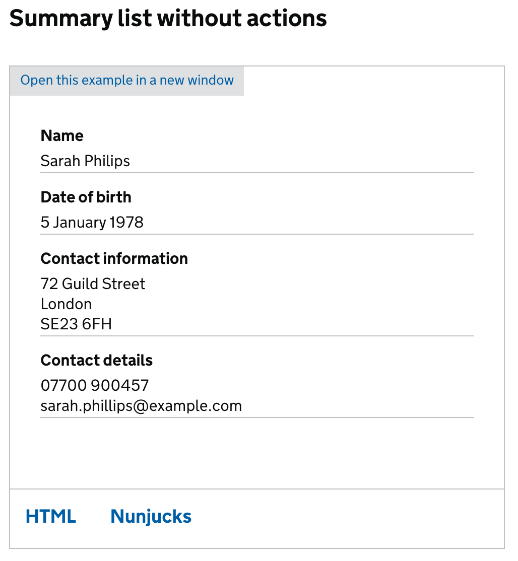
This component was initially developed to allow us to build the
'check your answers' pattern.
It is mostly the same as in the original pattern with some notable differences:
Review
Review application: https://govuk-frontend-review-pr-1065.herokuapp.com/components/summary-list
Original GOV.UK Prototype Kit implementation: https://govuk-prototype-kit.herokuapp.com/docs/templates/check-your-answers
Todo
htmlhttps://trello.com/c/kh2atSrd/1612-add-summary-list-component-to-govuk-frontend-pair