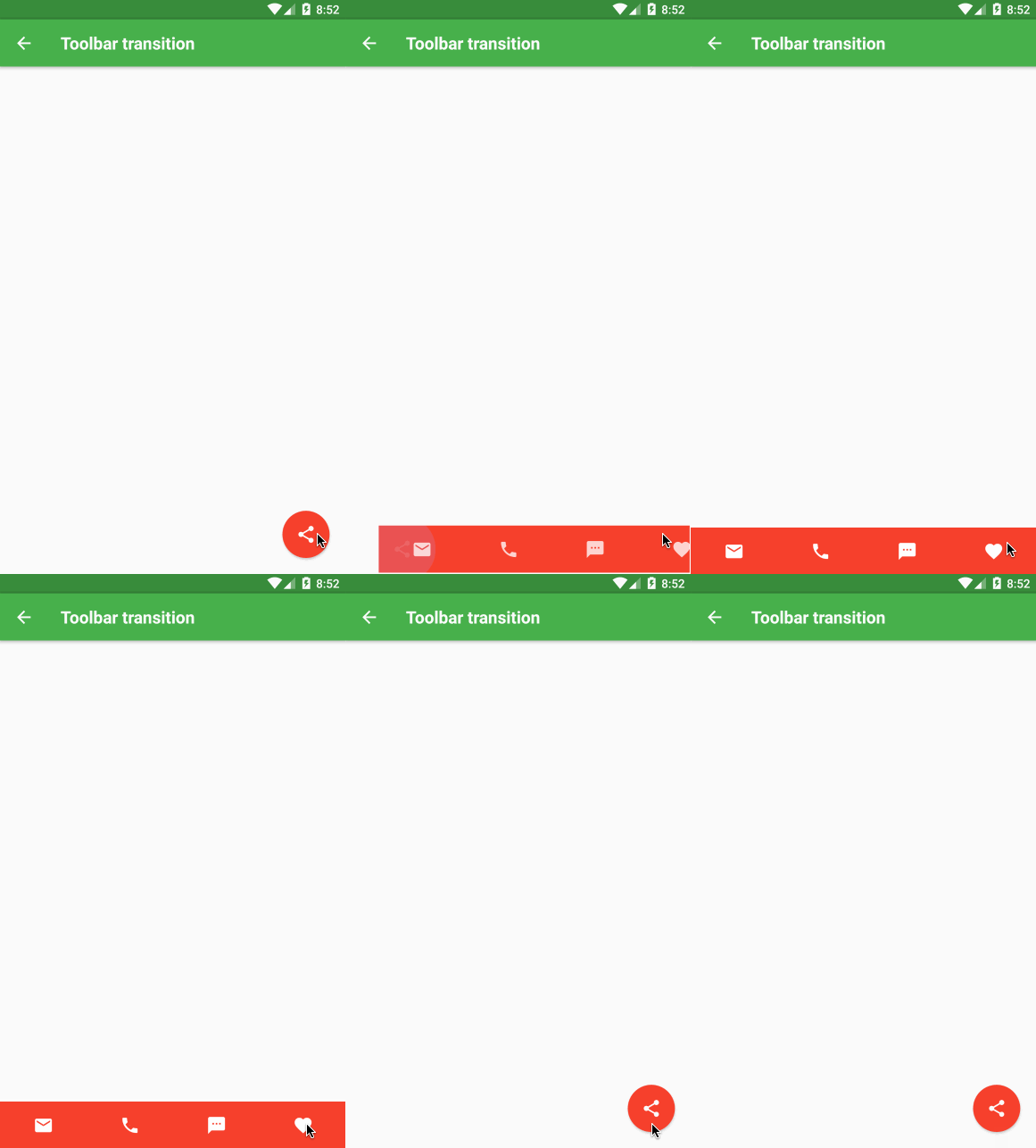
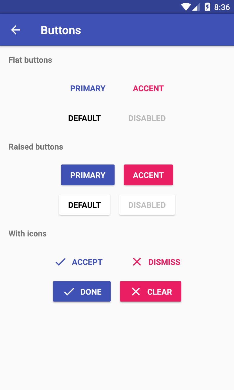
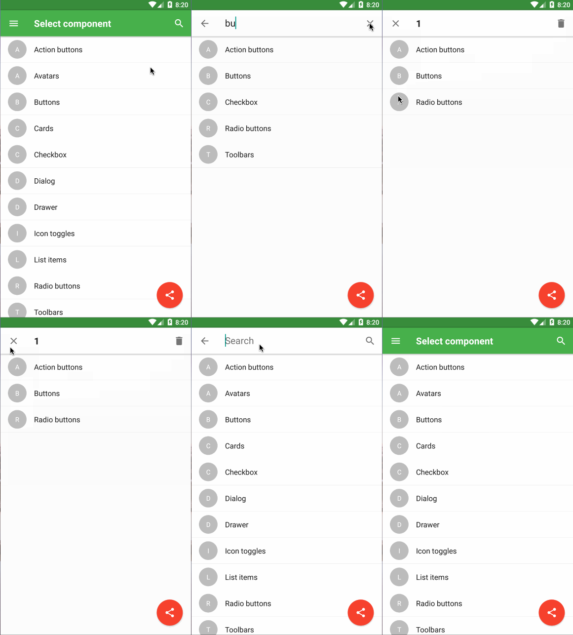
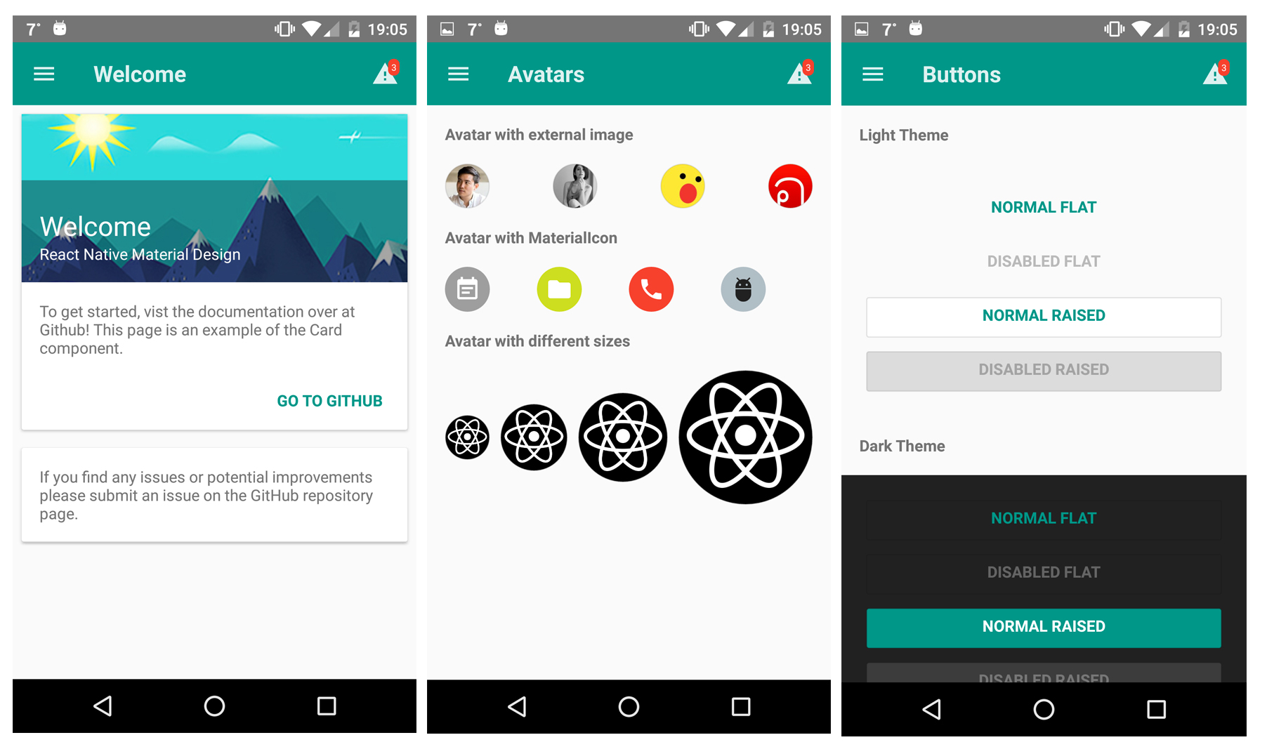
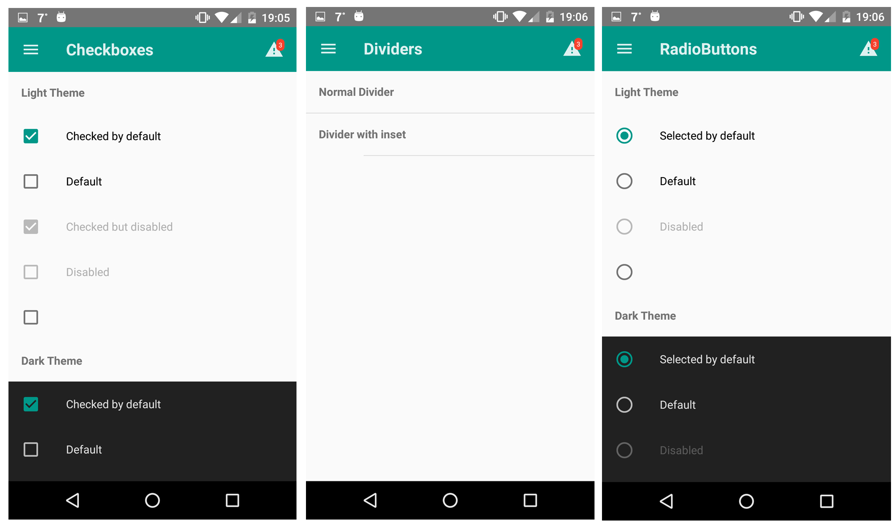
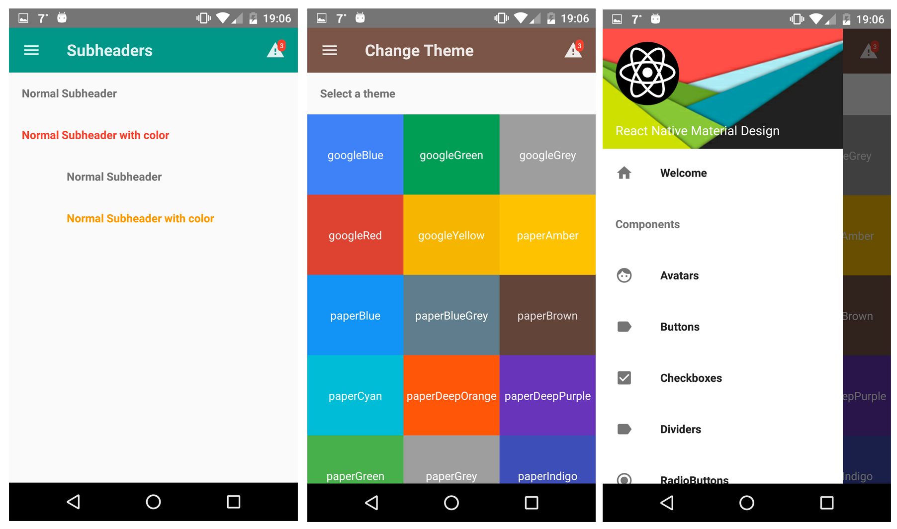
Highly customizable material design components for React Native!
$ npm i react-native-material-ui --saveYou can see this repo for much more information.
Make sure you have atleast v0.31.0 react-native version.
$ react-native link react-native-vector-iconsAndroid (see original)
Copy the MaterialIcons font file from react-native-vector-icons to your local working directory:
./node_modules/react-native-vector-icons/Fonts/MaterialIcons.ttf -> ./android/app/src/main/assets/fonts.
iOS (see original)
This project uses Roboto as the main font for text. Make sure to add Roboto to your project, as it will give the following error on iOS.
Unrecognized font family Roboto.
You can obtain Roboto free from here.
Here is a great tutorial which shows how to add custom fonts.
To achieve the level of customizability, React Native Material UI is using a single JS object called uiTheme that is passed in via context. By default, this uiTheme object is based on the lightTheme that you can find here. So, you can change almost everything very easily.
The uiTheme object contains the following keys:
spacing: {} // can be used to change the spacing of components.
fontFamily: {} // can be used to change the default font family.
palette: {  // can be used to change the color of components.
    primaryColor: blue500,
    accentColor: red500,
    ...
}
typography: {} // can be used to change the typography of components
// you can change style of every each component
avatar: {}
button: {}
toolbar: {}
...
import React, { Component } from 'react';
import { Navigator, NativeModules } from 'react-native';

import { COLOR, ThemeProvider } from '../react-native-material-ui';

// you can set your style right here, it'll be propagated to application
const uiTheme = {
    palette: {
        primaryColor: COLOR.green500,
    },
    toolbar: {
        container: {
            height: 50,
        },
    },
};

class Main extends Component {
    render() {
        return (
            <ThemeProvider uiTheme={uiTheme}>
                <App />
            </ThemeProvider>
        );
    }
}
It means, if you want to change primary color of your application for example. You can just pass to ThemeProvider object with your own settings. Your settings will be merged with default theme.
Another great feature is, you can use the uiTheme everywhere. Even in your own components. So if you built your own implementation of Button for example, look how you can get the primary color.
import ...

const contextTypes = {
    uiTheme: PropTypes.object.isRequired,
};

class MyButton extends Component {
    render() {
	    // it's really easy to get primary color everywhere in your app
        const { primaryColor } = this.context.uiTheme.palette;

        return ...
    }
}

export ...Of course, sometimes we need to change style of only one component. It means, all buttons have red background, but facebook login button that should have blue background. Every each component have style property. So you can very easily override whatever you want.
<Button style={{ container: { backgroundColor: 'blue' }}} />Note: You have to allow the animations for Android (see React Native's documentation)
UIManager.setLayoutAnimationEnabledExperimental &&
UIManager.setLayoutAnimationEnabledExperimental(true);You can try our Demo App!
Here is a list of all component included in this library. (I'm working on documentation for every each component. Be patient please :))


