-
Notifications
You must be signed in to change notification settings - Fork 4.3k
New issue
Have a question about this project? Sign up for a free GitHub account to open an issue and contact its maintainers and the community.
By clicking “Sign up for GitHub”, you agree to our terms of service and privacy statement. We’ll occasionally send you account related emails.
Already on GitHub? Sign in to your account
Add "Text & Image" Block #9416
Add "Text & Image" Block #9416
Conversation
8e556ed to
83f545d
Compare
83f545d to
5b0e620
Compare
| }, | ||
|
|
||
| supports: { | ||
| align: [ 'center', 'wide', 'full' ], |
There was a problem hiding this comment.
Choose a reason for hiding this comment
The reason will be displayed to describe this comment to others. Learn more.
Why is center alignment supported? What would that even do for this block?
There was a problem hiding this comment.
Choose a reason for hiding this comment
The reason will be displayed to describe this comment to others. Learn more.
By default, we have a wide alignment for this block the block goes out of the content area if the user does not want that, the center alignment (the default on most other blocks) can be used.
There was a problem hiding this comment.
Choose a reason for hiding this comment
The reason will be displayed to describe this comment to others. Learn more.
@jorgefilipecosta Center is not the default alignment for most blocks. No alignment is the default alignment for most blocks. There is a difference. The Columns block supports wide and full alignments but not the center alignment because the center alignment does not do anything for it.
There was a problem hiding this comment.
Choose a reason for hiding this comment
The reason will be displayed to describe this comment to others. Learn more.
The approach I was trying to follow of using center align was a way to unset the alignment is confusing I followed your suggestion and used just wide and full alignments for things to work correctly I needed to apply some engine fixes: #9634
| const MEDIA_POSITIONS = [ 'left', 'right' ]; | ||
| const ALLOWED_BLOCKS = [ 'core/button', 'core/paragraph', 'core/heading', 'core/list' ]; | ||
| const TEMPLATE = [ | ||
| [ 'core/paragraph', { fontSize: 'large', placeholder: 'Content...' } ], |
There was a problem hiding this comment.
Choose a reason for hiding this comment
The reason will be displayed to describe this comment to others. Learn more.
This should use an ellipsis (…) rather than 3 periods.
| </InspectorControls> | ||
| <BlockControls> | ||
| <BlockAlignmentToolbar | ||
| controls={ MEDIA_POSITIONS } |
There was a problem hiding this comment.
Choose a reason for hiding this comment
The reason will be displayed to describe this comment to others. Learn more.
Is there a way to give the media position options different labels from the standard block alignment toolbar? They should probably say "Show media on left" and "Show media on right".
|
Love the most recent changes. This is going to be a great block. Love:
It's delicious! The drag handle to resize needs a little love. Can we make sure the drag handle is only visible when the block is selected first? In addition to this, can we change it to use the same resizing handle that images do? I.e. instead of this: We do this: And instead of this: We do this: I'd also personally be okay if the placeholder spot wasn't resizable, and it wasn't until a media item was added that the resize handle appeared. But it's fine either way. |
8b273d2 to
b6e8d13
Compare
|
Thank you for your reviews @ZebulanStanphill and @jasmussen all the concerns were addressed :) |
|
This is really nice, I'm digging this block a lot: However, possibly a rebase issue, but I'm seeing the title spot way smaller font size than in master: Actually that's also in master.. I will investigate that separately. But 👍 👍 on the design! All this needs is a code review update and good to go I'd say. |
b6e8d13 to
80070df
Compare
80070df to
be42a10
Compare
0aa257b to
4a26026
Compare
There was a problem hiding this comment.
Choose a reason for hiding this comment
The reason will be displayed to describe this comment to others. Learn more.
Some small remarks, but overall, looking good to me.
I'd suggest doing a quick test in IE11 and ship.
d71e64b to
33db45f
Compare
33db45f to
e58c3c8
Compare
|
I am trying to recreate these sections using the block: http://edwien.no/publikasjoner/ Image has space above and below. Heading aligns somewhat to the top of the image. Text links aligns somewhat to the bottom of the image. In the frontend it looks like this (clicking the preview button): The frontend will show the image nudged up top, left and it is going below the edge of the box. Here it might be good to be able to set the height of the block through the block setting. |
|
Testing it today, I wasn't sure why I wasn't able to add a Quote block in the Text container. |
…0913)

## Description
Fixes: #10895
On unified toolbar mode, it was not possible to resize the media on Media & Text block.
During the elaboration of #9416 this bug was addressed but I think during subsequent rebases and changes more concretely the usage of our abstracted Resizable box we had a regression.

This PR applies exactly the same fix that was applied in spacer block to the Media & Text block.


## How has this been tested?
I checked it is possible to resize the media in Media & Text block in all modes including the unified toolbar.
…0913)

## Description
Fixes: #10895
On unified toolbar mode, it was not possible to resize the media on Media & Text block.
During the elaboration of #9416 this bug was addressed but I think during subsequent rebases and changes more concretely the usage of our abstracted Resizable box we had a regression.

This PR applies exactly the same fix that was applied in spacer block to the Media & Text block.


## How has this been tested?
I checked it is possible to resize the media in Media & Text block in all modes including the unified toolbar.
|
Hi guys, I certainly don't want to sound disrespectful, that's not my intention here. I just have feeling this block might be kind of redundant. You see, if Columns block allowed setting up a all/each column background and text color, and vertical alignment (which is definitely possible as columns are using styled using flexbox) I thing we could replicate Media & Text block's functionality that way and yet allow more flexibility still (as from what I know I can use any block inside column). However, I understand having a dedicated Media & Text block simplifies the setup of such layout section, as my approach would require some much needed improvements to Columns block setup. That's just my thoughts… Additional suggestion: If Media & Text block is here to stay, I suggest adding an option to set up also a text color, not just background color. Thanks! |
|
The Media & Text block seems like a precursor to the section/container block: |
This commit implements a block that contains two areas one for a media element (image/video) and one area for blocks (buttons, paragraphs etc). The elements of both areas are vertically aligned.
Here instead of middle blocks, the parent block will self-contain the media area (that allows images or videos), so we have only one simple nested area for the content.
…rdPress#10913)

## Description
Fixes: WordPress#10895
On unified toolbar mode, it was not possible to resize the media on Media & Text block.
During the elaboration of WordPress#9416 this bug was addressed but I think during subsequent rebases and changes more concretely the usage of our abstracted Resizable box we had a regression.

This PR applies exactly the same fix that was applied in spacer block to the Media & Text block.


## How has this been tested?
I checked it is possible to resize the media in Media & Text block in all modes including the unified toolbar.
…s. (#10696)


Currently, if a block contains a template when we insert that block the block that gets focused is one of the child blocks specified in the template. We don't offer a way to disable this behavior.

This current behavior makes sense in most cases (e.g: columns) but for some cases,
we may want to keep the focus on the parent. E.g. In PR #9416 @afercia pointed some a11y concerns in automatically selecting the child block on the InnerBlocks area.

Blocks may have their own edition area and an InnerBlocks are at the end. Automatically selecting a block in the InnerBlocks area, has some accessible concerns has the parent block edition area may be unnoticeable for screen reader users.

This PR adds a flag to the InnerBlocks component that allows blocks to disable the behavior of automatically selecting the children. In order for this flag to be possible another flag was added in insertBlock(s) action that allows for blocks to be inserted without a selection update happening.
Currently, we have a bug even if a block has a paragraph as the last block of the template if no locking exists another paragraph is inserted.

This happens because, before the template is processed the parent block is empty and DefaultBlockApppender is rendered right away. DefaultBlockApppender inserts blocks when it gets focused. The parent block has a mechanism to focus the first table and if InnerBlocks were not yet processed and the parent block does not contain inputs the DefaultBlockApppender is going to get the focus.

Before the template is processed we don't know what blocks will exist so during this phase DefaultBlockApppender should not be rendered. This PR makes sure that we don't render DefaultBlockApppender right after the block is inserted before the template is processed.

This behavior was noticed in #9416.


## How has this been tested?
I added the test block available in https://gist.github.com/jorgefilipecosta/edafb2422ef41020d75619adf31d725e.

I checked that after inserting the first paragraph specified in the template gets focused and no other paragraph is created.

I checked the blocks depending on the behavior of DefaultBlockApppender inserting a block (columns) continue to work as before.


## Screenshots <!-- if applicable -->
test block: https://gist.github.com/jorgefilipecosta/edafb2422ef41020d75619adf31d725e
```
	var TEMPLATE = [
		[ 'core/paragraph', { placeholder: 'Paragraph 1', customFontSize: 35 } ],
	];
```
After:

<img width="568" alt="screen shot 2018-10-18 at 13 07 03" src="https://user-images.githubusercontent.com/11271197/47153548-e36a5b80-d2d7-11e8-83a6-33a9b39d97ce.png">

<img width="700" alt="screen shot 2018-10-18 at 13 06 54" src="https://user-images.githubusercontent.com/11271197/47153560-e9f8d300-d2d7-11e8-8086-cfa2e2252432.png">
Before:

<img width="675" alt="screen shot 2018-10-18 at 13 17 27" src="https://user-images.githubusercontent.com/11271197/47153679-30e6c880-d2d8-11e8-82b4-d4e7c19fa0b9.png">
<img width="656" alt="screen shot 2018-10-18 at 13 17 21" src="https://user-images.githubusercontent.com/11271197/47153683-33e1b900-d2d8-11e8-80da-7afc0294d311.png">
| } | ||
| return ( | ||
| <ResizableBox | ||
| className="editor-media-container__resizer" |
There was a problem hiding this comment.
Choose a reason for hiding this comment
The reason will be displayed to describe this comment to others. Learn more.
This doesn't adhere to class naming conventions.


Description
Context: #6993
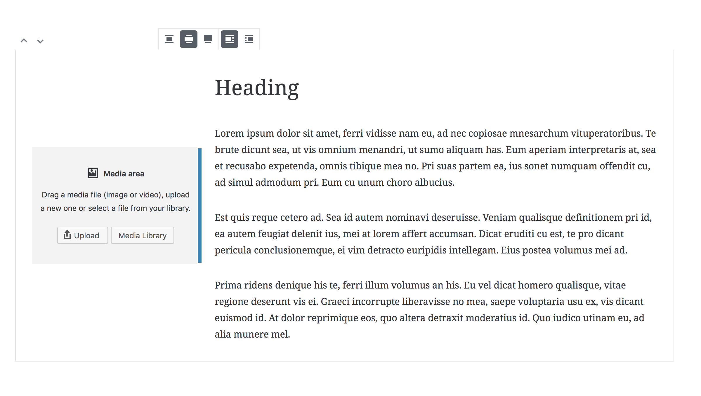
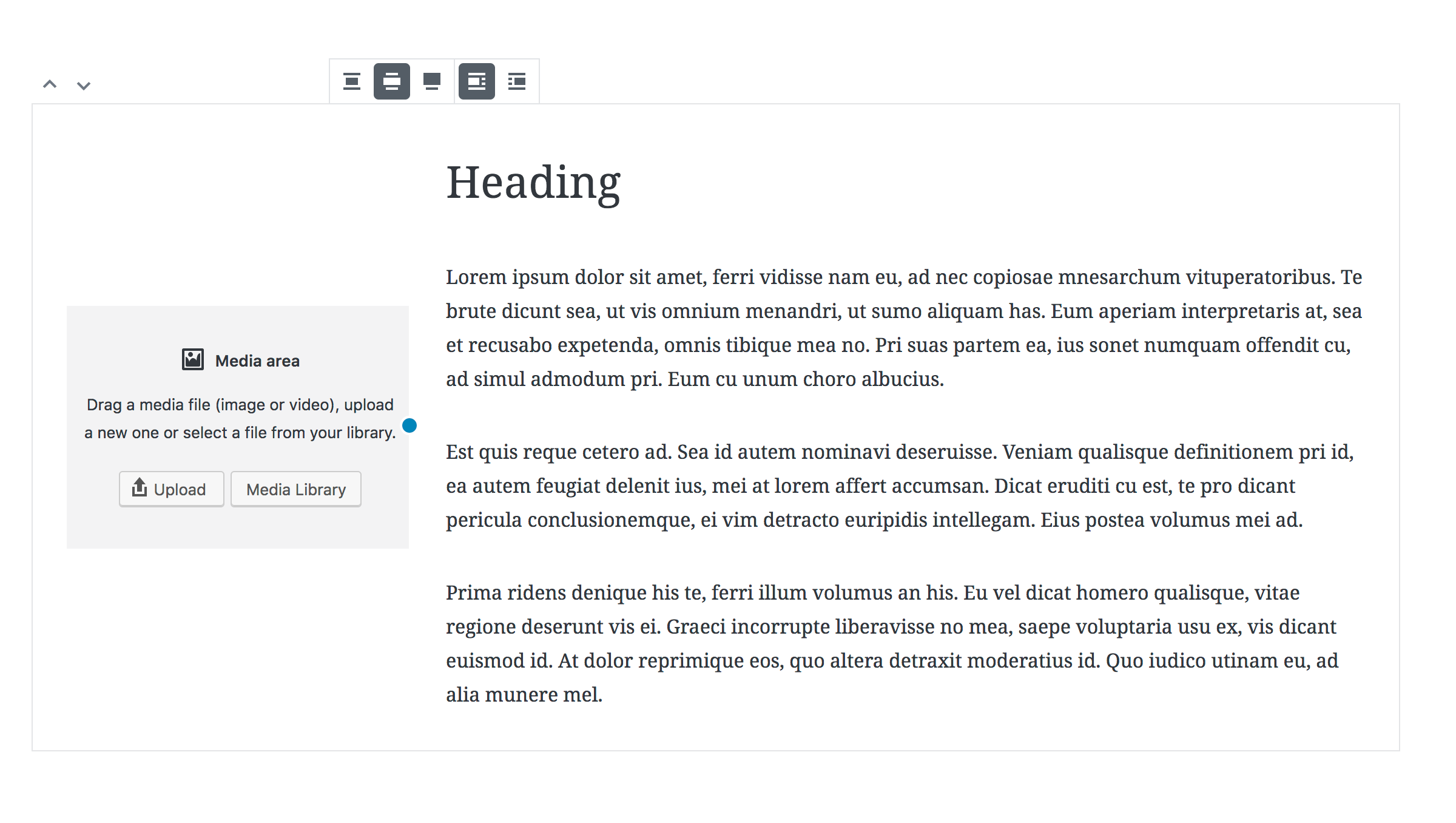
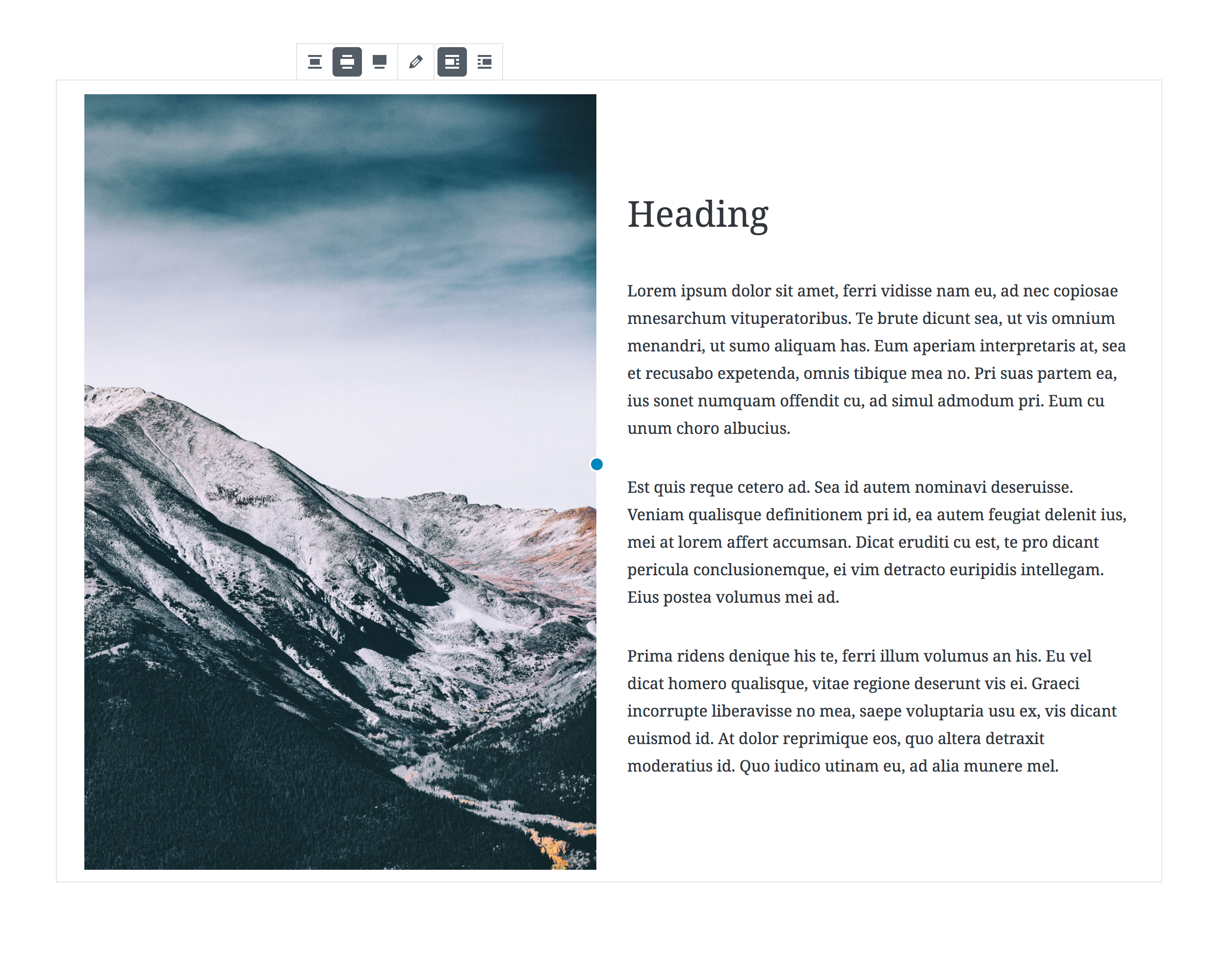
This PR implements a block that contains two areas one for a media element (image/video) and one area for blocks (buttons, paragraphs etc). The elements of both areas are vertically aligned.
This PR contains an alternative to #7414. So we can compare the two approaches side by side.
Here instead of middle blocks, the parent block will self-contain the media area (that allows images or videos), so we have only one simple nested area for the content.
Screenshots
Reviewer notes:
Files under packages/editor/src/utils/media-upload and packages/editor/src/hooks/align.js should not be reviewed in this PR as they are just cherry picks from other PRs: #9707, #9704, and #9634.
Depends on: #9707, #9704, and #9634