Skip to content
New issue

Have a question about this project? Sign up for a free GitHub account to open an issue and contact its maintainers and the community.

By clicking “Sign up for GitHub”, you agree to our terms of service and privacy statement. We’ll occasionally send you account related emails.

Already on GitHub? Sign in to your account

Add word and block count to table of contents #2684

Merged
merged 13 commits into from
Sep 25, 2017
Merged

Conversation

mtias
Copy link
Member

@mtias mtias commented Sep 6, 2017

Closes #1557.
Supercedes #1624.

This groups document counts and outline under the same component. It is shown in the main editor body (available when sidebar is closed) and is toggled on demand.

image

It'd be good to include a brief description of doc outline based on headings. We could also include revisions count here.

To-do:

  • Close on click outside.
  • Fix issue with toggling the document sidebar and editor freezing.
  • Figure out whether to add revisions.
  • Improve focus style.
  • Avoid showing on mobile.

@mtias mtias added General Interface Parts of the UI which don't fall neatly under other labels. Design [Status] In Progress Tracking issues with work in progress labels Sep 6, 2017
@codecov
Copy link

codecov bot commented Sep 6, 2017

Codecov Report

Merging #2684 into master will decrease coverage by 0.08%.
The diff coverage is 0%.

Impacted file tree graph

@@            Coverage Diff             @@
##           master    #2684      +/-   ##
==========================================
- Coverage   33.69%   33.61%   -0.09%     
==========================================
  Files         185      188       +3     
  Lines        5594     5867     +273     
  Branches      976     1051      +75     
==========================================
+ Hits         1885     1972      +87     
- Misses       3141     3280     +139     
- Partials      568      615      +47
Impacted Files Coverage Δ
editor/document-outline/item.js 0% <ø> (ø)
editor/word-count/index.js 0% <0%> (ø)
editor/modes/visual-editor/index.js 0% <0%> (ø) ⬆️
editor/document-outline/index.js 0% <0%> (ø)
editor/table-of-contents/index.js 0% <0%> (ø)
editor/sidebar/post-settings/index.js 0% <0%> (ø) ⬆️
editor/sidebar/document-outline-panel/index.js 0% <0%> (ø)
components/form-file-upload/index.js 66.66% <0%> (-4.77%) ⬇️
i18n/babel-plugin.js 37.9% <0%> (-1.68%) ⬇️
editor/header/index.js 0% <0%> (ø) ⬆️
... and 19 more

Continue to review full report at Codecov.

Legend - Click here to learn more
Δ = absolute <relative> (impact), ø = not affected, ? = missing data
Powered by Codecov. Last update 7fa7224...7c35f64. Read the comment docs.

@karmatosed karmatosed added the Needs Design Feedback Needs general design feedback. label Sep 6, 2017
<span className="table-of-contents__title">{ __( 'Table of Contents' ) }</span>
<div className="table-of-contents__items">
<ul>{ tocItems }</ul>
</div>
Copy link
Contributor

Choose a reason for hiding this comment

The reason will be displayed to describe this comment to others. Learn more.

maybe we could split out the TableOfContent to its own subcomponent and rename this one PostInfo or something?

Copy link
Member Author

Choose a reason for hiding this comment

The reason will be displayed to describe this comment to others. Learn more.

Document Outline may fit.

@youknowriad
Copy link
Contributor

A smallish design bug: The focus style (clickable area) is not centered properly?

screen shot 2017-09-06 at 17 04 10

@youknowriad
Copy link
Contributor

Could the "count" cards have a fixed width (50%) with a centered number and caption?

@afercia
Copy link
Contributor

afercia commented Sep 6, 2017

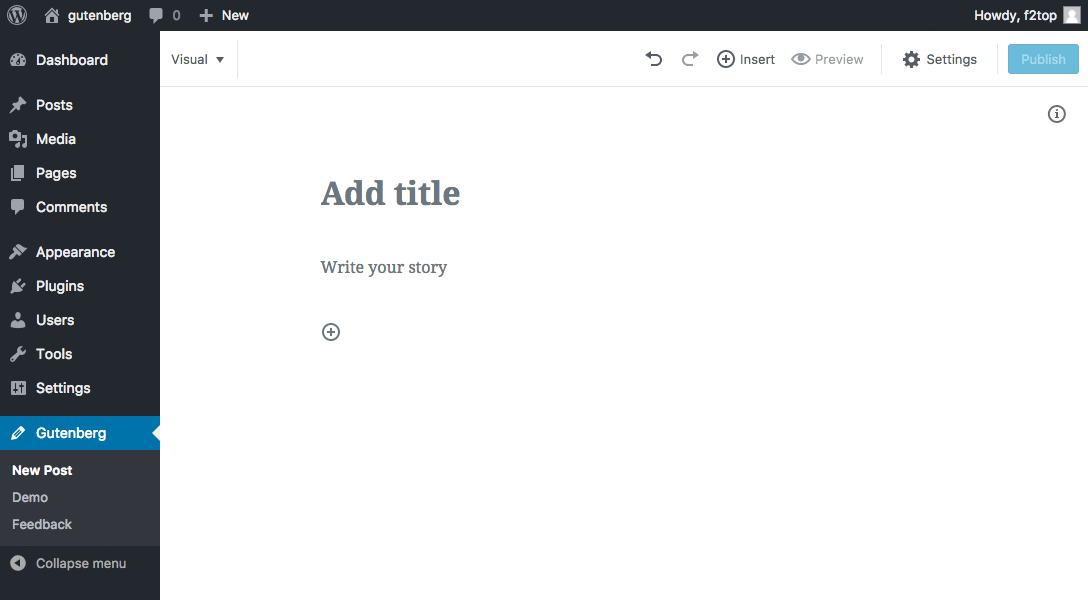
The placement of this new feature ("Info" button and Popover) doesn't seem ideal to me.

"Info" seems placed there just because there's some available space, There's no logic in the placement in the source order, nor this control is grouped logically in an area where it would make sense.

As a user, a label "Info" doesn't tell me so much. I'd be forced to explore the content to understand what it is.

The Popover component has pending accessibility problems tracked in other issues so I won't go in depth, but moving the Table of Contents here make the assistive technologies users experiences worse. It was far better when placed in the sidebar.

@afercia afercia added the [Focus] Accessibility (a11y) Changes that impact accessibility and need corresponding review (e.g. markup changes). label Sep 6, 2017
@field2
Copy link

field2 commented Sep 8, 2017

info
It should probably be a "i" icon to reinforce the "info" label.

@field2
Copy link

field2 commented Sep 8, 2017

I would suggest just showing the number of words as the author types, it increases for each word typed. It could be a color or underlined, or have the icon next to it add affordance, and when clicked shows the additional info about blocks and headings, etc.

@karmatosed
Copy link
Member

First up, really cool to see this feature. I think it's going to be useful and can already see the types of users will really benefit from this.

@afercia, the position is one that I really think we need to do testing at this point with. As you know, I love testing and I think getting something like this in is good, to then test and get feedback. After all we can iterate around where it goes and what it says.

How about we get it in, run testing and see if we can't actually improve the accessibility of it right there? I think we can at least try. I would +1 to merging it in, with the thought we need to iterate and do both usability and accessibility testing on this.

@afercia
Copy link
Contributor

afercia commented Sep 9, 2017

A smallish design bug: The focus style (clickable area) is not centered properly?

screen shot 2017-09-06 at 17 04 10

Just to remind that's not the focus style. What you see here it's just the native focus style that webkit browsers use on macOS. There's no focus style at all in other browsers and on Windows.

@afercia
Copy link
Contributor

afercia commented Sep 9, 2017

@karmatosed of course I'm not opposed to testing, as long as testing includes users with different abilities, keyboard users, and assistive technology users.

As a general consideration, it would be great to start thinking at accessibility as part of the design process.

A very important, first, step in accessibility is about building well structured, semantic HTML. The order of the main sections should be clear and intuitive. It should facilitate navigation through content and make easy to get an overall sense of the document. User interface controls should be grouped logically and placed where it makes the most sense, where they can be easily and intuitively found. It's about designing the information architecture of an HTML document.

This whole process (not to mention interaction and many other things) is actually a design process.

Instead, starting from mockups (or first implementations) that don't address (or don't fully address) accessibility, and then saying "and now please add accessibility", is a very ineffective process.

When important technical and design decisions have already been made, then it's just too late for accessibility. At that point, we can just try to “patch” here and there, in the hope to reduce the most severe accessibility barriers. This way, we may achieve technical compliance (maybe) but with a compromised user experience.

Back to this PR, I'll try to highlight some points and why I feel this PR is not ready for merge and would need some serious re-thinking;

Accessibility:

  • the Popover component has still many issues to address, primarily focus management; that's tracked in other open issues but as a general consideration I'd like to see the Popover usage limited in the cases where it really make sense. I see this implementation was inspired by what Bear Notes does (see Add word count to post settings #1557). However, I haven't seen any good argumentation why the Word Count and TOC should use a Popover and this seems to me just copying what others have done, without a thorough thinking
  • Add landmark regions #2380 introduced landmark regions, they identify 3 main logical sections in the editor:
    • Editor toolbar
    • Editor content
    • Editor settings
      The Editor content region should contain just the content and controls related to it. Instead, Word Count and TOC are information complementary to the content and should go in a region that's.. complementary (that is: in the sidebar)
  • "Info" as label doesn't tell me so much: when I open the Popover I find information that have a different nature, I don't see how a TOC can be grouped with word/blocks count not to mention if Revisions are going to be moved here (as mentioned above), the confusion will increase

Accessibility/Usability:

  • when "Close on click outside" will be added, using the TOC will be very inefficient: say I check the heading hierarchy using the TOC and I need to restructure the headings hierarchy: I click on a heading in the TOC and focus moves to the heading in the content (good! I can edit right away). However, the Popover is now closed. To check again the hierarchy, I have to click again to open again the Popover, click on a heading, the Popover closes again, etc. and repeat this process again and again... This worked far better when the TOC was in the sidebar and always available when opened.

Technical/implementation reasons:

  • this whole feature is available only when there are at least 2 headings in the content. Has anyone tested it in the New post page? No "Info button" there. Or just remove the headings from the Demo content page: the Info button will disappear. This can be changed of course and it's a configuration that makes sense (maybe?) for the TOC but doesn't make sense for the Word Count. It's not uncommon for posts to have just one heading or no headings at all. In that case, no Info button is available. As a user, I want to always be able to check the Word Count, regardless of the number of headings I use in the content.
  • the Editor text mode should have a Word Count too. Currently, the classic editor and even Calypso provide the Word Count also in the text mode. That's not covered here but should be implemented. It would be more efficient finding a way to have the Word Count that can work in both modes, without duplication
  • minor: when clicking on the Info button and then closing the sidebar, the Info button move to the right but the Popover stays there in its original position (see screenshot below) and I'm not sure making the Popover move together with the button would be ideal

I'll skip many other considerations related to implementation details (aria-expanded, focus style, etc.). Overall I feel this is largely unfinished. Just my personal opinion of course, but I think the flaw in the TOC interaction (continuous open/close/open/close) is enough to understand the Popover is not the right component to use for the TOC.


const getHeadingLevel = heading => {
switch ( heading.attributes.nodeName ) {
case 'h1':
Copy link
Member

Choose a reason for hiding this comment

The reason will be displayed to describe this comment to others. Learn more.

I'd never expect nodeName to be lowercase. Why were these additional cases added originally? cc @sirreal re: #1916

Copy link
Member

Choose a reason for hiding this comment

The reason will be displayed to describe this comment to others. Learn more.

I don't recall actually encountering lowercase nodeNames, I believe this was just some defensive coding that seemed to have minimal cost.

@mtias
Copy link
Member Author

mtias commented Sep 21, 2017

Since there are a few things we need to polish here, I'm going to keep the headings in the sidebar and just duplicate them on the popover for now. Once we are satisfied we can consolidate.

Word Count and TOC are information complementary to the content and should go in a region that's.. complementary (that is: in the sidebar)

I agree these are information elements, but I disagree they have to be in the sidebar. Perhaps we need another landmark region for this.

when "Close on click outside" will be added, using the TOC will be very inefficient [...] However, the Popover is now closed.

The popover remains open when you click on a heading item.

As a user, I want to always be able to check the Word Count, regardless of the number of headings I use in the content.

For sure, this is just a bug. :) I think we should show it only if there's some content (any content) but not on a plain new post. Thoughts?

It would be more efficient finding a way to have the Word Count that can work in both modes, without duplication

WordCount after this implementation is just a component. Can be reused wherever.

@mtias mtias removed [Status] In Progress Tracking issues with work in progress Needs Design Feedback Needs general design feedback. labels Sep 21, 2017
@afercia
Copy link
Contributor

afercia commented Sep 22, 2017

I agree these are information elements, but I disagree they have to be in the sidebar. Perhaps we need another landmark region for this.

I disagree. Landmark regions should be kept to a minimum and not added just to meet a visual design. Landmarks identify sections with logically related content. tink for example to a main element and to an aside element. This matters for the placement of the component in the source: it must not be in the editor landmark. It must be placed in the sidebar landmark, then visually can be displayed where designers prefer (even if I personally disagree on its current visual placement).

The popover remains open when you click on a heading item.

And closes as soon as you start editing the heading, or am I wrong?

Lastly, the aria-label Focus heading block still breaks accessibility and needs to be fixed.

@gziolo gziolo mentioned this pull request Sep 22, 2017
@karmatosed
Copy link
Member

karmatosed commented Sep 22, 2017

I had a chat with @afercia earlier today and would like to summarise that here what we discussed.

  • If some way to have in the code (not visual) sidebar could be found, this would mean both design and actually accessibility are met. We may need to have a chat to work through this, we totally should if that helps.
  • The PopOver has accessibility issues but they can be solved away from this ticket and shouldn't be a blocker.
  • The aria-label issue needs to have a solution. Currently all the headings are not announced and the only thing that is would be 'Focus heading block'.
  • @afercia would like to check this once 'close on click outside' has been implemented.

We had a good chat about a lot of things and going forward things which are design feedback, not just accessibility, will be split from accessibility requirements. This doesn't mean we won't look at both, it's just so we can get a baseline accessibility in and then build amazingly up from there. As design is subjective, we need to focus on the actual requirements for accessibility that sometimes get lots in a subjective debate.

@afercia
Copy link
Contributor

afercia commented Sep 24, 2017

Sorry maybe I was not clear but using a title attribute is not an option. In the last months / years WordPress has been progressively removing title attributes from the admin, as they're often ignored by users and assistive technologies. As a best practice, important information shouldn't rely on the title attribute.

There are two options I can think of:

  • complement the heading titles with a visually hidden text (click to focus this heading) parenthesis are important as they make screen readers pause briefly
  • use an aria-label composed by the heading text and the "hint" text, something like: aria-label="{heading text here} (click to focus this heading)"

I guess the misunderstanding comes from the confusion between "title" as title of the heading and "title" as title attribute... anyways, we should avoid to introduce new title attributes.

To get an idea of the progress in removing title attributes from WordPress so far, see https://core.trac.wordpress.org/query?keywords=~title-attribute and see also the data reported in https://make.wordpress.org/core/2017/05/26/tag-cloud-widget-changes-in-4-8/

WordPress 4.0: 157 results found in 37 files
WordPress 4.1: 156 results found in 37 files
WordPress 4.2: 146 results found in 35 files
WordPress 4.3: 101 results found in 30 files
WordPress 4.4: 97 results found in 32 files
WordPress 4.5: 21 results found in 12 files
WordPress 4.6: 19 results found in 11 files
WordPress 4.7: 17 results found in 9 files

(occurrences of title= (space-title-equal) only within .php files and only in the wp-admin directory)

@mtias mtias merged commit 98f3a87 into master Sep 25, 2017
@mtias mtias deleted the add/word-count-and-doc-info branch September 25, 2017 09:25
@jasmussen
Copy link
Contributor

Realizing that I'm raising the dead here, but the Info icon in the main body of the content feels a bit heavy to me, and every time we add new UI to an already heavy interface it feels like we are regressing a bit.

Could we consider putting this information in a future ellipsis dropdown?

block

CC: @karmatosed

@field2
Copy link

field2 commented Oct 2, 2017

preview
If the icon is there, it should look like this. I still think the icon shouldn't even be there, and we should indicate info when the user starts typing the content area with a small number that auto-increments as words are added.

@mtias
Copy link
Member Author

mtias commented Oct 4, 2017

@field2 is that icon available in dashicons? The problem with the count being visible is that a number updating whenever you write is distracting. Several new editors are choosing to keep info like this in popovers or panels.

@field2
Copy link

field2 commented Oct 4, 2017

No, but it could be; should we add it?
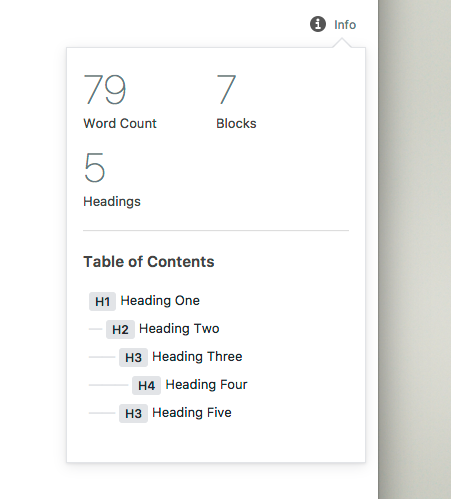
MS Word on mac shows a dynamic word count in the footer, when clicked reveals more info:
screen shot 2017-10-04 at 11 10 40 am
I think that's what made me think of it. Not that Word is the golden standard by any means, but a lot of people use it.

Sign up for free to join this conversation on GitHub. Already have an account? Sign in to comment
Labels
[Focus] Accessibility (a11y) Changes that impact accessibility and need corresponding review (e.g. markup changes). General Interface Parts of the UI which don't fall neatly under other labels.
Projects
None yet
Development

Successfully merging this pull request may close these issues.

Add word count to post settings
8 participants