-
Notifications
You must be signed in to change notification settings - Fork 4.2k
New issue
Have a question about this project? Sign up for a free GitHub account to open an issue and contact its maintainers and the community.
By clicking “Sign up for GitHub”, you agree to our terms of service and privacy statement. We’ll occasionally send you account related emails.
Already on GitHub? Sign in to your account
Publishing Flow accessibility #4187
Comments
|
As always I don't agree that we should work on accessibiity from the start since the UI is changing. For example, the Panel won't be closed right after clicking publish or update, it won't even open for updates after all the iterations. So most of the accessibility work would have been lost time. That said, yes, accessibility is important and once the iteration completed, I'll make sure to address all the accessibility issues as another iteration. |
|
I agree we disagree (kindly) 🙂 What I'd really like to avoid is to be blamed that "accessibility is slowing down development" when the time to fix all these things will arrive. In my experience, accessibility as an afterthought, in the erroneous belief "it can be added later" leads always to non-optimal results. Some accessibility features (not all of them) are really part of the design process and should be addressed during the design process. That would actually save time because some, as already happened, some iterations can't be made accessible and avoiding to spend time on not-accessible implementation saves time. |
|
Update, see also the new "Post Published" panel added in #4158
|
|
Report from one of the accessibility testers. Sorry for the image, she sent a PDF: Ah well actually I can copy and paste text: Opening the publish panel: |
|
@karmatosed I think you were on to something with #4920, and I'd like to continue that conversation here while we're also considering the post accessibility. Most importantly, you wrote:
In my opinion, the publishing is a major user milestone. As such, I think the publishing process should be intentional and decoupled from the content. Mapping to what we currently have, that means having the publishing options dominate the visual space (with a clear and easy way to get back to the draft). In a best-case scenario, anything related to publishing could be accomplished there too (taxonomy, excerpts, featured image). It's your chance to review all of this document information before going live. Here's a wireframe of what I mean: This is essentially what happens on mobile, and I think it could be easily extrapolated to a desktop screen. Also, plugins could extend this pre-publishing screen for sharing to social, SEO check, etc in a way that isn't confined by a small slideover. Just a thought. |
|
From an a11y perspective, an accessible modal or a "screen takeover" that behaves like a modal would be better than what we have now, where the publishing flow "slideover":
|
|
I'm marking as needs design as seems to me it's not feedback as much as a design here? I totally could be wrong. With regards to that, I have one point to ask, does it have to be full screen? |
Not necessarily. From an a11y perspective the most important thing is the modal has all the a11y feature that react-modal has. |
|
In that case if it doesn't have to be full screen I would suggest we don't change the design and look at ways to if possible add those features. I do not believe adding more content to the publishing flow like this is a good idea. Design wise, at the end I don't feel we need more functionality or a split in functionality, we just need to know it gets there and celebrate it in an appropriate manner, close the story. |
|
Can we start with proper keyboard interactions so that users can publish the post with keyboard only? |
|
Worth reminding one of the a11y features needed here is "constraining tabbing" within the publishing panel. A dedicated HoC is going to land in a pending PR about modals, see |
|
@nic-bertino It seems we need to work with the existing design that is there. We should probably start trying to fix keyboard interaction, tab order, focus management, etc. |
|
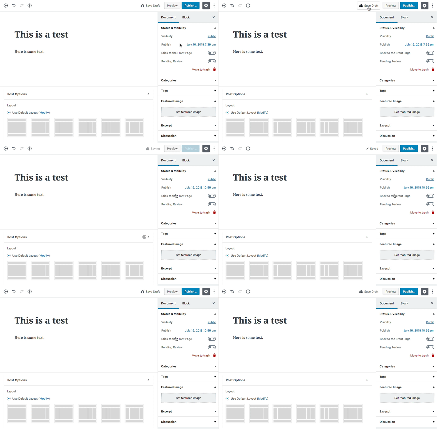
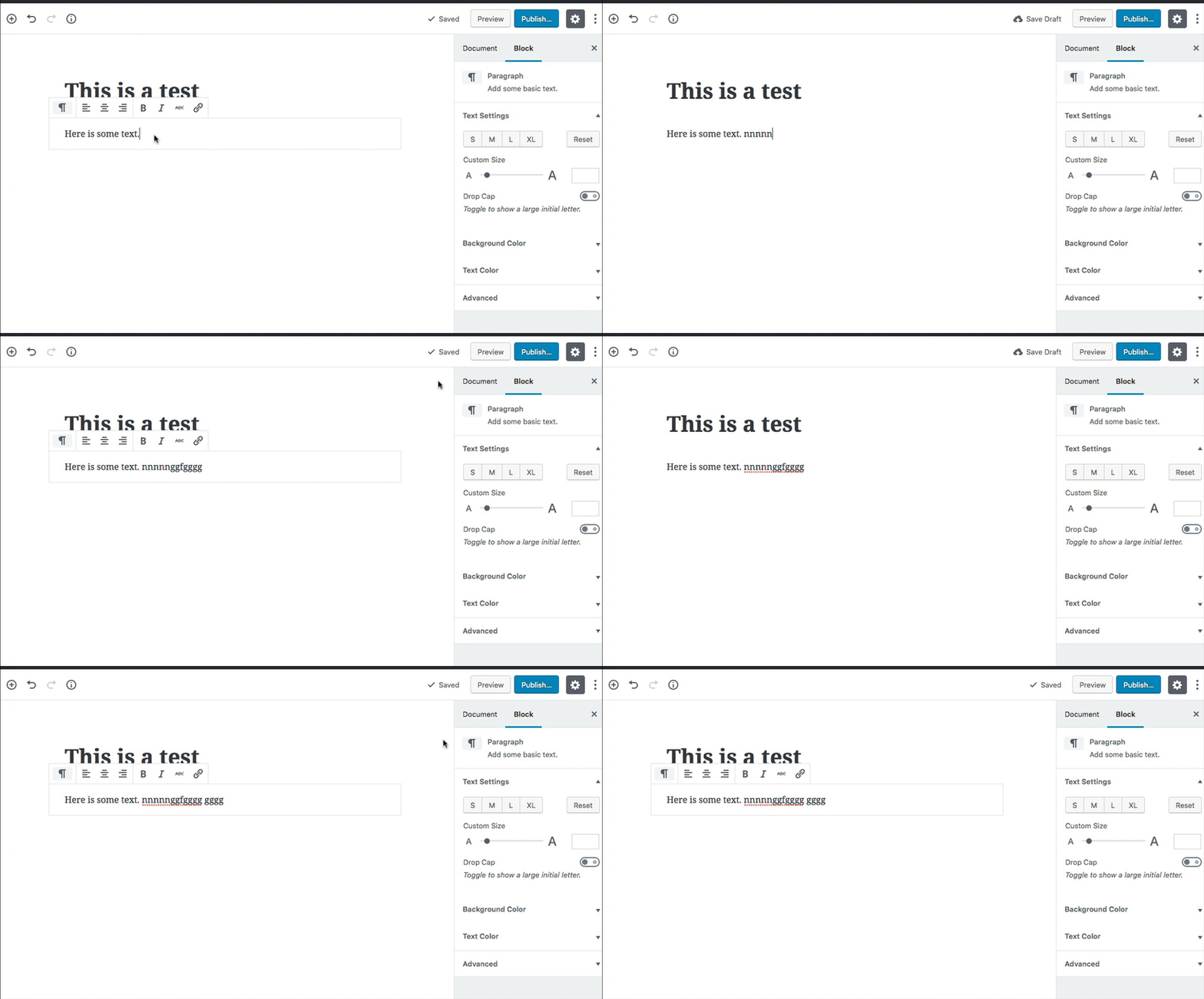
Hey In regards to saving and publishing a post. Clicking Save Draft it will for a moment show Saving and then Saved. Then go back to the words Save Draft. It really should show Saved until I do something in the document. As I might click it a few times just to be sure. When the word Saved remains then I really know that the post is saved. Example: For instance Photoshop will show a star * next to the document title when a change has been made after the last save. Saving will remove the star until I do something in the document in which the star comes back again. I would think the same concept should imply here. One clicks Save Draft. The words Saved are seen until the user has made a change in the post. Save/publish status. Another matter. At the top of the Publish panel there should be a Status check. Perhaps something similar to this (I added Status: Document saved as Draft.): |
…#7552)

## Description
This commit makes a series of changes to make publish panel more accessible. The PR tries to follow the ideas discussed during WCEU contributors day and Accessibility chats on Wordpress slack.
Tries to address most parts of #4187.

## Types of changes
Adds a new Publish landmark. When publish panel is visible the publish landmark contains the Publish panel. When the panel is hidden nothing is visible, unless we focus the landmark using Gutenberg landmark navigation (control + < or control + `) or we focus the button using tab, in this cases a button to open publish panel appears.

We automatically focus the contents of the publish panel when we open it. The first element of the Panel is the publish button, so it gets focused.

We now don't render other sidebars if the publish panel is visible. The other sidebars were not visible, but they were tabbable making keyboard users experience sub-optimal.

Added aria-expanded true to the close button on publishing panel. This button allows collapsing the panel so I feel it should have this aria property.
|
Hi @paaljoachim, thank you for sharing your thoughts. I did some tests and I think the behavior described by you of "one clicks Save Draft. The words Saved are seen until the user has made a change in the post." is implemented, we show saved until a change is made. Could you confirm if that is the case? |
|
It looks like the remaining point to address is having a status in a pre-publish panel. Is that correct? |
|
Hey @jorgefilipecosta Regarding pre-publish panel. -- So those are my two issues I believe would make it clear that the document is saved and how it is saved. |
|
Hi @paaljoachim could you confirm if you have some meta-boxes in the tests you are doing? |
|
Hello @jorgefilipecosta When meta boxes are not present it shows up like this: Many themes and plugins will add meta boxes to the screen. |
|
Noting that the publishing flow is being worked on in #7602. I don't think the answer here is to add a new status to the document settings. I feel we can iterate the flow over add that. |
|
I think the first step here is to write some E2E tests that ensure a post can be written and published entirely using the keyboard–that'll identify any issues with the keyboard-only publishing workflow. I'll try to get on this soon. I'll have a look at some of the focus issues mentioned in the original comment as well, as they're what I consider in the scope of this issue. The panel has changed a bit but it should be checked to see if any of the issues still remain. |
|
I've been reviewing this issue and related ones to digest what's left to do into actionable tasks. I know there are some changes coming in that would affect this, but wanted to have a go-to place to keep the state of things and communicate progress. Here are my on-going notes (will update them as I continue with the audit): Pre-publish panel
Post-publish panel
Is there any outstanding issue missing? |
|
@nosolosw Has there been any work on the issues you mentioned in I don't think there's anything off the top of my head to add to that list, it seems a good first pass. |
|
Not that I know of. I'm wrapping one task and then will start implementing these changes. |
|
#11403 addresses the constrained tabbing. Managing the focus is going to take me more thinking, so we may want to merge that and iterate on focus in a separate PR. |
|
#11489 addresses focusing a tabbable element when the post-publish panel is opened. |
Sounds good.
This could be another case where we use an |
|
Thanks for the pointer, Matt. Returning focus to the opener it's been more involved than I originally thought: we render different components for the publish button in the header settings that mount/unmount at different stages. I've started to explore a solution at #11543 but I'm still not convinced that's the right way. |
|
#11543 is ready for review. It looks like we can close this issue as soon as that lands in |


Just seen the publish dropdown has been replaced by a sidebar panel #4119, as first step towards the updated publish flow #3496 (comment)
This is a very good example of why accessibility specialists recommend to design with accessibility in mind since the beginning. I see this new feature as an UI improvement compared to the previous dropdown but I also see many accessibility concerns haven't been addressed at all, not even the most basic ones. At this point of the project, I'd expect to see new features merged with some basic accessibility already built in.
A few things noticed so far:
Placement:
The publish panel is placed outside of any of the 3 landmark regions, and also can't be navigated to with the
Ctrl+backtickshortcut. Since the introduction of landmarks to indicate 3 main editor regions (toolbar, content, sidebar), any UI component must be placed within one of these regions. Landmark regions can be reviewed and adjusted, of course.Keyboard navigation:
Activating Publish/Update in the toolbar makes the Publish panel slide in but there are several tab stops between the toggle button and the panel. As mentioned several times on other issues, see for example #469 (April 20th!), controls that expand a panel should be placed immediately before the panel itself, or focus should be handled programmatically. The first option is always preferable. Now, when the publish panel opens, the underlying default sidebar controls are still focusable, though visibly hidden. This produces various tab stops to hidden controls and must be avoided.
Focus loss:
Closing the panel by publishing/updating/switching to draft, makes the panel disappear and there's a complete focus loss: press Tab again and keyboard navigation starts again from scratch from the document root.
Also, disabling focused buttons causes a focus loss UI controls should never get disabled while they're focused. In this kind of scenario, either focus should be moved programmatically to a logical, predictable, expected, place, or the control shouldn't get disabled in the first place. Worth reminding in at least one other place, we're keeping a button focusable and just make it noop.
The text was updated successfully, but these errors were encountered: