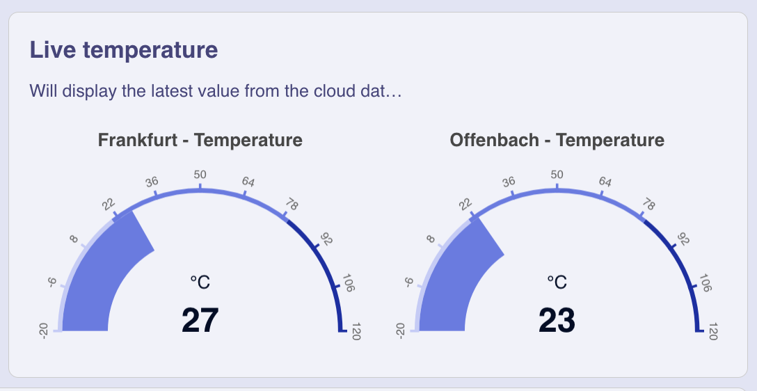
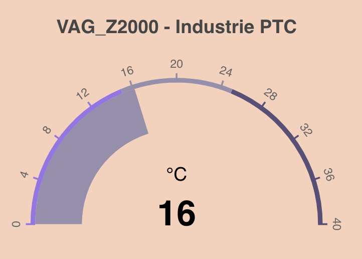
npm i widget-gauge<script type="module">
import 'widget-gauge'
</script>
<widget-gauge inputData="default-data"></widget-gauge>To use the widget locally during development clone the widget repo and start the dev server:
npm run startThis runs a local development server that serves the basic demo located in demo/index.html
If you want to use the widget inside another project X, then add the widget as npm module to the project X as usual. i.e. in the folder of X
npm i widget-gaugeTo avoid releasing the widget-gauge on every change and updating the node_modules in your project X you can "link" the package locally. This replaces the already imported widget-gauge package with your local widget-gauge git repo. Since this node module is linked all changes you make in your local widget-gauge repo will immediately be visible in project X.
Go to your local widget-gauge git repo and do
npm run linkThis create a global symbolic link on your environment and links your local package into the project X folder. (You may need to adjust the project X folder in your package.json) To reinstall the original npm version of the widget do
npm run unlinkTo release a new version of the widget commit all your changes and run
npm run types
npm run release
Note that npm run release automatically increases the path version number. If you want a minor update, then either adjuste the version in the package.json manually or use minor instead of patch in the npm run release command.
After the version tag has been successfully published to github, our github action kicks in and creates a release on github and publishes the release on npm as well.
Now you need to tell the IronFlock system that a new version of the widget should be offered. You do this by executing with the new version string you created.
select swarm.f_update_widget_master('{"package_name": "widget-gauge", "version": "1.5.21"}'::jsonb);To make it work locally you need to npm run build to get the correct version string in your build files locally, then restart the node web server container.
It the widget is part of the demo dashboard-template.yml, then also adjust the version numbers there!
The Gauge-Widget is part of the widget series for the IoT dashboard builder. While the Record Evolution platform provides various IoT functionalities, building Dashboards is one of them. As of now, around 10 widgets are available for usage and each widget is publicly accessible on Github.
In order to make use of your own custom widgets we provided a boilerplate function that will set up the file structure required by us including a builder for development and production. As we’re big supporters of the Web component standard the repository is following their guidelines and is built with the JavaScript framework Lit. And can therefore be integrated into any other project regardless of the library.
The main files in the repository that describe and provide your widget with data are the definition-schema.json and the default-data.json. As you can see both files are JSON files and therefore rely on the JSON schema format in order to have a standardized representation of the data and a simple validation logic.
The definition-schema describes the data structure your widget code will consume. Once the widget is released to our platform the JSON schema will be rendered into an input form and therefore significantly reduces complexity for the user when mapping data according to the definition schema. While our schema relies on the JSON schema standard we provided some extra features to simplify things. This includes the sorting of input fields with the order value. Extra data types for colors and enum fields in order to render color picker and dropdown elements.
{
    "title": "Configure the Widget",
    "type": "object",
    "properties": {
        "settings": {
            "title": "Global Settings",
            "type": "object",
            "order": 1,
            "properties": {
                "title": {
                    "title": "Title",
                    "type": "string",
                    "order": 1
                }
            }
        },
        "dataseries": {
            "title": "Dataseries",
            "type": "array",
            "order": 2,
            "items": {
                "type": "object",
                "properties": {
                    "backgroundColor": {
                        "title": "Color",
                        "type": "color",
                        "order": 3
                    },
                    "data": {
                        "title": "Data",
                        "description": "The data used to draw this data series.",
                        "type": "array",
                        "order": 4,
                        "items": {
                            "type": "object",
                            "properties": {
                                "x": {
                                    "type": "string",
                                    "required": true,
                                    "order": 1
                                },
                                "y": {
                                    "type": "number",
                                    "required": true,
                                    "order": 2
                                }
                            }
                        }
                    }
                }
            }
        }
    }
}As the file name already describes the default-data provides some fallback data that follows the given definition structure. The following format represents the data according to the provided definition-schema shown above:
{
    "settings": {
        "title": "New widget"
    },
    "dataseries": [
        {
            "backgroundColors": ["#AAC8A7", "#F1C27B", "#FF9B9B"],
            "data": [
                {
                    "value": 90,
                    "pivot": "Frankfurt"
                }
            ]
        },
        {
            "backgroundColors": ["red", "green", "blue"],
            "data": [
                {
                    "value": 34
                }
            ]
        }
    ]
}
