Replies: 5 comments 7 replies
-
|
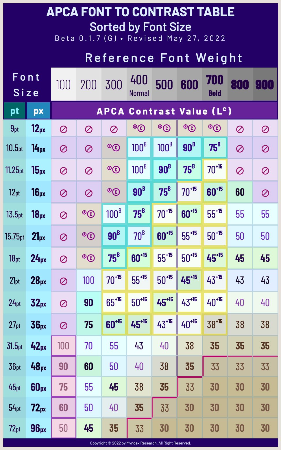
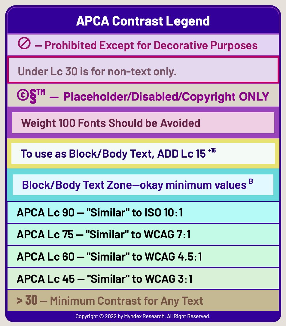
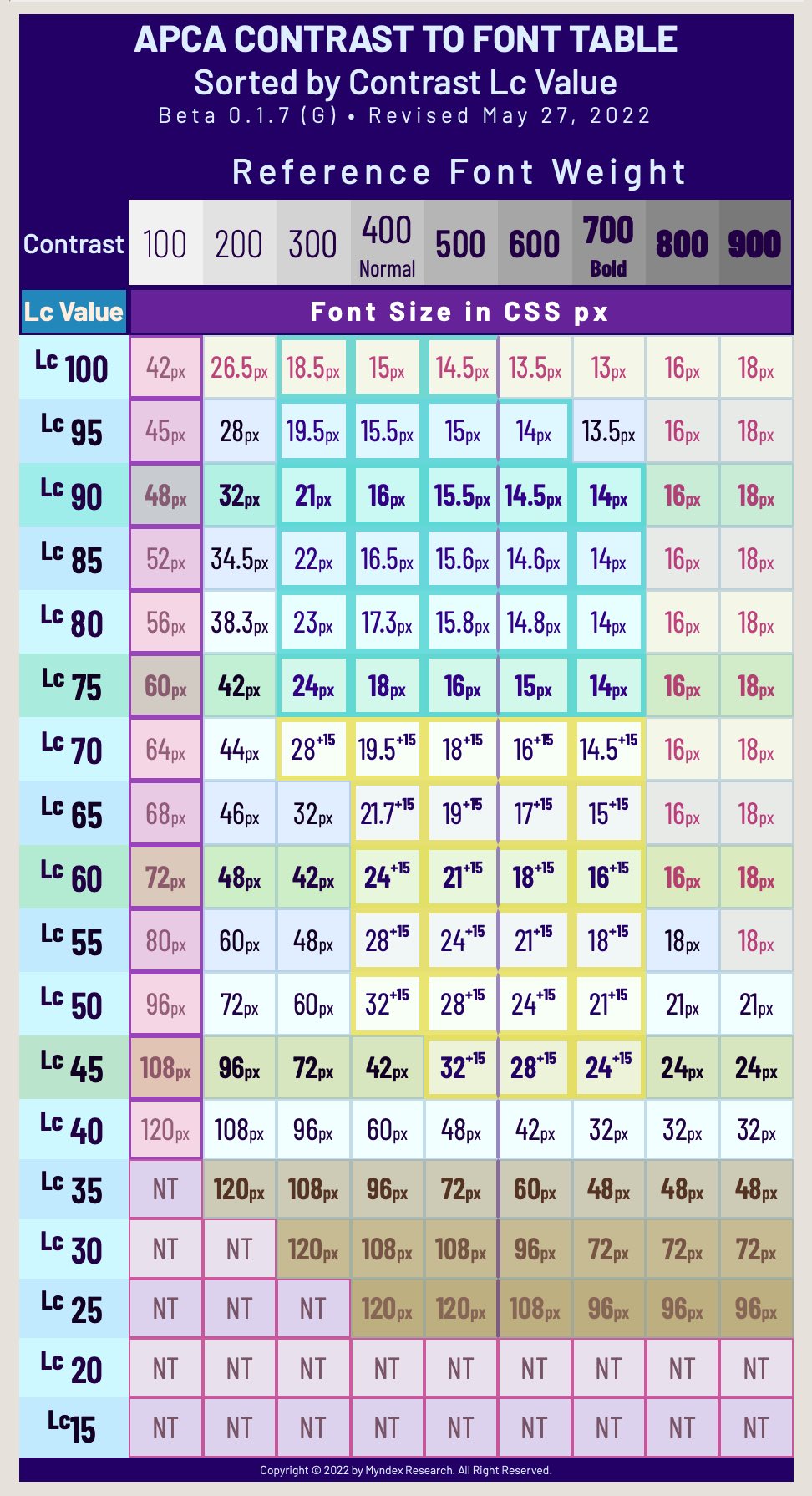
From the current APCA tool page: Accessible ContrastRelative to Font Size and WeightThe table below is current as of January 2022, though as this is a public beta, there may be occasional discrepancies with the above automated font display above. GENERAL GUIDELINES on LEVELSThese general levels are appropriate for use without reference to the lookup table.
NOTES ON FONT SIZEFont sizes listed above assume an x-height ratio of at least 0.5. Font weight is based on highly standardized reference fonts such as Helvetica or Arial. "px" means the CSS reference px not device pixels. The reference px is defined as 1.278 arc minutes of visual angle. NOTES ON WCAG_2 COMPATIBILITYTo use the APCA tool for minimum Bridge-PCA conformance (backwards compatible for WCAG_2):
Using the Lookup Table
Font Lookup TableAbout the colors in these tables:The colors in these tables are designed to be discernible by all forms of color vision deficiency.
Additional Notes
Other guidance |
Beta Was this translation helpful? Give feedback.
-
Non Text CategorizationThis is something that's been on my mind lately, as I've been thinking of irreducible base categorization for non-text design guidance: Four broad categoriesThese four categories have a similar hierarchal need of contrast as does body text followed by fluent text followed by spot text followed by ancillary text. Each of these categories is distinct enough to have different design guidance needs.
Uniqueness of
|
Beta Was this translation helpful? Give feedback.
-
This post was moved to #104If you followed a link here, please let the linker know the link changed TERMINOLOGY EMERGING FROM SAPC/APCA RESEARCHOld post contents hidden hereThis was moved from the first post above to make it easier to link to: In the course of research here, we have a few terms that are specific to the use case(s) and I'd like to clearly define them. These terms were created in the interest of clear and plain terminology that is descriptive and easily understood with little to no special explanation. I.e. the terms themselves are intended to be easy to grok, to help keep things simple, short, and digestible. (Some of the definitions need to be reworked, and moreover, visual aides created.) COLOR and LIGHT
TEXT SIZE and CONTRAST
PAGE and LAYOUT
USER PERSONALIZATION
|
Beta Was this translation helpful? Give feedback.
-
|
Hello, after quite some research as a complete beginner in everything regarding colors, I stumbled over this Myndex repository with lots of new information for me. I have been trying to achieve my goal of automatically and consistently creating (at least more or less) perceptually linear bit by bit lighter or darker shades of a random color, instead of having to find recognizable small changes in shade manually by trial and error in some regular color picker, but wasn't successful so far. I started this whole "journey" like probably any complete beginner with no knowledge in the RGB color space using the HSV model, then I learned about blending, then I learned about gamma correction, then I learned about luminance, then I learned about contrast ratio. Still, no success was in sight, so then I learned about bigger color spaces and the XYZ color space and I learned, that my goal should be possible to achieve with the LAB color model. Therefore, I now meanwhile have some working code, that - according to different color conversion calculators - can correctly represent and transform any RGB/HSV color into the corresponding LAB/LCH value and can also correctly calculate relative luminance and contrast ratio according to web standards. I now thought, that in this model I could just increase lightness in equidistant steps to receive perceived gradually lighter shades of grey (to start with), but the result was unfortunately underwhelming. I tried to increase lightness in the LCH model in equal steps and in percentage increases, and I also tried to decrease contrast ratio against the background and against the previous darker shade in percentage steps, but still can't closely recreate my manual result. Therefore, I would like to ask, if you could give me some hint, into which direction I would not have to extend my research to achieve my goal? |
Beta Was this translation helpful? Give feedback.
-
This post was moved to it's own thread at #103Defining Requirements for a Complete Visual Contrast Guideline
Comments and thoughts welcome, (see new thread please) Old post contents hidden hereWCAG 2 Contrast — Key Failure Points
What Is Needed In a Complete Visual Contrast GuidelineScience (empirically based models)
Spatial Frequency (size, weight, spacing, zoom)
Non-Text (spatial semantic nonsemantic)
Hue and Chroma (CVD, auto adjust, auto invert)
Needed Technology Adds
Not the Kitchen SinkThe list looks long, but this list is more about process, the actual guideline(s) should have much of this "hidden" and simplifed for ease of use by designers and testers. FOOTNOTES Copyright © 2021 to 2023 by Somers & MTI. All Rights Reserved. |
Beta Was this translation helpful? Give feedback.


-
APCA KEY USE CASE DEFINITIONS
USE CASES CLARIFIED & RELATED CONDITIONALS (APCA)
It is of particular importance for complex information design to present a clear visual hierarchy, and the use of contrast variations is one of the important methods for doing so. As such, the definition of contrast requirements per use cases is the ideal means to achieve a reasonable guideline.
In WCAG 2, SC 1.4.3 attempted to achieve this with the claim of "3-way" contrast at 4.5:1 (#FF/#76, #76/#00), however this fails for several reasons.
WCAG 2 "Three Way" example:
Notice the darker pair is much less readable than the lighter pair. Click for full size
Use Case By Functional Need
What we introduce with APCA is the concept of guidelines per use-case, and based on the functional need. For instance, the assumed functional need for columns of body text is a high quality of fluent readability, where the text can be read effortlessly, with minimal fatigue, and at maximum speed and comprehension.
At the other end of the spectrum is text for things such as placeholders, or disabled items, or copyright notices. It should be abundantly clear that such text has a much lower need for readability.
Making these distinctions among use cases is of critical importance, no merely for aesthetic design reasons, but for arranging the content within a visual hierarchy. This is particularly important for lexical, cognitive, and accessibility reasons of its own. A page of content with everything at the same size and contrast is difficult to read and access.
Good readability requires not only adequate contrast for the content text, but a layout and visual hierarchy that leads the user through the content in an accessible manner. APCA guidelines are intended to present a complete visual readability best practice.
USE CASE CLASSES and CONSIDERATIONS
The "fluent" category is divided into body text and non-body text, with the highest contrast reserve ascribed to body text, critical contrast of 18 times threshold at critical size, where threshold is a LogCS of ~1.3 or ~5% (roughly related to 20/70¹), or an APCA Lc 5. (1)It is important to note that acuity and contrast sensitivity are independent, despite what is stated in WCAG 2, which is notwithstanding here).
Fluent text values assume a font sized at the critical size for the given contrast. Sub fluent levels permit smaller than critical font sizes.
(2)Bailey/Lovie-Kitchin define minimum spot reading at 3 times threshold, here we set that low bar only for certain non-text elements).
Semantic & differentiable non-text requires a similar contrast relative to spatial frequency as "other fluent text". Merely discernible non-text is more equivelent to sub-fluent text.
FLUENT
ZOOM
- does not include text the user controls or adjusts in size or color
ZOOM
SPOT/ANCILLARY (non-fluent), SOFT (semi-fluent), and LARGE (fluent headlines)
Currently under consideration are the breakpoints for:
• "spot" readable non-content (disabled, placeholder, copyright)
• a subcategory of "soft content" that applies to certain aspects of dataviz (call-outs, de-enhanced aspects of visual hierarchy), and
• the subcategory of "large content" such as big, bold headlines which exist at a lower spatial frequency and require less contrast.
Large Fluent header/title content
Soft Readability, small semi-fluent secondary/ancillary content
Spot Readability, sub-fluent "non-content"
NON LEXICAL
Non-Text Discernible Elements
Non-Text Functional Elements
EMPIRICAL BASIS FOR THE FOREGOING (IN PART):
Contrast Sensitivity vs Spatial Frequency
Per the following chart, we can see that spatial frequency drives contrast perception.
Here, various sizes of font and font weight are used for a practical demonstration. This premise applies to icons, pictograms, and other graphical elements as well.

Not shown is hue/chroma contrast, which is much lower in spatial frequency sensitivity, and peaks well below 1 cycle/degree. whereas luminance contrast peaks at at 2 - 3 cycles/degree.
"Normal" Vision Defined
Normal Vision is a specific definition, and a somewhat clinical definition:
Footnotes:
copyright © 2019-2021 by Andrew Somers and Myndex Research™. All Rights Reserved.
Myndex Infographics
Critical Font Size
NOTE: review is ongoing in particular to align actual fonts to relevance with this table.

Physical Device Visual Angle per Distance
CITED RESEARCH (selects)
TERMS FROM RELATED RESEARCH OR STANDARDS
From Choeng/Lovie-Kitchin/Bailey/Bowers, also Legge, Arditi, Whittaker, and others. This includes some of the terms as commonly used in research.

-----
-----
-----FOOTNOTES
This first post may be edited periodically.
When discussing the areas of vision and readability, there are a few terms that are important, which while they are used in research are not generally used in accessibility. However they are increasingly important to know as modern vision research makes its way into accessibility.
On the Visual Contrast Wiki, the RESOURCES PAGE has a glossary and definitions, mostly they are the terms used in vision research or in colorimetry.
Here I am going to try to limit to only those terms directly relating to readability.
LOW VISION
TERMINOLOGY EMERGING FROM SAPC/APCA RESEARCH
This was moved to a new post below
Beta Was this translation helpful? Give feedback.
All reactions