Welcome to the ultimate starting point for your web development projects: a comprehensive template designed to integrate Remix, Vite, and Tailwind CSS with a focus on flat routes, an advanced Tailwind configuration, and powerful animation libraries like Framer Motion and React Spring. This template is perfect for seamless design flexibility, efficient development, and stunning animations.
This template includes various features that allow developers to quickly customize the project, offering pre-configured design presets, UI components, and dynamic animation libraries to enhance both functionality and aesthetic appeal. The extensive integration of gradient and background combinations, typography scaling, and animation demos ensures your web applications remain modern, interactive, and visually engaging.
You can also view the minimal version of this template, which contains only the most fundamental building block components and the color scheme setup. It is also the repo that I keep updated as a pristine launchpad for projects.
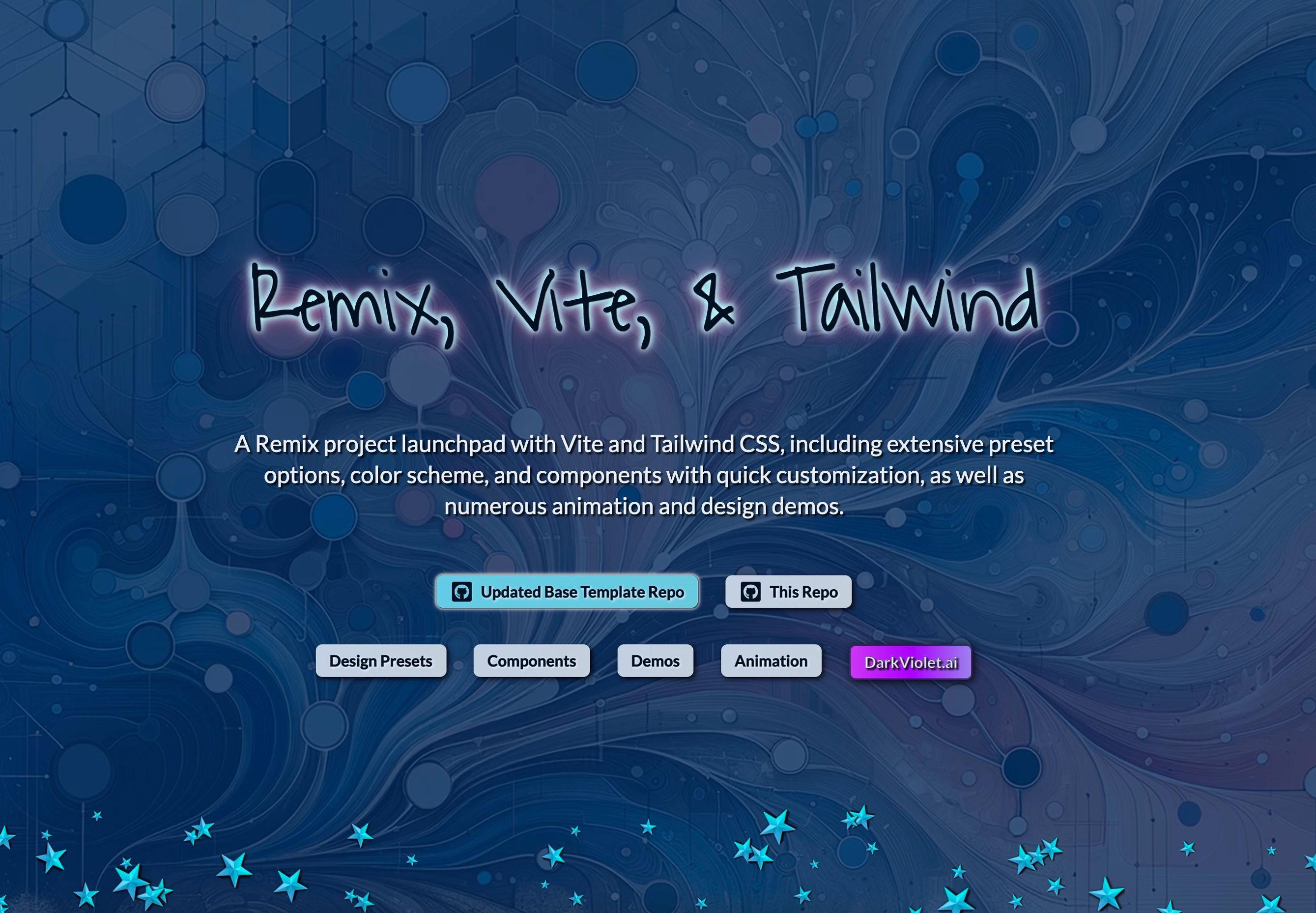
Figure 1: 🔗 Spalsh Screen - This introduces the Remix-Vite-Tailwind template, a powerful starter framework that seamlessly integrates Remix, Vite, and Tailwind CSS. It showcases a modern, visually engaging design with a focus on speed, flexibility, and animation. Developers can quickly customize the project with various pre-configured design presets, UI components, and extensive animation libraries, ensuring both functionality and aesthetic appeal for any web project.
- Remix with Flat Routes: Utilize the full power of Remix, enhanced with a flat route structure for simplified, scalable routing solutions.
- Vite Integration: Experience lightning-fast development and build times with Vite, seamlessly integrated with Remix and Tailwind CSS.
- Advanced Tailwind Configuration: Unlock a versatile, extended Tailwind configuration, allowing you to easily adapt your design to various color schemes, layouts, and utility-first configurations. The template provides an enriched palette for colors, backgrounds, and typography, making customization simple and efficient.
- Comprehensive Component Library: Includes a variety of UI components inspired by Chakra UI, with essential building blocks like Flex, VStack, HStack, Wrap, and more. These components simplify the design process, allowing you to visualize your layout directly from the code.
- One-Click Color Scheme Customization: Tailor the entire color scheme of your application directly through the Tailwind config file, perfect for brand-focused projects.
- Dynamic Animations: Incorporate advanced animations with Framer Motion, React Spring, and SVG libraries to create functional, aesthetically-pleasing designs that respond fluidly to user interaction.
Additionally, the template offers the following advanced design features:
- Color Palette Customization: Fully customizable via the Tailwind configuration file, with presets that allow developers to effortlessly adjust colors across different shades. (See Figure 2 below for a preview of the color palette designer's view.)
- Gradients and Opacity: Versatile gradient options with customizable opacity for smooth background transitions. Experiment with linear, diagonal, and radial gradients to enhance user experience and design consistency. (See Figure 3 below for examples.)
- Complex Background Designs: Extensive options for combining gradients to create rich, layered visual effects. (See Figure 4 below.)
- Interactive Buttons and Shadows: Pre-designed button variations, including icon and negative buttons, alongside transition effects and shadow classes for adding depth and hierarchy. (See Figure 5 below.)
In addition to the core features, this repository is packed with tons of animation demos and code snippets using Framer Motion, React Spring, and SVG animations. These animations range from functional interactions to purely decorative effects that enhance your app’s user experience.
Framer Motion is a powerful library for declarative animations in React. We have built multiple examples to showcase how you can integrate beautiful and fluid animations into your project with minimal effort.- Interactive Buttons: Responsive buttons with hover, press, and release effects.
- Page Transitions: Smooth transitions between routes, making navigation fluid and user-friendly.
- Drag and Drop Elements: Implement drag-and-drop functionality in your interfaces with easy-to-understand code.
- Animated Modal Windows: Eye-catching modal windows that slide, fade, or expand into view, improving user engagement.
- Hero Animations: Create dynamic hero sections with text, images, and background animations that respond to scrolling or user interaction.
- Radial Progress: As users scroll, a radial progress indicator tracks their position on the page, offering a visually engaging way to signal content progression. (See Figure 9 below.)
- Spring-Based Animations: Learn how to create bouncy, spring-like effects on elements such as cards, images, and buttons.
- Parallax Scrolling: Implement smooth, engaging parallax effects where elements shift at different speeds as the user scrolls.
- Gesture-Based Animations: Incorporate gesture-based animations that respond to user input (such as touch or drag events) in a fluid and intuitive way.
- Horizontal Parallax Carousel: Create dynamic scrolling effects where foreground and background elements move at different speeds. Perfect for image galleries or product showcases. (See Figure 13 below.)
- Icon Animations: Create SVG icons that animate on hover or load, drawing attention to important UI elements.
- Path Animations: Animate SVG paths to create line-drawing effects, perfect for logos, signatures, or decorative elements.
- SVG Text Animations: Implement eye-catching text effects that utilize SVG's power to animate letter strokes, fill patterns, and more.
- Interactive SVG Animations with Framer Motion: Turn static SVGs into interactive, animated elements using Framer Motion. (See Figure 24 below.)
- SVG Path Playground: Experiment with different shapes and animations using the SVG Path Playground tool. (See Figure 25 below.)
All demos are well-documented, providing explanations and code snippets that can be easily integrated into your project.
- Node.js (LTS version recommended)
- npm or yarn
- Use this template:
npx create-remix@latest --template https://github.com/EvanMarie/remix-vite-tailwind- Install dependencies:
cd <project-directory>
npm install
# or
yarn install- Start the development server:
npm run dev
# or
yarn dev
Your project should now be running on http://localhost:3000.
The tailwind.config.js file has been extensively extended to provide a wide array of design utilities. Customize color schemes, background patterns, text styles, and more directly from this file. The setup enables you to easily adjust the visual aspects of your application without writing excessive custom CSS.
Explore the components directory to find a comprehensive set of UI components. These are fully customizable and can be extended to fit your specific project needs. The components adhere to best practices for accessibility and responsive design, ensuring your web application works smoothly across all devices.
Distributed under the MIT License. See LICENSE for more information.
- Remix Team for the incredible framework.
- Tailwind CSS for the powerful utility-first CSS framework.
- Vite for the blazing fast build tool.
- Framer Motion and React Spring for providing amazing animation libraries.
- Chakra UI for inspiring our modular component library.
This Remix-Vite-Tailwind template, enriched with advanced animations and design utilities, is the perfect foundation for your next project. With a clean and scalable structure, powerful styling tools, and dynamic animations, you'll be ready to build stunning, high-performance web applications.
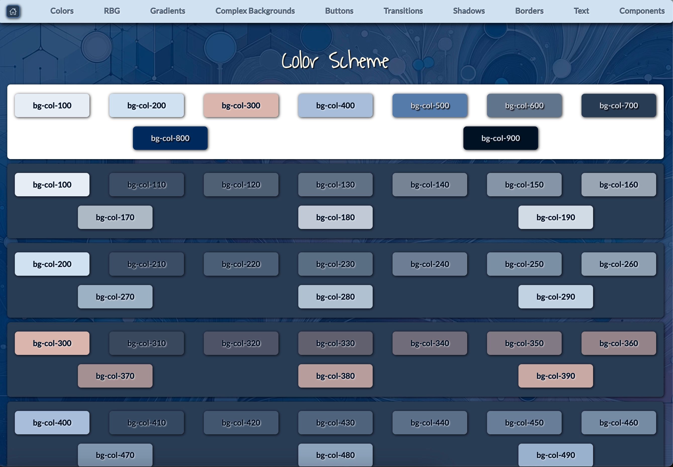
Figure 2: 🔗 Color Palette Designer's View - This image presents the dynamic color palette integrated within the Remix-Vite-Tailwind template. Featuring an extensive range of background colors, the palette is fully customizable via the Tailwind configuration file.
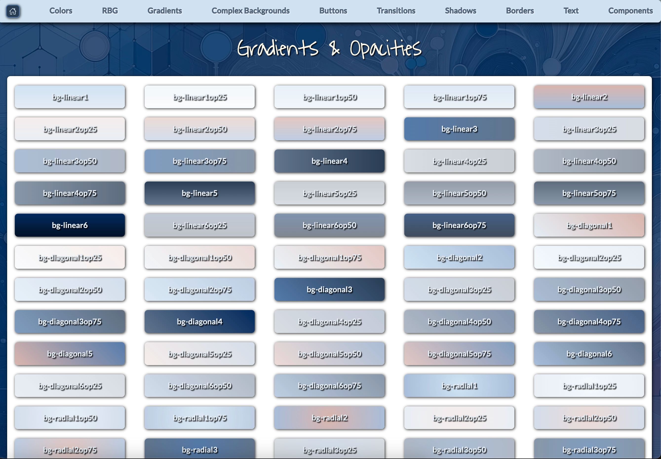
Figure 3: 🔗 Gradient Library - This image showcases the versatile gradient and opacity options available within the Remix-Vite-Tailwind template. Developers can experiment with various linear, diagonal, and radial gradients to create smooth, visually appealing transitions.
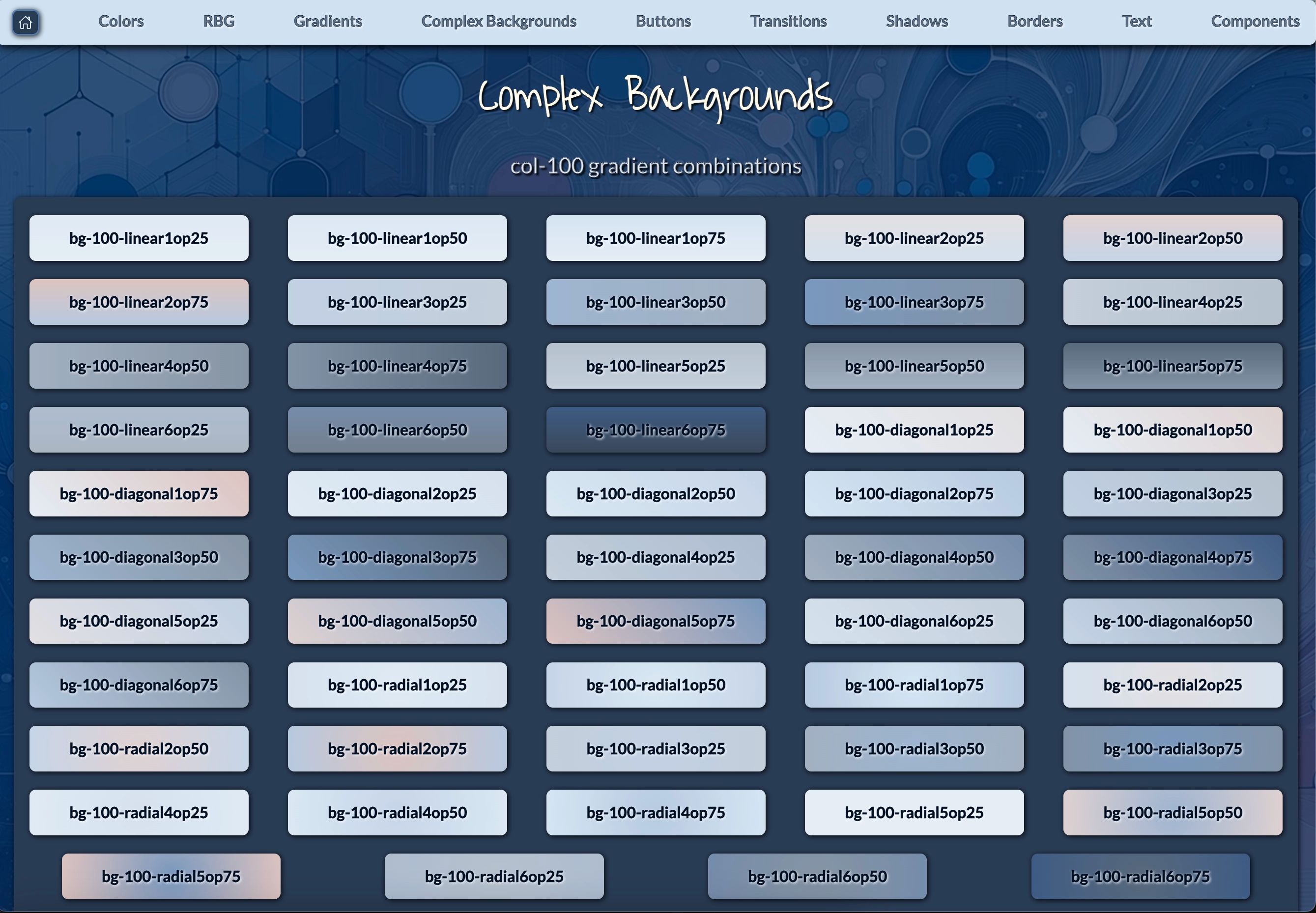
Figure 4: 🔗 Backgrounds - This image highlights the col-100 gradient combinations available for complex background designs in the Remix-Vite-Tailwind template.
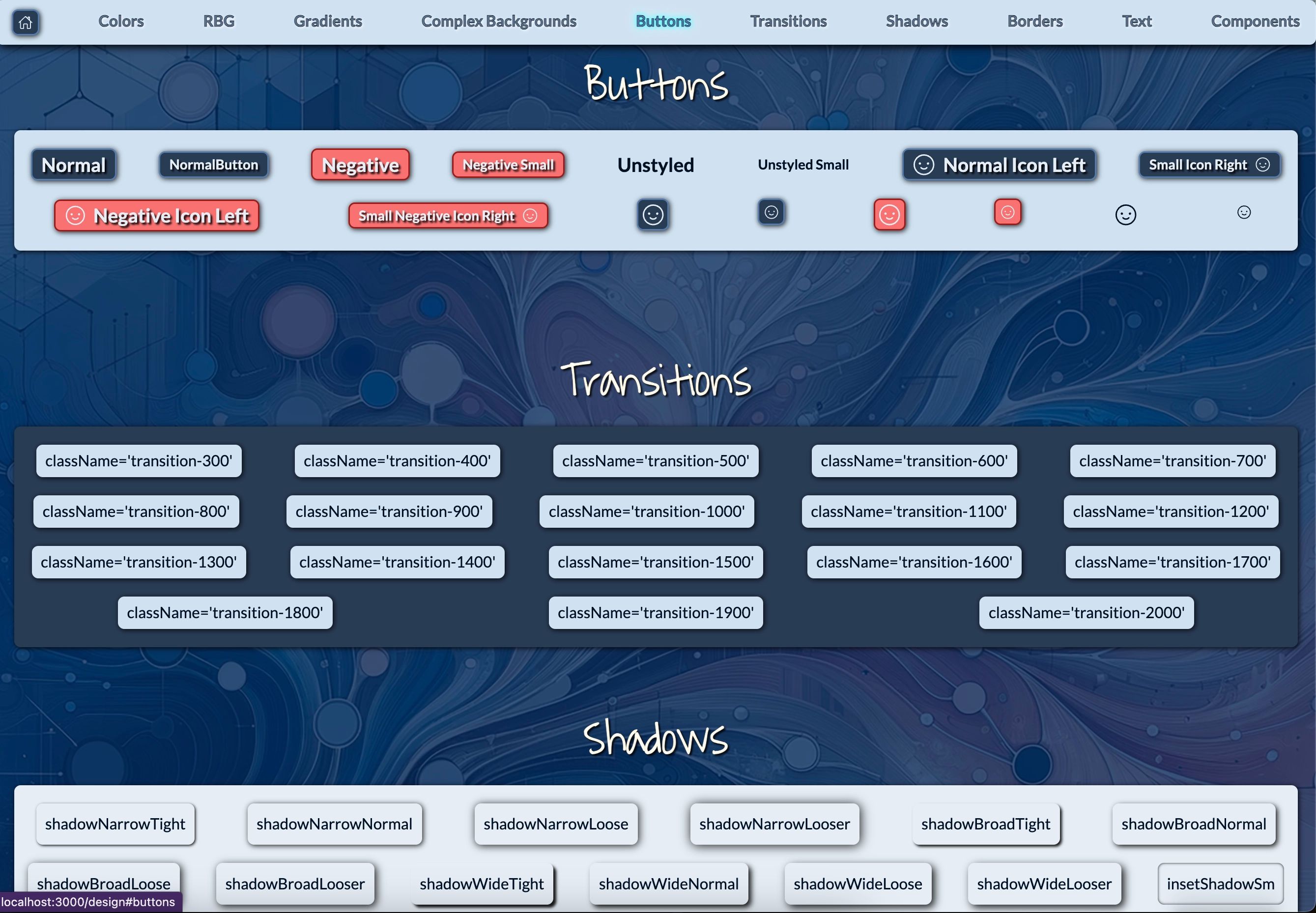
Figure 5: 🔗 Buttons, Transitions, Shadows - This image demonstrates the wide range of customizable button styles, transition effects, and shadow configurations available in the Remix-Vite-Tailwind template.
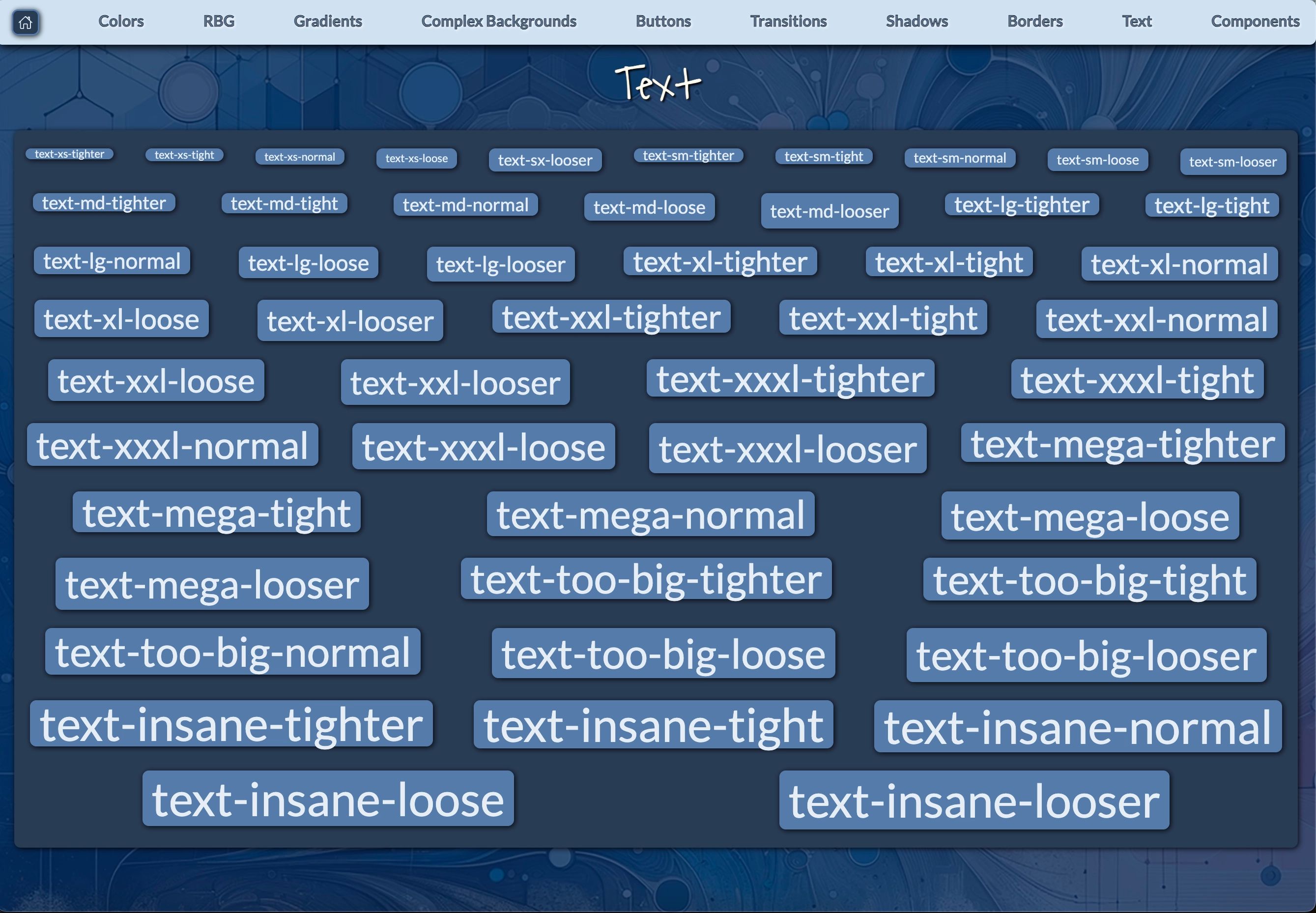
Figure 6: 🔗 Text Sizing & Spacing - This image displays the extensive range of text size and spacing options available in the Remix-Vite-Tailwind template.
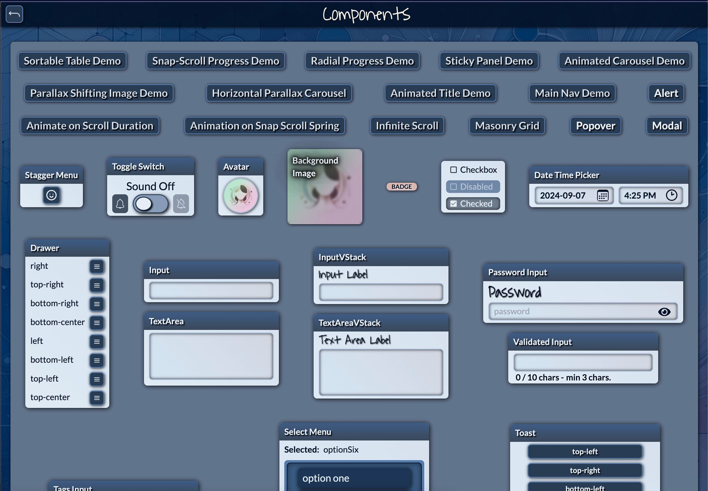
Figure 7: 🔗 Components Overview - This image provides a glimpse of the extensive component library included in the Remix-Vite-Tailwind template.
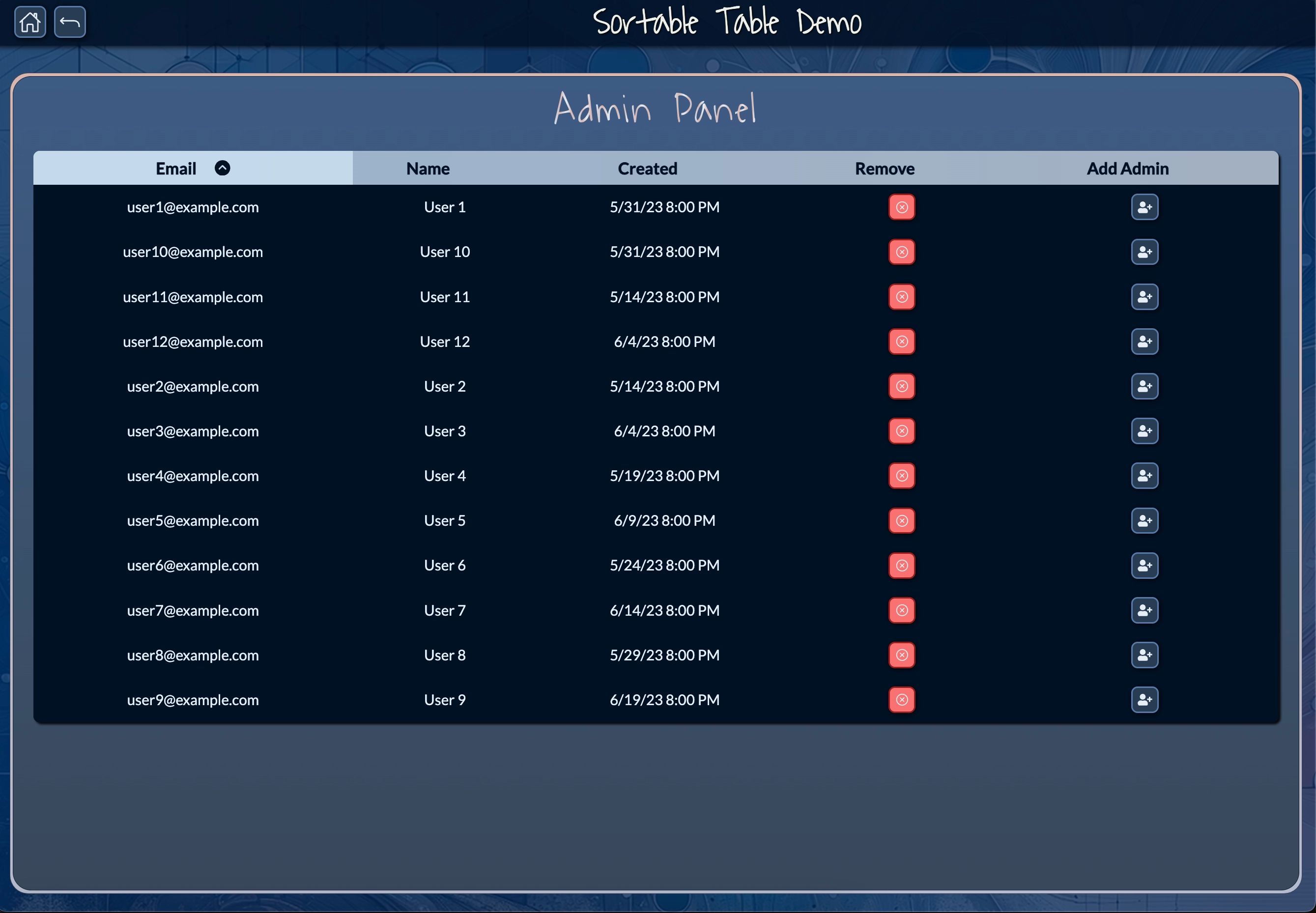
Figure 8: 🔗 Sortable Table Demo - This image showcases the sortable table feature in the Remix-Vite-Tailwind template, designed for use in administrative dashboards.
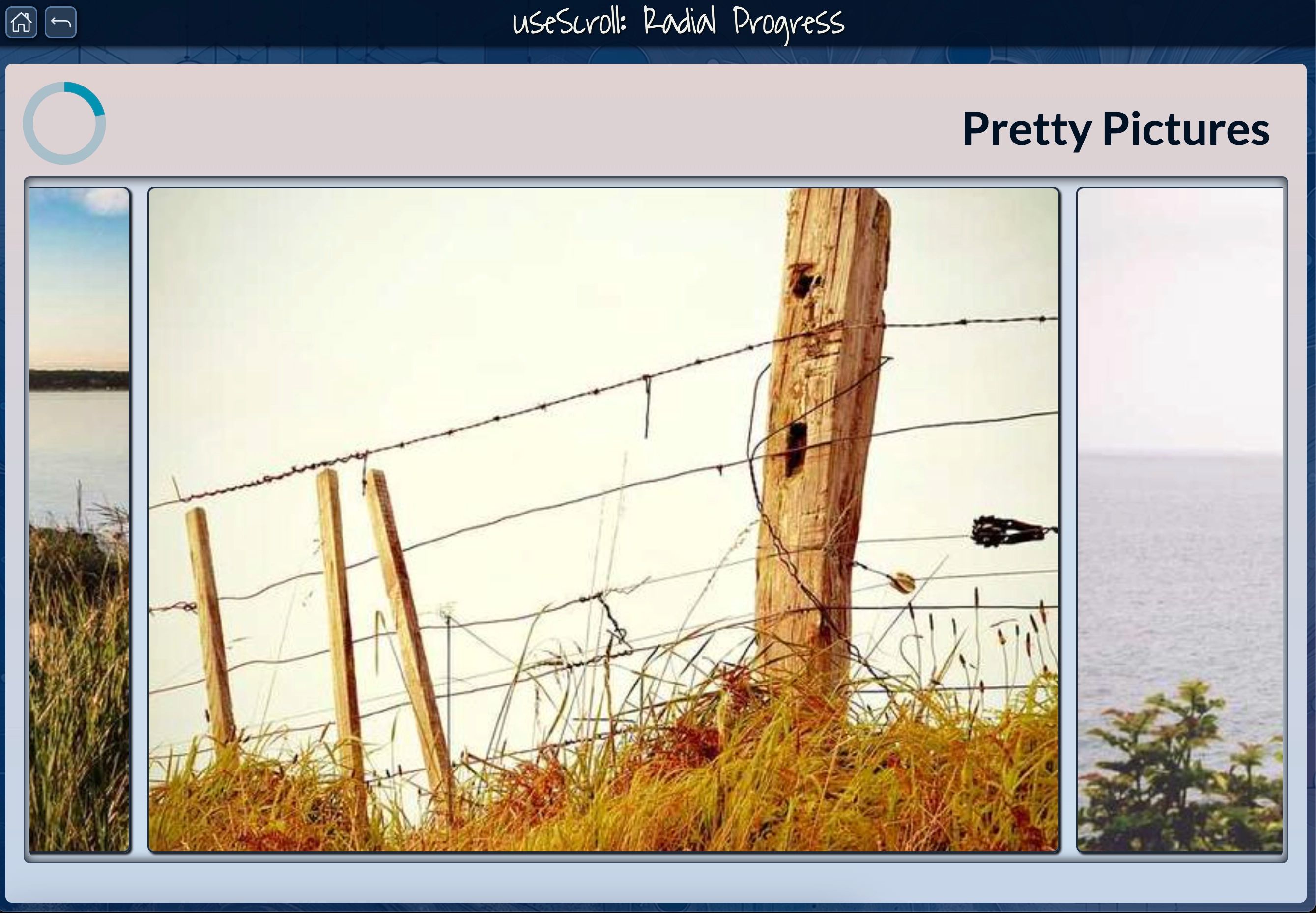
Figure 9: 🔗 useScroll: Radial Progress - This image demonstrates the radial progress feature tied to scrolling interactions.
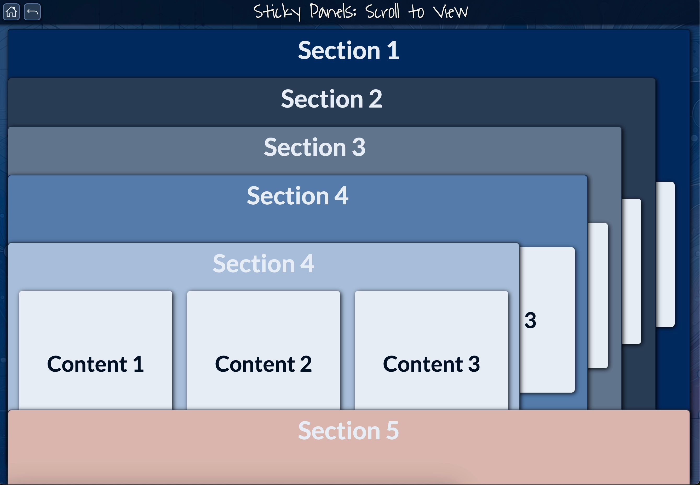
Figure 10: 🔗 Sticky Panels: Scroll to View - This image demonstrates the sticky panels feature within the Remix-Vite-Tailwind template.
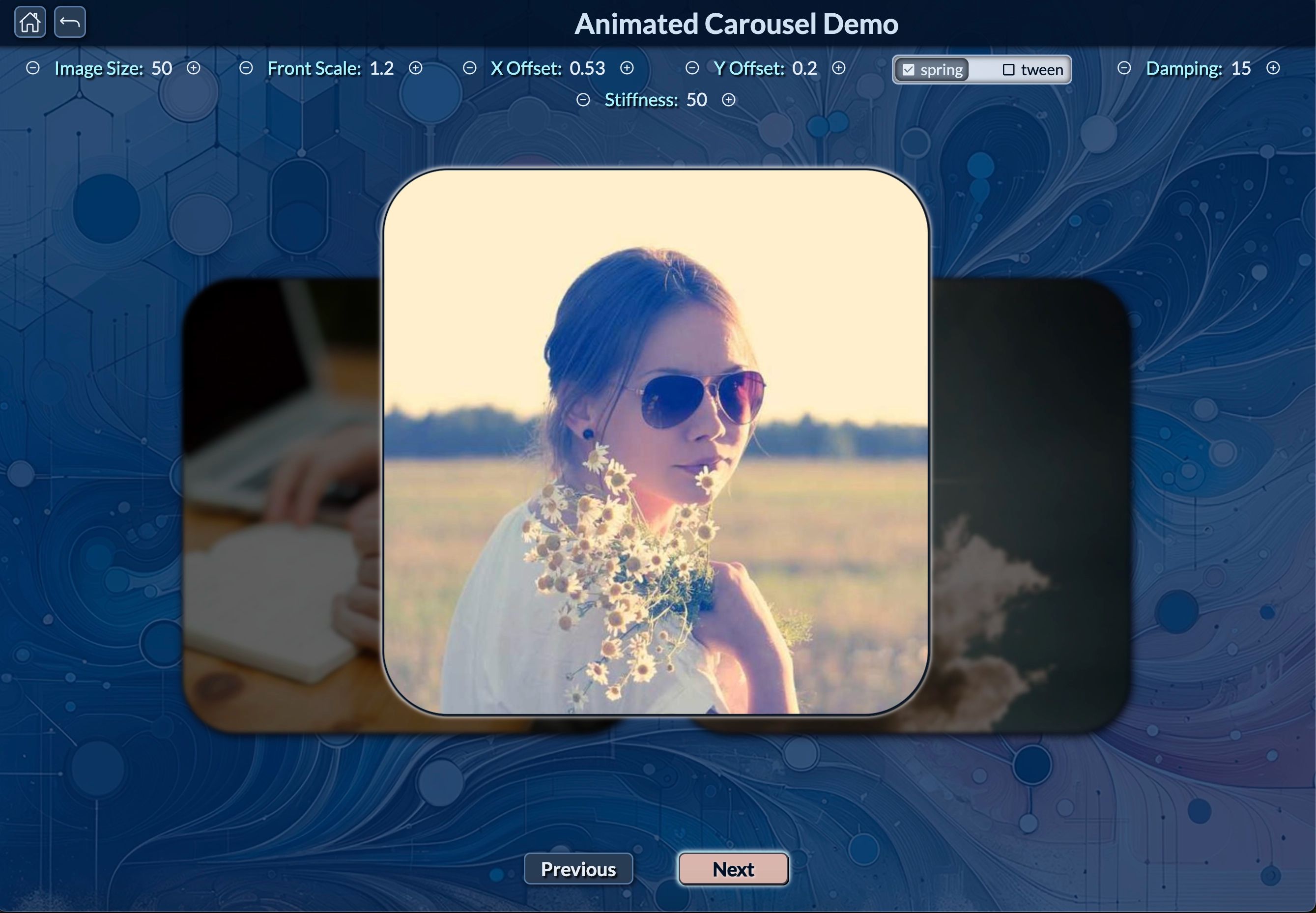
Figure 11: 🔗 Animated Carousel Demo - This image showcases the animated carousel feature from the Remix-Vite-Tailwind template.
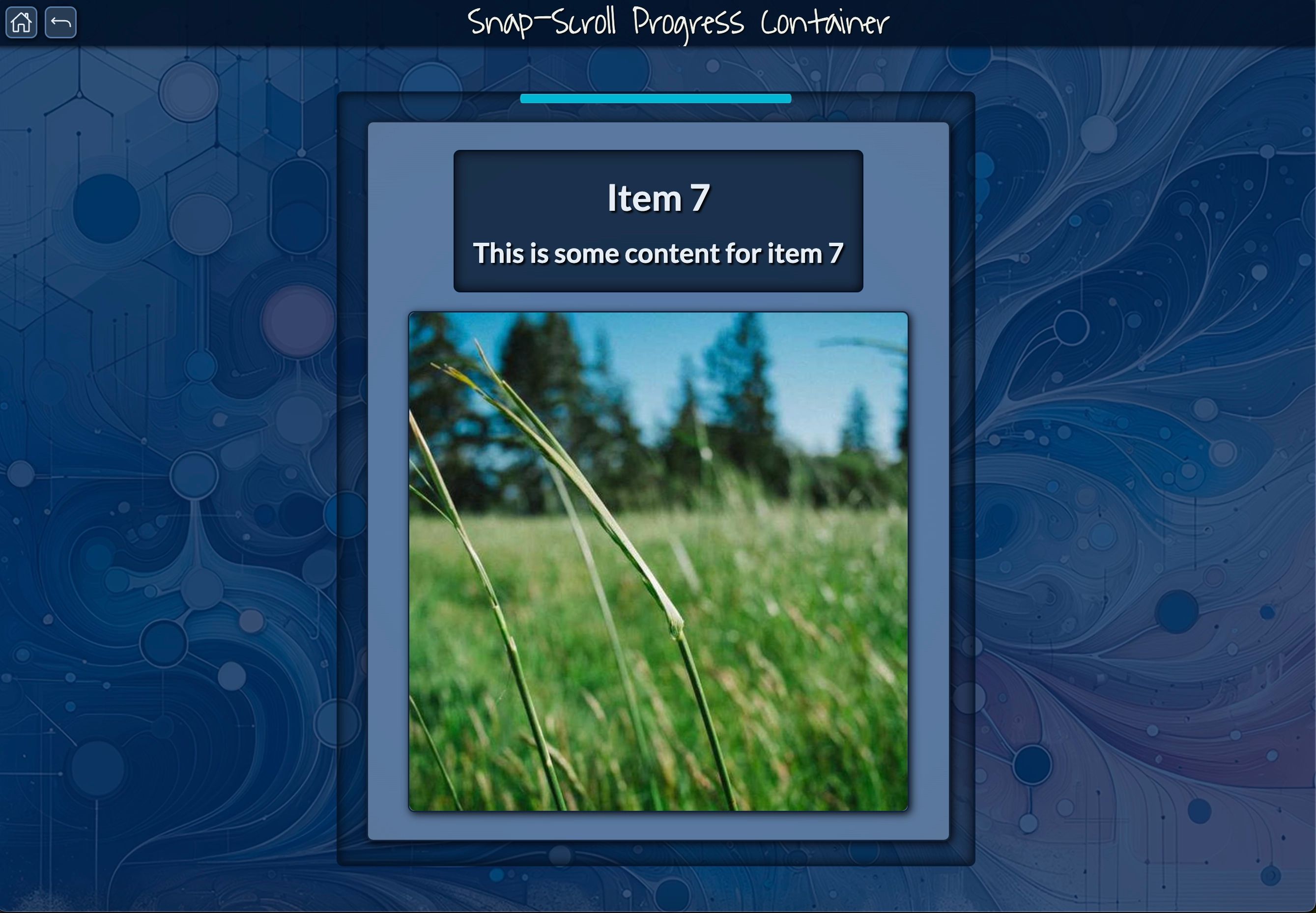
Figure 12: 🔗 Snap-Scroll Progress Container - This image highlights the Snap-Scroll Progress Container feature, where users can navigate through content sections with a smooth, snapping scroll effect.
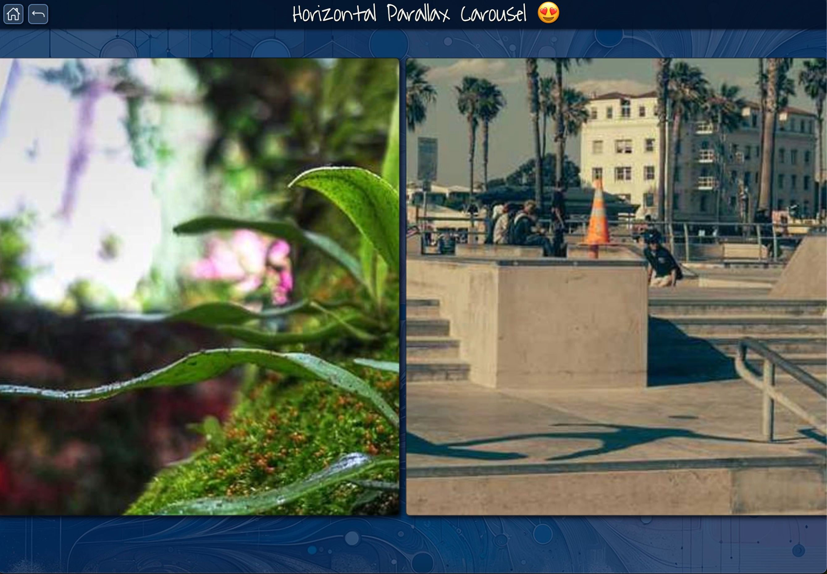
Figure 13: 🔗 Horizontal Parallax Carousel - This image demonstrates the Horizontal Parallax Carousel feature, where foreground and background elements move at different speeds as users scroll horizontally.
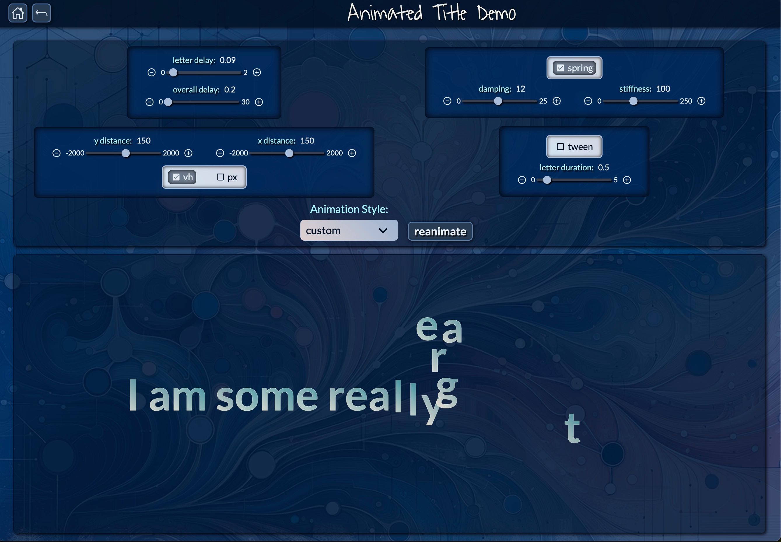
Figure 14: 🔗 Animated Title Demo - This image showcases the Animated Title Demo, where developers can configure custom text animations using adjustable parameters like letter delay, distance, and spring stiffness.
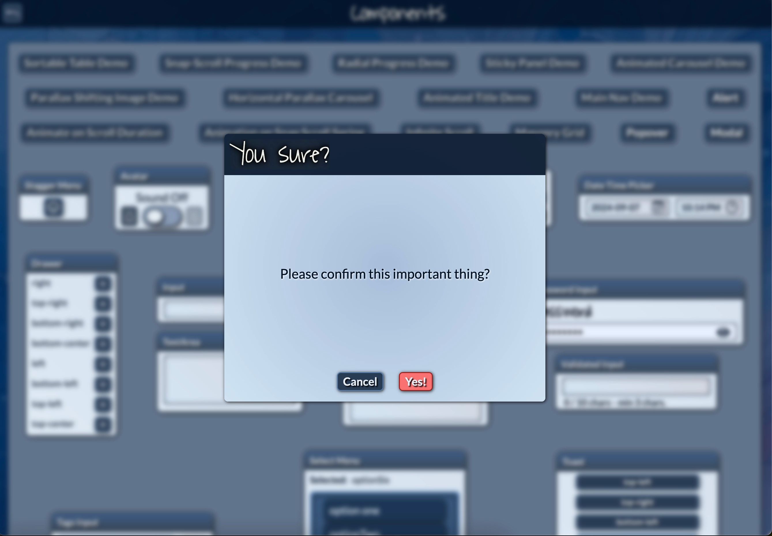
Figure 15: 🔗 Confirmation Alert Demo - This image displays a confirmation alert example, offering a simple yet effective way to manage user interactions for critical actions.
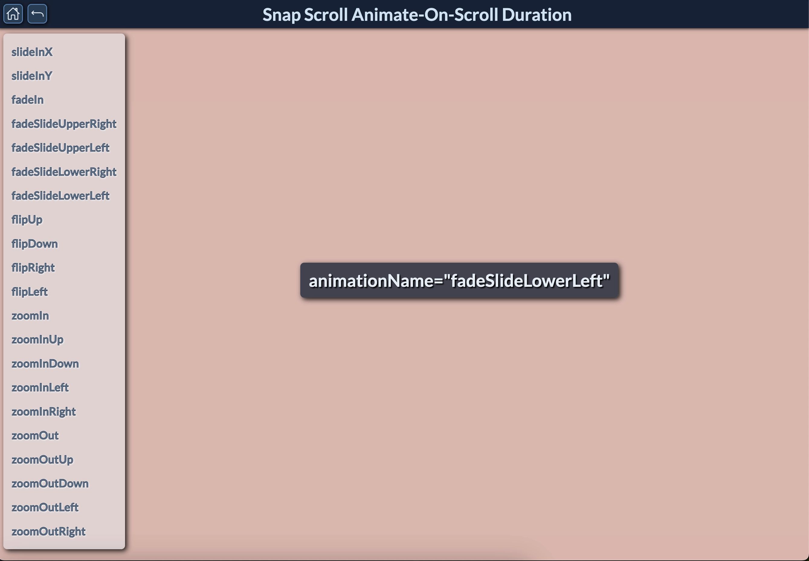
Figure 16: 🔗 Snap Scroll Animate-On-Scroll Duration - This image demonstrates the Snap Scroll Animate-On-Scroll feature, with customizable animations triggered as users scroll through the content.
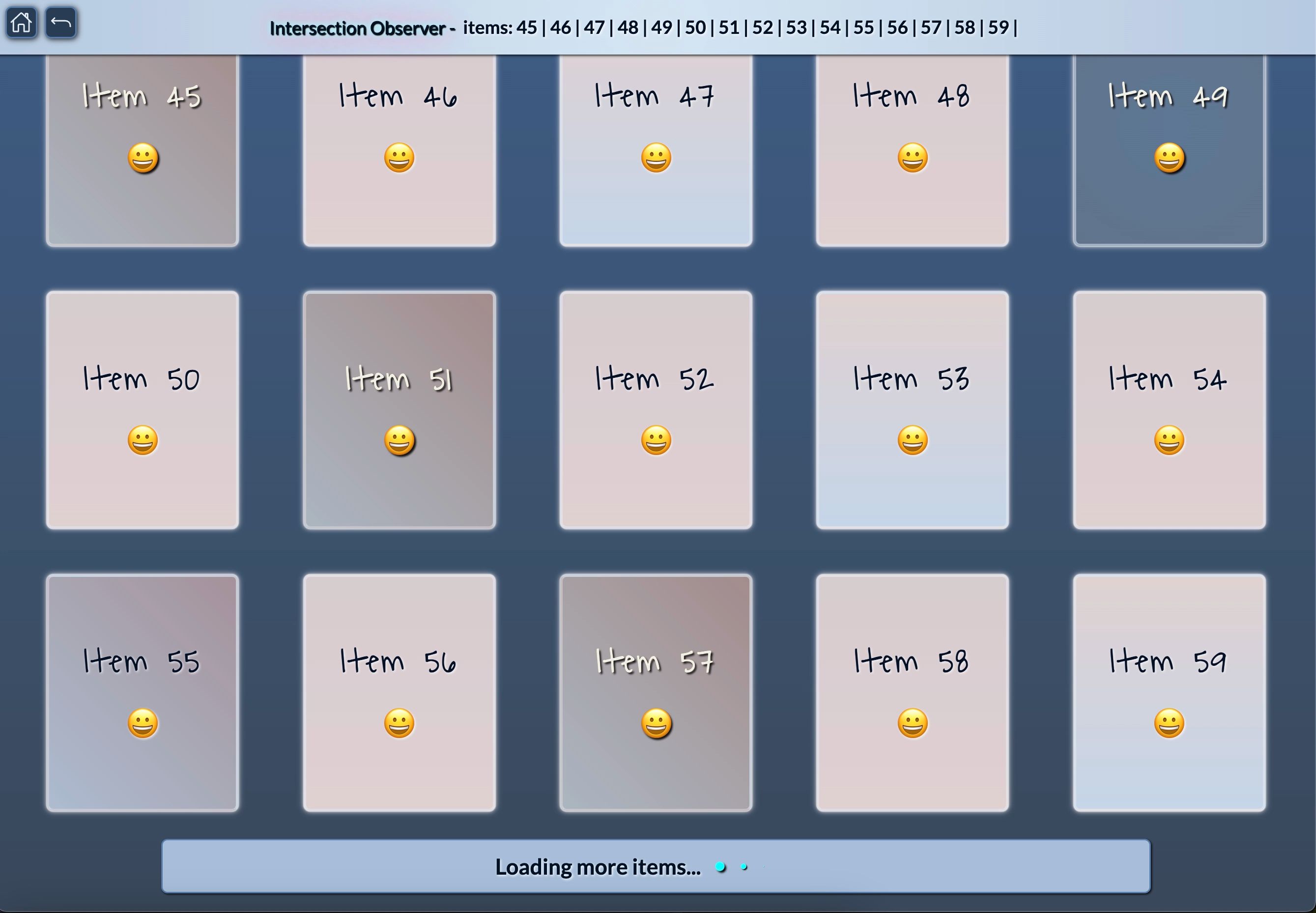
Figure 17: 🔗 Intersection Observer - This image demonstrates the Intersection Observer feature, showcasing how items are dynamically loaded as users scroll using the Intersection Observer feature, optimizing performance with lazy loading.
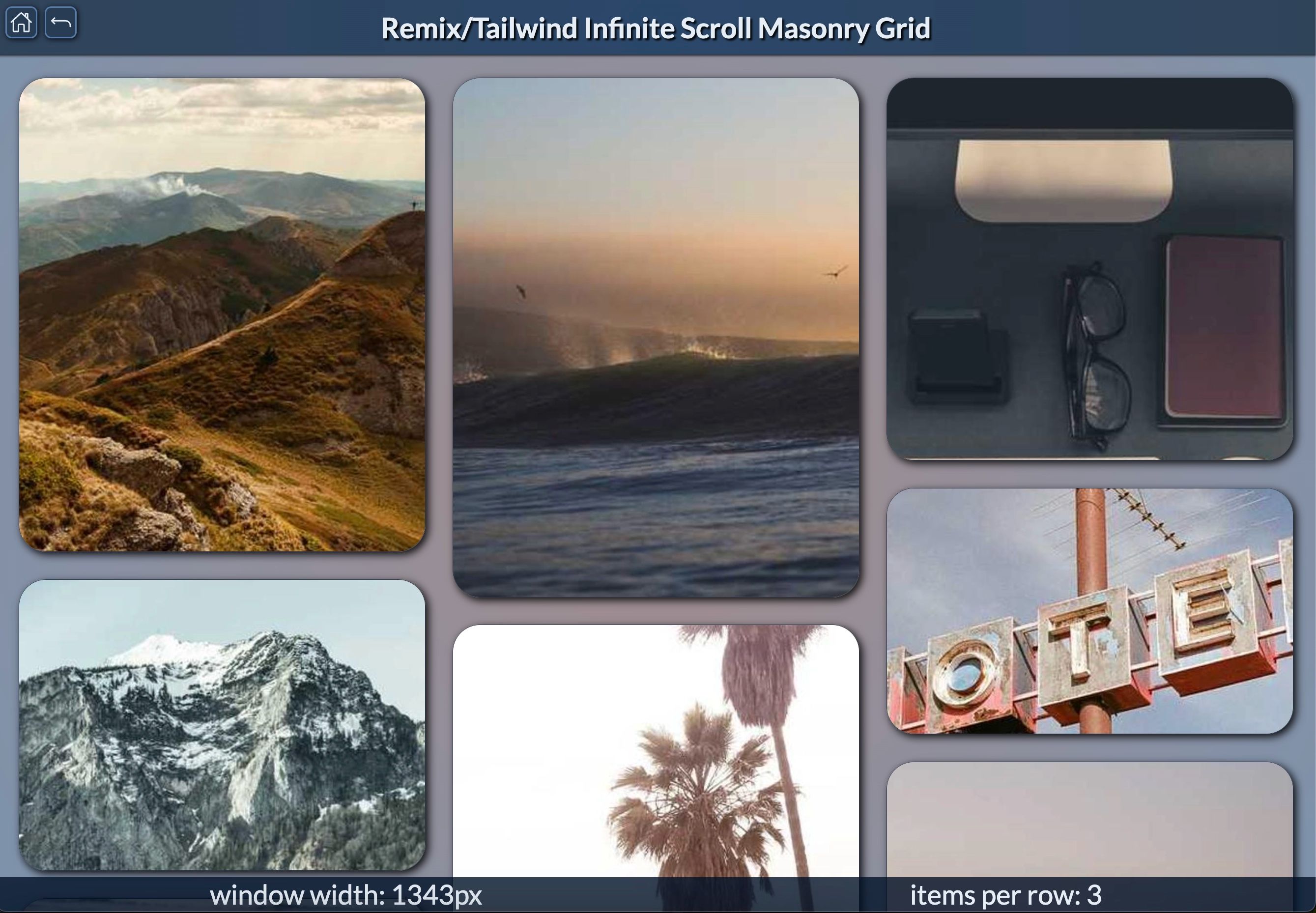
Figure 18: 🔗 Infinite Scroll Masonry Grid - This image showcases the Infinite Scroll Masonry Grid feature, where content is loaded continuously as users scroll, displayed in a visually appealing masonry layout.
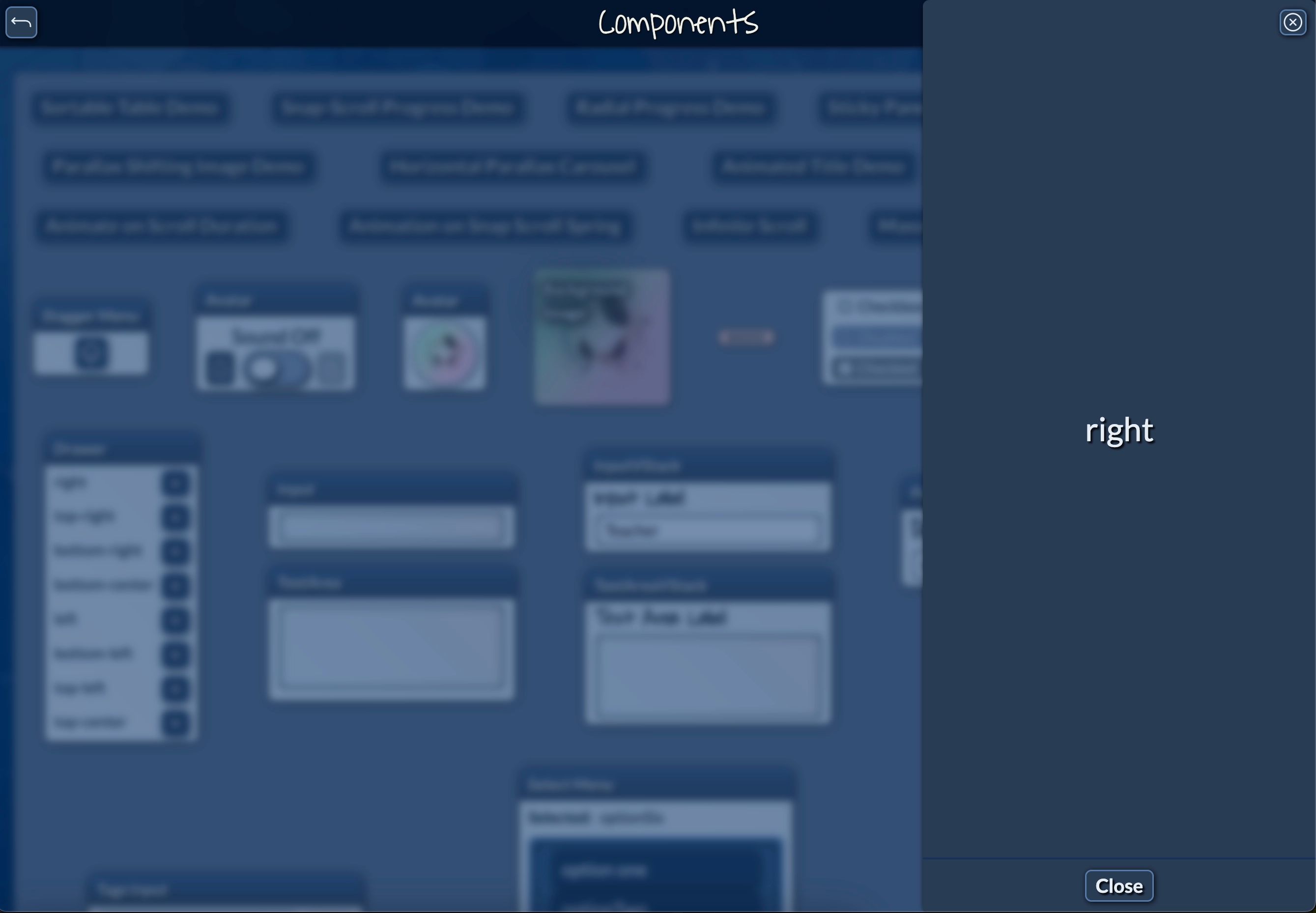
Figure 19: 🔗 Drawer - This image demonstrates the drawer component, showcasing a smooth and customizable animation for opening and closing sliding sidebars or panels in a web app layout.
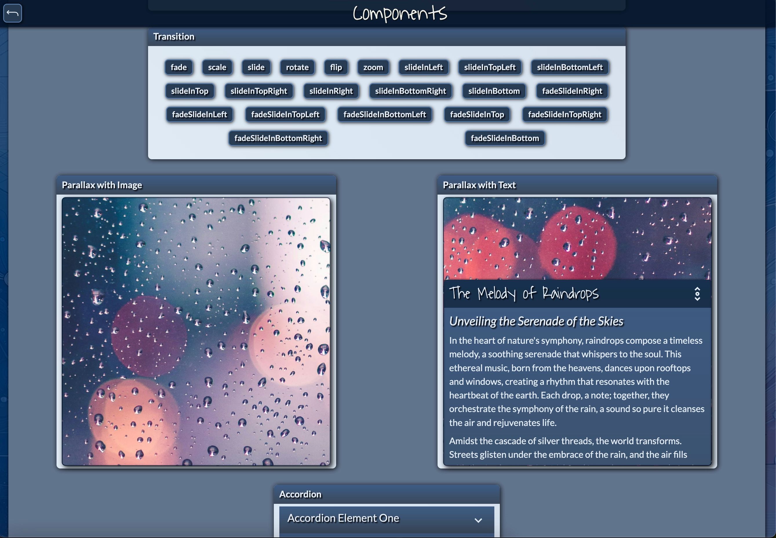
Figure 20: 🔗 Parallax Image and Text Demo - This image demonstrates the Parallax with Image and Parallax with Text features, adding depth and movement to the content as users scroll.
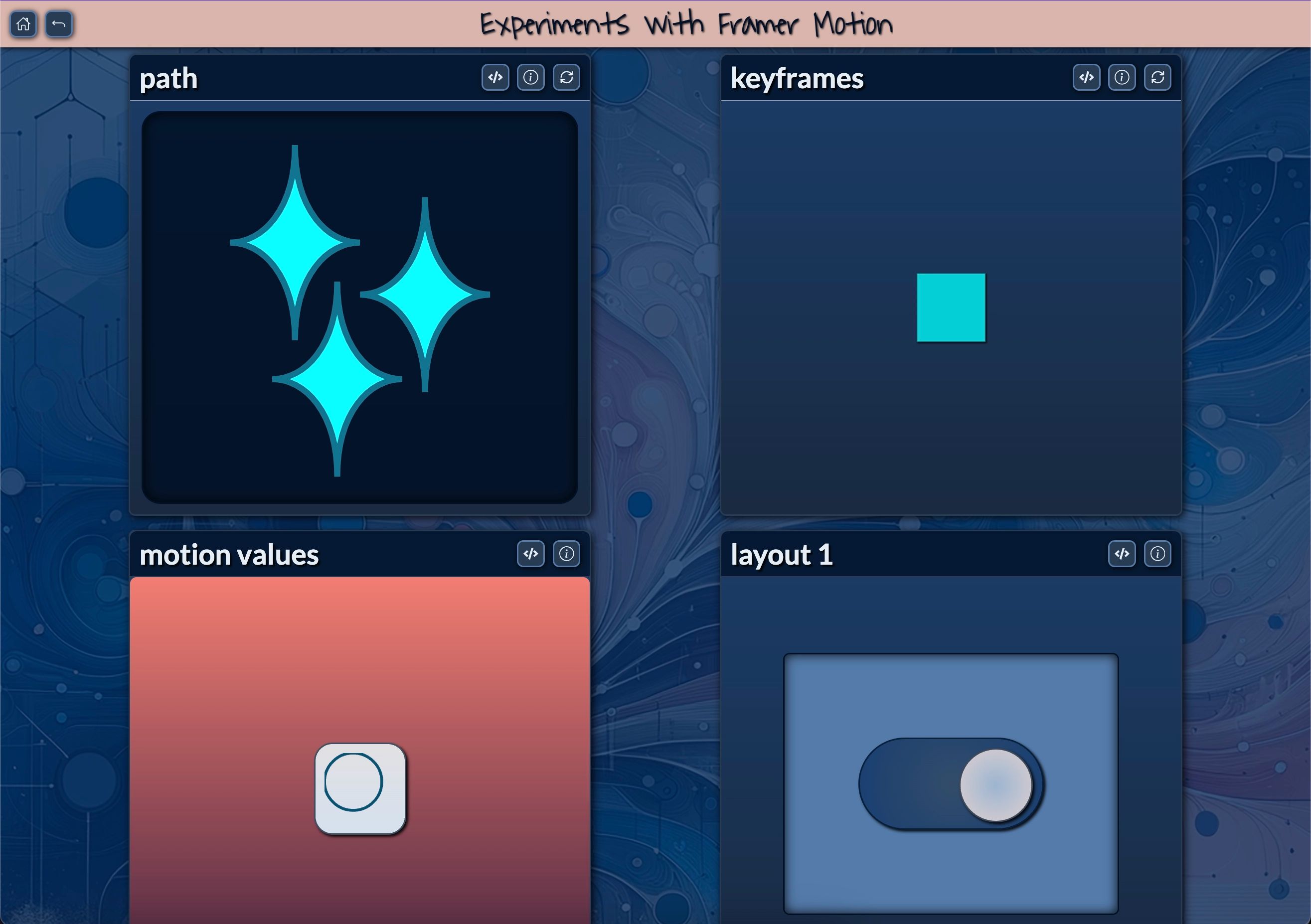
Figure 21: 🔗 Interactive Framer Motion - This interactive dashboard showcases a variety of animations created with Framer Motion. It allows users to explore features like keyframe animations, motion values, and layout transitions, equipped with replay controls for seamless experimentation and learning.
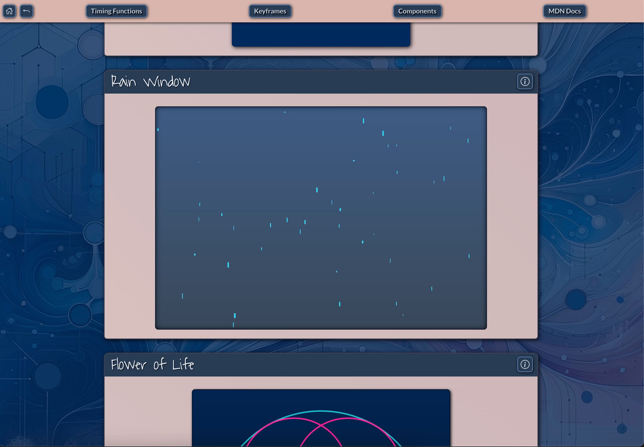
Figure 22: 🔗 Rain Window Animation - This visual showcases a Rain Window animation, where animated raindrop-like particles simulate rainfall on a screen.
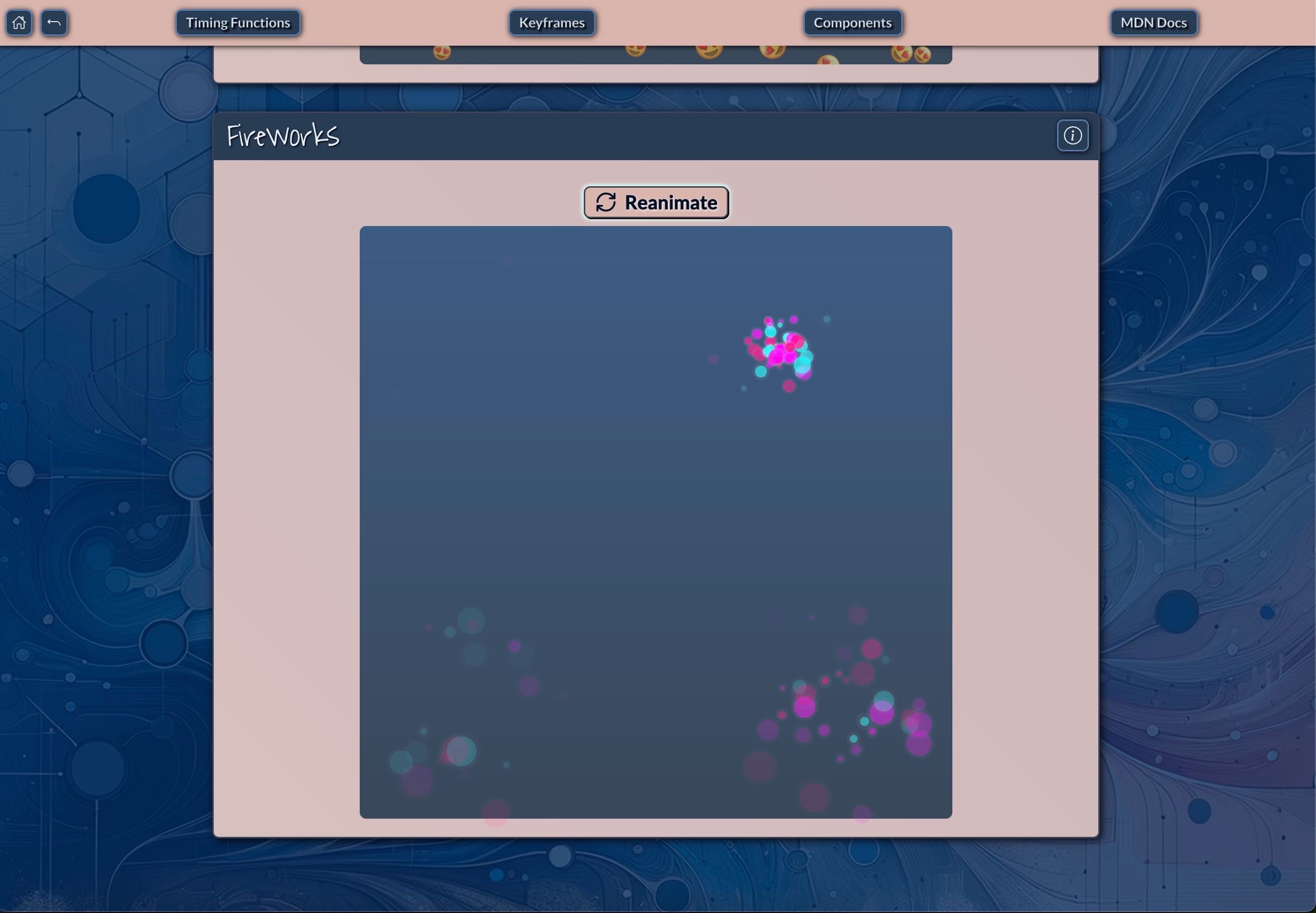
Figure 23: 🔗 Fireworks Animation - This image demonstrates a Fireworks animation using timing functions and keyframes, simulating fireworks bursts on a web page.
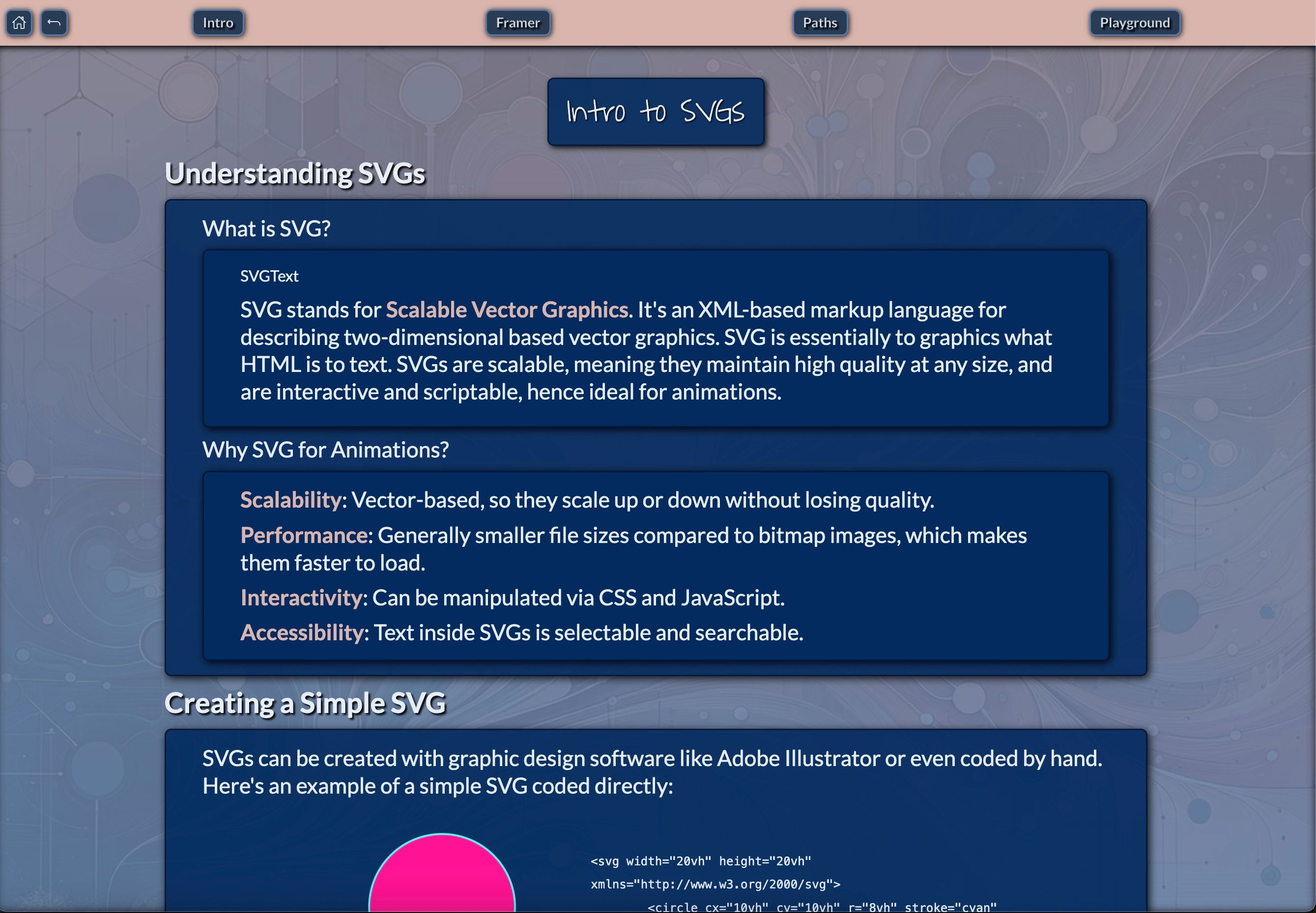
Figure 24: 🔗 Intro to SVGs - This image provides an introduction to SVGs (Scalable Vector Graphics), explaining their XML-based structure and benefits for web animations.
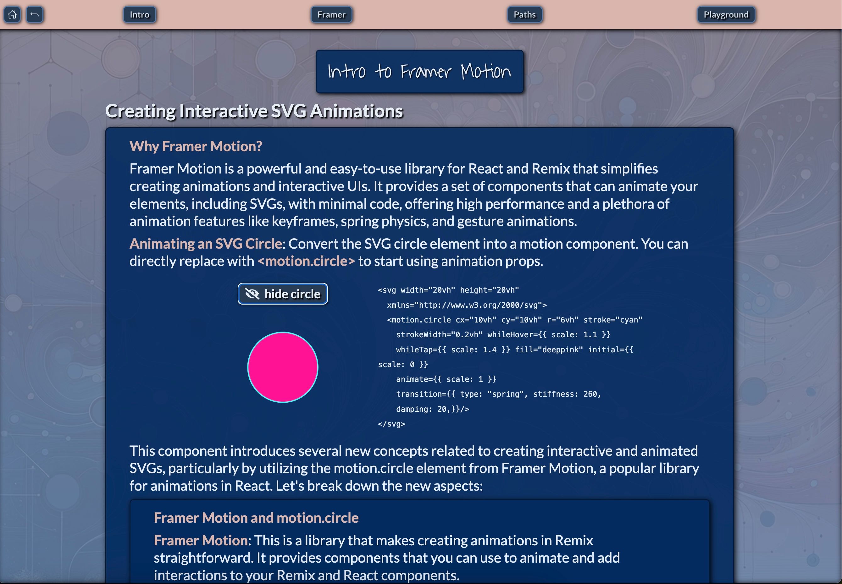
Figure 25: 🔗 Creating Interactive SVG Animations with Framer Motion - This image provides an overview of Framer Motion, a library for creating animated and interactive UI components in React and Remix.
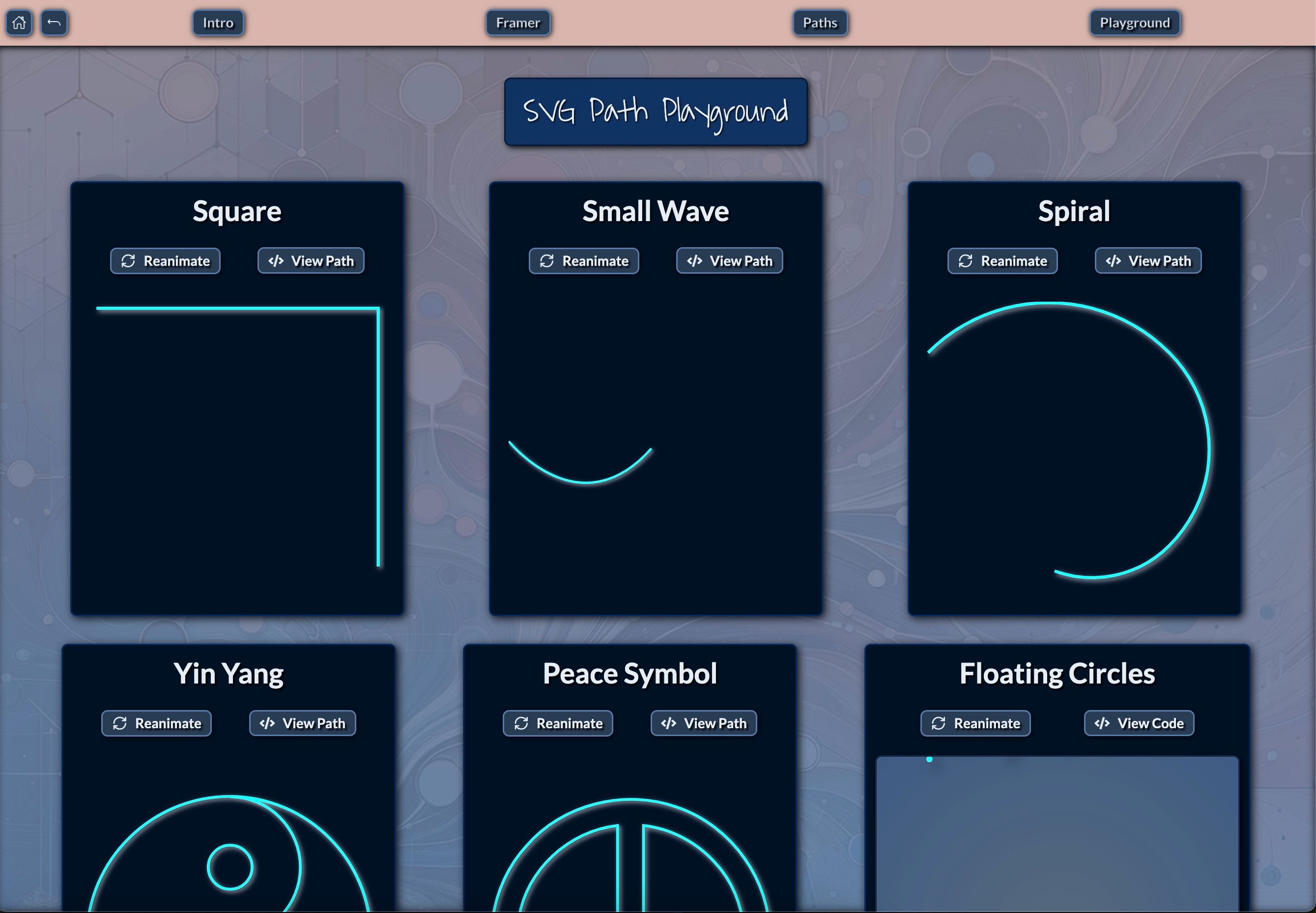
Figure 26: 🔗 SVG Path Playground - This image features the SVG Path Playground, a dynamic tool for experimenting with and animating SVG paths.
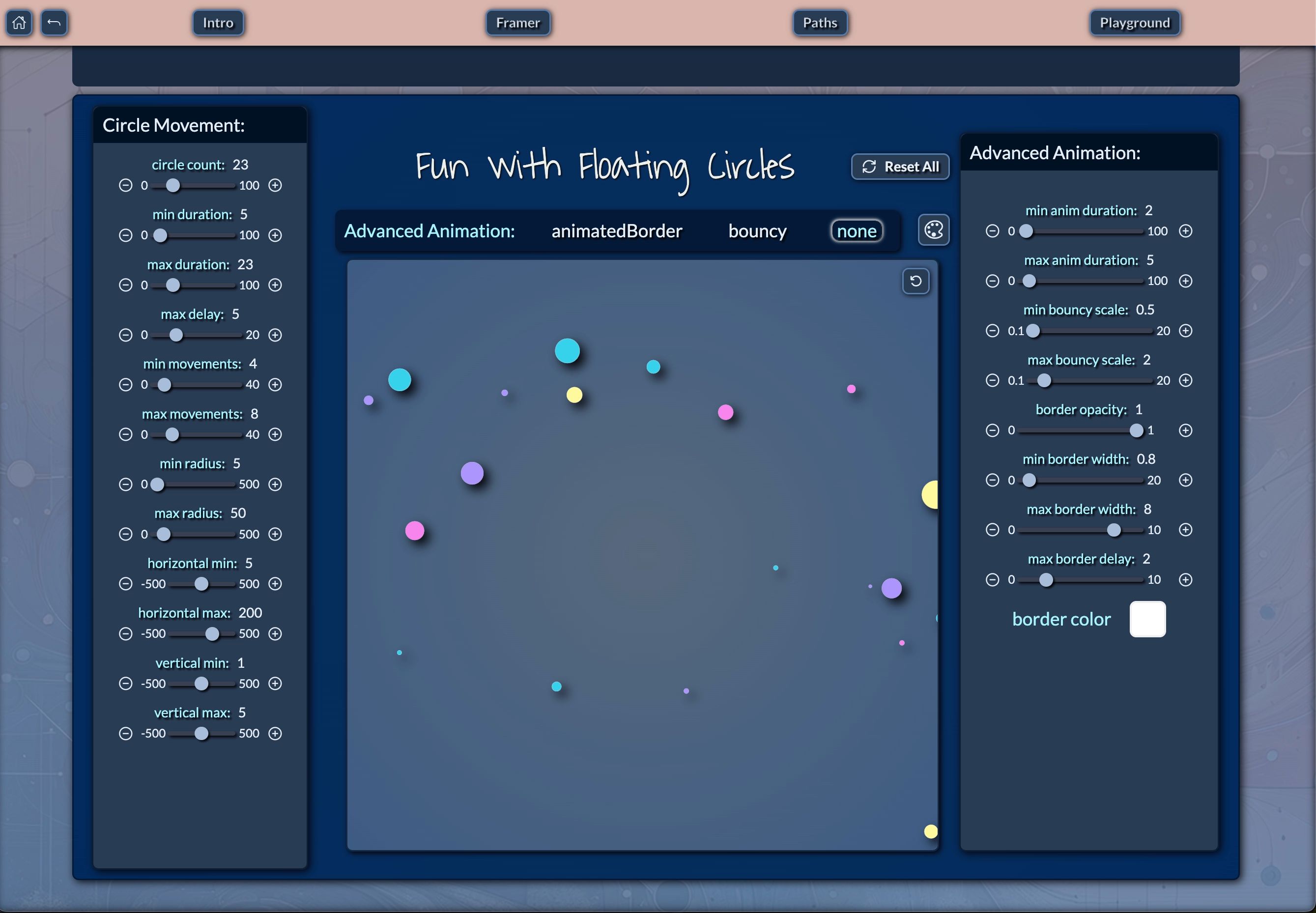
Figure 27: 🔗 Fun with Floating Circles - This image showcases an interactive Floating Circles Animation Tool, where users can customize various circle movement and animation properties.

Figure 28: 🔗 Fun with Floating Circles - This image showcases an interactive Floating Circles Animation Tool, where users can customize various circle movement and animation properties. The interface allows control over the number of circles, duration of animations, size (radius), and movement range (horizontal and vertical). The right panel offers advanced settings like bouncy effects, border animation, and opacity control for even more refined animations. This tool is perfect for visualizing dynamic floating objects, creating engaging animations, and experimenting with circle physics and design elements.