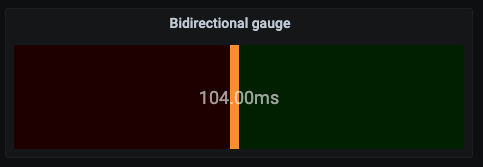
This grafana plugin displays a horizonal bar gauge showing how close to a target a value is. It covers a range of -100% to 100% (values outside the range are clipped visually)
It is meant for displaying metrics such as SLA target compliance.
For example, for a service with a response time SLA of 100 milliseconds, a value of 104 milliseconds falls 4% under the SLA and is displayed as a warning like so:
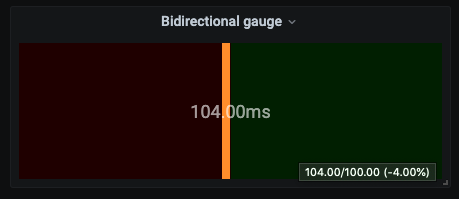
The panel also displays a tooltip on mouse hover with details:
The plugin is waiting to be added to the central Grafana Plugin Hub
In the meantime, you can install it locally using the dist folder in the latest release
You can enable a threshold to show as a warning instead of an error using a different color:
If the value displayed is above the specified threshold (but below 0 obviously), then the gauge will be coloured as a warning
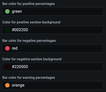
You can control the different colours of the gauge:
The colours, in order, correspond to the gague colour for positive values, the background colour of the positive section, the negative values, the negative background section and, finally, the warning section, if enabled.
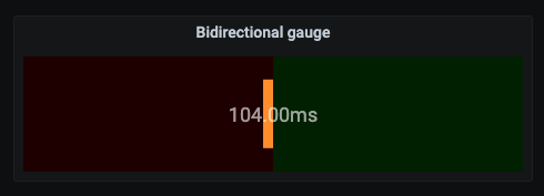
You can control the height of the gauge bar:
This field accepts values in the range 0-100 and it controls the height of the bar. For example, for a value of 60, it will produce this:
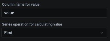
The value to be displayed can be calculated from a column in the supplied table:
The first field is the name of column to pull the value from and the second field is the calculation to use to produce the final value from all the table rows supplied (defaults to using the first row)
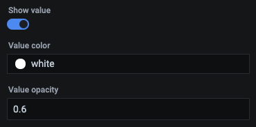
You can control the value overlay:
If the slider is selected, the gauge will show an overlay with the final value, using the specified colour and opacity.
You can also decide to show a unit in the overlay:
The gauge compares the final value to a target value in order to produce the percentage difference. The target can be specified manually:
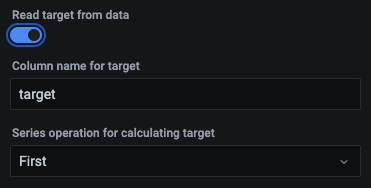
or calculated dynamically from the supplied data table:
The first field is the name of the column in the supplied table containing the target values and the second field determines how the target value is calculated using the rows (defaults to using the first row value)
You can temporarily enable a debug option:
This will show the data supplied to the gauge for troubleshooting purposes:

