Flex-direction || Flex-wrap || Flex-flow || Justify-content || Align-items || Align-content
In the last article, I established some core principles. What flex-containers and flex-items are, and how to initiate the Flexbox model. Now is a good time to put all of that to good use. So, brace up.
Having set a parent element as a flex container, a couple of alignment properties are made available to be used on the flex container.
Just like you'd define the width property on a block element as width: 200px, there are 6 different properties the flex container can take on, and defining these properties do NOT take a different approach.
The Flex-direction property may take any of four values:, and it controls the direction in which the flex items are laid along the main axis.
/*where ul represents a flex container*/
ul {
  flex-direction: row || column || row-reverse || column-reverse;
}
The flex-direction property let's us decide how the flex items are laid out. Either horizontally, vertically or reversed in both directions.
Technically, horizontal and vertical isn't what it's called in the "flex world". These are described as main-axis and cross axis, and the defaults are shown below:
By default, the flex-direction property is set to row and it aligns the flex-item(s) along the main axis. This explains what happened with our unordered list at the start of this article. Even though flex-direction property wasn't explicitly set, it took on the default value of row and so the flex items were laid across the main-axis, stacking horizontally from left to right.
The flex wrap property can take on any of three values:
//where ul represents a flex container
ul {
  flex-wrap: wrap || nowrap || wrap-reverse;
}
Let's try sticking in a lot more list items within our unordered list. What do you think? Will our flex container resize or break up the list items?
/*adding 3 more li elements*/
<ul> <!--parent element-->
  <li></li> <!--first child element-->
  <li></li> <!--second child element-->
  <li></li> <!--third child element-->
  <li></li>
  <li></li>
  <li></li>
</ul>
Fortunately, the flex-container adapts to accommodate our new flex-items
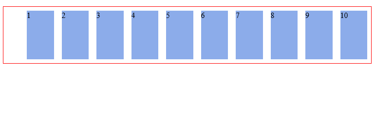
So let's go a bit further...Add a ridiculous amount of flex-items to our parent element. I choose 10 more items. What happens??
Again, the flex container adapts to fit all children in, even if I need to scroll my browser horizontally.
This is the default behavior of every flex container. It keeps on accommodating more flex items on a single line because the flex-wrap property defaults to nowrap.
ul {
  flex-wrap: nowrap; /*Keep on taking more flex items without breaking (wrapping)*/
}
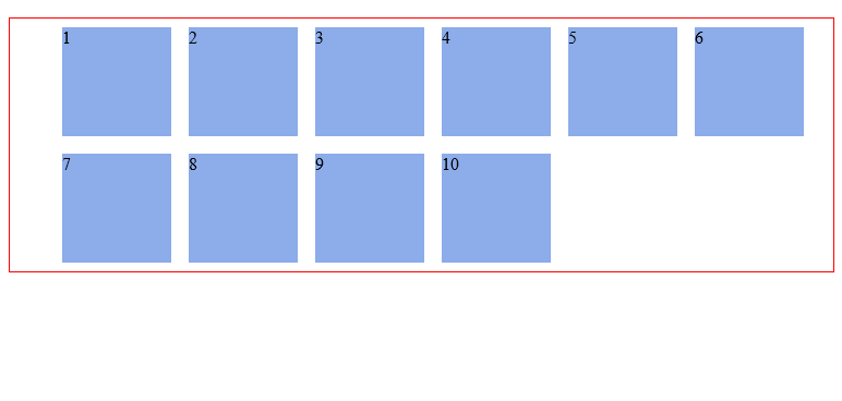
Well, with that number of flex-items, you certainly want the flex-container to 'wrap' around these elements. i.e. When the available space can no longer support the flex-items, break unto multiple lines when needed, and with that comes the wrap value
ul {
  flex-wrap: wrap;
}
With this, the flex items now break up into multiple lines when needed. In this case, when a single line can no longer contain all the list items in their default width, they break up into multiple lines. Even on resizing the browser!!
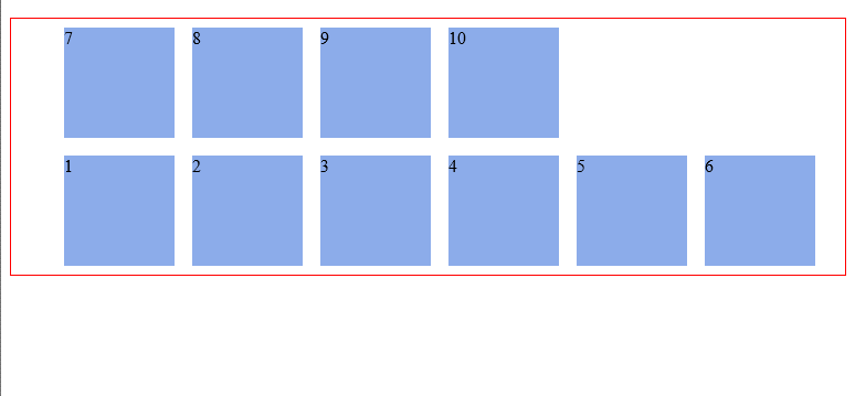
There's one more value, wrap-reverse. Yes, you guessed right. It lets the flex items break unto multiple lines but in the reverse direction.
The flex-flow is a shorthand property which takes flex-direction and Flex-wrap values. Ever used the border shorthand property? border: 1px solid red. It's the same concept here. Multiple values declared in one line.
Re-writing the code above would yield this:
ul {
  flex-flow: row wrap; /*direction 'row' and yes, please wrap the items.*/
}
Try out the other combinations this could take. flex-flow: row nowrap, flex-flow: column wrap, flex-flow: column nowrap
I'm sure you understand what those would produce. Give it a try.
Life's really good with the flexbox model! If you still doubt that, the justify-content property would convince you. It may take on any of these 5 values:
ul {
  justify-content: flex-start || flex-end || center || space-between ||
    space-around;
}
And what exactly does the justify content property bring to the table? Well, It may remind you of the text-align property.
The justify content property defines how flex items are laid out on the main axis.
Consider the simple unordered list below:
<ul>
  <li>1</li>
  <li>2</li>
  <li>3</li>
</ul>
Adding up some basic styling...
ul {
  border: 1px solid red;
  padding: 0;
  list-style: none;
  background-color: #e8e8e9;
}

li {
  background-color: #8cacea;
  width: 100px;
  height: 100px;
  margin: 8px;
  padding: 4px;
}
We have this:
With the justify-content property, the three flex-items may be aligned across the main-axis in whatever way you desire. Here's the breakdown of what's possible.
Fist off, the default value, flex-start, groups all flex-items to the start of the main axis.
ul {
  justify-content: flex-start;
}
flex-end groups the flex-items to the end of the main axis.
ul {
  justify-content: flex-end;
}
Center does just you'd expect - centering the flex items along the main axis.
ul {
  justify-content: center;
}
Space-between keeps the same space between each flex item.
ul {
  justify-content: space-between;
}
Uhmm, did you notice anything different here? Take a look again:
Finally, space-around keeps the same spacing around flex items.
ul {
  justify-content: space-around;
}
A second look doesn't hurt:
Don't worry if these seem like too much to get a hold of. With a bit of practice you will get very comfortable with the syntax.
The align-items property is somewhat similar to the justify-content property. Having understood the justify-content property, this should be easier to take in.
Align-items can be set to any of these values: flex-start || flex-end || center || stretch || baseline
/*ul represents any flex container*/
ul {
  align-items: flex-start || flex-end || center || stretch || baseline;
}
It defines how flex-items are laid out on the cross axis. This is the difference between the align-items property and justify-content.
The default value is stretch, and this will 'stretch' the flex-items so they fill the entire height of the flex container.
The flex-start and flex-end properties do what you expect - group the items to the start or end of the cross-axis.
The center value is equally predictable. It aligns items to the center of the flex-container.
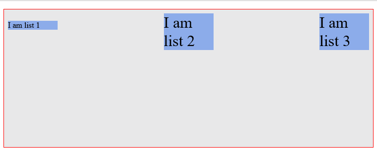
And the baseline value? It aligns flex-items along their baselines.
"Baseline" really sounds fancy. It appears to look just like flex-start but it is subtly different. What the heck is "baseline"? This should help:
Isn't it awesome the amount of layout control you have here?
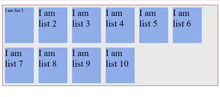
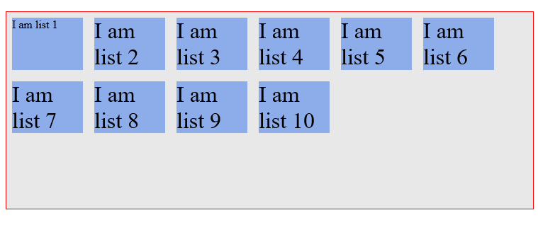
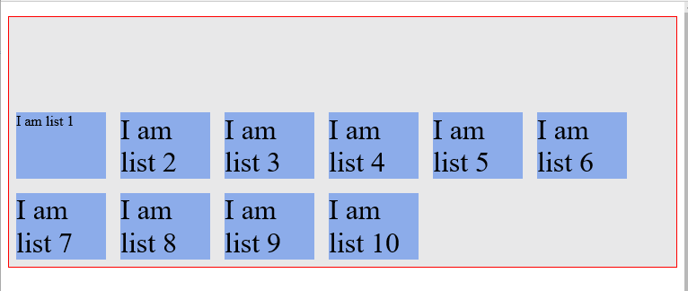
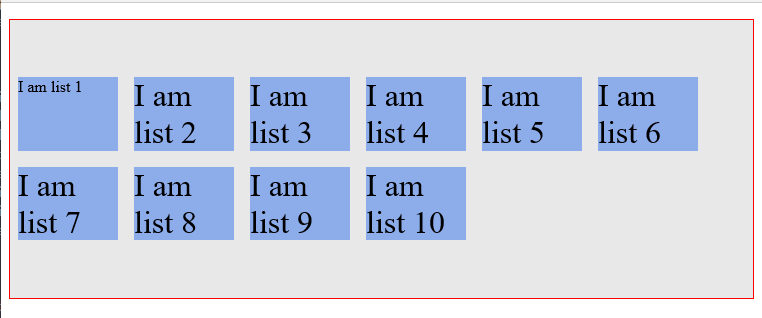
Remember when you added more list elements to our unordered list? You got a multi-line flex container by using the flex-wrap property. The align-content property is used on multi-line flex-containers.
It takes the same values as align-items apart from baseline. By definition, it controls how the flex-items are aligned in a multi-line flex container. Just like align-items, the default value is also stretch
These are values you're familiar with. So, here's how they affect a multi-line flex-container.
Stretch
Flex-start
Flex-end
Center
...and that concludes this. You now understand how to use the various flex-container properties. Pretty soon, you'll need these to work through the practical sections coming up. I guess you're feeling much more confident now, right?
More fun stuffs lie ahead!
Don't forget to spread the word on Twitter. Much appreciated!
Free PDF version available here.
Next Read: THE FLEX-ITEM PROPERTIES


