Like most 25-year-olds, Julia Rozovsky wasn’t sure what she wanted to do with her life. She had worked at a consulting firm, but it wasn’t a good match. Then she became a researcher for two professors at Harvard. All she knew for certain was that she wanted to find a job that was more social.
She thought about various opportunities — Internet companies, a Ph.D. program — but nothing seemed exactly right. So in 2009, she chose the path that allowed her to put off making a decision: She applied to business schools and was accepted by the Yale School of Management.
Study groups have become a rite of passage at M.B.A. programs, a way for students to practice working in teams and a reflection of the increasing demand for employees who can adroitly navigate group dynamics.
Every day, between classes or after dinner, Rozovsky and her four teammates gathered to discuss homework assignments, compare spreadsheets and strategize for exams. Everyone was smart and curious, and they had a lot in common: They had gone to similar colleges and had worked at analogous firms.
The team’s dynamics could put her on edge. When the group met, teammates sometimes jockeyed for the leadership position or criticized one another’s ideas.
So Rozovsky started looking for other groups she could join. A classmate mentioned that some students were putting together teams for ‘‘case competitions,’’ contests in which participants proposed solutions to real-world business problems that were evaluated by judges, who awarded trophies and cash.
It always struck Rozovsky as odd that her experiences with the two groups were dissimilar. Each was composed of people who were bright and outgoing. When she talked one on one with members of her study group, the exchanges were friendly and warm. It was only when they gathered as a team that things became fraught.
age enables us to examine our work habits and office quirks with a scrutiny that our cubicle-bound forebears could only dream of.
began by reviewing a half-century of academic studies looking at how teams worked.
No matter how researchers arranged the data, though, it was almost impossible to find patterns — or any evidence that the composition of a team made any difference.
been invited to join one of two groups.
What interested the researchers most, however, was that teams that did well on one assignment usually did well on all the others. Conversely, teams that failed at one thing seemed to fail at everything. The researchers eventually concluded that what distinguished the ‘‘good’’ teams from the dysfunctional groups was how teammates treated one another. The right norms, in other words, could raise a group’s collective intelligence, whereas the wrong norms could hobble a team, even if, individually, all the members were exceptionally bright.
-
First, on the good teams, members spoke in roughly the same proportion, a phenomenon the researchers referred to
-
Second, the good teams all had high ‘‘average social sensitivity’’ — a fancy way of saying they were skilled at intuiting how others felt based on their tone of voice, their expressions and other nonverbal cues.
To set multiple points at which an element should undergo a transition, use the @keyframes rule. The @keyframes rule includes the animation name, any animation breakpoints, and the properties intended to be animated.
@keyframes slide {
  0% {
    left: 0;
    top: 0;
  }
  50% {
    left: 244px;
    top: 100px;
  }
  100% {
    left: 488px;
    top: 0;
  }
}
Once you have declared the animation-name property on an element, animations behave similarly to transitions. They include a duration, timing function, and delay if desired. To start, animations need a duration declared using the animation-duration property.
.stage:hover .ball {
  animation-name: slide;
  animation-duration: 2s;
  animation-timing-function: ease-in-out;
  animation-delay: .5s;
}
To have an animation repeat itself numerous times the animation-iteration-count property may be used. Values for the animation-iteration-count property include either an integer or the infinite keyword.
.stage:hover .ball {
 animation-name: slide;
 animation-duration: 2s;
 animation-timing-function: ease-in-out;
 animation-delay: .5s;
 animation-iteration-count: infinite;
}
Fortunately animations, just like transitions, can be written out in a shorthand format.
.stage:hover .ball {
  animation: slide 2s ease-in-out .5s infinite alternate;
}
.stage:active .ball {
  animation-play-state: paused;
}
CSS3 has introduced countless possibilities for UX designers, and the best thing about them is that the coolest parts are really simple to implement.
Here are 8 really simple effects that will add life to your UI and smiles to your users’ faces.
All of these effects (bar one) are controlled with the transition property. So we can see these effects working, we’ll set up a div in an HTML page:
<!DOCTYPE html>
<html>
<head>
    <style type="text/css">
    </style>
</head>
<body>
    <div></div>
</body>
</html>
set its width and height
<style type="text/css">
body > div
{
            width:483px;
            height:298px;
            background:#676470;
            transition:all 0.3s ease;
}
</style>
- Fade in Fade in effects are coded in two steps: first, you set the initial state; next, you set the change, for example on hover:
.fade
{
        opacity:0.5;
}
.fade:hover
{
        opacity:1;
}
- Change color Animating a change of color used to be unbelievably complex, set the div’s class to “color” and specify the color we want in our CSS:
.color:hover
{
        background:#53a7ea;
}
- Grow & Shrink
Set your div’s class to “grow” and then add this code to your style block:
.grow:hover
{
        -webkit-transform: scale(1.3);
        -ms-transform: scale(1.3);
        transform: scale(1.3);
}
Shrinking an element is as simple as growing it. To enlarge an element we specify a value greater than 1, to shrink it, we specify a value less than 1:
.shrink:hover
{
        -webkit-transform: scale(0.8);
        -ms-transform: scale(0.8);
        transform: scale(0.8);
}
- Rotate elements CSS transforms have a number of different uses, and one of the best is transforming the rotation of an element. Give your div the class “rotate” and add the following to your CSS:
.rotate:hover
{
        -webkit-transform: rotateZ(-30deg);
        -ms-transform: rotateZ(-30deg);
        transform: rotateZ(-30deg);
}
- Square to circle A really popular effect at the moment is transitioning a square element into a round one, and vice versa. With CSS, it’s a simple effect to achieve, we just transition the border-radius property.
Give your div the class “circle” and add this CSS to your styles:
.circle:hover
{
        border-radius:50%;
}
- 3D shadow 3D shadows were frowned upon for a year or so, because they weren’t seen as compatible with flat design, which is of course nonsense, they work fantastically well to give a user feedback on their interactions and work with flat, or fake 3D interfaces.
.threed:hover
{
        box-shadow:
                1px 1px #53a7ea,
                2px 2px #53a7ea,
                3px 3px #53a7ea;
        -webkit-transform: translateX(-3px);
        transform: translateX(-3px);
}
- Swing Not all elements use the transition property. We can also create highly complex animations using @keyframes, animation and animation-iteration.
@-webkit-keyframes swing
{
    15%
    {
        -webkit-transform: translateX(5px);
        transform: translateX(5px);
    }
    30%
    {
        -webkit-transform: translateX(-5px);
       transform: translateX(-5px);
    }
    50%
    {
        -webkit-transform: translateX(3px);
        transform: translateX(3px);
    }
    65%
    {
        -webkit-transform: translateX(-3px);
        transform: translateX(-3px);
    }
    80%
    {
        -webkit-transform: translateX(2px);
        transform: translateX(2px);
    }
    100%
    {
        -webkit-transform: translateX(0);
        transform: translateX(0);
    }
}
@keyframes swing
{
    15%
    {
        -webkit-transform: translateX(5px);
        transform: translateX(5px);
    }
    30%
    {
        -webkit-transform: translateX(-5px);
        transform: translateX(-5px);
    }
    50%
    {
        -webkit-transform: translateX(3px);
        transform: translateX(3px);
    }
    65%
    {
        -webkit-transform: translateX(-3px);
        transform: translateX(-3px);
    }
    80%
    {
        -webkit-transform: translateX(2px);
        transform: translateX(2px);
    }
    100%
    {
        -webkit-transform: translateX(0);
        transform: translateX(0);
    }
}
This animation simply moves the element left and right, now all we need to do is apply it:
.swing:hover
{
        -webkit-animation: swing 1s ease;
        animation: swing 1s ease;
        -webkit-animation-iteration-count: 1;
        animation-iteration-count: 1;
}
- Inset border One of the hottest button styles right now is the ghost button; a button with no background and a heavy border.
.border:hover
{
        box-shadow: inset 0 0 0 25px #53a7ea;
}
see these following code and try to simulate theme 6 Buttons animated
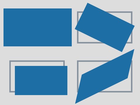
are a collection of functions that allow to shape elements in particular ways:
- translate: moves the element along up to 3 axis (x,y and z)
- rotate: moves the element around a central point
- scale: resizes the element
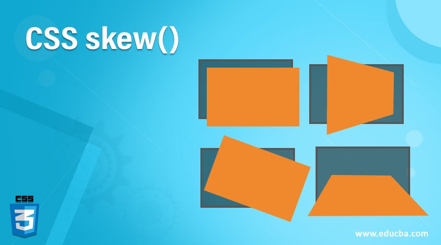
- skew: distorts the element
There are 3 CSS transform properties:
- transform defines which transform function to use (translate, rotate, scale…)
- transform-origin allows to modify the origin point of a transformation (works like background positions)
- transform-style is for 3d settings
translate() function allows to move an element across the plane (on the x and y axis) for example:
@keyframes translating {
  0%  { transform: translate(0, 0);}
  25% { transform: translate(240px, 0);}

}
The rotate() function allows to make an element revolve around a fixed point.
for example:
@keyframes rotating {
  0%  { transform: rotate(0deg);}
  100%{ transform: rotate(360deg);}
}
The scale() function allows to resize an element,The range of possible value is:
- 1: the element retains its original size
- 2: the element doubles in size
- 0.5: the element is half of its size
- 0: the element basically disappears (as its height and width are equal to zero)
- -1: the element is mirrored
for example:
@keyframes scaling {
  0%  { transform: scale(1);}
  20%{ transform: scale(2);}
  40%{ transform: scale(0.5);}
  60%{ transform: scale(0);}
  80%{ transform: scale(-1);}

}
The skew() function allows to distort an element, by dragging its sides along a line basically. for example:
0%  { transform: skew(0deg);}
  20% { transform: skew(10deg);}
  40% { transform: skew(45deg);}
  60% { transform: skew(90deg);}
  80% { transform: skew(120deg);}
  100%{ transform: skew(0deg);}

/translate.png)


