-
Notifications
You must be signed in to change notification settings - Fork 29.5k
New issue
Have a question about this project? Sign up for a free GitHub account to open an issue and contact its maintainers and the community.
By clicking “Sign up for GitHub”, you agree to our terms of service and privacy statement. We’ll occasionally send you account related emails.
Already on GitHub? Sign in to your account
Theming: add workbench configuration option for minimap opacity #58324
Conversation
|
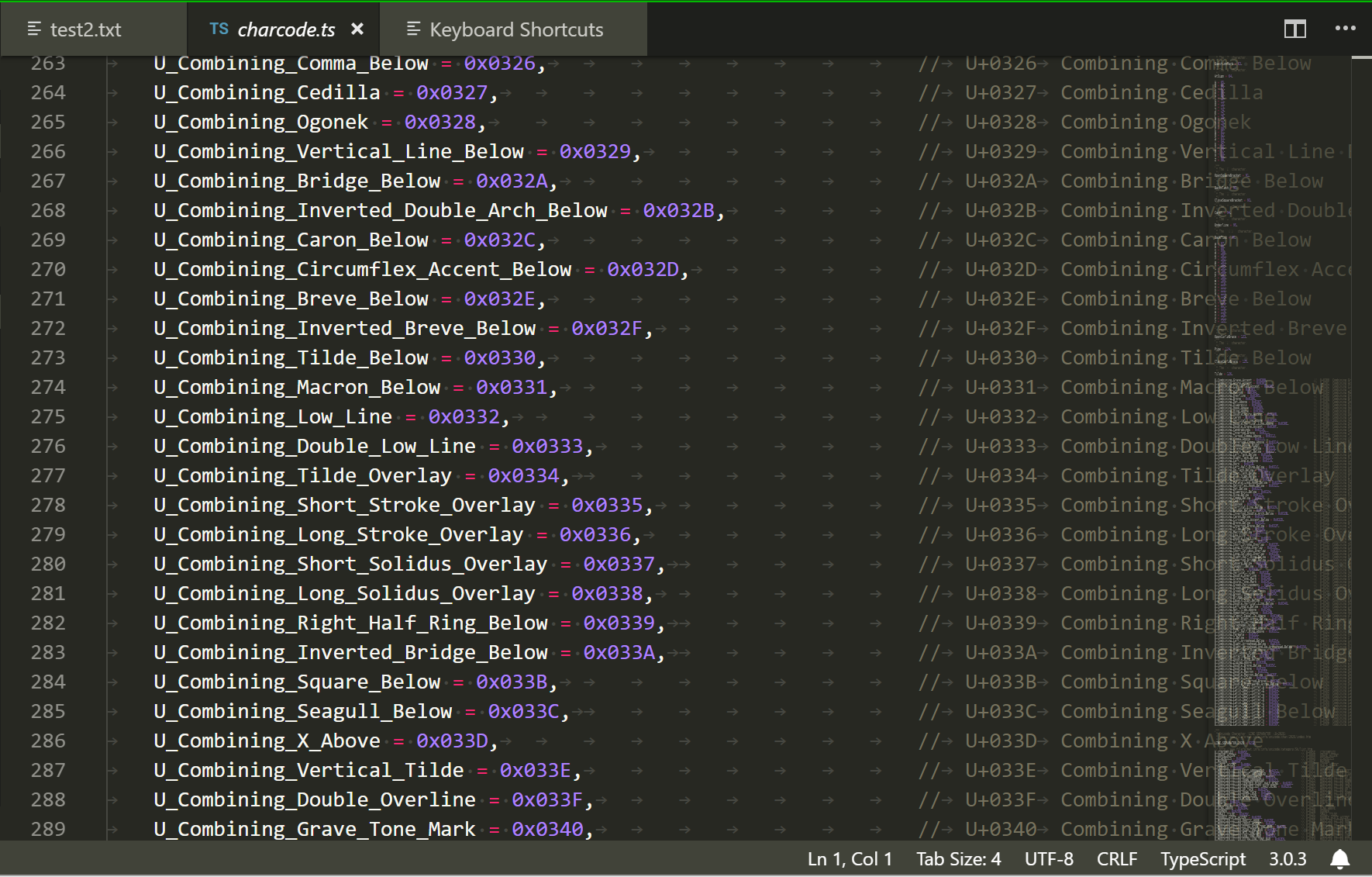
I am sorry, but this PR is literally adding "screen cheese" behind a setting. I don't understand why this screen cheese is desirable. We typically do recovery builds if we have bugs that lead to renderings like these: I don't understand how this can be useful. Are there are other editors or even software that has screen cheese like this intentionally? |
There was a problem hiding this comment.
Choose a reason for hiding this comment
The reason will be displayed to describe this comment to others. Learn more.
See above
|
I'm not sure I've run into the term "screen cheese" before... Google searching only brings up other vscode issues and PRs, along with cheese articles. :) I'm assuming it means the possible clash of having text on top of other text. The difference between this and bugs where things overlap is that the minimap, while useful, is only useful in terms of "general shape" of the code. It does not give me insight into what the text is, or does, or even give me lint highlights. The code/writing/etc underneath it, on the other hand, is useful. It's of direct interest to me, and when you're working in more cramped configurations, like the very common vertical split, code is often tucked underneath it. There are times when I (personally) would rather not scroll further right in order to view, for example, those comments you took a screen shot of. I'd like to know where I am in the file, but in those moments, the minimap is less useful than the text underneath. The most frustrating example of this is when a line ending is right next to the minimap -- is that the end of the line? Or is there more to see? You can't view it at a glance, and it can be frustrating. I could see considering this "cheese" if you could read what was on the minimap. At present it's just a visual indicator of where you are. Regardless of the opinion on whether it "looks like cheese"(?), the PR was to add a setting for it. Right now there is no option besides having a decent chunk of your editing space obscured, unless you want to forgo the minimap entirely. As for previous art, yes, this is an editable setting in:
Are there other text editors I should check? Those are the three relevant ones that came to mind first, and out of those I only used Sublime and Notepad++. |
|
Hi @alexandrudima! Just a ping as I see aeschli removed their assignment, which I'm guessing means that there won't be additional input. Is there anything else that I can do on my end for you (better/more examples from other editors/similar software, etc)? I guess what I'm really asking is: Either way, thanks for taking the time to look at this stuff :) |
|
Hi! Still hoping for a response in either direction here. |
|
Hi @alexandrudima! Is this still something you would never consider as an option? I can see that scrollbars are opaque, and the option to make the minimap opaque to match would be ideal. |
|
@alexandrudima This PR is the best available method for me to maximize horizontal screen space, which I need. I frequently have three or four columns of code open. These files are often quite small, so the 100% opacity full-length minimap is covering code with... nothing. This is a pure loss of screen real estate for no reason. The issue with minimap covering code is not an issue, as the default behavior is the same as the current behavior. Users would have to opt into changing the transparency. Users being able to configure their system to something that is not suitable for your use-case is fine, in the same way that allowing users to configure their font size to be too small for me to read is fine. |
|
You worded that much better than I did ^^ Maybe one day they will glance our direction again |
|
Thank you. This will now work via the |

This change allows configuration of the opacity of the entire minimap.
Following the pattern set for configuring opacity via hex color in editorUnnecessaryCodeOpacity, this adds an option under

workbench.colorCustomizationscalledminimapOpacity. Color input into this property is ignored and only the opacity is used, as was done here previously.Sample usage with default dark theme and minimapOpacity set to

#0007:Defaults for dark, light, and high contrast themes are set to null, meaning by default these themes display the minimap at full opacity.
Light default:

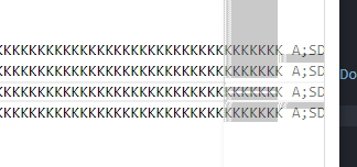
Light with

minimapOpacity: "#0007":Dark default:

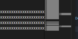
Dark with

minimapOpacity: "#0007":High-contrast default:

High-contrast with

minimapOpacity: "#0007":