-
Notifications
You must be signed in to change notification settings - Fork 1.6k
New issue
Have a question about this project? Sign up for a free GitHub account to open an issue and contact its maintainers and the community.
By clicking “Sign up for GitHub”, you agree to our terms of service and privacy statement. We’ll occasionally send you account related emails.
Already on GitHub? Sign in to your account
Combined (border+image) Program Node Rendering Issue #1427
Comments
|
@oda79 Thanks for that report! I totally get this issue, and that's bad, and I have no idea how to solve it yet. Maybe something with z indexing, I'll try as soon as I can. About collision layout in Graphology though, you can use graphology-layout-noverlap. It was not working properly with sigma.js before because we reinterpolated node sizes before, but since v3 you can use I hope this helps, until I find how to solve the initial problem. |
|
Just to keep you updated, I started digging, and enabling the depth buffer might be the solution, though it kinda collides with alpha blending at the moment. I'll keep trying when I have some time.
|
|
Thank you for the update! And also for the hint about using In general, graphology layouts are a bit weird in comparison to d3-force, and they can not be combined. Regarding the issue, to overcome it I made a new It is definitely not the fix. But if is worth being added to the packages, I guess it needs a new issue for a further PR. Thanks for your efforts! |
|
Update: I found a way to fix the issue using the |
This commit is related to #1427.

Details:
- Updates depth management in sigma.ts to clarify the difference between
  zIndex and depth in nodes and edges data
- Adds depth management in all node programs
- Adds depth management in createNodeCompoundProgram
This commit is related to #1427.

Details:
- Copies code from node programs to edge programs to handle depth
- Adds code to clear the depth buffer before rendering
- Fixes various node programs depth issues (where the depth wasn't
  normalized)
|
FYI I've been working on a fix these last days, and it starts working: The main issue that remains is that using |
|
After some more digging, it appears that one solution to solve that glitch would be to implement some "order independent transparency" technique, such as this one. |
This commit is related to #1427.

Details:
- Updates depth management in sigma.ts to clarify the difference between
  zIndex and depth in nodes and edges data
- Adds depth management in all node programs
- Adds depth management in createNodeCompoundProgram
This commit is related to #1427.

Details:
- Copies code from node programs to edge programs to handle depth
- Adds code to clear the depth buffer before rendering
- Fixes various node programs depth issues (where the depth wasn't
  normalized)
|
We've just run across this very issue during user feedback testing. Users zoom out and see images overlayed within the node layering on top of the other nodes. We use images inside the node to visualize what the node represents, especially when a user zooms out and the node label disappears. As an alternative/workaround, is clustering of nodes supported? For example.. Two or more nodes would cluster/group together to form a node that says "+5" more nodes when zooming out. Also, we're interested to see multi-node selection and the ability to collapse/expand sections of the graph. |


Combined (border+image) Program Node Rendering Issue
Description
When using a combined program (
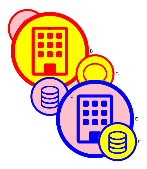
node-imageandnode-border) for rendering nodes, overlapping nodes appear messy. The nodes' borders are rendered separately and on a different layer from their images, resulting in a 'transparent background effect' or incorrect clipping areas. This issue is critical for large graphs, as graphology lacks collision layout, leading to massive node overlap.Details
Steps to Reproduce
Expected Behavior
When nodes overlap, their borders should be clipped accordingly, similar to the node 'B' in the reference image below:
Actual Behavior
Nodes' borders are displayed regardless of the nodes' z-position, leading to visual artifacts and a cluttered appearance:
Additional Information
This issue becomes more noticeable and problematic for large graphs due to the lack of collision layout in Graphology, causing significant node overlap.
The text was updated successfully, but these errors were encountered: