-
Notifications
You must be signed in to change notification settings - Fork 8.3k
New issue
Have a question about this project? Sign up for a free GitHub account to open an issue and contact its maintainers and the community.
By clicking “Sign up for GitHub”, you agree to our terms of service and privacy statement. We’ll occasionally send you account related emails.
Already on GitHub? Sign in to your account
Enable histogram panel to plot multiple fields #374
Conversation
…h plot to a set of queries
|
I like the idea, but I think it needs some refinement before its ready to merge. For example, if you change the color for a "plot" it desyncs them visually from the query panel, so now there's no way to tell what query is paired to which line. Even without changing the color you can't tell what the line represents (count/min/mean/max/total) |
|
One query can be source for more histogram lines (multiple fields in message) and one field can be displayed as multiple lines, fe. min/max/mean. There may be hard to synchronize query panel and histogram panel. I prefer allow setup own histogram legend for each line/data series. |
|
Having all the searches in one place is in principle a good idea but in practice it's kind of awkward a lot of the times. I've seen dashboards with 15+ searches, and if you have 15+ searches colors start to overlap (depending on eye color resolution). So my current thinking is that the "master search panel" is a good idea for pages with 5 or 6 searches max. P.S. the filtering panel(s) seem to be going in a really nice direction and are pretty useful to drill down on your searches. |
|
Real world example> I have data source in format timestamp rowtype,field1=value1,field2=value2,field3=value3 I want to display values in histogram (mean/max/min) for selected fields (field1, field2). I can query rowtype and timerange. Multiquery+histogram panel works just for count or single selected field expecting data in different format> timestamp record_type_field1,generic_field=value1 It can be displayed in histogram with multiquery. Each query request record_type_fieldX and histogram will be setup to field generic_field. For now there may be solution transform data before indexing in Elasticsearch or use tvvmb solution. |
|
How is this going? It would be really useful! |
|
Do you have some news about this feature ? It would really help. |
|
I'd like to see this accepted as well. |
|
This feature would be very useful. |
|
+1 for this feature, bump |
|
+1 for me as well. This is exactly what I am looking for. |
|
+1 also, this feature would be really a good benefit and exactly what is missing for me |
|
+1 |
2 similar comments
|
+1 |
|
+1 |
|
I just ran into this limitation because I have one "sysstats" message type that has many fields like memory free, memory used, cpu idle, cpu used, etc. I wanted to use these many fields to show graphs in two colors with used/free, but right now it's not possible unless I create one message per field and then do a query for free memory and one for used memory where messages would both have a "value" field that the graph can display. I would love to see this merged. |
|
+1 the fealtrue is the bigest limitation I think,It would be force me to use tvvmb's |
|
Will this be fixed with the new aggregation framework? |
|
Honestly, this is the ONLY missing feature that steers us clear of Kibana, which is otherwise perfect. Does anyone know if tvvmb's solutuion works with the latest Kibana release? This looks like a version back, but I could be wrong. |
|
Yeah it's quite old you're right, it does not work with the latest version for sure. |
|
Thanks tvvmb. Any chance you're working on an update? |
|
Not at the moment :) |
|
Dang! I really hope they sort this out for future releases. We have been using straight Graphite for cross-metric comparison and always assumed it would be a standard feature for any data-visualization software. You know what they say about assuming... thanks mate! |
|
+1 would love to this see |
+1 on this. I'm currently working on getting metrics and logging for OpenStack into one place - preferably Kibana :). When you combine data visualization with the ability to facet and drill down to a given time range, that would make for a great "cockpit" in order to keep tabs on all those moving parts. As it stands, it looks like I will have to view some data in Graphite because of the histogram panel's inability to graph multiple fields :( That means having two tools to do the job. Sure, I can wrap both in an iframe to put them on the same page, but not having the two locked into the same timeframe makes is less valuable. |
|
+1 me too, but with a suggestion: organize these selections of fields and aggregation methods in a seperate 'metrics' section (as done with 'query' and 'filtering'). In the configuration of e.g. a histogram panel, one combines prefined queries with predefined metrics. A general metrics section might also be the place to
|
|
Is this in the roadmap (particularly now that ES 1.0 is out)? |
|
+1 |
2 similar comments
|
+1 |
|
+1 |
|
+1. This would be really useful, the community seems to agree on this point. What's keeping this from getting merged? Can we do something to have this in the upstream soon? |
|
+1 |
2 similar comments
|
+1 |
|
+1 |
|
Jumping on the bandwagon-- this would be killer. |
|
+1 |
|
+1 I think this should be a mandatory function of next kibana. |
|
+1 |
|
+1 |
1 similar comment
|
+1 |
|
I'd love to see this feature. I'm wondering though why this is laying around for almost a year now :( |
|
+1 |
1 similar comment
|
+1 |
|
+1 this is highly desirable. |
|
Looks like an alternative implementation is available here: #1296 |
|
+1 |
4 similar comments
|
+1 |
|
+1 |
|
+1 |
|
+1 |
|
I sincerely wish people would stop leaving +1 comments here, they're not going to help get this merged any faster at this point, and you spam everyone who's monitoring this issue for progress, which just creates noise for everyone. I'm sorry for adding to the noise, but at least if this stops two people from leaving pointless comments, we'll be ahead. |
|
i agreed. oops! :) |
It should be OK to run the agent when http.enabled is set to false, shipping to another cluster.

Closes elastic#374
Proto file for taser traffic
Closes #199
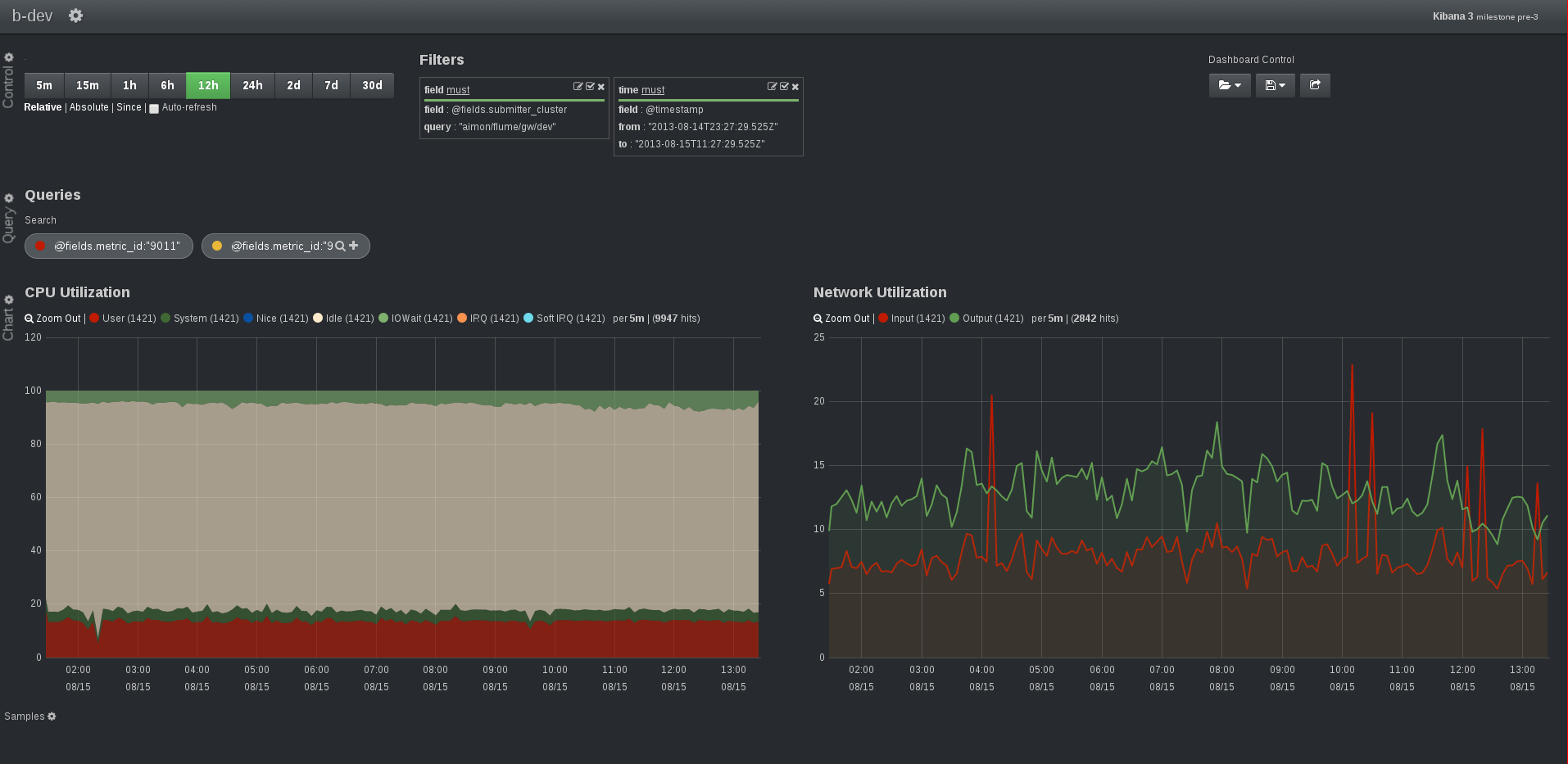
This is a first prototype to enable histogram panel to plot multiple fields. It also enables the pairing of a "plot" (a line in the graph) to a set of queries.
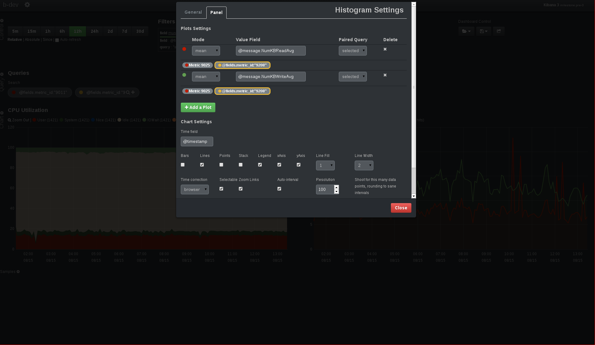
Thus it introduces a new concept to the panel: a plot, which is represented by one (or more) lines on the graph. It is associated with: a mode (same as before), a value field (when the mode is different than 'count'), and a set of query ('all','pinned','unpinned','selected'). The default color of a line is taken from the query it is paired to, but it can be changed for each plot. A plot can also have an alias, cause a pair (queryA, value_fieldA) may represents something different than the pair (queryA, value_fieldB).
Worth noting that the time_field is shared across all plots.
How the panel looks like: (left panel=>first query, right panel=>second query)

How the editor looks like: (editor for the second panel)
