You signed in with another tab or window. Reload to refresh your session.You signed out in another tab or window. Reload to refresh your session.You switched accounts on another tab or window. Reload to refresh your session.Dismiss alert
1. 'Connect to a wallet' button's boarder has a light boarder and seems like have a different boarder radius
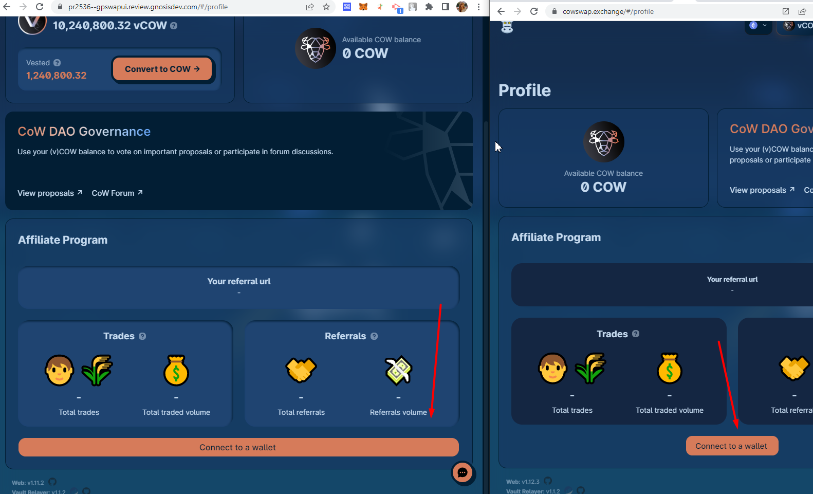
2. Profile page: 'Connect to a wallet' button is too wide
3. Text in the network selector is almost invisible in the dark mode
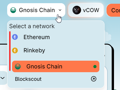
4. Networks in the selector are not aligned
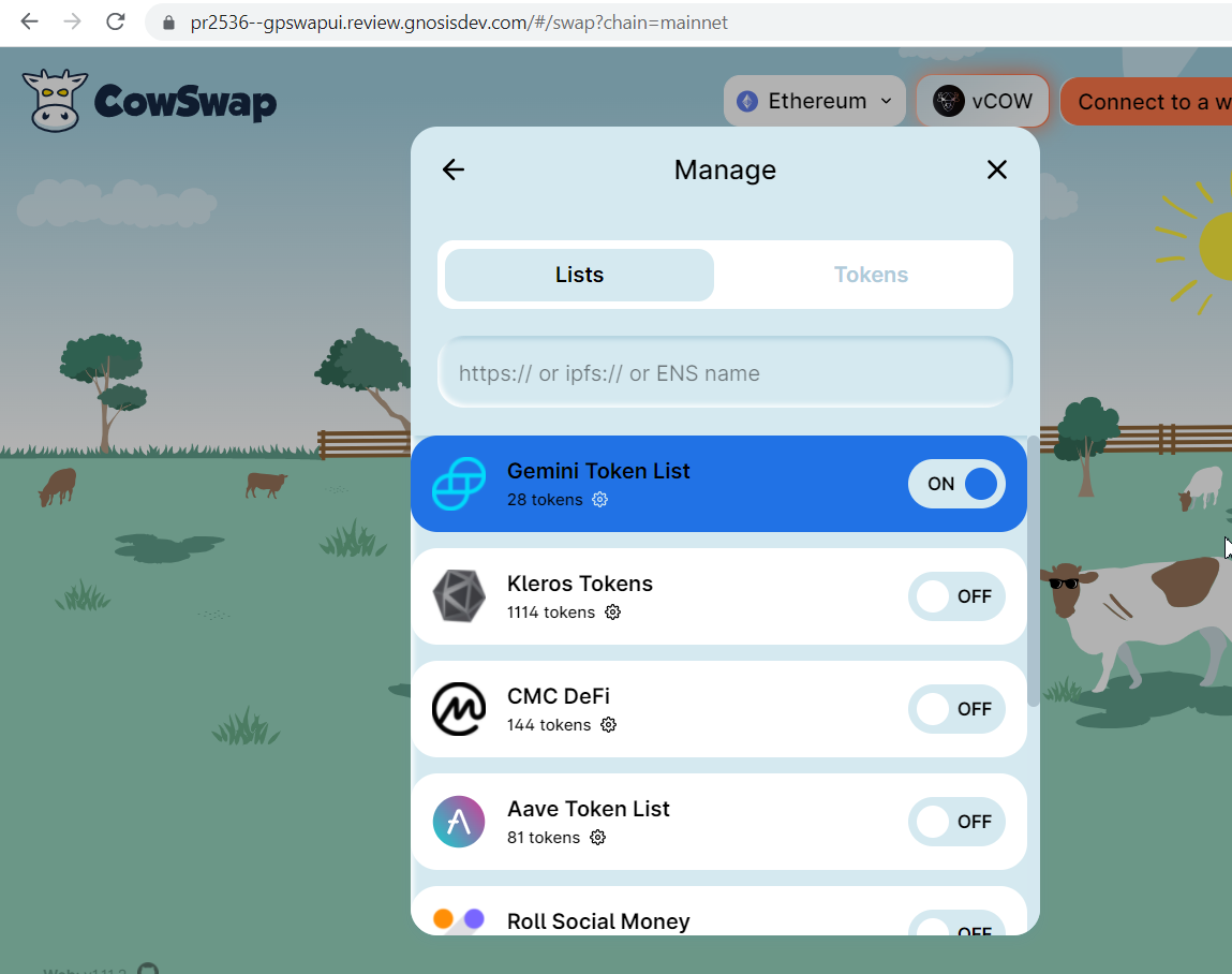
5. Token lists exceed the modal area
6. Arrow before' Add a send' field has too bold boarder + center-aligned
7. Naming is inconsistent: 'Add a send' and 'Remove recipient'. I think, we need to use 'recipient' for both labels (or at least 'send' for both, as it is currently on Prod)
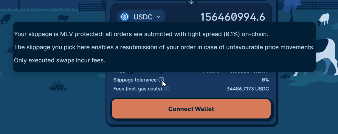
8. Too big tooltips
9. Account Icon on the 'Confirm' modal is too small
-The same is on the 'Claim' page
10. Network selector exceeds right screen boarder in mobile devices
11. Network selector is opened 'on hover' event instead of the 'on-click' as we currently use on Prod. So when I press on the network selector twice, it remains opened until I remove a mouse from it. Will we leave it as it is or change to the behavior we currently use?
12. Sometimes I can't open the network selector after a network changing in a mobile view
Related to #2536
1. 'Connect to a wallet' button's boarder has a light boarder and seems like have a different boarder radius


2. Profile page: 'Connect to a wallet' button is too wide
3. Text in the network selector is almost invisible in the dark mode

4. Networks in the selector are not aligned
5. Token lists exceed the modal area
6. Arrow before' Add a send' field has too bold boarder + center-aligned
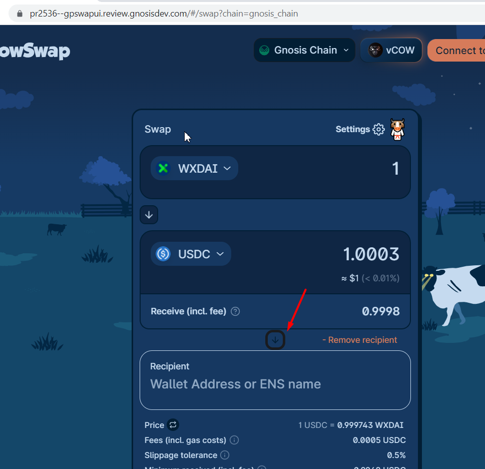
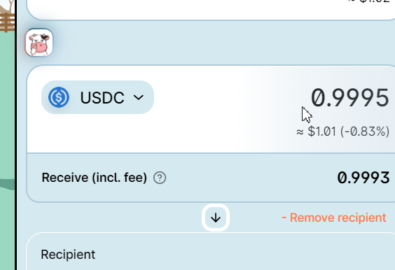
7. Naming is inconsistent: 'Add a send' and 'Remove recipient'. I think, we need to use 'recipient' for both labels (or at least 'send' for both, as it is currently on Prod)

8. Too big tooltips
9. Account Icon on the 'Confirm' modal is too small


-The same is on the 'Claim' page
10. Network selector exceeds right screen boarder in mobile devices

11. Network selector is opened 'on hover' event instead of the 'on-click' as we currently use on Prod. So when I press on the network selector twice, it remains opened until I remove a mouse from it. Will we leave it as it is or change to the behavior we currently use?
12. Sometimes I can't open the network selector after a network changing in a mobile view
The text was updated successfully, but these errors were encountered: