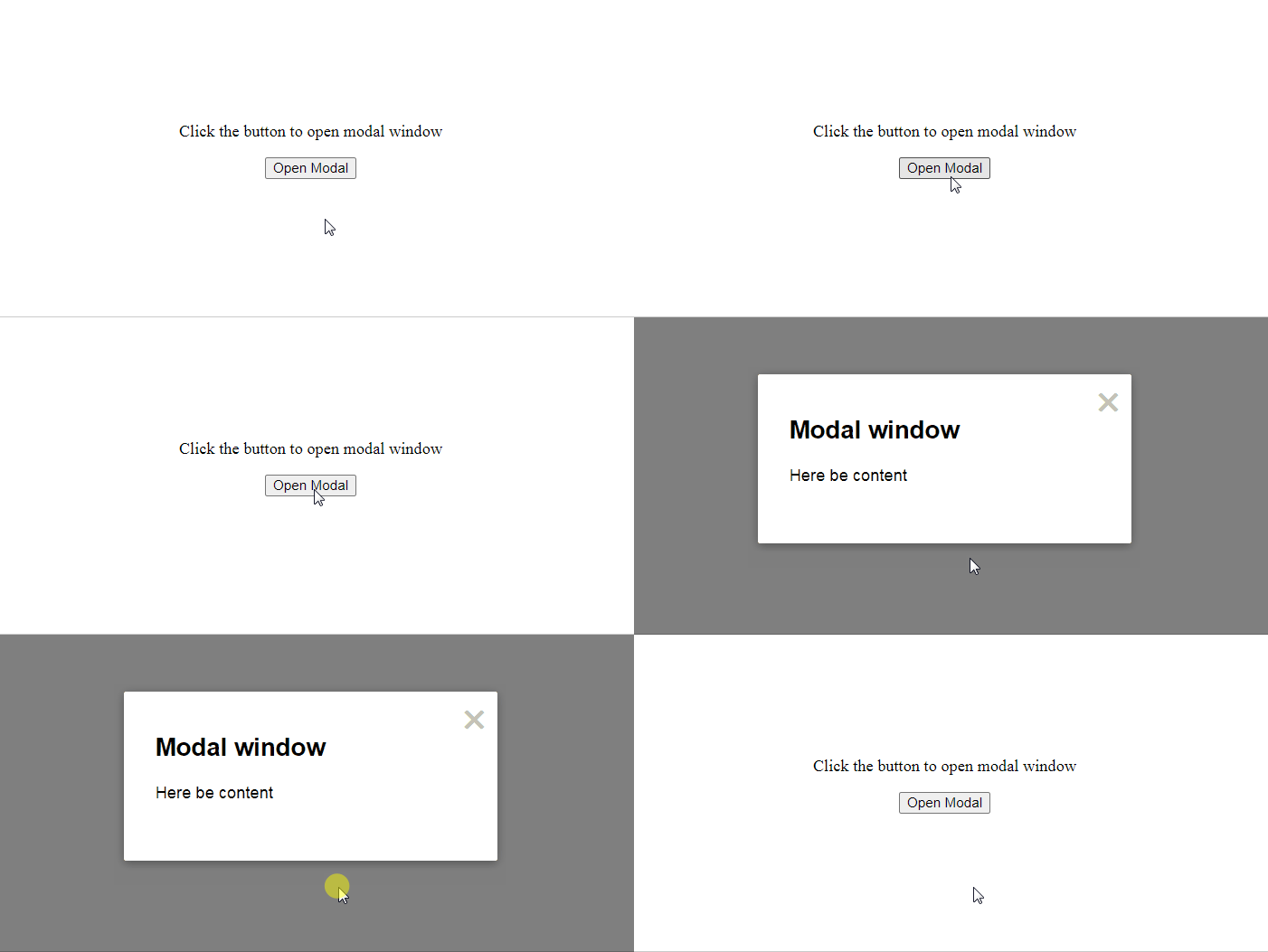
Simple Modal window Vue.js component that takes care of overlay, centering, animation, outside click/Escape key/X-mark closing and allows you to concentrate on its content only
Can be used for alerts, modals, dialogs etc.
You can install it via npm
npm install @vuesence/modal-window --saveor just copy/paste ModalWindow.vue component code into your Vue.js project
<template>
	<div id="app">
		<p>Click the button to open modal window</p>
		<button @click="showModal = true">Open Modal</button>
		<modal-window
			:visible="showModal"
			:close-on-escape="true"
			:close-on-outside-click="true"
			:show-x-mark="true"
			@close="showModal = false"
		>
			<h2>Modal window</h2>
			<p>Here be content</p>
		</modal-window>
	</div>
</template>
import ModalWindow from "@vuesence/modal-window";
...
data() {
return {
showModal: false
};
}All the props (close-on-escape, close-on-outside-click, show-x-mark) are optional.
Above listed their default values
showModal property is used to open\close the window
There can be several instances of the ModalWindow.vue
Styling and animation can be customized - check out ModalWindow.vue's <style> section for CSS class names
https://vuesence.github.io/modal-window/
Try it on codesandbox.io
- Vuesence book - minimalistic Vue.js based documentation component
- Sliding header - Vue.js component representing sliding header (or two different headers)
- Cloud Sync Button - a button with cloud synchronization animation
Any bugs, issues, feature and pull requests are welcome
Please use GitHub's issue reporter or send me an email
Contribution is always welcome and recommended. Here is how:
- Fork the repository
- Clone to your machine
- Make your changes
- Create a pull request
@vuesence/modal-window package is freely distributable under the terms of the MIT license.

