Skip to content
New issue

Have a question about this project? Sign up for a free GitHub account to open an issue and contact its maintainers and the community.

By clicking “Sign up for GitHub”, you agree to our terms of service and privacy statement. We’ll occasionally send you account related emails.

Already on GitHub? Sign in to your account

What's going on with Ecuador? #185

Open
git2samus opened this issue May 13, 2020 · 5 comments
Open

What's going on with Ecuador? #185

git2samus opened this issue May 13, 2020 · 5 comments

Comments

@git2samus
Copy link

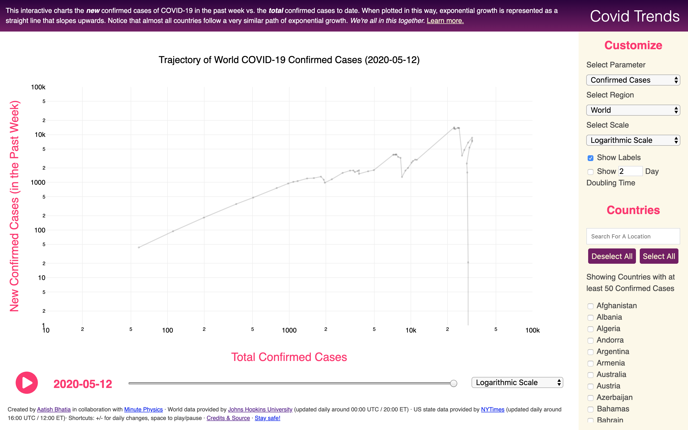
The confirmed cases seem to be decreasing and the chart went out of bounds.

https://aatishb.com/covidtrends/?trendline=false&location=Ecuador
@MrSpiffyClean
Copy link
Contributor

I'm guessing there was a recheck of cases in Ecuador and some cases that were overcounted before are now being rectified, which is why the graph seems to "go backwards" around 2020-05-05. Need to check the actual data (and any news reports perhaps) but it seems to be the most logic explanation.
Console view of plot data of Ecuador

@MrSpiffyClean
Copy link
Contributor

MrSpiffyClean commented May 13, 2020

Looking about a bit I found some reports confirming what I stated. From https://www.eluniverso.com/noticias/2020/05/08/nota/7835562/casos-coronavirus-ecuador-viernes-8-mayo-11h00-30-confirmados-16:

La cifra de contagiados volvió a bajar en -1480 casos-, Zevallos volvió a decir que el sistema de procesamiento de datos sigue ajustando duplicidad y triplicidad de resultados en una misma persona, pues el sistema que se utilizaba tiene diez años de antigüedad.

Translating:

The [Confirmed Cases] count went back again, to -1480 cases, Zevallos again said that the data processing system keeps counting double and triple results to a single person, since the used system is ten years old.

As for why the graph looks that way, it all has to do with how the data is displayed. The Y axis represents the difference between the number of confirmed cases on the selected date and the number of confirmed cases 7 days before. If you compare the number of cases in 2020-05-04 and 2020-05-11, you'll notice that there are less confirmed cases now than before, hence the drop.

@SteveCadaver
Copy link

Hi Gents. Seems to be a problem not related to the rolling week count.

As shown here Total Reported Deaths for South Africa on 2021-11-14: 89746 and the next day 2021-11-15: 89489. Where do you pull the data from?
image

I've been following the stats here, and its a great tool for keeping track of Covid-19.

@MrSpiffyClean
Copy link
Contributor

The whole "graph jumping up and down thing" is, as I mentioned earlier, a consequence of values going down in what should be an always growing series of values.
And this can be usually attributed to post-fact corrections to the dataset, to which I started checking some news sources and the like... however, for the case of South Africa, no such thing appeared in that specific timeframe. (there is a recent report about an antigen test backlog that was added, but that is too recent (check https://coronavirus.jhu.edu/region-data-notes/south%20africa)

Thus, I guess the most likely explanation is that someone messed up entering the values for the South Africa dataset. Checking the official figures (at https://sacoronavirus.co.za/category/daily-cases/) does show values that do make some sense...
The data for the graph comes from the John Hopkins Covid-19 dataset (https://github.com/CSSEGISandData/COVID-19) (apart from the US, which might use the NY Times dataset). I'll report the issue to them as soon as I'm able, though there's no guarantee that it will get fixed.

@MrSpiffyClean
Copy link
Contributor

After a bit of time, the folks at the John Hopkins Covid-19 dataset read and dealt with the issue I raised, and it seems to have fixed the issue.

covidtrends_sa_fix

Sign up for free to join this conversation on GitHub. Already have an account? Sign in to comment
Labels
None yet
Projects
None yet
Development

No branches or pull requests

3 participants