-
Notifications
You must be signed in to change notification settings - Fork 0
New issue
Have a question about this project? Sign up for a free GitHub account to open an issue and contact its maintainers and the community.
By clicking “Sign up for GitHub”, you agree to our terms of service and privacy statement. We’ll occasionally send you account related emails.
Already on GitHub? Sign in to your account
Re-think Filter Dialog #34
Milestone
Comments
|
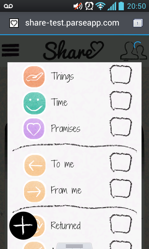
@konewa filter contents is ok, but on other screens we are eliminating checkboxes, should we eliminate them on this screen also? |
|
|
|
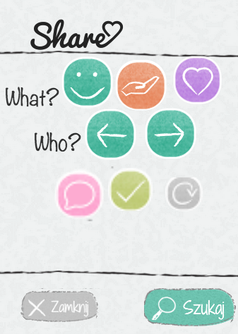
@rimbambala what about empty checkbox? that looks more to what a hand-drawn checkbox would be like - drawing what you have by hand would take a lot of time... |
|
I think that is better. let's go with this. |
This was referenced Mar 31, 2014
|
Implement in #171 |
Sign up for free
to join this conversation on GitHub.
Already have an account?
Sign in to comment


Currently the filter dialog does not fit on the page and is much too big.

I propose the following re-arrangement

The text was updated successfully, but these errors were encountered: