- Wireframes critique
- CSS quiz
- Responsive Web Design (RWD)
- Beyond media queries
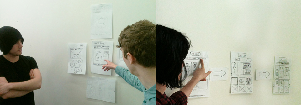
- Hang your drafts on the wall
- Grab a pen and some post-its
- Let's critique each other's drafts
For this first session we'll all be around the same project and critique one project at a time.
In future sessions we'll do it more informally.
All comments must be KASH:
-
Kind
Focus on the work. No sarcasm or personal comments.
Your comments can be challenging but the creator of the work should feel that your feedback is work-oriented and happy to receive it.
-
Actionable
Your comments should include suggestions or instructions, which the creator of the work can simply take away and use.
-
Specific
Don't just state
It's (not) goodorI (don't) like it. Explain why.Comment on specific aspects or details of the work, eg:
Navigation labels are unconventional but I wonder if most people would get what they stand for.. -
Helpful
If it doesn't benefit the work, its creator or the class, don't share it.
In a nutshell:
Be hard on content and soft on people!
- Like it / Don't like it
- Clean
- Dynamic
- Empty
- Minimal(istic)
- Modern
- Poor
- Professional
- Simpl(istic)
- Static
- XYZ font
- XYZ colour / background
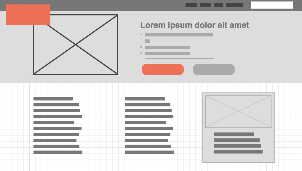
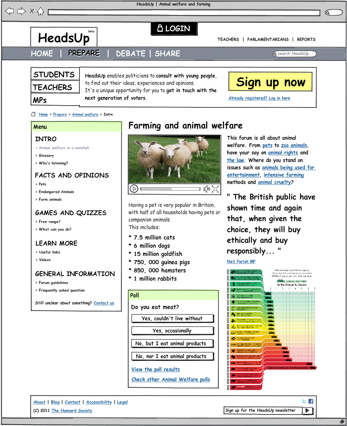
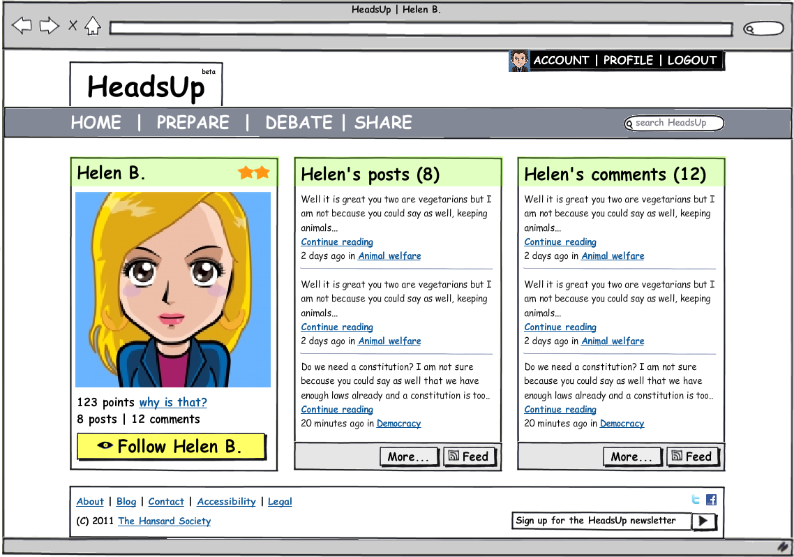
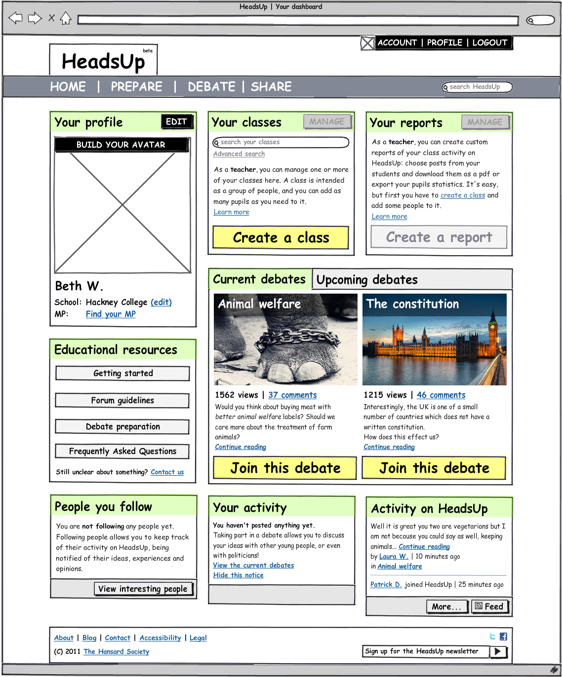
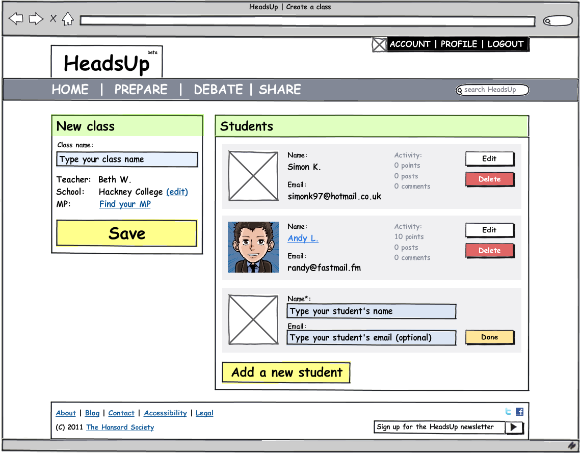
What's wrong with the wireframes above?
What's wrong with the wireframes above?
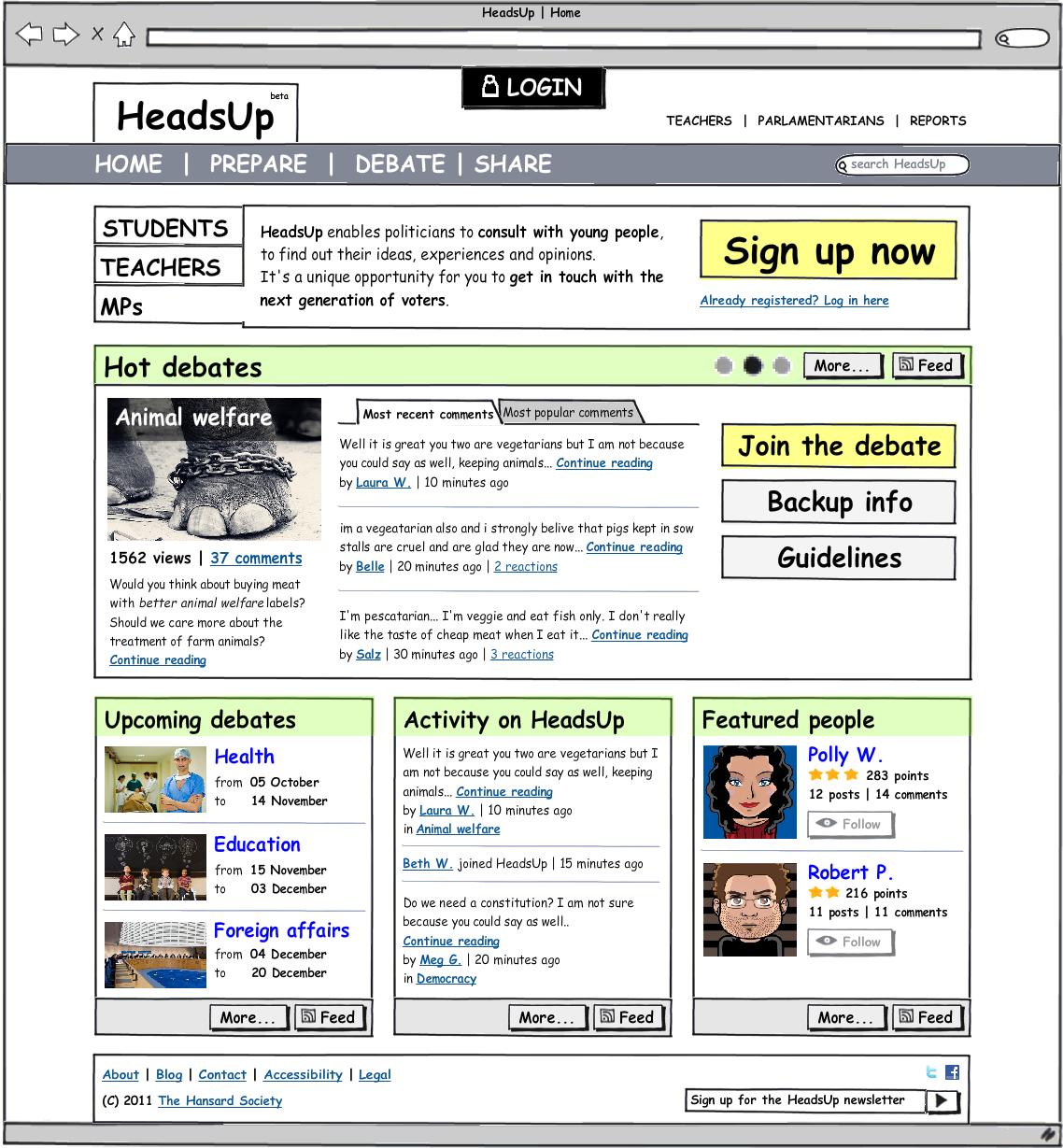
Proposed re-design of an online space for topical political debates that aims to promote political awareness and participation amongst young people.
Used both as a teaching tool in the classroom and by 11-18 year olds in their own time.
Commissioned by the Hansard Society in 2011.
- Is anything important missing from this page?
- Is the most important content the first thing you notice?
- Is there anything on this page that shouldn't be there?
- Do you know what all of the elements on this page are?
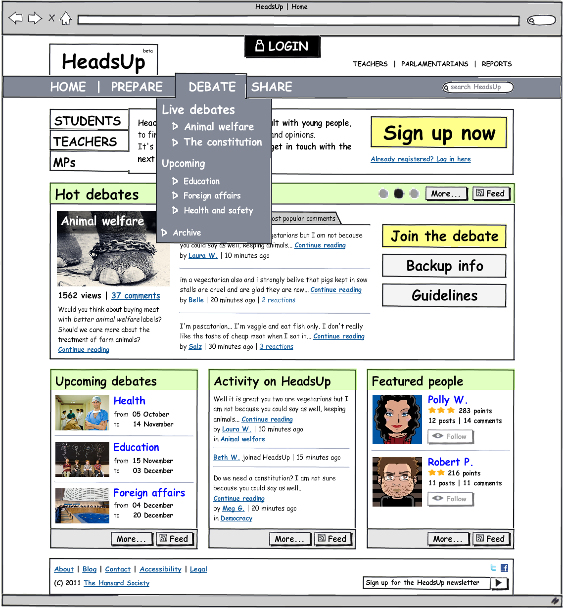
- Can you get to all of the major sections of the site from here? Should you be able to?
- Do all of the labels make sense?
Reflect on the feedback and suggestions that you received, ask any clarifications and start redrafting your work.
Drafting and redrafting, making improvements after improvements, is a vital part of the design process. Nothing is perfect the first time.
Keep every copy of your drafts. We'll ask you to present them during the formative and summative assessments, and they'll be part of the body of work on which you'll be marked.
-
A CSS declaration is terminated by
.period!exclamation mark;semi-colon:colon
-
style1.cssis parsed beforestyle2.css[ true / false ]<head> <link href="style1.css" rel="stylesheet"> <link href="style2.css" rel="stylesheet"> </head>
-
How do you insert a comment in a CSS file?
// this is a CSS comment //// this is a CSS comment/* this is a CSS comment */
-
How do you display hyperlinks without an underline?
a { text-decoration: none; }a { text-decoration: no-underline; }a { underline: none; }
-
This media query applies to screens 600px wide and up [ true / false ]
@media (min-width: 600px) -
This media query applies to screens 599px wide and up [ true / false ]
@media (max-width: 599px) -
This media query applies to screens 640px wide and up [ true / false ]
@media (min-width: 40em) -
With media queries, you can check against a device's
height[ true / false ] -
With media queries, you can check against a device's
orientation[ true / false ] -
With media queries, you can check against a device's
resolution[ true / false ] -
With media queries, you can check against a device's
bandwidth[ true / false ] -
With media queries, you can check against a device's
local date and time[ true / false ]
2007: computing becomes really personal, as computers start to fit in our pockets (known as smartphones).
We (designers) had to design different sites for different devices (variable capabilities and screen sizes). In one word: fragmentation.
New developments in CSS came to the rescue, by offering a technology to target specific media and screen sizes: media queries.
Rather than developing multiple resources, we can create a single site which reshapes for different devices and responds to the available screen space.
RWD hinges on media queries.
Here's an example from LearnLayout.
@media (min-width:600px) /* this line is the query */
{
	/* if the query is true, then the following rules are applied.. */

	nav
	{
		float: left;
		width: 25%;
	}

	section
	{
		margin-left: 25%;
	}

	/* ..up to here */
}

@media (max-width:599px)
{
	nav li
	{
	    display: inline;
	}
}
When a media query is true, the corresponding style sheet or style rules are applied, following the normal cascading rules.
To get smartphone browsers to listen to media queries, you need to use meta viewport tag
<meta name="viewport" content="width=device-width, initial-scale=1"> Mediaqueri.es is a collection of sites that make good use of media queries.
Breakpoints are the points at which our RWD layouts change. The breakpoints we use currently relate almost exclusively to screen size.
But this should change in the near future.
The websites of tomorrow have to be more than responsive — they have to be contextual, too. These concepts of flexibility and fluidity have to transcend screen size.
RWD is not just about media queries.
People access the Web from different devices, that have different capabilities, on different connections, in different contexts, doing different tasks!
The vast majority of RWD sites weigh the same in both small screen and large screen versions: performance is not an afterthought.
Progressive enhancement: start from the small, less capable devices and build "richer" experiences for the "richer" devices.
Let's take a look at a demo page which puts these principles into practice.
Show slides from this presentation (from 75 onwards).
This is the tutorial to build that page.
Continue redrafting your wireframes in a digital format.
Consider a mobile-first approach (see the RWD section above).
Two options:
-
Use Moqups and then upload your screens to InVision to make them clickable.
or
-
To save yourself work in the long run, start translating your wireframes into HTML + CSS using a framework like Skeleton, Bootstrap or Foundation
Watch The Internet's Own Boy, a film about Aaron Swartz: wiz-kid, co-founder of Reddit and activist for social justice and freedom of information.
Heads up! This will be available on BBC iPlayer until the 4th of March 2015, so you better watch it before then.
Questions that may guide your blog post (in no particular order):
- How do you feel about freedom of information?
- What do you think constitutes digital theft?
- How do you feel about Net Neutrality?
- If you had magical powers, would you use them for good or to make you mountains of cash?
