You signed in with another tab or window. Reload to refresh your session.You signed out in another tab or window. Reload to refresh your session.You switched accounts on another tab or window. Reload to refresh your session.Dismiss alert
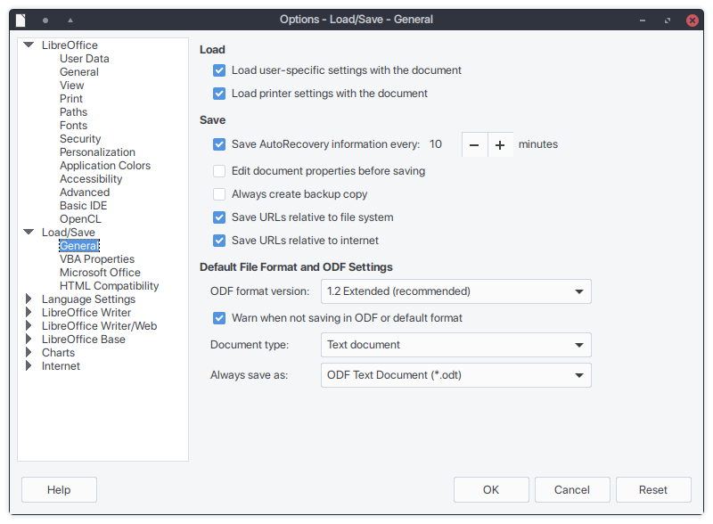
It seems like the general spacing of the Kvantum theme is too compact when compared to GTK, mainly for dropdown menus and general element spacing.
For example, some dropdown menus from LibreOffice (with libreoffice-gtk3 and the default Ubuntu 18.04 arc-gtk-theme package):
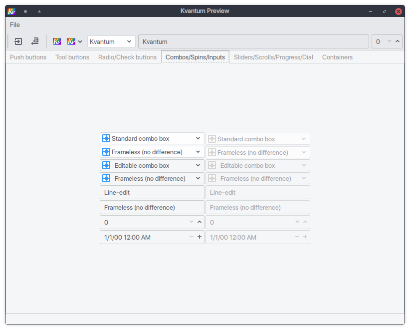
Compared to the Kvantum implementation (Arc, downloaded from Github on 8/10/18):
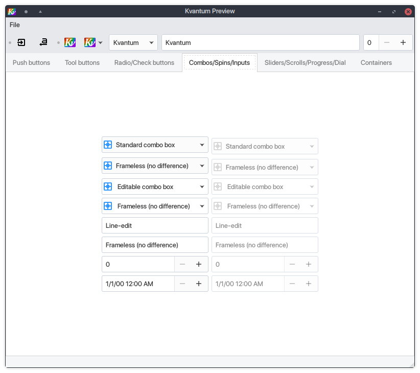
Or the default Kvantum implementation (KvArc, compiled from source on 8/10/18):
As said before, the same applies to most, if not all, other elements. However, nor is the default Kvantum implementation consistent with GTK; it is too widely spaced and uses different dropdown arrows.
System information: Ubuntu 18.04.1, Plasma 5.12.6LTS.
The text was updated successfully, but these errors were encountered:
I've also noticed that icons don't show up besides text on buttons even when I have it set to. Also, unlike the built-in arc theme, white text appears over gray progress bars instead of black text, such as the free GB bar in Dolphin. I'm hoping consistency can be improved.
It seems like the general spacing of the Kvantum theme is too compact when compared to GTK, mainly for dropdown menus and general element spacing.


For example, some dropdown menus from LibreOffice (with
libreoffice-gtk3and the default Ubuntu 18.04arc-gtk-themepackage):Compared to the Kvantum implementation (
Arc, downloaded from Github on 8/10/18):Or the default Kvantum implementation (
KvArc, compiled from source on 8/10/18):As said before, the same applies to most, if not all, other elements. However, nor is the default Kvantum implementation consistent with GTK; it is too widely spaced and uses different dropdown arrows.
System information: Ubuntu 18.04.1, Plasma 5.12.6LTS.
The text was updated successfully, but these errors were encountered: